What font does Youtube use? (Answered)
When it comes to overall visual design and art, one key component for an excellent design is the typing font. It is vital as it communicates the desired message to the right audience. This works the same for YouTube. Statistically speaking, YouTube holds one-third of all existing internet traffic. It has more than one billion users across the globe.
It is a platform where almost anyone can create content. Not only that but it is a place where users are able to discover and share likes and interests through a simple video. YouTube, as a company, has grown to be one of the most widely recognized companies in the world.
We can define YouTube as a video-sharing platform. It was founded in America, specifically in San Bruno, California. This service was created by three former PayPal employees. Steve Chen, Jawed Karim, and Chad Hurley were the ones that created this service back in February 2005.
A year later, it was bought by Google for exactly $1.65 billion. Today, YouTube works and operates like one of Google’s many subsidiaries. But, even though it works under google, the design and typeface don’t resemble Google at all. Unlike Google, it comes with a packed personality. The typeface is full of joyful yet sharp letters. YouTube uses a very special font called Youtube Sans.
YouTube Sans
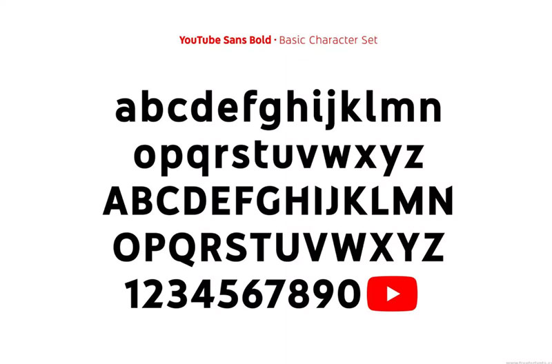
YouTube Sans comes as a display face. It was so deeply incorporated into YouTube that it seemed like it actually belong to it. As Youtube TV was launched in 2017, the second version of this font came out.
This family of fonts composes of light, medium and bold weights. This offers an extended range of uses both inside and outside of the product. This font is ideal as it is specifically designed for reading on smaller screens. It can be read on such screens through cinematic scales.
The new logo consists of the word-mark in black and the play button in pure red. The wordmark is likely custom lettered.
Here are several fonts that are similar to YouTube Sans
Trade Gothic
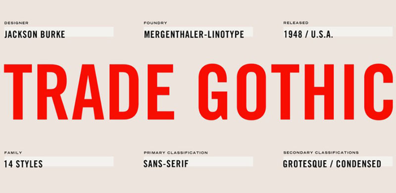
The first font that is similar to YouTube Sans is Trade Gothic. It is a font that was originally designed by Jackson Burke. It was designed in 1948. This designer then further continued to work on other other weights and designs. After the 1960’s, he became the director of type development for Mergenthaler-Linotype, USA.
This type of font style is defined by its use of condensed faces. These faces are excellent for headline uses.
GT America Font
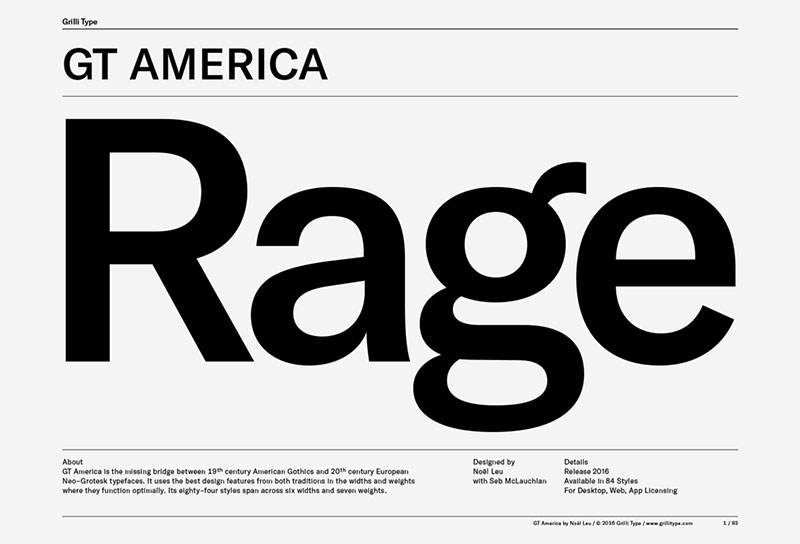
Another font that is like YouTube Sans is GT America. It was formerly known as GT Federal. It is a sans-serif typeface. It was released through Grilli Type back in 2016. Designed by Noel Leu, it was then improved by Seb McLauchan. This is a unique design. It draws inspiration from American and Swiss grotesques. It is an enormous family of fonts that comes in seven weights and five weights. It also comes with a monospased version.
This font has only been used for YouTube titles and videos. That is why they are bold and rendered large. But this font only applies to titles. Other fonts, such as Roboto,are used in forward buttons, and subheads. Other content is written with other fonts as well. Google has chosen Roboto as the official font for both Android and YouTube.
Roboto
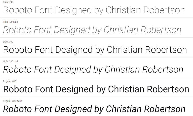
Roboto is the font that is most commonly used in Android devices and applications. This is a font that comes in several weights. This type of font was designed by Christian Robertson in 2011. It is an open-source, sans-serif typeface. Its nature is dual. Roboto has a skeleton that is mechanical and the forms are large and geometric.
Fonts Similar to Roboto
DIN
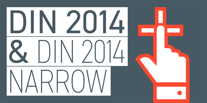
The original version of this font was released first in 1931. It was originally created to be used in technical and engineering applications. This font characterizes with old, primate look that is unrefined.
Akkurat
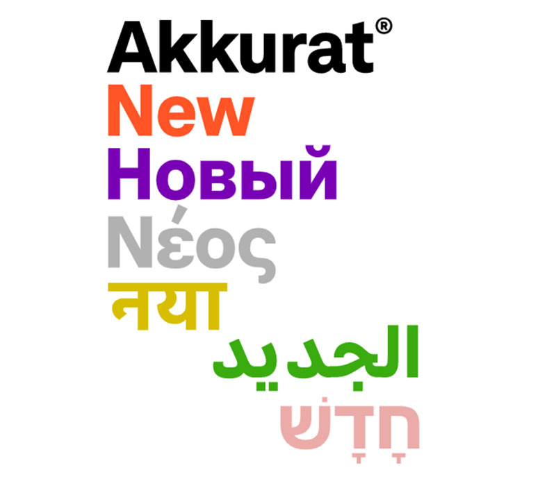
This is a gnarly sans-serif typeface. This typeface was made by Laurez Brunner. He is a designer that has released this font in 2004. After it has been released, it has gotten a lot of critical approval. This is a font that can ba found in three weights.
IBM Plex Sans
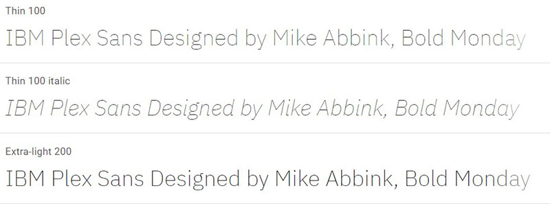
IBM Plex™ is a worldwide typeface family. It was created by Mike Abbink, IBM BX&D, in partnership with Bold Monday. Bold Monday is an independent Dutch type foundry. The result is a neutral, yet friendly Grotesque style typeface. It incorporated a Sans, Sans Condensed, Mono, and Serif and has outstanding legibility in print, web and mobile interfaces. Plex’s three designs work well separately and even better together.
Old YouTube Font: Arial
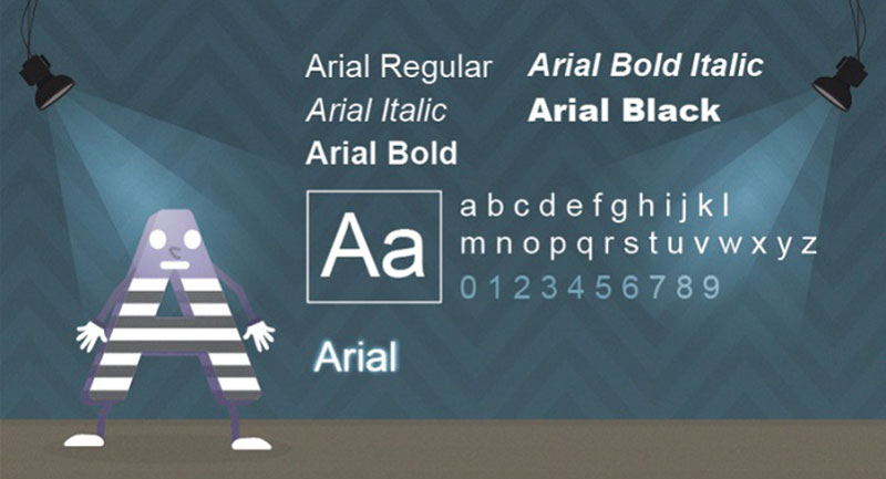
Arial is a modern sans serif typeface. It was originally created by Patricia Saunders and Robin Nicholas. It was designed for Monotype in 1982. It is the most wide known and most used default typeface. Arial is easy to read at both large and small sized. It is used in various applications. This font has been the default for several decades.
But, its use doesn’t end here. This font type has been most commonly used in many forms of advertising as well as office communication and book designs. Because it has many narrow widths, it makes it perfect for all kinds of poster and large print ads.
Similar Fonts to Arial
Helvetica
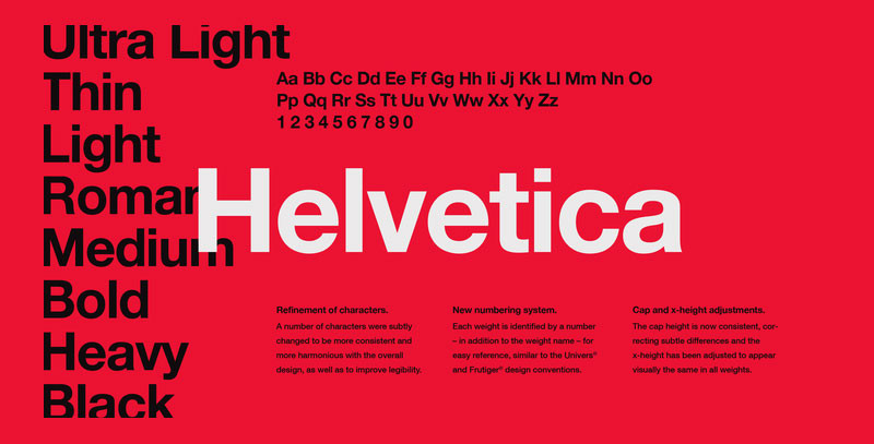
Helvetica is a sans-serif typeface designed by Max Miedinger. It was originally released through the Haas Type Foundry in 1957. The design of Helvetica was influenced by Akzidenz Grotesk. Helvetica is considered the quintessential neo-grotesque typeface.
Neue Haas Unica

Neue Haas Unica is a font that is quite similar to Helvetica. But, what’s different is that it is slightly looser when it comes to spacing. The letterforms are narrower as well. This is a family of fonts that is comes in nine weights. These are: ultra light, thin, light, regular, medium, bold, heavy, black and extrablack—each with matching italic styles.
Fonts used by Content Creators on Youtube
Fonts are used in almost any thumbnail of a video. They are specifically designed to catch the attention of users and viewers. By using the right font in a way that it is suitably and elegantly placed, content creators convince viewers to click on their video.
They most certainly understand how important it is to use the right font. This is why they use all kinds of ideas, strategies and techniques to get the right result. There are several default fonts. They are offered by Google, of course. Roboto, Roboto Mono, Sans Serif, YT Sans, are just the some examples of the fonts Google provides.
A large number of Youtubers have begun downloading fonts that are custom-designed. They are experimenting with all kinds of fonts to get the maximum results.
About Noto Sans
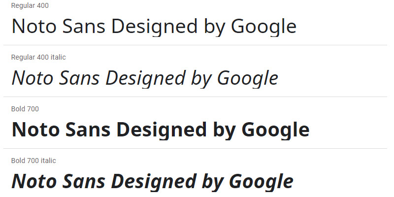
Noto is a great family of fonts. It is a group of fonts that is able to make almost any website even more interesting. For example, when some text is rendered by a computer, not all characters in the text will be displayed. This happens because there is no font that supports them. When this happens, small boxes appear instead of the characters.
Noto, in the moment covers more than thirty scripts. It is possible that it will cover all of Unicode sometime in the future. This includes Sans Greek, Latin and even the Cyrillic family. It also has Bold, Regular and Italic as mentioned before.
If you enjoyed reading this article on what font does Youtube use, you should read these as well:
- How to Add Fonts to Photoshop In A Few Easy Steps
- How to add fonts to FireAlpaca (FireAlpaca fonts guide)
- How to add fonts to Adobe Illustrator to use in vector