Looks and Beyond: Choosing the Right Fonts for Your Website
Web typography is in its golden age. There is a nearly endless array of fonts available to web designers, along with great options for implementing them. We are spoiled, indeed.
All of this variety is wonderful. Yet it can also make for tougher decisions when picking fonts. With such a massive ecosystem, how do you make the right choice?
While looks are a key factor, the decision goes deeper. There are plenty of other items to consider. It all comes down to which typefaces match your needs. Swapping them later is possible, but not as desirable as starting on the right note.
With that in mind, here are some tips for choosing the right fonts for your website. Whether you’re designing for yourself or a client, these factors should be part of the process.
Find Fonts That Fit Your Message
Typography is a means to an end. It’s used to convey a message or feeling and also establishes consistency across a brand.
However, this can be a great challenge for web designers. In some cases, we’re only handed a logo to use as the basis for the overall look. That’s not much to go on.
It’s far easier when a client has an established style guide. This enables us to step right in and carry on with the brand’s existing identity.
But even without that data, it’s still possible to get typography right. Consider the site’s intended audience, subject matter, and content. Taken together, these factors should at least help to point you in the right direction.
For example, knowing that a site’s core audience is children opens up the possibility of fun fonts. Likewise, having long-form content means that legibility and spacing are crucial.
The more you know about the project, the more informed your decisions will be.
Consider the Source
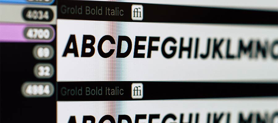
These days, there are many places to find great-looking fonts. Whether it’s a recognizable name like Google or a small foundry – we don’t lack creative options. But the source does matter for several reasons.
Licensing
Font licensing is a big deal, as it determines where, how, and how much a typeface can be utilized. Some libraries, such as Google Fonts, are free to use in any type of project. That’s a safe bet, provided the library has the styles you’re looking for.
Other sources can be more restrictive. For instance, you could find a “free” font that looks like a perfect fit. But you may have to purchase a license to use it in a commercial project.
Still, others have limits based on the amount of traffic to your website. A busy site could mean you pay dearly for access to fonts.
Therefore, it’s worth doing a little research and being comfortable with licensing before you commit to a web font.
Local or Remote Hosting
How a font is implemented is part of its licensing – but also an important consideration in its own right.
The ability to call fonts remotely via an API is highly convenient. It’s not without risk, however. The potential for downtime, privacy concerns, and degraded performance all need to be weighed against the benefits.
Meanwhile, hosting a font locally means a little more work upfront. If the foundry allows it, this will help you avoid some trappings of a remote API. The downside may be an increased load on your web server, so pay mind to file sizes and implement caching when possible.
Each method for implementing fonts has benefits and drawbacks. Think about which is best for your situation.

Accessibility and Legibility
The fonts we choose have a huge impact on accessibility. And we’re not talking solely about persons with disabilities (PWD). A poorly-chosen font can affect every user.
Much of ensuring accessible typography is about using your best judgment. Consider how a font will be used and test to make sure it’s legible on a variety of screen sizes and devices.
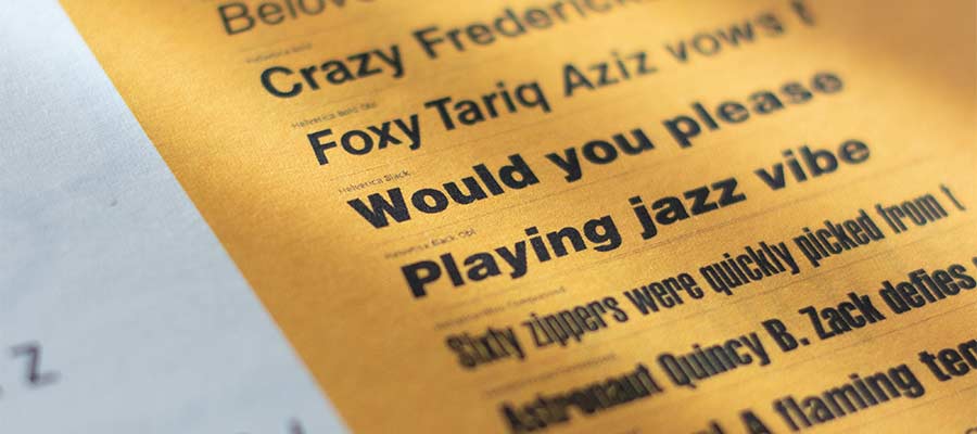
The safest choices tend to be basic serif and sans-serif fonts. Script and display fonts might work well enough – but sizing is important. Attempting to use one of these fancy typefaces at a small size or in a long passage of text will make for a poor user experience.
This can be an area where designers and clients may clash. Thus, discussing the importance of accessibility should be at the top of your to-do list.
Making Sound Decisions About Web Typography
In some ways, web typography was easier to deal with back when there were just a few browser-safe fonts. Pick one or two that make sense for your project and move on.
Choice makes for harder decisions. But it becomes that much easier when you know what to look for. The considerations above should provide a helping hand.
Understanding a font’s fit with your project’s branding, its licensing, and implementation allows you to significantly narrow down the options. And if a font is a drag on accessibility, don’t be afraid to toss it out of the running.
Like just about everything in design, typography is about making sound decisions. Learn to do that consistently, and you’ll achieve outstanding results.