15 Tips For Creating Effective Business Flyers & Win it All!
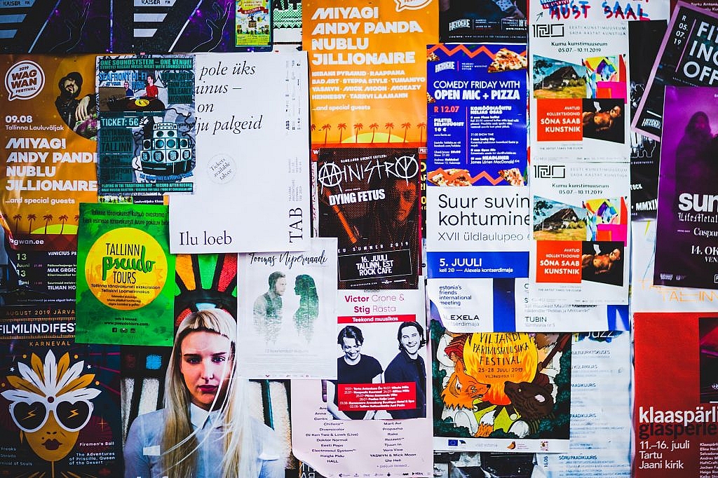
It could be a task as easy as pie or difficult as breaking a mountain, depending on how you implement the tips for creating effective business flyers.
We’re bringing some easy-to-digest tips for EFFECTIVE flyer design that sums-up our experience with successful & failing flyers. Big shots may have costly flyer maker at their disposal; small businesses are often vulnerable in this case. No matter if it is your first ever experience designing a flyer or you’ve been doing it a dozen times, you need this shot of motivation for a polished flyer design.
You’ll love to explore our good flyers tip handpicked by our experts just for you.
15 Foolproof Business Flyer Tips for the Win
1. Go For a Catchy Headline

The headline is the heart & soul of your flyer design. The more impactful it is, the more you’ve got chances to be successful for the marketing strategy. Your title should be extremely eye-catchy, provocative, memorable & inspiring.
In short, you win or lose at the title of your flyer. So, make sure this tip for an effective flyer is implemented for pin-point & outstanding design.
2. Don’t Forget to Include a Call-To-Action

What do you want your target audience to do after reading your flyer? This defines your intent for the flyer design. You may want them to:
- Walk-in at your restaurant to avail of the offer
- Call you for bookings
- Reach out to you for a free consultation, and so on.
Make sure your flyer has a CTA to make this flyer marketing campaign successful.
3. Never Settle for Anything Less Than TRENDING

Be very careful with the kind of design you choose for your flyer. The template is expected to be contemporary & unique to make a great 1st impression among the target audience. Always opt for a futuristic flyer design that fits your promotion theme & is the best-in-class according to your niche. If your flyer is old-fashioned or outdated, your business is likely to be assumed similar. You better be picky in this case because the creative ways to make flyer is endless!
4. Keep It Simple & Understandable
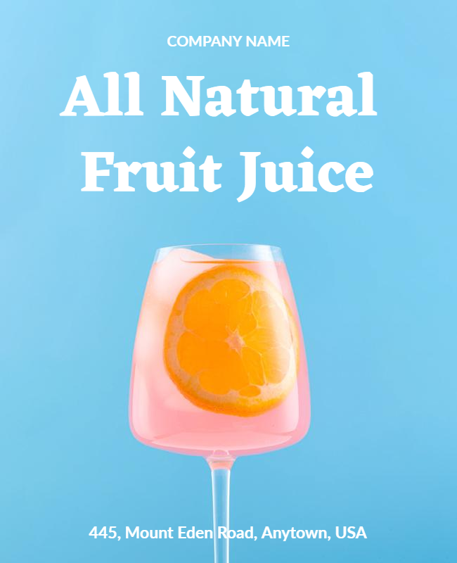
Your inner self may want to pour so much for the occasion, but you should limit yourself to be less fancy. Keep your target audience in mind & think about their understanding capabilities. Use simple words in a creative fashion instead of using overwhelming language that’s hard to digest. The simpler your flyer is, the more it will be uncomplicated.
5. Make Your Intents Clear
What if you receive a flyer that displays a nice furniture collection, but the store owner forgot to add a CTA? You’ll be puzzled as to what you should conclude after all these efforts, right?
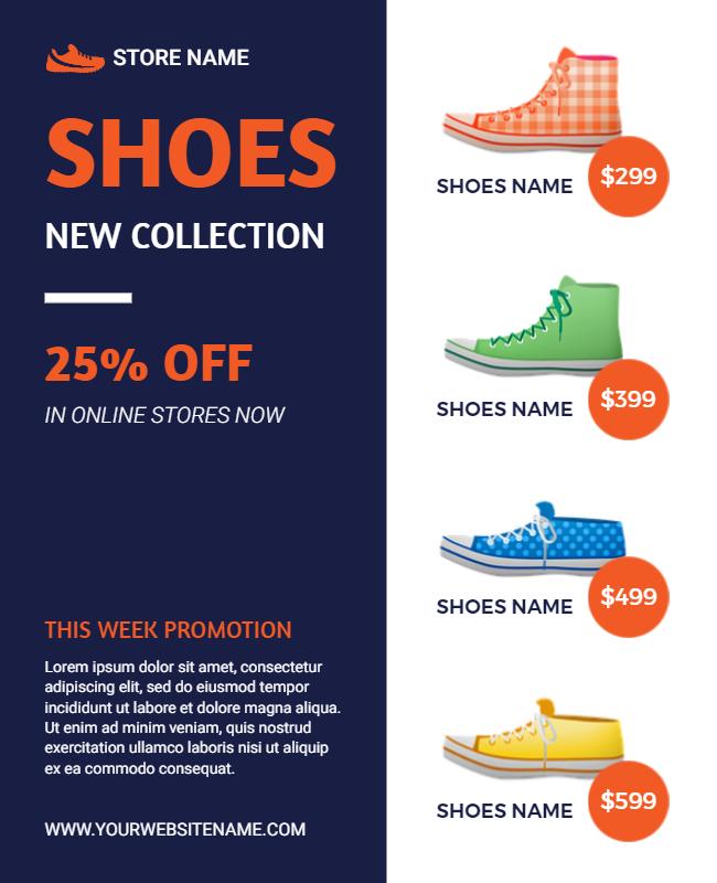
The most important thing to keep at the core of a flyer design is to clear your intentions first. Promotional content is mainly intended to drive leads & increase customer flow. But, this should be clearly visible with the flyer itself. The key to a successful flyer design is to personalize it with a goal & stick to it throughout the flyer.
6. Be Specific With the Colors
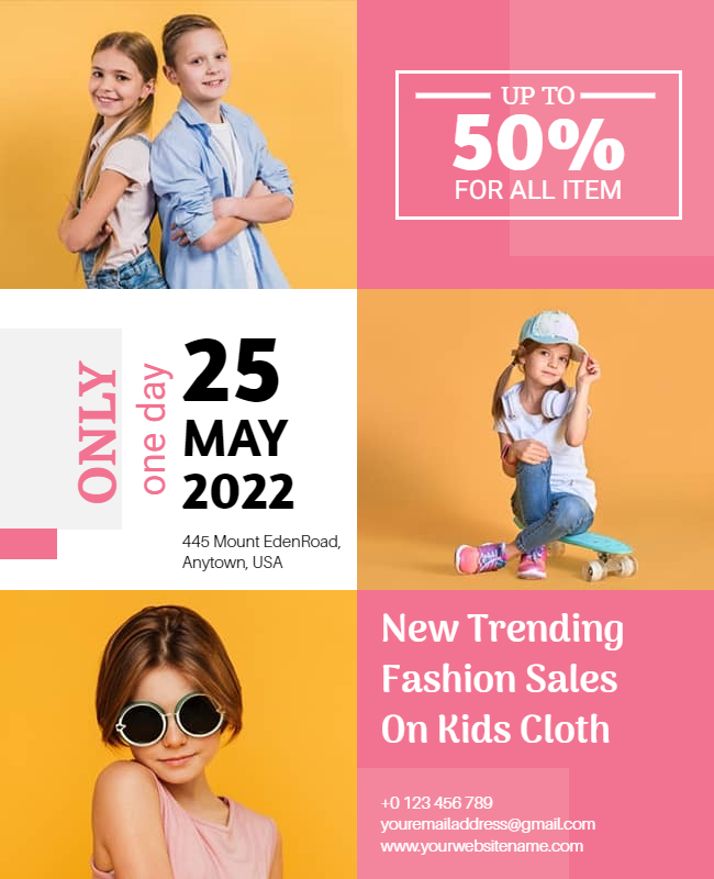
Every color has a meaning. Depending on the colors you choose for your flyer, they’ll carry meaning among the readers. For instance, red symbolizes the brand’s revolution, strength, and passion. Similarly, orange is perceived as a color of friendliness, courage, and confidence.
White represents freshness, purity, faith, safety, etc. Thus, define your color palette in such a way that it blends with your purpose & brand colors, of course.
This creative flyer tip should always be in your back pocket.
7. Don’t Make Overwhelming Use of Fonts

It’s great if you have a sound knowledge of font-pairing. You can utilize it to smartly combine more than three fonts for an extravagant appeal. If this isn’t your cup-of-tea, you better go with the standard font combinations. Don’t experiment with more than three fonts for a feel-good appeal. This is one of the most considerable flyer design tips that make or break the look.
8. Say NO to Anything that isn’t High Resolution
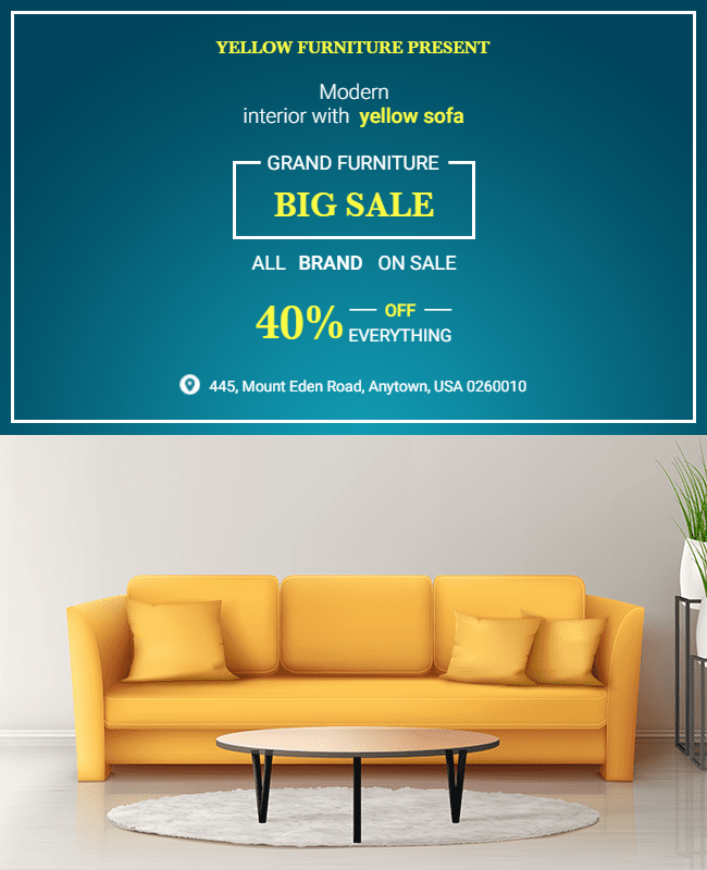
Whether it is about stock images or the pictures you upload make sure it is HD only. Taking care of this will help you ensure that the hard-copy prints aren’t blurry or low-quality. Also, if you share your flyers via Emails or share them on social media, they won’t distort upon zoom-in. This is what makes it look professional after all!
9. Know & Include Your Essentials
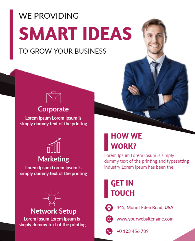
It’s you who knows the basic details that must be present on your flyer design. Usually, companies include contact details (address, phone no., Email, etc.) & company logo as the default information. The main intention to add these details is to let your target audience know where they should reach out to you.
10. Set Your Flyer Tone “Engaging”
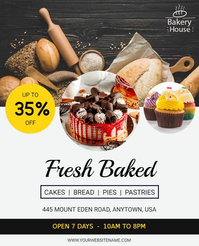
Like every pebble makes the shore, you should use each flyer element wisely as it defines the overall tone of your flyer design. Mostly, promotional flyers are shout-outs for products or services & it should be a positive tone to make your target audience want to try them at least once.
Above all, the baseline theme should be highly engaging & utterly impressive so that people want to check out every bit of your flyer design.
11. Proofreading is MUST
“Not proofreading your content means leaving loopholes in your design.” – This should never ever happen to your flyer. Check & double-check each piece of content on your flyer, including the name mentioned in the contact information, Email, etc. It may take a few extra minutes, but it is better than making a false & unprofessional impression after thousands of your flyers are printed.
12. Opt For Free Flyer Designing Resources, Whenever Possible
Who says you have to spend lavishly or hire a graphic designer compulsorily if you want a dashing & professional-looking flyer? You’ve got so many options online.

Hey! Have you tried PhotoADKing? We’ve got incredible flyer templates & endless choices for graphics, illustrations, and stock images to grace your flyer designs. Feel free to explore our collection hereby! So, when you know a free resource, be keen enough to discover something new & do the needful to your brand promotions.
13. Add Attractive Discounts/Limited-Time Deals For Faster Conversions
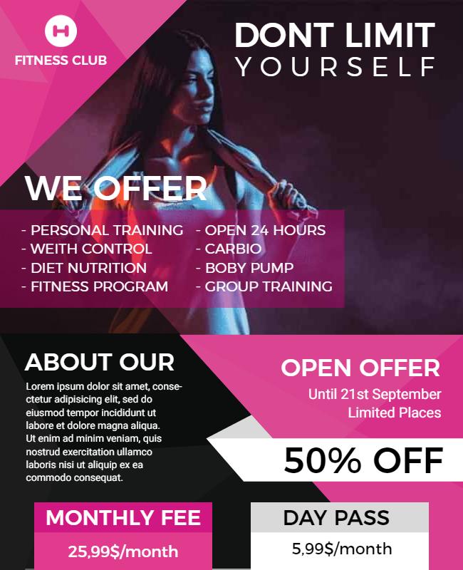
Take this as your call to inspire your target audience to reach you as soon as possible. Your flyer design must have at least one sticker or illustration where you highlight your offer.
It could be something like “Hurry…Limited Time Offer,” “1st 100 Customers get Surprise Gifts,” “Flat 10% OFF on your 1st Order,” etc.
14. Prefer Graphics Over Words
Why use text when you can use icons? Similarly, you may have a number of instances to make your flyer interesting with the least use of words. Though it is essential to add text wherever necessary, it’s good if you make the overall look clutter-free by replacing graphics with words wherever possible.
15. Focus more on the Benefits of your Products/Services

Your brand name & other flyer elements are important. But, your focus should be on explaining the benefits of your products or services to your target audience. Tell them how your product/service will solve their problem instead of saying “Our product is good at this or that.”
The Takeaway
Now you have the secret recipe for making your flyer design successful. Use This all flyer maker tips while creating flyers for your business. We hope you’ll design better flyer templates from now onwards. Also, you should have a look at PhotoADKing’s free flyer designs that are premade by professional designers & available for all niches. You’ll surely find one to edit in minutes & save your time & efforts.
Photo by Jonne Huotari on Unsplash