How to choose a color for your website
Colors are one of the first things your website visitors can see. You should carefully select colors to deliver a perfect first impression. The color scheme you choose can significantly impact the success of your website as well. However, we often see website owners facing challenges locating the best website design colors. That’s why we have created this guide on finding the best colors for your website.
Best website colors
Let’s look at some of the most prominent shades that we can usually find on websites. Based on this, you can locate the best website colors. We will also be sharing the meaning of each hue to help you decide what shades to pick.
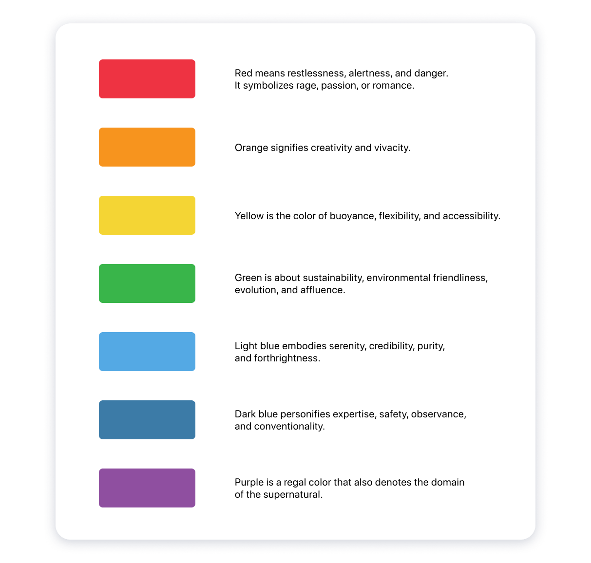
Red
The color red represents passion, energy, and speed. If you want your website visitors to take action, we suggest using red for that. This is one of the main reasons why hues of red are present in most ecommerce websites.
Orange
Orange is a hue that represents happiness and optimism. It’s a fun color that you can use on your website. If you don’t want the visitors to take things too seriously, you can use orange.
Yellow
Yellow represents positivity and an inviting feeling. Moreover, this color is often associated with joy and happiness. It is one of the most cheerful shades available for you to use.
Green
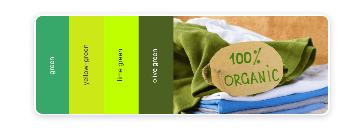
Green represents good health and nature. It’s also a color that delivers a calming effect. We can see that eco-friendly brands out there tend to use green color.
Blue
Blue is the most versatile color that you can find on websites. This color evokes a feeling of trust. When looking for the best background color for your website, you might want to consider using blue.
Black
This color represents neutral, sleekness, and modernity. Moreover, black represents minimalism as well.
White
White is a color that represents transparency and minimalism. It is ideal for branding purposes.
How to locate the best website color scheme ideas
Once you understand the meanings of different colors, you can move on to picking an appropriate color scheme. The following tips will help you to locate a suitable color scheme for your website.
Understand the basics of color psychology
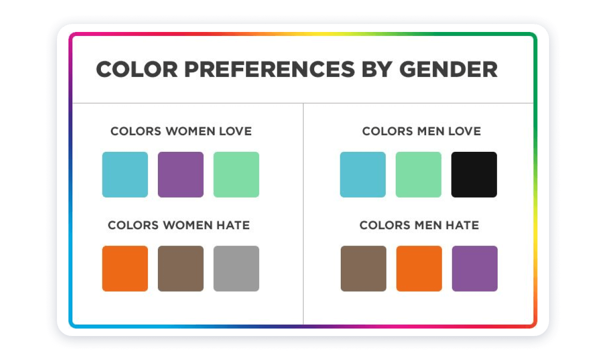
Before you proceed with website color matching, you should have a basic understanding of color psychology. People in all parts of the world tend to think of green shade as a symbol for nature. You can take a look at a color wheel and learn more about what different colors mean. We also suggest you consider the cultural connotations of certain colors. If you can keep your target visitors in mind, you can end up selecting the most appropriate color scheme.
Understand color theory
People who wish to find the best website design colors should understand color theory. Color theory explains how colors work. You will need to understand what primary, secondary, and tertiary colors are.
Primary colors are the colors that cannot be made by mixing two different colors. There are three primary colors: blue, yellow, and red.
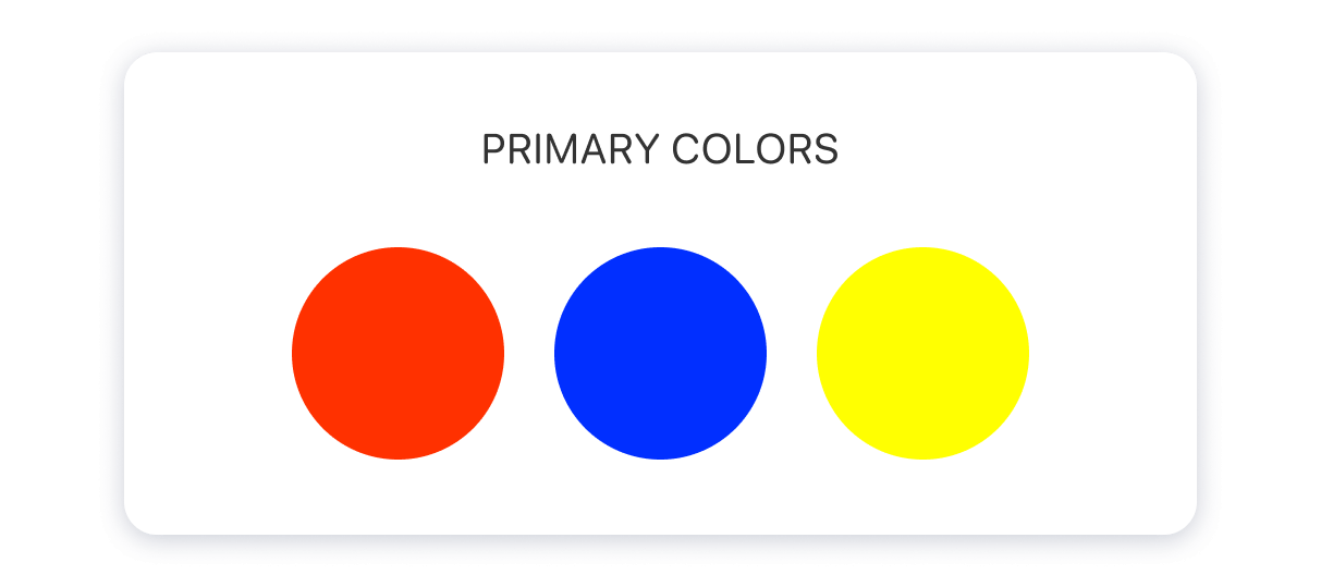
Secondary colors are the colors you can create by combining two different colors. For example, you can get green by mixing yellow and blue.
Tertiary colors are made by combining a primary color along with a secondary color. For example, you can mix violet with blue and create blue-violet color.
Likewise, you should also recognize warm shades and cool shades. Yellow, orange, and red are warm colors. On the other hand, violet, green, and blue are cool colors.
You should be aware of color nuances as well. All the colors you can see in a color palette are not pure colors. Most shades are affected by some external factors. For example, you can find a tone, shade, and a tint in color. Due to the same reason, you will see desaturated or oversaturated colors in a color palette. The saturation level linked with color would determine how bright or dull it is.
Learn how to mix different color combinations
As you go through website color scheme ideas, you should mix different color combinations. That’s because you can’t just stick to primary shades and introduce an appealing look and feel to the design of your website. You will need to find the best web design colors by mixing different color combinations. The overall theme of your website will be made out of those colors.
Keep everything simple
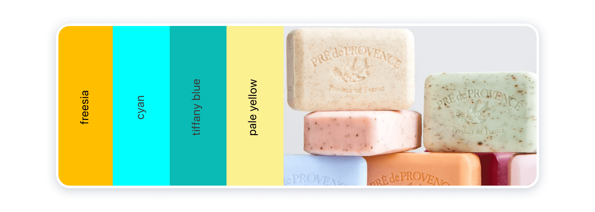
All people who wonder how to choose colors for a website should learn to keep everything as simple as possible. Using too many colors might ruin the experience that you are delivering to the visitors. Our advice is to try to stick to simple color combinations. This will even assist you in minimalism, which is one of the most prominent web design trends.
People who take a look at your website would consider it a great website. When you use only several colors, you can get the website’s overall design to look unified.
No matter what, the color scheme you select should be consistent across all pages of your website. Otherwise, you will fail to deliver a smooth user experience to a person going through different pages of your website.
Contrast different colors
You will also need to take a look at color contrast as you try to pick the best colors for your website. In fact, contrast is one of the critical elements that can help you deliver an excellent design for the website. Color contrast can create a major impact on the impression that you deliver to the visitors. In addition, the correct use of contrast can help you draw attention to specific areas of your website.
For example, if you are running an eCommerce store, you are going to need to create a noticeable call to action. This is where you can think about getting the most out of color contrast. You will need to use highlighting colors to draw visitors’ attention to the call to action. One of the best colors that you can use for the call-to-action buttons you have on the website is orange. Consider the color of the background and pick a contrast color accordingly.
Don’t forget your branding
Your branding is one of the factors that significantly affect the choice of colors for your website. Most website owners and designers tend to take a look at the brand colors and pick a similar color scheme for the website design. Then you can make your website related to your brand. This is one of the most effective methods available for you to align your website with your brand.

If your brand is not consistent with the colors used on the business website, you will be delivering a negative experience to the visitors. The visitors who are familiar with your brand and brand hues might wonder whether they have come to the right website or not. This is why you should have a strong understanding of brand colors and pick an appropriate color scheme.
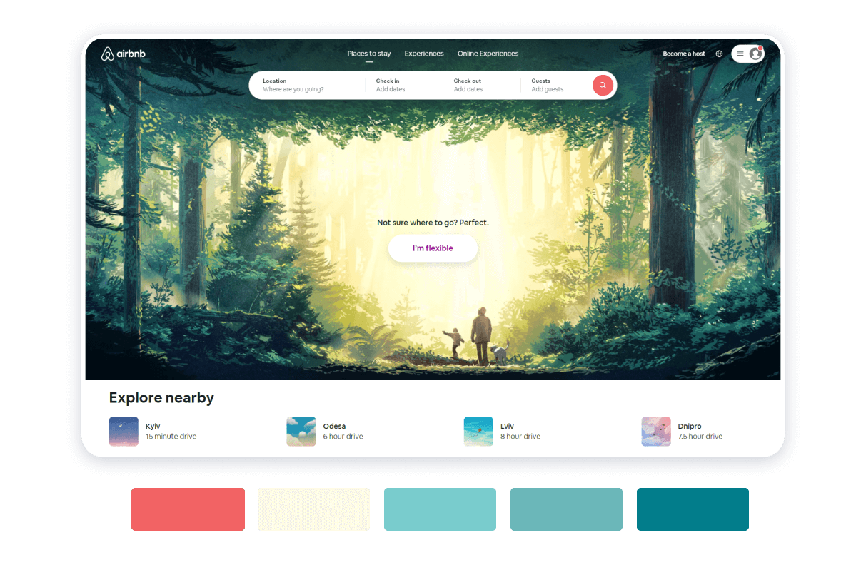
However, you will still have the freedom to tweak the brand colors up to a certain extent. For example, assume that one of your brand colors has a negative meaning. Then you can use an alternate color. For instance, if your brand has a reddish scheme but you want to show the sustainability of your business through the website design, you can use green color.
Go ahead with color scheming
Armed with these tips on how to pick the suitable shade scheme for your website, you’re set for finding the ideal color scheme so that you can impress your visitors and engage with them better. And Weblium makes it even easier — all of our pre-made templates have been created by professionals with an understanding of color theory and a great taste. We also have all the tools necessary for color customization in case you want to adjust it to your vision. Get creative and make the most out of your website!