The Resume Debate: Simple + Clean, or Visually Stunning?
Your resume design says a lot about you. It communicates things to a potential employer simply from the design alone.
As a designer, this can be especially true, because your resume design can show your style, understanding of design elements and theory, and even if you may be a fit with a company visually.
That’s why the internet is full of questions about resume design and why the debate about the best type of design for your professional information rages on.
Why a Simple and Clean Resume
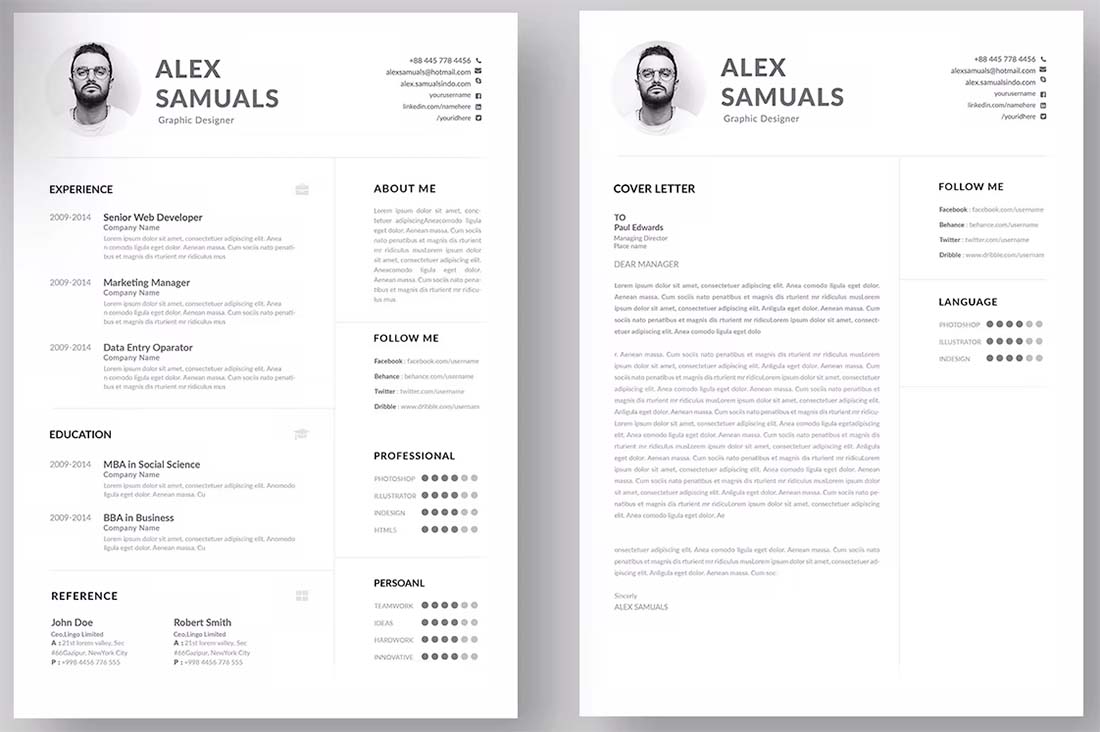
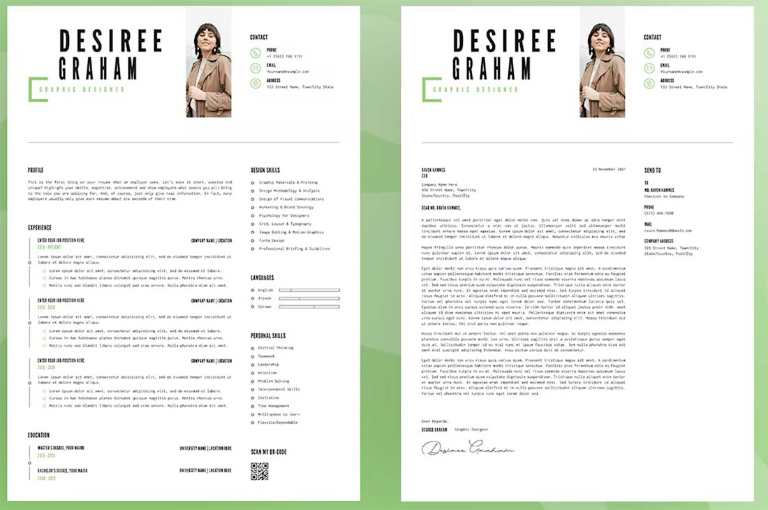
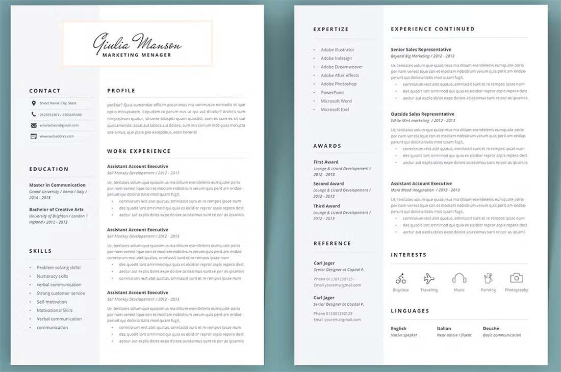
A simple and clean resume is a safe choice. This style of resume puts the emphasis on content and doesn’t often have a lot of design flair.
According to Indeed.com, the leading job website in the world:
“A simple resume can help you stand out among other applicants and highlight your attributes in a clean, easy-to-read manner.”
That doesn’t mean it is a flat black and white document using only a Times New Roman typeface either.
A clean and simple resume can look interesting. It can include beautiful typography. It can have a color or other design elements.
The common thread is that the focus is on readability and clean lines. There should be a distinct flow from one section of the resume to the next so that the design is practically invisible. The person looking at the resume is comfortable with every element of the design and doesn’t have to think about what they are seeing or feel jarred by unusual flow or visual stops.
This type of resume design is a level beyond that standard template that so many people know from a Microsoft Word template, but it doesn’t venture too far into the uber-creative space.
Design elements that make a simple and clean resume design stand out include:
- A style that’s consistent throughout the design, including headers, body text, and type sizes
- Plenty of white space to encourage reading flow and to separate different types of information groupings
- A monotone or neutral color palette that provides interest but isn’t overwhelming
- Clean typefaces that are easy to read with well-edited copy
- Delineated sections, such as a header, footer, and main resume content (header and footer styles will likely carry over to your cover letter or references page as well)
Why a Visually Stunning Resume
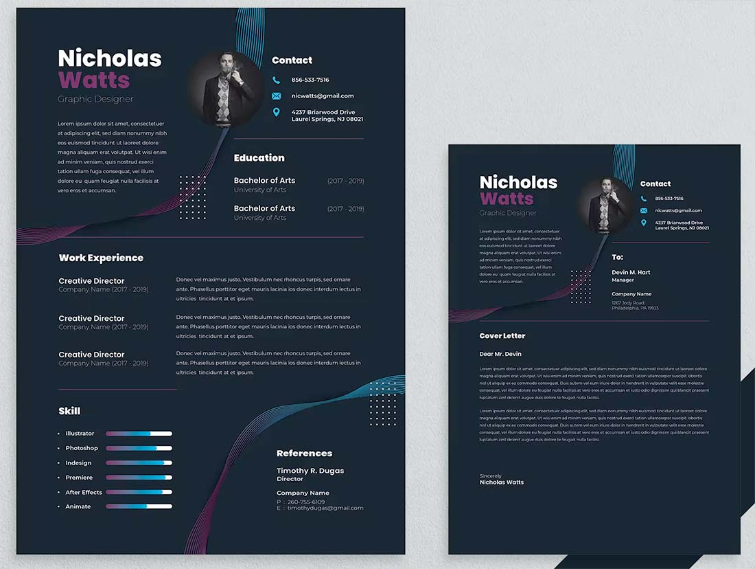
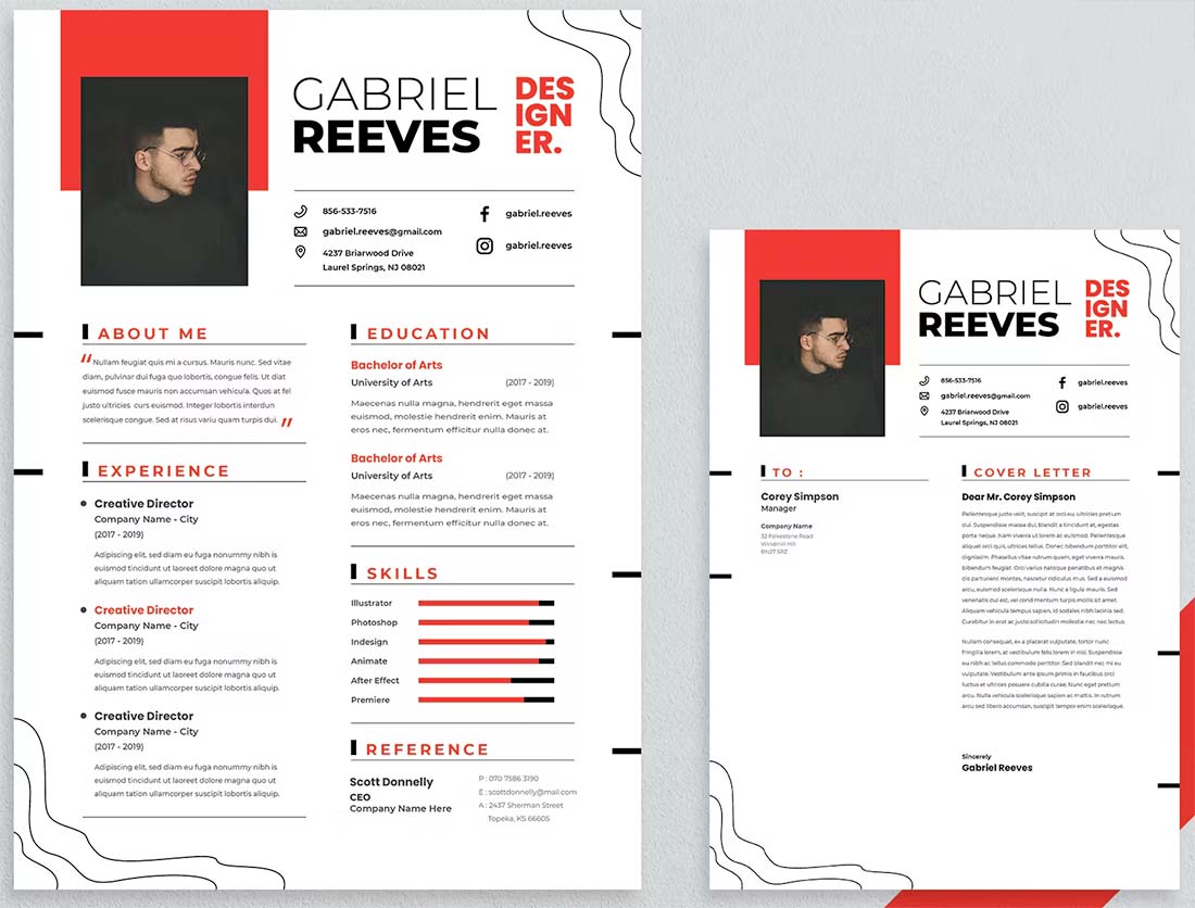
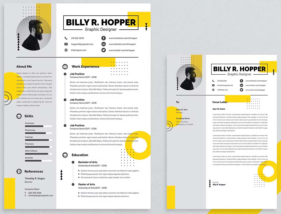
The other choice is to go with a highly designed, visually stunning, or infographic-based resume design.
According to Resume.io:
“Hiring managers will notice the nature of a visual resume 60,000 times faster than your words. The ‘look’ of your resume format will make a vastly more immediate impact on a recruiter than you expect.”
So this almost seems like a no-brainer, right?
A visually stunning resume is most relevant if it accurately communicates your ability and proficiency for design and the job you are applying for.
Visually stunning resume designs can take all kinds of shapes and forms with a unifying key benefit – they are immediately noticed. This style of resume design is most common for those in creative fields and not widely used outside of those jobs.
You are most likely to see or create a highly visual resume for jobs in:
- Graphic design
- Website or UX/UI design
- Advertising
- Photography or videography
- Art
- Marketing
- Social media
There are other fields where you might see these types of resumes as well but they are a lot less common.
Visually stunning resumes often include some, but not all, of the following elements:
- High color with graphic elements such as icons, images, or geometric shapes
- Visual theme that pertains to the job – a resume for UX design might even have a website-style feel to it
- Layered elements with text and design features that are on top of each other or in close groupings
- Include links and elements that mirror or match your portfolio
- Delineated sections, such as a header, footer, and main resume content (header and footer styles will likely carry over to your cover letter or references page as well)
When it comes to visual resume design, there are some technical considerations that are vital:
- You need to save the resume in a format that ensures the design looks as intended (such as a PDF)
- You probably need a layered file so that you can easily extract text for resume forms online where you don’t only upload a single file
- You need to think about printing because many hiring managers will print resumes that make the finalist cut to review or share, does your highly visual design print well?
Another strong consideration is the visual linkage between this type of resume and your portfolio. If the two get submitted together, they should have a consistent look and style that communicates the same thing. The resume and portfolio should not look like they were submitted by two different people.
So here’s the trick, once you have one style that you like, design the other to mimic it.
What Should My Resume Look Like
It all comes down to one big question: Should you use a simple and clean or visually stunning resume design?
There’s not a right or wrong answer. Choose a style that best represents you and your work and is appropriate for the type of job you are applying for. Think about the demographics of the company or hiring manager: What type of resume will appeal to them more?
A resume is all about making the right first impression in hopes of landing a job. You want the design to help you stand out, but also provide all the necessary information to help a hiring manager choose to call you for an interview.
With this in mind, you may actually create your resume in both styles.
- Use the simple and clean resume for online submissions and uploads
- Use the visually stunning resume for in-person meetings or mailed submissions when you have control over the exact look and printing
Conclusion
Need more inspiration when it comes to designing your resume? We’ve got a collection of CV and resume templates to help you visualize what your resume should look like.
You can also click through any of the examples above; they are downloadable templates from Envato Elements.