Website Design Trends & Tips for a COVID World
A lot has changed about the world in the past year. The impact of COVID on human interaction is undeniable. It’s influencing digital experiences as well. If you haven’t started to think about adjustments you need to make to your website design due to the worldwide pandemic and virus, it might be time to develop a strategy.
Here, we’ve got tips on things to consider when it comes to COVID and website design.
Does COVID change everything about website design? Of course not. But it might impact some of the decisions you make about imagery, your general approach to sharing information, or how you communicate some aspects of your brand.
Imagery and Photos
The wrong image or photo can make your website look dated now that we are well into the pandemic and new ways of life. Photos of large gatherings of people – once a sign of a healthy, thriving event – should be avoided.
But you don’t have to go to the extreme of no images with people either, that time of complete quarantine has also mostly passed. The goal is to use photos and illustrations that show people somewhere in the middle.
People in Masks
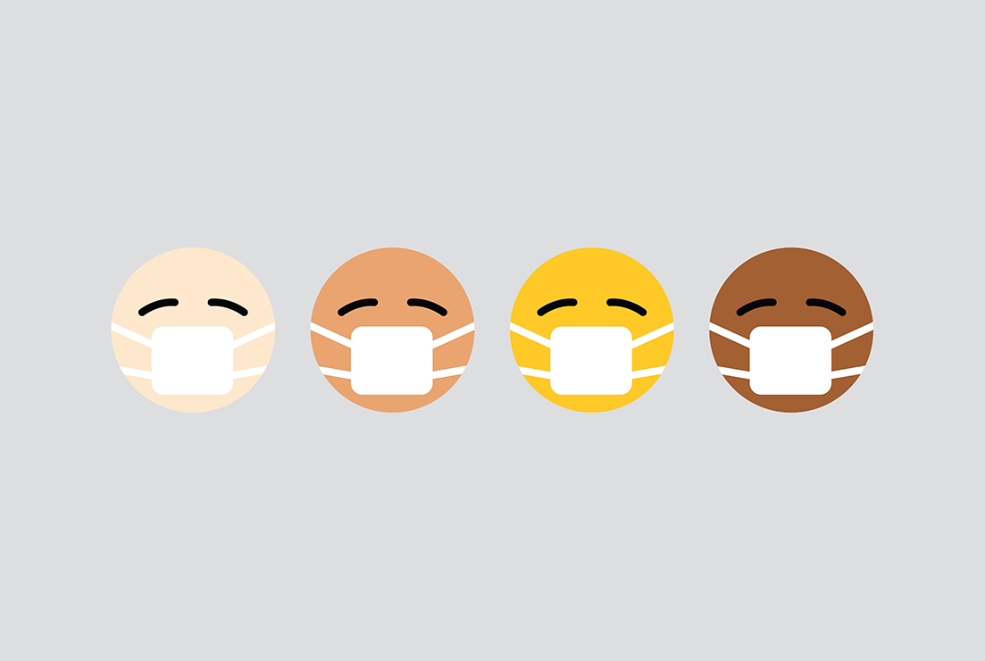
Your website design is likely to include images of people in masks. It’s something you probably never would have considered a year ago, but has become the norm in much of the world.
Plan to use photos of masked people in a natural way. Images should imitate real life with mask-wearing as it would actually happen. (Pictures of people eating or drinking would be maskless, but people wandering around in a store would show masked individuals.)
Imagery with masks is a little tricky and can present some issues, but your photographer should be able to navigate this with ease. Your primary concern in terms of masks is whether any graphics or branding on masks stand in contrast to your design. As a best practice, people should wear solid color, neutral masks for photos. Stay away from branded prints or patterns unless that goes with your website content.
Finally, images that show mask-wearing should feature face coverings that are worn appropriately (unless you are trying to make a point about improper use).
Limit Groups of People
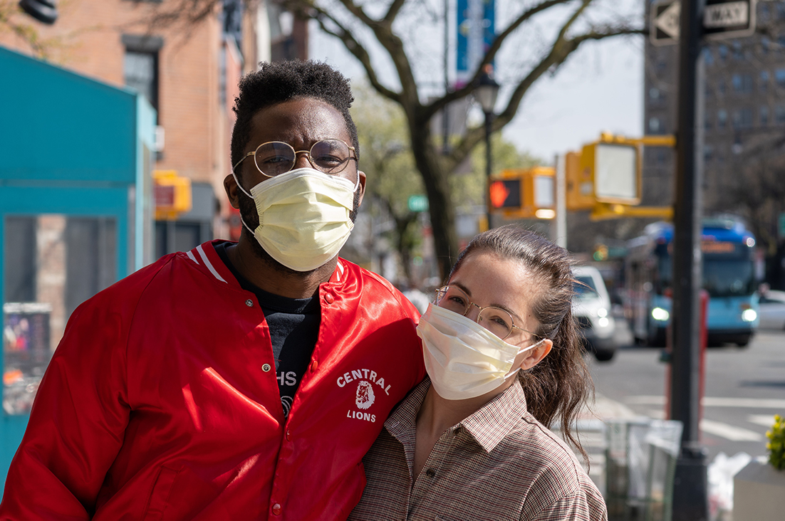
It’s likely time to remove any images of large groups of people from your website.
The best options for website design and imagery are tighter detail photos that show just one person, or wide-angle shots that can show multiple people at a distance.
The former is pretty easy to work with and may have already been part of your design strategy. The latter can be a little more tricky because subject in images start to get small or you have difficult spaces in images. Plan a creative use for this, such as text placement.
Language and Text
It’s important to watch the way you communicate with audiences during this time. People are stressed; they may be working longer hours, not working at all, are helping a sick family member, or are sick themselves.
Compassion should be part of your communication toolkit.
Direct and Inform in Regard to Rules
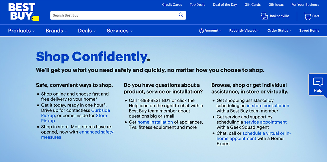
If your website or business has new rules or hours due to COVID, make sure to directly state this information or those guidelines on your website. If you are closed, update your hours accordingly (and don’t forget your Google My Business profile as well).
If mask-wearing is required in your location, it should be stated. If you require other things, such as temperature checks or to sign a waiver for entry, these things should also be noted on your website.
It can also be beneficial to explain what your location or business is doing in response to the coronavirus. This can help customers better understand what is happening from your end as well.
For many locations, adding a page with all of the COVID-specific information has become pretty standard and makes it easy for you to keep track of updates and changes in a single location.
Softer and Understanding Overall
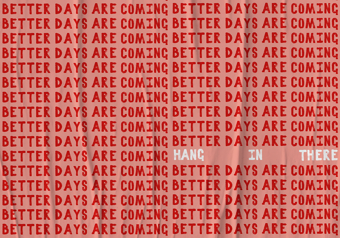
Generally, the tone of the text should be compassionate and understanding. This is a tricky time, and being nice never hurt.
There are a lot of tense feelings out there and you want to ensure that the language on your website doesn’t unintentionally offend.
It’s also acceptable to be upfront about your situation. If orders are slow due to supply chain issues or shipping delays, put that information out there. Customers are more likely to understand if you tell them upfront rather than when they email or call to complain about delays later.
Notifications and Alerts
A website is often a conduit for in-person activities. If this is true of your business or organization, you may want to consider how you’ll use your website (or app) for COVID-related notifications or alerts.
Contact Tracing
You can set up alerts through the website for event participants or on-location guests if someone tests positive and notification is required. (Rules here vary by location and industry.)
But you can use a user database to create notifications or include pop-ups on your actual website.
This method of contact tracing can be efficient for some and less attractive for others; you have to decide how it best works for you.
Status Changes
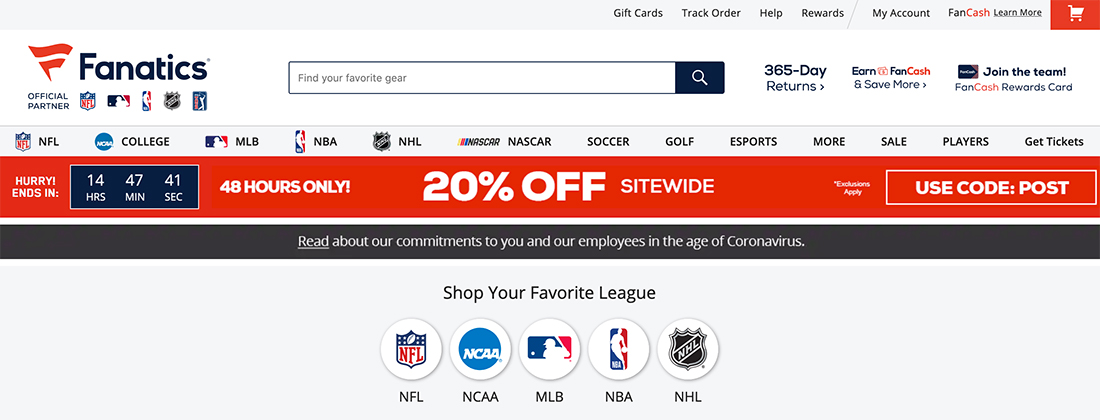
Notifications – particularly pop-ups or banners – are a good way to keep website visitors in the loop about changes. This can include anything from changes to hours to shipping delays to new rules.
Design these notifications to be disruptive and almost get in the way of the design so that users see them. This isn’t a passive communication. The more information you convey right now, the better in most cases.
Most of these notifications do not require a lot of information and can work best as a banner across the top of the screen in a bright color with a single (or scrolling) line of text with a link to additional information if needed.
Forms
Your needs may have changed due to COVID on the kind of information you need to collect. The most common changes include addendums to event waivers or questionnaires for in-person activities.
Event Waiver or Rules
If you are hosting live events or having people come to your location, an event waiver or rules acknowledgment might be necessary. Providing these forms online can make it easier for you to collect information in a user database, rather than handling pens and paper.
To make the most of an event waiver or rules, consider a digital signature system. (There are plenty available from several vendors.)
Questionnaires
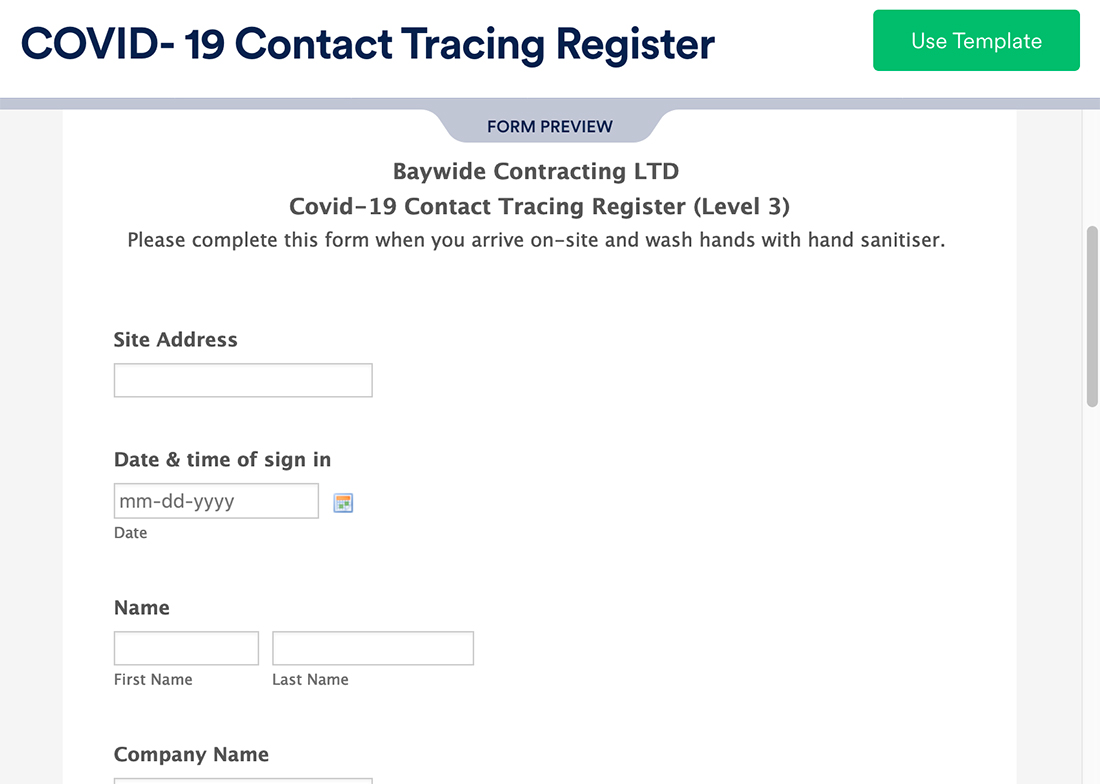
An online questionnaire is much like any other type of form but can be used to answer questions related to COVID and your business.
Consider a quick and easy online form that participants can complete on their devices from anywhere. This eliminates the need for person-to-person screening while creating a “paper trail” for potential contact tracing should the need arise.
Just make sure to create the form in a mobile-friendly format.
Conclusion
The impact of the worldwide pandemic will continue to impact website design. Think of things that you aren’t doing so much anymore – travel, for example. If this is a part of your website design content or strategy, it’s time for a Plan B.
Many organizations and businesses are having to evolve rapidly right now. Sometimes it takes a couple of tries, but your willingness to accept change and try will give you the best chance at success. Don’t ignore the world around you; accept it as part of the bigger picture for your website.