Looking at an Online School Through a Web Designer’s Eyes
Like so many families around the globe, ours has had to make some difficult decisions during the COVID-19 pandemic. One of the most agonizing was what to do about school. Should we send our daughter back to traditional school, or should we opt for an online school?
Out of both concerns for safety and consistency, we chose the online program offered by our local school district. It would require some adjustments from all of us, but we felt it was the right path to take – at least for now.
Still, there was a lot we didn’t know in terms of how this virtual school worked. How are parents kept in the loop? How easy would it be for our daughter to use? What would the classes be like?
We’ve now had some experience with this method of learning and are slowly getting the hang of it. With that, I thought it might be interesting to look at things from a web designer’s perspective – one who is also a parent.
Below are some observations based on the particular provider our school district uses. It’s by no means a complete review of online education – just a look at the design and functionality of this one system. And any critiques are just that, as I’m not privy to why certain decisions were made or the limitations involved.
So, how does the experience stack up? It’s a bit of a mixed bag so far.



Background Information
The virtual academy we’re utilizing doesn’t have live classes. Rather, it’s a mix of videos, testing and interactive features all run through a web browser.
While classes can theoretically be taken at any time, students are encouraged to do their work during normal school hours. That is in part due to the availability of live tutoring help via a chat application.
Both students and parents can keep track of progress, grades and access courses through a portal. A messaging system is included, along with detailed student activity reports.

A Dated, Unintuitive Portal
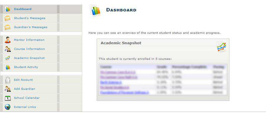
Upon entering the portal for the first time, I was reminded of the content management systems of yesteryear – as in pre-WordPress. The design is very early-to-mid-2000s, complete with a helping of 3D icons spread throughout.
Of course, compelling design isn’t really the point here. It’s a shared space for parents and students. Both groups can view activity logs, grades and exchange messages with teachers. Students also use it as a gateway to their individual courses as well.
For those tasks, the portal gets the job done. There are some usability issues, though – particularly when it comes to navigation. One can find themselves clicking around in circles due to an ambiguous series of links within the content area. It doesn’t always lead to the expected result.
This may be my biggest pet peeve with the experience. The design doesn’t have to look cutting-edge, but it should at least be intuitive. For something that looks this dated, you’d think that these sorts of bugs would have been ironed out long ago.
Courses Look and Function Well
Easily the most impressive part from a design and functionality perspective, the online courses are first-rate. The look is much more modern and is infinitely more usable than the portal.
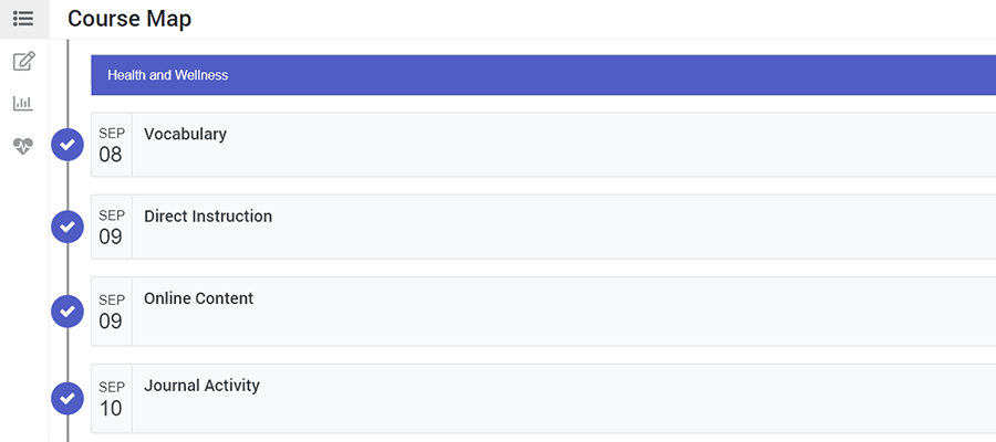
Students can view a course “map” that lists the activities they will have to complete that day (as well as those in the future). That includes quizzes and tests, as well as standard lesson material.
It’s easy to navigate. Importantly, students can also go back and review past lessons. There’s also a separate panel for notetaking and the ability to generate some highly-visual reports regarding grading and activity.
If extra help is needed during a lesson, students can click an icon to open up a chat window to speak with a tutor. It’s very similar to what you’d see in a technical support setting, providing students with their place in the queue.
Overall, the UX here is excellent. But if I had one issue, it’s…
Wait, They Still Use Flash?
When first considering the online school, we were provided with a technical requirements document. Among those requirements was the Adobe Flash Player – which is set to go away at the end of 2020. The document was from 2015, so I figured that things must have evolved a bit since then.
Not so fast. There are in fact some interactive games interspersed throughout the courses that still rely on Flash.
And, even though my daughter’s laptop had Flash installed, we still had to specifically enable it in Google Chrome. That’s because it’s deactivated by default as a security measure.
I admit: the games are fun and help reinforce the lessons. But the long-term viability of using Flash is concerning. They’ll need to be ported over to HTML5 or some other technology to still be usable after Flash dies off.

The Lessons for Web Designers
One of my big takeaways from this experience is that web applications have to be revisited again and again. They should be tweaked based on user feedback in order to provide the best possible experience. We’re unlikely to get it right without their help.
Take the aforementioned portal, for example. The fact that it looks dated may be dismaying to a designer – fair enough. But that doesn’t hurt the user experience quite like the navigational shortcomings.
It’s OK, even if a bit unsavory, if a website doesn’t look like it was designed yesterday. What matters is that users can get what they need without confusion. A little bit of cleanup here would do wonders.
This is one of the big challenges of maintaining a legacy system. Various elements need to be periodically refreshed to keep up with the times. Plus, bugs and usability concerns can arise at any time. Designers and developers need to stay on top of them.
The use of Flash here is a prime example. It may have served this online school well for years, but is now likely to cause more problems than it solves. Less tech-savvy parents may not know that the software needs to be enabled or be aware of the security issues it poses. Not to mention what it all means as far as accessibility is concerned. This will make things harder for everyone – potentially impeding a student’s progress.
In addition, this also reinforces the need for simplicity. Sometimes, we can overthink an interface to the point where it’s not intuitive enough. Here, the courses offer that simplistic design while the portal does not. The difference is night and day.
No, it’s not perfect. But overall, we’ve found a lot to like about online schooling so far. Viewing it through a web designer’s eyes, I’ve also learned a thing or two myself.