9 Key Instagram Trends for Designers to Watch in 2022
From hard-core ‘grammers to those that post the occasional pic, Instagram is the social media platform that’s practically made for designers because it is so visual.
So, you’ll probably want to be on-trend when it comes to posting. Here are nine ways to create images that look modern with a few examples and Instagram templates to help you get started.
From #nofilter, to framing, overlay elements, carousels, and more, we’re exploring all the trends you need to know.
1. Hand-Drawn Text
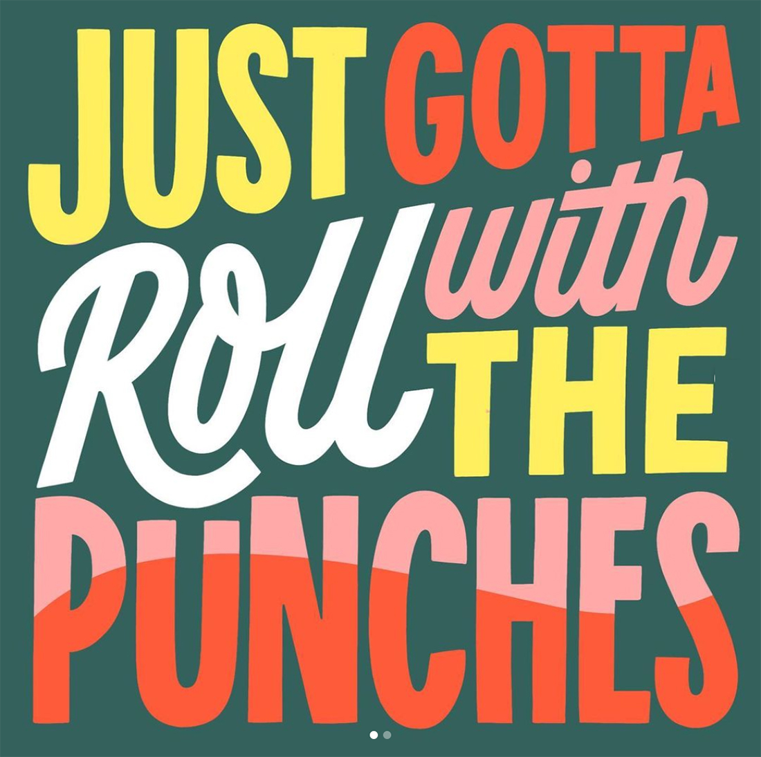
Type-based posts are increasingly popular, but designers can take this Instagram trend to the next level with hand-drawn lettering elements that dazzle.
Bold phrases paired with colorful or interesting lettering will jump out from all of the other text-based posts with poor typography choices. This can be a great way to show off some of you typography skills or practice lettering styles for an audience.
Just remember to use hand-drawn styles that contain a few words and simple phrases so they are easy to read. Instagrammers are often on small (phone) screens and you don’t want the beauty of your lettering to get lost because it is too small.
If you really want to take it a step further, consider showing followers how you created the text element for the post, such as the example above.
2. Matching Posts and Stories
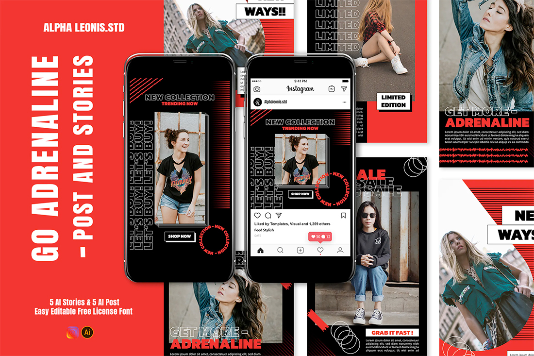
Pick a visual theme and go with it. Matching colors, styles, and patterns for Instagram posts and stories are a major bonus for personal branding and to create a trendy aesthetic. The consistency is great if you are trying to establish a brand personality on the social media channel.
To make the most of this Instagram design trend, think about ways to use color, texture, and typography for still and moving images. (A design kit, such as the example above, can be a good starting place.)
The key to making this trend work is to create a series of matching posts and stories with a similar visual theme, and then mix it up later. If you use the same visual elements for too long, the design might start to feel flat or followers may think they’ve already seen the content.
3. #nofilter
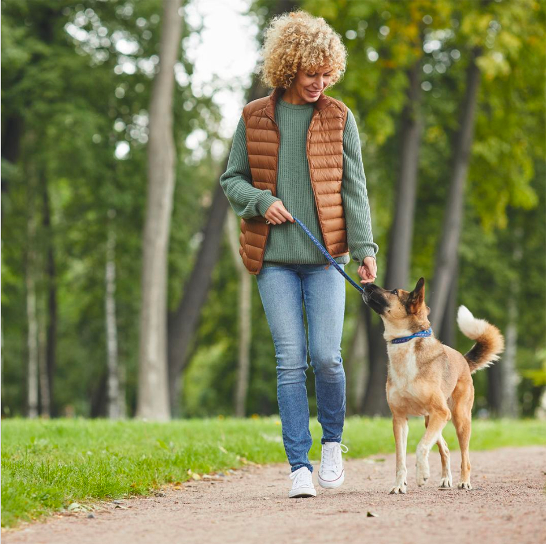
Authenticity is the key phrase for social media. That’s why we see so many images sans filter.
While filters were the fun element that drew many users to Instagram to begin with, the trend is leaning away from using them.
More authentic, filterless images convey a greater sense of reality and credibility. These can include anything from organic selfie shots to professional images that showcase who you are or what you do. Just skip the step of adding a filter before you post.
The #nofilter Instagram trend works for image posts and stories.
4. Framing
A lot of designs are using frames for images and text combinations on Instagram. It can be fun to create a collection or library of frames for use in different instances.
Using frames can help create visual emphasis for images or content that’s not quite as strong as you’d hope or to prevent visual theft. (It’s tough to extract enough of a piece of artwork or image from within a funky frame that’s layered with other elements.)
A set of designed frames can also emphasize your brand identity, help you create a social media persona, and establish a visual theme so that followers can instantly identify your posts.
5. Page Theme Colors

This is one of those Instagram trends that you don’t truly see unless you visit a user’s profile page, but it can be brilliant and beautiful.
It’s all about creating a color theme for posts so that they all look like part of the same story.
Take it a step further with highlight icons for stories that use the same color palette.
With this trend, you can pick a single color or color pair that helps create a connection to your Insta brand.
6. Promo Style
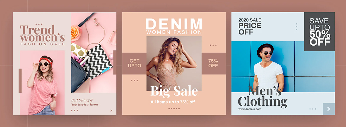
Sometimes it’s difficult to tell what’s an ad or promotion and what’s organic media on Instagram. And some of that is by design.
Promo-style Instagram posts are popular because they work.
The combination of images with some type of offer can draw followers in and help them engage with your content or page.
The fun part of this trend is you can use the design concept even without an ecommerce base or sale. The visual idea is to combine text blocks, backgrounds, and images in layers that have high impact.
7. Background Gradients
Gradients are a pretty universal design trend. They are popular for digital and web design, print design, and on social media.
Background gradients are primarily used on Instagram in one of two ways:
- As a true background layer behind other images to create depth
- As a background behind a card that contains a quote or image of a tweet or repost.
You can create a gradient that you use for all gradient styles on your profile or using a gradient style could be the theme. Think about what colors and elements best represent the photos and content you plan to share on Instagram and experiment with different options to figure out what works for you.
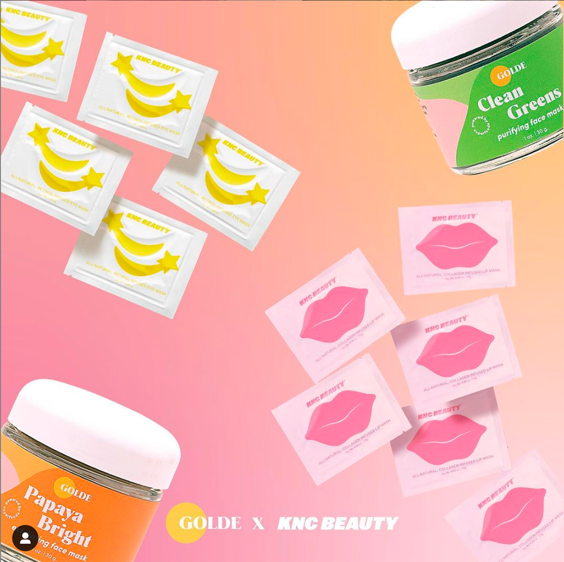
8. Overlay Elements

Overlay elements can help you create a more “designed” Instagram post. From color blocks to font options, a consistent set of overlay colors, shapes, and rules can establish brand identity with individual posts on the social network.
While you can design your own, sometimes this is more easily accomplished with the help of a template that you can adjust. It can also help if you are working through different techniques and layers and want to ensure that your elements work together well in this format.
The best advice for using overlay elements is to develop a few style rules. The biggest challenge with this design trend is that it can get a little messy if you aren’t careful.
Select and overlay style and color. Pick a font. Determine a photo style (color versus black and white.) And stick to your rules for the best success.
9. Oversized Fonts and Phrases

While Instagram has roots as a photo-based social media channel, it’s evolved to also be a showcase of amazing typography.
Oversized fonts with short phrases are all over the platform. It’s a great option to show your personality or values with words and design skills with use of typography.
Create phrase badges or type designers can show off some of their custom fonts.
Just remember that most people are looking at these type-based images on small screens so don’t cram them full of text. Bold, bold typography with just a few words works best (and is at the core of this Instagram trend).
Conclusion
Instagram trends change fairly rapidly. You’ll best know what’s popular on the social media channel by using it and watching what others are doing.
It’s safe to experiment and see what trends and design elements work best for your account, content, and followers.