Design Trend: Text-Only Homepages
Where did all the images go? There’s a major trend right now, where designers are creating homepage hero areas that only include text, but with no images or video.
It’s an interesting aesthetic that puts a lot of focus on words and lettering. It can be elegant and beautiful or turn disastrous quickly. And it requires quite a bit of nuance and craft to get right.
As you notice more of these trending sites, you can decide how you feel about them. Personally? We think, when done well, they can be a beautiful example of design on the web.
What is the Text-Only Homepage Design Trend?

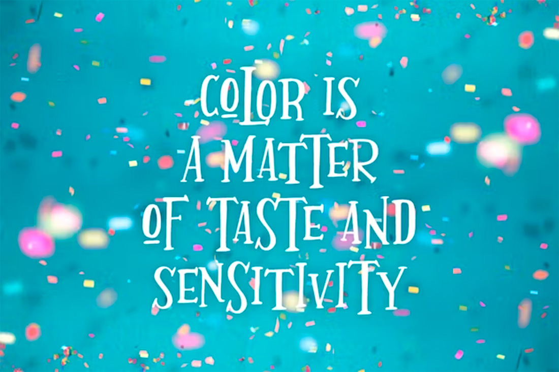
This is one of those trends that needs almost no explanation because it is exactly what you would expect – websites that feature text-only designs for the homepage or hero area.
With the right concept, these can be stunning visual compositions that lend themselves to readability and direct messaging. With more difficult typefaces, they can be somewhat unreadable and fall flat.
The characteristics of this trend are bold homepages in terms of typography. While some of the font choices might be oversized or experimental, that’s not always the case. Often these designs feature high color contrast.
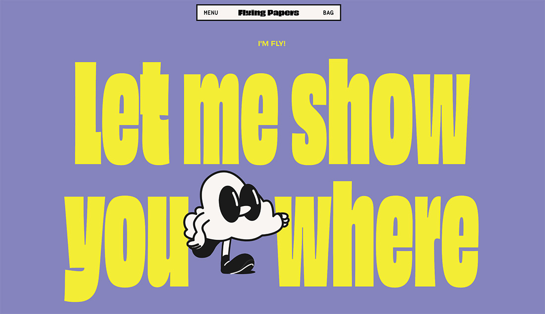
There’s also an iteration of this trend that’s almost text-only. You’ll see all the other characteristics of a text-only design but often with a small icon, illustration, or animation that serves as an accent.
No matter what direction the design takes, this trend is sure to grab your attention because of an often simple style and words that demand attention.
Tips for Using this Design Trend Well
Here’s the more important thing you can do when words are the only real “art” element for the design: Make them readable.
Now that doesn’t mean the fonts have to be plain or follow traditional typography rules, but you do want people to understand the words with ease. Otherwise, they could likely get frustrated and leave the design before diving in.
It also helps to make sure there’s plenty of contrast:
- Contrast between colors in the background and text
- Contrast in space around lettering so everything has room to be read
- Contrast in size to create a hierarchy with the words and message
Finally, one of the things many designers are experimenting with here (you can see it in multiple examples) is mixing and matching typefaces or styles within words. This isn’t the easiest technique and can sometimes cause more problems than benefits, but when it works well, it can be striking.
If you are working on a project in this style for the first time and are a little unsure, start with a two-color outline – background and text colors with high contrast – and add a fun typeface. Don’t overthink it too much. Start simple and then grow the idea as you keep working.
This design trend and technique often works best when it is super simple and stays true to what the text is for – reading.
5 Examples We Love
There are plenty of different ways to use this website design trend – from pure text-only options to also incorporating a few extra elements. Here are five examples we love.
Lights
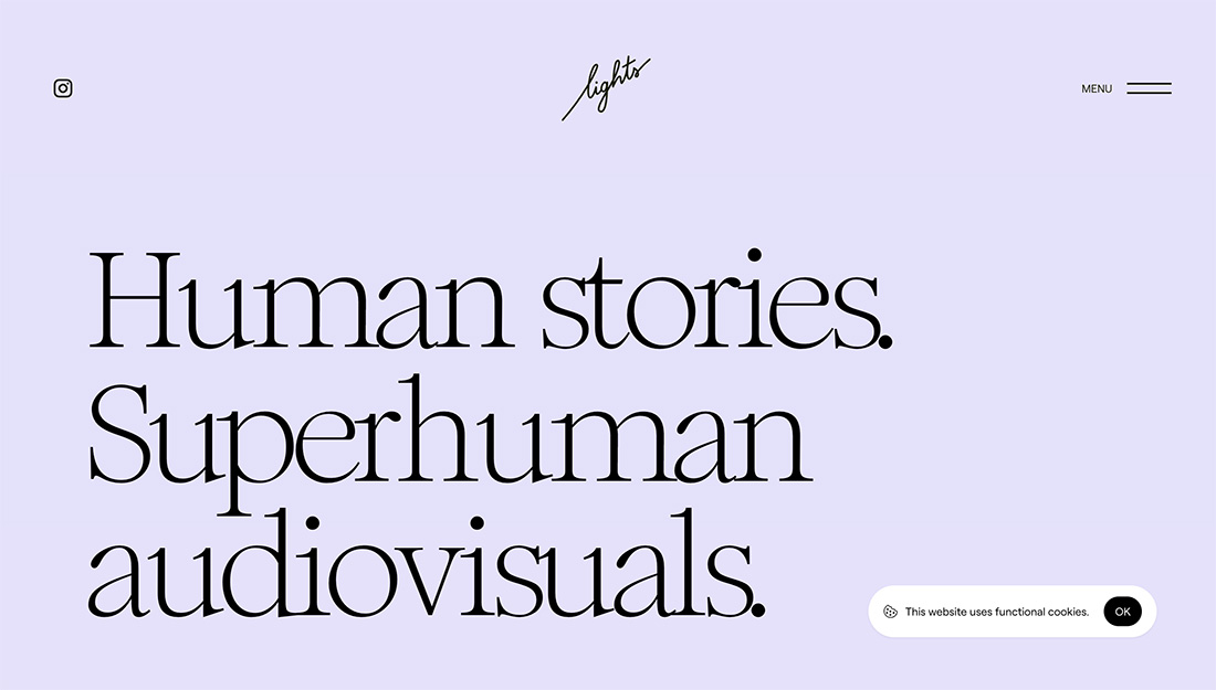
An interesting serif typeface carries this design. With big powerful words, you are sure to read and hopefully scroll on.
NSSC
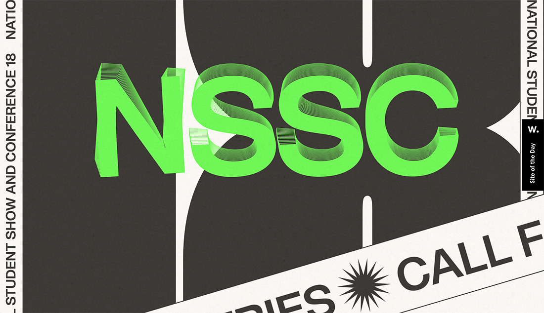
Nifty animation makes this words-only design stand out. The bold neon letters have a float, then twitch, effect that is attention-getting.
Dash
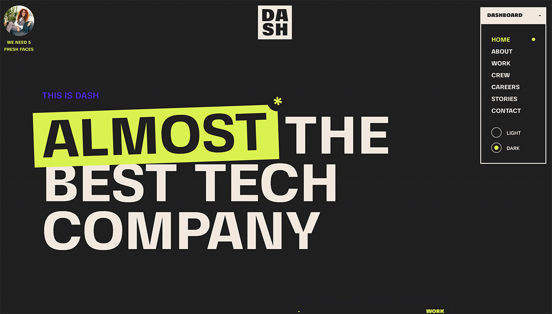
Dash is simple and elegant with easy-to-read lettering and simple colors. It’s almost too simple but works exceptionally well.
Neutra VDL Studio
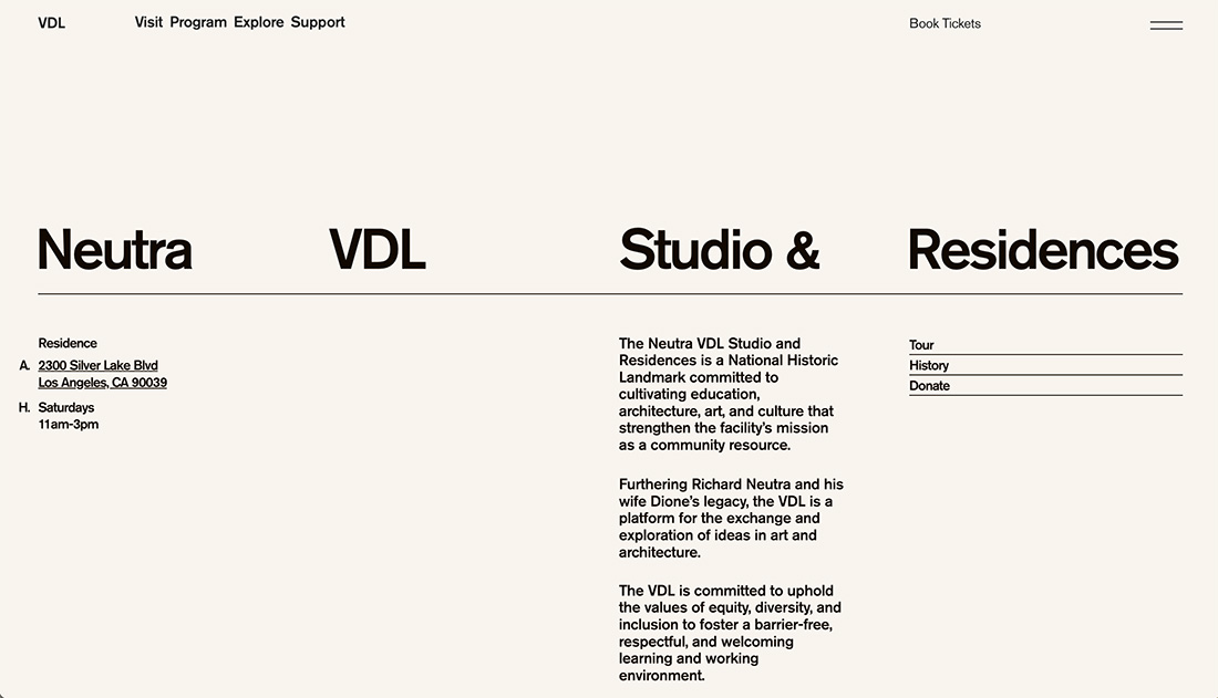
With big text that serves as both information and navigation, this design is simple and highly understandable. Big lettering helps direct the eye.
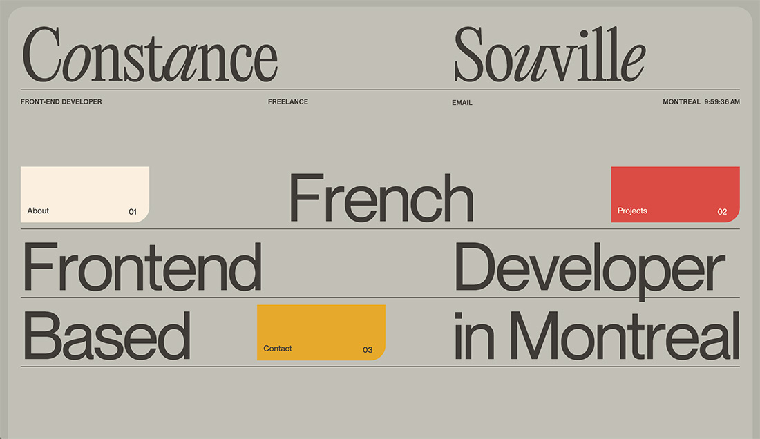
Awwwards Conference
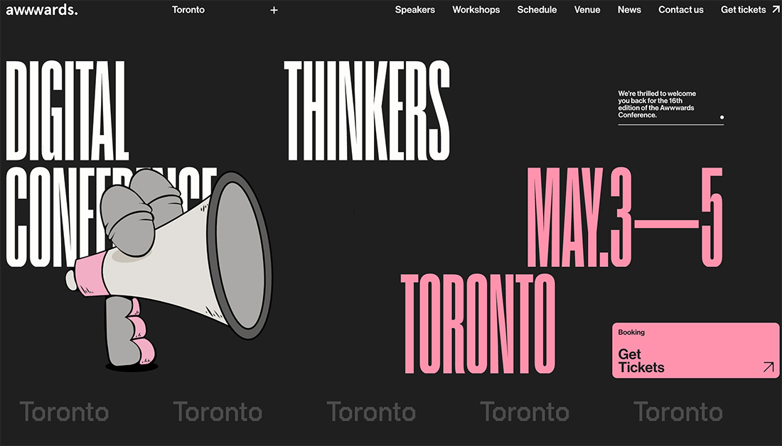
Condensed typefaces can be tough to use, but here they work well. This design also features a little something extra, that keeps it from being a pure text-only homepage, but it’s close.
5 Fonts to Try
A great typeface can help carry this design trend and help your final project stand out. We’ve gathered five fun typefaces from Envato Elements to jumpstart your creative thinking.
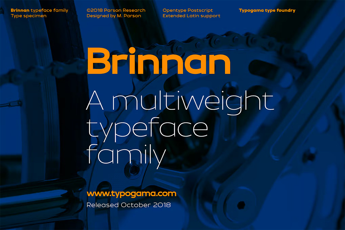
Brinnan
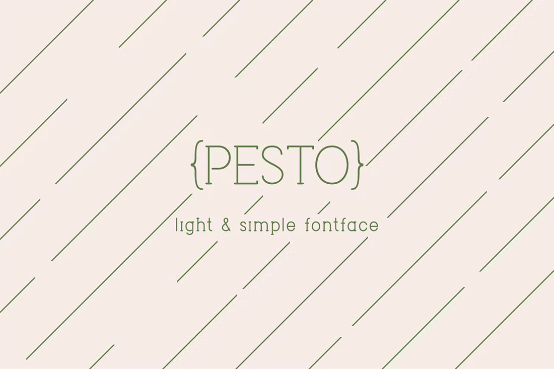
Pesto
WinterLand Font
Fonseca Art Deco Font
Whimsy
Conclusion
This design trend is one that can work well with some other popular themes, including color trends. The great thing about text-only designs is that you can use them for landing pages when you don’t have a lot of other stuff to work with or to truly emphasize specific messaging.
The challenge is this design trend can be a lot harder than it looks to pull off well. Especially when thinking responsively, working with text needs to be well thought out, so that you don’t end up with a jumbled mess in the end. Good luck!