The Non-Designers Guide to Creating Stunning Email Graphics [+ Inspo!]
For every $1 you invest in email marketing, you can earn $44 on average in return — an impressive ROI of 4400%!
But don’t take that money to the bank just yet. In order to maximize conversions and revenue, your campaigns need personalized copy AND compelling email marketing graphics.
In this email design guide, we’ll focus on the recipe for winning email design.
Read on to get seven tips for creating email marketing graphics (+ campaign examples) that dazzle and three email design tools to help you get started!
Like what you see? Subscribe to our emails for more exclusive marketing tips!
Our library of free guides can help youLearn digital marketing insights from the WebFX experts
plan your next digital marketing strategy.
7 tips for creating eye-catching email marketing graphics (+ real-life examples!)
Not sure how to create email marketing graphics? Here are seven tips:
- Incorporate brand colors
- Choose email-safe fonts
- Use email graphics to highlight CTAs
- Invest in high-quality images
- Experiment with animated email graphics
- Make sure email graphics are mobile responsive
- A/B test and personalize email graphics
Let’s break down each email design tip and look at some real-life campaign examples you can steal for inspo!
1. Incorporate brand colors
Using brand colors in email graphics can spark brand recognition and cement the connection between your brand and emails in the minds of subscribers.
That said, don’t be afraid to play around with an extended color pallet that mixes and matches complementary hues and tones. For each campaign, you’ll want to stick with 3-4 main colors to keep your email graphics clean and avoid overwhelming subscribers.
You may also consider the psychology of color when designing email marketing graphics. Various colors evoke different moods and emotions. For example, the color red is often used to create a sense of urgency, while blue puts people at ease.
So, be sure to choose a color scheme that fits your brand and communicates your intended message.
Email example: Dunkin’
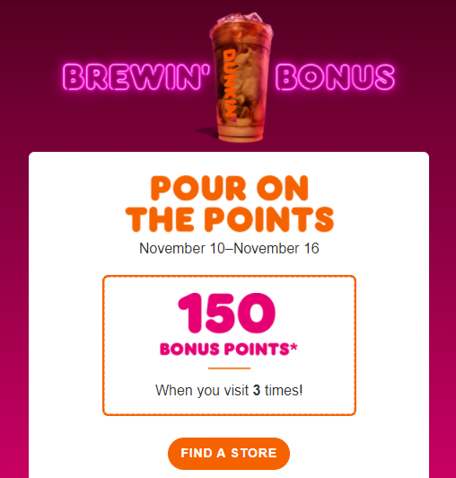
Coffee company Dunkin incorporated hues of their signature orange and pink brand colors in an email graphic to promote a bonus offer for DD Perks rewards members. Orange is also commonly used for call-to-action (CTA) buttons like Dunkin’ did in the email below.
2. Choose email-safe fonts
When designing email graphics, you’ll want to choose fonts that will display properly, no matter the email provider or device a subscriber uses.
Email-safe fonts include:
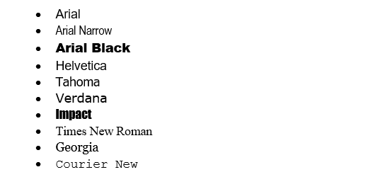
Though you don’t have to stick with the list above, we recommend picking an email-safe font and using a platform like MyEmailFX to test your email display across a range of devices. Like color, it’s best to limit the number of fonts — usually around 2-3 per email — for the best results.
As for font size, we recommend using 14px or higher, so people can easily read email text on desktop and mobile devices.
Email example: Madewell
Clothing retailer Madewell uses simple, easy-to-read fonts that make it easy for subscribers to act. In the email graphic example below, Madewell limited the number of fonts used, but got creative with bold and capitalized text to highlight key info and add visual interest.

3. Use email graphics to highlight CTAs
Next, be sure to keep your overall campaign goals in mind when creating email graphics.
For example, if you want subscribers to click a button to shop, use your design to highlight the CTA.
Keeping your email design simple ensures your graphics complement, rather than compete with other email elements like copy and CTAs.
Depending on your email builder and design template, you may incorporate CTAs directly into email graphics, whether that be text CTAs, buttons, or links.
You can also use the inverted pyramid principle to ensure your email copy and graphics funnel readers to a specific CTA.
Email example: Nordstrom
Department store Nordstrom incorporated a CTA directly in an email graphic to remind Nordy Club members to use their $10 bonus notes. And their inverted pyramid design funnels readers to the “Redeem Your Note Now” button.

4. Invest in high-quality images
High-quality images are crucial for creating stunning email graphics.
Especially when showcasing products in email graphics, we recommend investing in high-quality, original images.
If you’re unable to take original images, you can use sites like Unsplash to find high-quality stock photos for your email graphics.
Product images help subscribers envision themselves using your brand — and coupled with engaging text and CTAs, top-notch images inspire purchases.
Email example: Henly
Clothing brand Henly uses high-quality product images with text overlay to showcase new arrivals in emails.

5. Experiment with animated email graphics
In addition to standard email graphics, you can also play around with animated email designs.
Animated graphics help catch readers’ attention, and you can use them to direct subscribers to specific email elements, like a CTA button.
With tools like Canva (more on that below), you can easily create animated email graphics, ready to add to your campaigns.
Email example: Grubhub
Food delivery company Grubhub whipped up a mouth-watering animated graphic for an email campaign promoting their “dish of the month” — pie.

6. Make sure email graphics are mobile responsive
Since half of all email opens come from mobile devices, it’s extremely important to make sure your graphics display properly on mobile devices.
Sometimes, graphics that look great on desktop computers are less-than-flattering on phones or tablets and vice versa.
Platforms like MyEmailFX allow you to preview your emails on mobile before sending, which is essential for delivering the best results.
Email example: Anthropologie
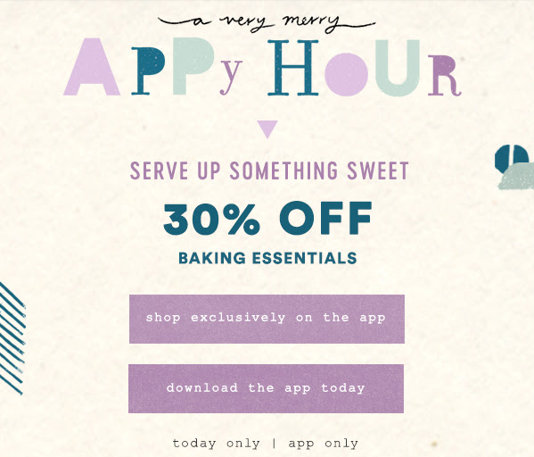
Retail brand Anthropologie used a mobile-friendly email graphic to encourage mobile users to download and shop via the app for a special offer. Readers can easily click the button on the graphic and download the app in just a few seconds.
7. A/B test and personalize email graphics
A/B testing multiple versions of your email graphics ensures you get the best possible results from your campaigns.
Platforms like MyEmailFX let you A/B test email graphics to determine which versions perform best — and you can send the winning graphics to the rest of your email list.
In addition to A/B testing, you can also use dynamic content to display personalized graphics to unique subscriber segments.
The majority of your audience — 77% of people — will choose and pay more for brands that deliver personalized experiences. So, using dynamic content to deliver personalized email graphics can boost clicks and conversions.
Email example: Expedia
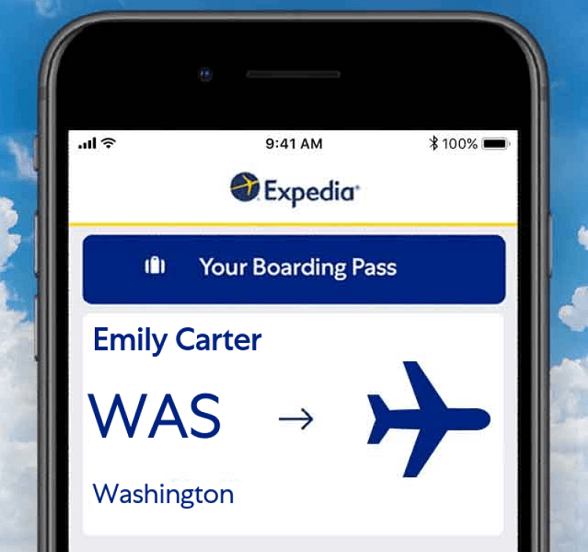
Travel company Expedia uses personalized email graphics to remind visitors of recently viewed destinations and encourage them to follow through with booking a trip.
3 email design tools
Now that we looked at some tips for creating email graphics, you’re probably wondering how to get started.
Here are three easy-to-use email design tools:
1. Canva
First on our list of email design tools — Canva makes it easy to create stunning email graphics, even if you don’t have a background in design.
Canva lets you choose from thousands of custom email design templates, and the drag-and-drop feature makes creating email graphics a breeze.
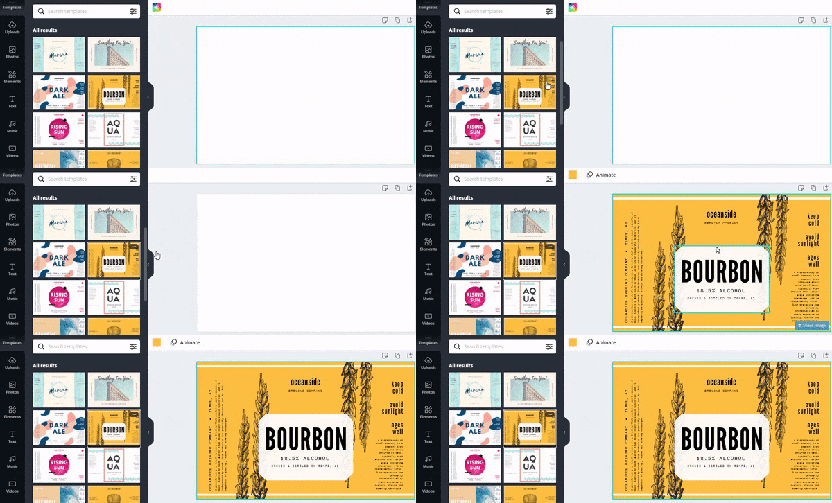
To get started with Canva for email graphics:
- Select a pre-designed email template or enter your custom dimensions.
- Choose your background color or image.
- Drag and drop elements like text, images, animations, and more.
- Download your custom graphics and add them to your email campaigns!
Canva’s easy-to-use interface is a dream for designers and non-designers alike, and it’s a great solution for creating eye-catching email graphics.
Cost:
Canva offers several pricing tiers including:
- Enterprise: $30/month per user
- Pro:95/month for up to five users
- Free plan
2. Piktochart
Piktochart is the next email design tool on our list.
Like Canva, Piktochart lets you easily add design elements to create email graphics in a breeze.
To get started with Piktochart for email graphics:
- Choose from a list of pre-designed templates or click “Create New” to create a custom design.
- Select your color scheme.
- Add design elements like text, photos, icons, and more.
- Download and add your designs to your email campaigns!
Piktochart gives you three pricing options:
- Team: $99/month for five users
- Pro: $29/month per user
- Free plan
Just like Canva, Piktochart lets you select the plan that’s best for your business, so you can start creating email graphics in seconds.
3. MyEmailFX
Finally, MyEmailFX — our proprietary email tool available to clients — allows you to easily browse a curated selection of email design templates to fit your brand and goals.
Whether you’re an email design pro or just getting started with your campaigns, MyEmailFX’s intuitive campaign builder lets you drag and drop elements like images, text blocks, buttons, and more to create one-of-a-kind campaigns.
MyEmailFX is far more than an email design tool, though. The all-in-one dashboard lets you create, send, and monitor emails, all in one easy-to-use platform. And when you use MyEmailFX, you’ll get access to our experienced team of email marketers and design experts to guide you every step of the way.
To learn more, check out our email marketing pricing guide, or get your custom quote today.
93% of customers are extremely satisfied with our results.

Need help creating email marketing graphics?
WebFX has you covered!
Our comprehensive email marketing services include:
- Email graphic creation
- Email testing and tracking
- Email list maintenance
- Access to MyEmailFX
- And more!
Give us a call at 888-601-5359, or connect online to get started!