10 Things NOT to Do While Creating a Website Layout
One of the most challenging things to do when it comes to the website is creating a website layout. Many companies struggle to generate a website that attracts enormous conversions and a lot of revenue. Your website should be visually appealing, but it loses its point if it fails to make money. Many businesses think that they should focus on the design to make it look good. But they fail to understand that the design should be such that it will offer you maximum conversions. Such mistakes damage your business in the long run. Such problems tend to chase the website visitors away and may cost your business tens or hundreds of thousands in lost revenue.
To increase your visitors and revenue, you need to stop making some of the most common mistakes made by business owners today. It is a little challenging to find errors and fix them, but it is not an impossible task. If you apply consistent efforts, you can increase your lead generation, website traffic, and conversions. This blog takes you over the things that you should not do while designing a website. Let us take a look.
1. Unresponsive Design:
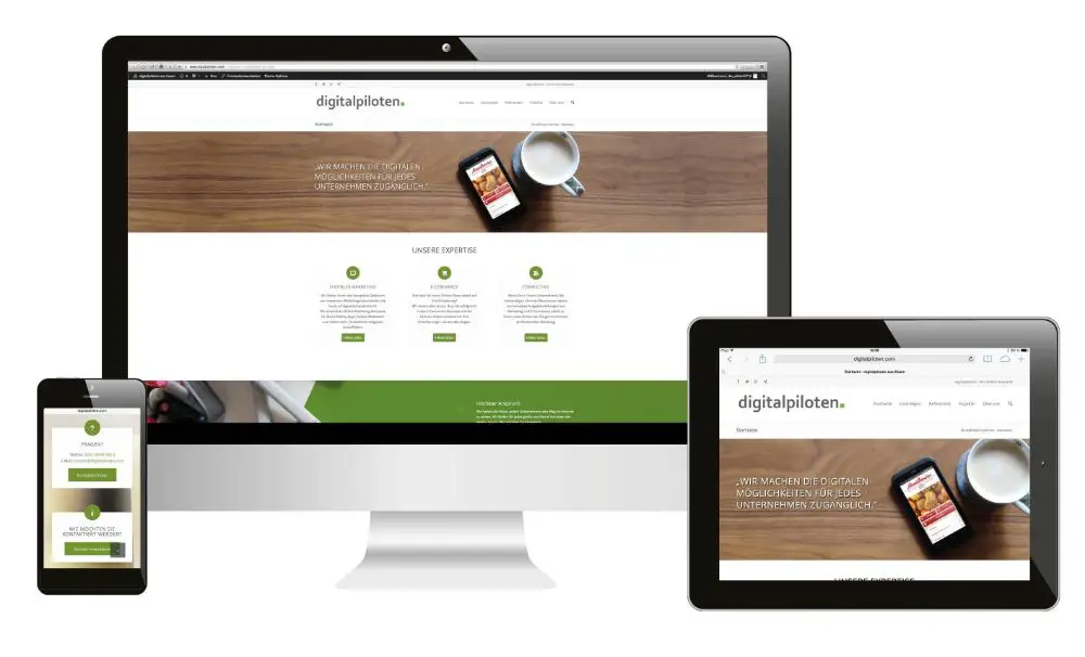
One of the most important traits your website should have is responsive design. Responsive design is one where your website design adjusts itself according to the device or the screen that the user is using. And responsive design is listed as one of the most significant features of the website layout. The responsive design of a website makes sure that every user on the planet can access your website, irrelevant of the device, or the location of the user.
It would be best if you had your website design optimized for various devices. These devices can range from a laptop, desktop, mobile phones to PS4 device. And this is something that Google insists on having, as far as your website is concerned. Your website should have the kind of optimization where the same URL is used, even if the devices change. And the layout of the website varies according to the CSS file code.
2. Absence of Favicon:
![]()
Favicons are the icons on the top left corner of the browser tab that tells the user about which website is open in that tab. It would be best if you used favicons while you design the website so that it is easy to identify the website by merely looking at the favicon. So many users prefer to have a lot of tabs open in their browser while they read something on another tab. In such cases, you can take a look at the favicon and see which website is accessible in that specific tab. These favicons are not only useful when you are browsing a website while multiple websites are available in other tabs. When you are going through the bookmarks or browsing history, favicons help you see which websites are those.
It is necessary to have a favicon through an SEO perspective because it suggests that the site is usable and leads to a high rank in the search engine results page. It saves the user a lot of time while they are browsing and going through multiple websites. Hence, if your website has no favicon, there are chances that the user may or may not consider your website worthy of visiting.
3. Generic 404 pages:
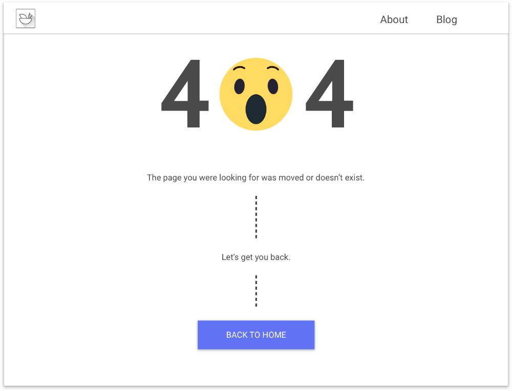
404 pages are the error pages that your website should show when there is an error finding the page that the user is looking for. The error 404 is generally translated to page not found in the world of website design and development. 404 pages silently kill the traffic of your website. And users who hit this page almost always choose to bounce off your website. Moreover, these users don’t take any initiative to resolve the problem.
Hence, if you have 404 pages on your website, you should give an action that a user can take. For instance, you can tell the user to report the broken link or take the user to the page from where he landed on this page. You can also choose to have the user reach back to the home page from the 404 pages. If you are including 404 pages on your website, make sure to include proper CTA to direct the user.
4. Using Carousels on your home page:
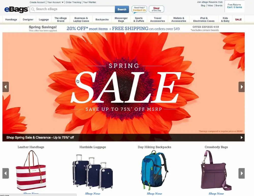
A revolving slider is called a carousel, which a website uses to display its top-selling products or professional portfolio. You can choose to use a carousel on your website, but it is necessary to show relevant information in the carousel. When you go through the things in a carousel, you can choose to revolve the carousel when you want to see something on the other side of the carousel. As far as you can move the items in the carousel, things look good.
But the trouble starts when the carousel starts moving automatically. This doesn’t give your user a chance to see the products or items correctly. Moreover, these days add also look a lot similar to carousels that revolve. This causes banner blindness, and the user may think that the carousel is an advertisement. Hence, the most important thing that a user should notice often goes unnoticed. A carousel is known to distract or irk the user, and this may result in a customer going without converting on your website. Therefore, you should use the carousel only if it is necessary.
5. A slow website:
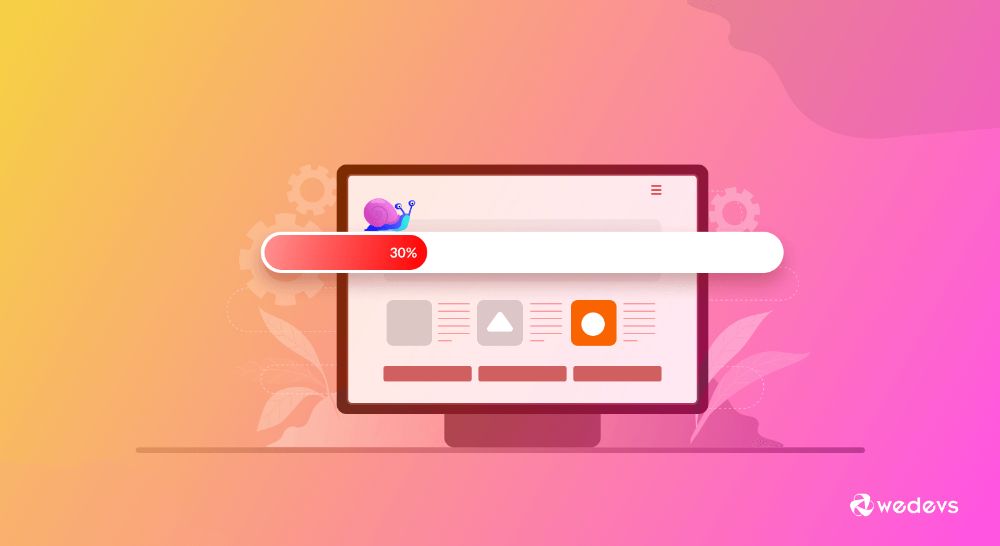
Nothing turns a user off than a website that takes ages to load the web pages and the web page elements. In the fast-paced Internet, if a website takes more than 4 seconds to load, it is considered slow. In a study, Google found that a maximum of websites took seven or more seconds to load. What do you do when you encounter a slow website? You leave the website and go to another website that seems comparatively faster.
If you want to keep your visitor on your website, you should develop a website that takes 3 to 4 seconds maximum to load everything that you have. If you don’t serve the user in this window, your user may consider your website slow. He may choose to leave your website. This is called the Bounce rate. Like the bounce rate of your website increases, the traffic of your website decreases. Moreover, if your website has a high bounce rate, it can hurt your ranking on the search engine. With an increased bounce rate, the search engine thinks that your website is too slow and may rank your website lower than it should be.
6. Low server response time:
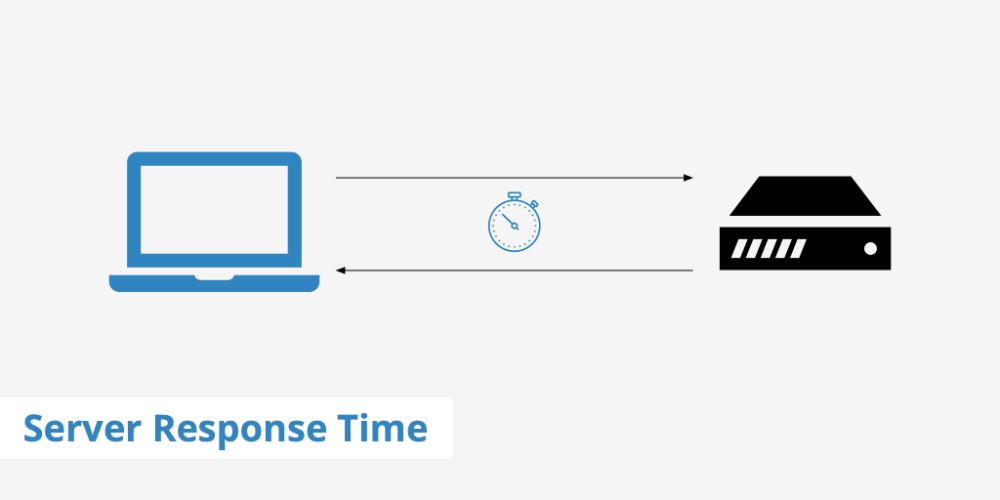
A server is a place where the browser requests or summons a web page of which the user has asked for the URL. The time is taken to render the browser’s web page when the user requests the web page is the server response time. As the server response time increases, the website generates slowly. A slow server response time is indicative of an underlying problem related to the performance.
Ideally, the response time should be 200 ms or lesser when the website is requested from the server. There can one or more following issues that lead to slow server response time:
- Slower application logic working behind the website
- Database queries are slower.
- Issues with frameworks and libraries.
- CPU resource starvation issues.
- Issues where memory starves.
Faster response time is the key to increased website speed and improved website performance. It would be best if you always looked at the above-given issues before hosting your website on the server. If these issues are ignored, your website can lose traffic, and in turn, you may lose the conversion.
7. Using too many different fonts:

The selection of the fonts is essential when it comes to putting textual content on your website. The fonts should be such that the text should be readable. They should neither be too small nor too large for the user’s reading preference. It is common sense to use similar fonts for similar purposes. For instance, all the headers should be written in Times New Roman fonts. But subheaders can be in Arial fonts. The textual content on the website should be restricted to a few font variations.
Using a lot of variations in the fonts can confuse the user when he is on your website for reading the content. If you use a lot of fonts, the user may be distracted and may lose the understanding of the hierarchy of the content. Moreover, it reduces or weakens the cognitive fluency of the user. Using different fonts may break the user’s focus while reading the content of the website. Hence, avoid using too many different types of fonts on your website.
8. The content is not focused on the visitor:
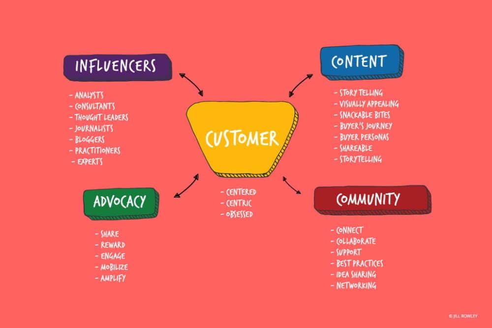
Content is the heart of the website. The readers prefer reading the textual content on the website rather than focusing on the images on the web pages. A piece of content is the small part of the text that explains the user about the website. For instance, if your website deals with the coffee products, it is imperative to write down about the coffee types that your business can offer to the customer.
Hence, the textual content should be visitor-centric, where you take care of what the visitor needs to understand about the product. If the visitor understands perfectly what you have to offer, it gives him an opportunity to convert. Through word of mouth, you can have the possibility of having more traffic on your website. You should always have the kind of content that explains how your website can benefit the user.
9. Using whitespace poorly:
White space is the space between the different pieces of content and the images on any web page. It allows the user to focus on the textual content because of the existence of white spaces. White space increases readability, comprehension of the text, improves user’s attention, and increases clarity. With white space, you offer a separation between the different types of content.
If your website doesn’t have enough white space, it means that your content is taking up too much space on the web page. With a lack of sufficient white space, your web page may look cluttered. And no one likes to look at things that have been poorly organized. You should pay attention to managing the content wisely. Moreover, if you sardine the page with too many elements on the page, the user may not be able to find the piece that he is looking for. Hence, with a good amount of white space, there are so many benefits to your website’s user.
10. Poor Grammar:
The most significant part of any text is the grammar. If your text contains grammatical errors, it turns a user off instantly. And nothing can revive the wrong impression once it is created. Poor grammar destroys the image of your business as soon as it is made. Moreover, good English is always required when you are targeting the global business sector.
It is imperative to have the textual content in good English that has correct spellings without any grammatical errors. Hence, you should always make sure that the content you write on your website is free from grammar issues.
Conclusion:
The design of the website is as important as the back-end that you use to retrieve the information from the database. A website is an extension of your business and helps you to create a digital footprint. You can extend or enlarge the digital print with the way you design and develop your website. A website is only successful if it is made using specific standards during its creation. As a web designer, you have to understand the website design from the user’s point of view. And designing after understanding the user’s mental model helps you in creating a website that resonates with the user. This can benefit your business mainly in the long run and can bring you a lot of conversions.