How to Render Your Emails Perfectly on Different Email Clients
Email marketing is an effective and widely used medium to reach a large set of audience. Unlike one-to-one messages, email marketing requires sending one message to hundreds and thousands of people across multiple email platforms and clients.
With the increase in email clients over the years, it has become a challenging task for email marketers to reach each and every subscriber. While planning for email campaigns, marketers need to take a plethora of email clients into consideration so that each one renders the email perfectly.
Litmus conducts studies each month to find the most popular webmail, desktop, and mobile email clients. Their latest research report shows the following data:

Source: Litmus Email Analytics, May 2017
All these major email clients render emails differently and hence they look different for viewers using different devices and platforms. Let us have a brief detailing on the challenges and workarounds of widely used desktop email clients, email web apps, mobile email apps and other email clients.
Decoding Email Client Hacks for: Apple iPhone Native App
Text gets resized automatically
A minimum font size of 22 pixels for headers and 14 pixels for body should be used.
Updates lead to rendering issues
To ensure good rendering across all devices, keep the device width fluid instead of fixing it to breakpoints at the exact device width. For iPhone 6 Plus, update media queries using 320px to 414px breakpoint.
The general sibling selector ~ is not supported in iOS 9
When used with :hover or :checked pseudo-class selectors, the adjacent sibling selector + can be used. Though it isn’t as flexible as ~, it will still give the same result.
White spaces on the sides of the email in iOS 9
Emails that use background images add padding to the right and left side of the email campaigns. The workaround for this is adding margin padding “0” in the body inline.
Responsive emails appear zoomed out due to auto-scaling in iOS 10 with x-apple-disable-message-reformatting
Use <meta name=”x-apple-disable-message-reformatting”> to disable auto-scaling and add a “padding:0;” to the <body> tag of your email.
Decoding Email Client Hacks for: Gmail for Desktop
Clipping of messages
Avoid unnecessary styling tags and keep the HTML email size below 102 kb.
Does not support <style> or <link> in the head if the email is sent from ESP
Overwrite the default link color by adding a color style to each and every <a> tag within email code.
Attribute selector does not work
Use .class selector instead of attribute selector.
Float, margin, paragraph, and padding not supported
Use table based layout with <td> for padding and margin.
Background images do not work for non-Gmail ids configured for Gmail
Use the background color as a fallback in such cases.
Decoding Email Client Hacks for: Gmail for Mobile
Gmail App increases the font size by almost 50%
Use a spacer image and include white-space: nowrap. Use mobile-specific content and declare! Important.
Two-sliced images are separated by a white line
To remove the white line, use “display:block” in the image tag.
Gmail app on iPhone turns dates and numbers into blue
Use “text-decoration:” and provide a class in media queries with important defined to override the inline style and avoid blue line.
Fluid emails look unimpressive
Use “display: inline-block” along with “text-align: center” to create the illusion of floating elements.
Decoding Email Client Hacks for: Outlook
Margins in <p> and <a> not supported
Use <td> tag to add margin.
Max-width and min-width not supported
Use fluid layouts with a fixed width within media queries and define tables with fixed width in media queries.
Displays only the first frame of animation in GIF emails
Create a GIF that conveys the full message in the first frame that runs for milliseconds or use a static image as fallback.
Google Fonts is not supported
Use suitable fallback with conditional Outlook comments, otherwise, it will automatically use Times New Roman.
Full-width background images not supported
Use patterned background images and avoid using content-dependent graphics for background images.
Any resolution in the range of 1920x1080 and above distorts the email layout
Change the DPI scaling of your Windows based device as a workaround.
Decoding Email Client Hacks for: Outlook.com
RGB borders not supported
For background color, use HEX code.
Unnecessary white space is added below the images
Set the display property as img {display:block;} to remove the padding and still giving the desired result across all media clients.
Using # in href breaks the anchor tag
Avoid using # href and use a domain name instead.
Decoding Email Client Hacks for: Yahoo! Mail
Center align attribute not supported
Use align="center" and for tables of fixed width, use align center in td.
Float tags do not work
Add align=”top” to the concerned images.
Media queries do not support min-device-width, max-device-width for webmail and Android App
Use width attribute &/or in style instead of min or max-width to control the layout.
Decoding Email Client Hacks for: Android Native App
Android 4.4 clients render videos but do not play
Provide video fallback.
Some Android clients do not support general sibling selector E~Y
Enable general sibling selector by using body { -webkit-animation: bugfix infinite 1s; } @-webkit-keyframes bugfix { from { padding: 0; } to { padding: 0; } }.
Absolute positioning is not supported by Samsung Native Client
Use margins to overcome this challenge.
Decoding Email Client Hacks for: Windows Phone 8.1
To support CSS3/Media Queries, Windows Phone 8.1 requires X-UA-Compatible meta tag
Use <meta http-equiv="X-UA-Compatible" content="IE=edge"/>
Also, a viewport selector proves to be useful for certain designs.
To activate :hover selector, you need to keep it pressed for around 1-2 seconds.
Decoding Email Client Hacks for: Windows Live Mail
Windows live mail also displays an unnecessary space of around 4px added below the images just as in Outlook and Outlook.com
To remove this extra padding, set the display property as “img {display:block;}”.
Just as in Outlook, the email layout appears broken above the resolution of 1920x1080
As a workaround for this, change the DPI scaling of your Windows based device.
So before you plan for your next email campaign, make sure your emails are compatible across all major email clients. What rendering issues do you face with your emails? Share with us in the comments!
Don't forget to take a look at our premium newsletter templates.
SHMail - Multipurpose Responsive Email Newsletter Template

Demo | Download
Market - Corporate Responsive Email Newsletter Template
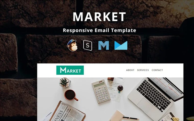
Demo | Download
Lead - Corporate Responsive Newsletter Template
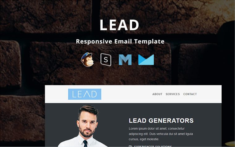
Demo | Download
Marketing - Responsive Newsletter Template

Demo | Download
Agency - Multipurpose Responsive Newsletter Template

Demo | Download
Shopping - Multipurpose Responsive Newsletter Template

Demo | Download
BigSale Newsletter Template

Demo | Download
iPhoto - Responsive Email Template Newsletter Template

Demo | Download
Related Posts
- Email Listing Done Right: an Ultimate Guide from TemplateMonster
- Save Big on Email Campaigns with 10 Cheaper Alternatives to MailChimp
- 50+ Amazing Responsive Email Newsletter Templates
- TOP 30 Professional Email Templates for Business 2020
FAQ
When an email client receives an email, it is a long wall of HTML code wrapped around by CSS animation. A rendering engine creates a structure based on the code specified in the HTML and adds specific styling accordingly to the CSS.
All Mail clients render HTML/CSS differently, in their own ways and for their own reasons. To get more tips on various emails clients please refer to our blog post.
The majority of email clients don't support every type of HTML content you see on the web. Web browsers are able to display scripts, animations, and complex navigation menus, while your typical email inbox isn't built to handle this type of content.
Each email client renders HTML and CSS differently, which causes the email to look differently in certain providers. HTML emails can appear incorrectly when viewed in some email clients.