11 Advertisement Design Tips That Will Help You Make an Impression
“Make it simple. Make it memorable. Make it inviting to look at. Make it fun to read.”- Leo Burnett
That is one quote that packs a punch. It has some of the best advice you could get about advertisements and we are going to dive a little deeper into that today.
If you get your advertisement design right, it could lead to more sales, increased customer loyalty, and even making more money down the road.
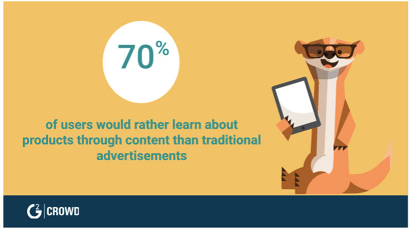
Image Source
Global ad spend reached an estimated $579 billion by the end of 2018 so that is a big part of a company’s budget being spent on advertisements. It is how you get more clients, better target the ones you already have, and grow your brand.
Getting the design of your advertisement right is key to increasing conversion rates and getting the most out of your ad spend. So, keeping that in mind, here are some tips that are worth remembering-
#1 Make it memorable
Focusing on making your ads memorable means going deeper than the rest of your competitors did. You cannot simply produce a copy of the same old content that has been produced for years. You want to add emotion to your ad.
A great example of a memorable ad is the one by Orea during the Super Bowl power outage. This quick tweet that was posted during the blackout was creative, memorable, and free.
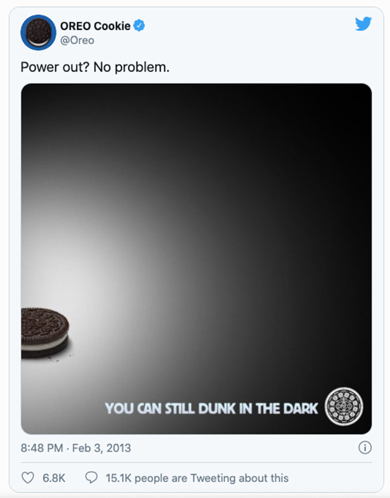
Your design is memorable when it is creative, conveys emotion, is different, or all of the above.
#2 CTAs are not limited to your blog posts
Marketers often make the mistake of thinking CTAs are limited to email marketing, the bottom of webinars, or the end of blog posts; and have no place being included in an advertisement. I believe they are missing out on an opportunity.
CTAs can be subtly included in advertisement design as well and can have a great conversion effect.
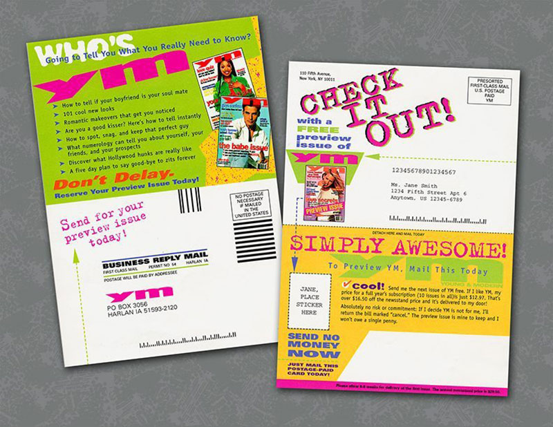
Image Source
Looking at the example above, you will notice how the simple advertisement becomes ten times more effective by prompting the person to mail the card back to the business so they can get a free preview issue.
It is doing more than simply advertising the product on offer- it is prompting the reader to take action so that they can nab an awesome product for free.
#3 Model’s gaze focusing on the CTA
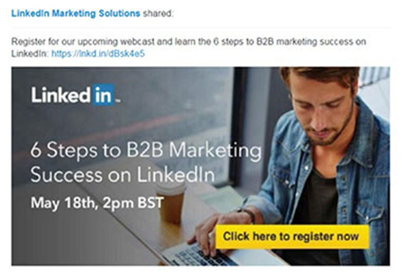
In advertisement design, you are focusing on the model so it should make sense that what the model is focusing on is going to be of some importance too. Also, human beings tend to follow the gaze of other people pretty naturally.
This means that if your ad includes pictures of a model, you should focus their gaze on your CTA.
Here is a good example of this tip in action-
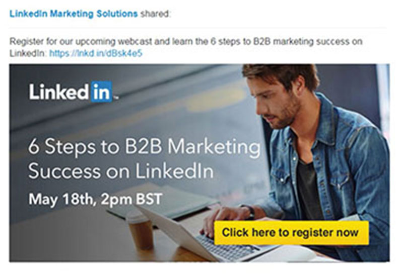
Image Source
The above image came from a split test conducted by Linkedin where the model’s gaze was subtly drawing the attention of the viewer to the CTA. The other option is far less effective in comparison because your attention would go to the model rather than the CTA.
#4 Constantly perform split tests
Speaking of split tests, conducting them as frequently as possible can be a blessing for your business. You will learn what works faster, stop doing things that have low conversion rates, and increase revenue in the long-term.
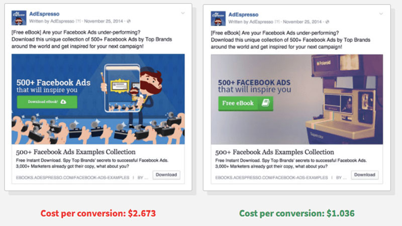
Image Source
You can conduct split tests to decide what wording is working best, what colors are converting more, which CTA is the best option, and much much more.
#5 Focus on emotion words
Changing the font, color, or size of your emotion words (the ones that convey emotion) is a good tactic to use to draw attention to them. You want to do that because these words are more likely to reel a potential customer in or get them to relate to your advertisement.
Some of the most common emotional words include-
- Free
- Because
- Guaranteed
- Easy
Let us take Free as an example in this digital ad from a few years ago-
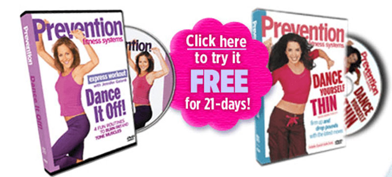
This ad was for the Prevention Dance it Off! Series and is one of the earlier digital ads when companies were only beginning to sell online. As you can see they have purposely increased the size of the word ‘Free’ to draw attention to the word and get people to click.
Speaking of emotions, keep in mind that you should try and lead with the benefits instead of the features. Here is a very simple but easy-to-remember example from iNECTA – advertising their food ERP software.
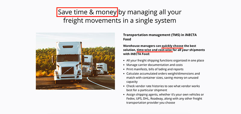
Image Source
Instead of boring the user with all the features of their software, they kick it off with ‘Save time & money’ and immediately get the attention of pretty much everybody in their target market.
#6 Using well-known people or ideas
If your brand logo and name is not instantly recognizable just yet, you can make up for this by focusing more on well-known icons that everyone knows. The advertisement will include this well-known icon in the ad portrayed differently to draw attention.
DesignCrowd, a marketplace for freelancers, asked users across the world to photoshop icons from the past into modern-day advertisements as part of a contest. This was one of the entries that serve as a perfect example-
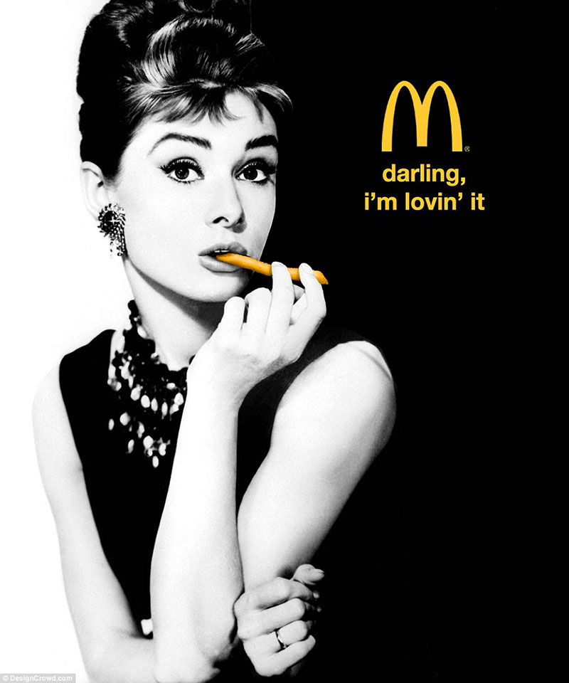
Image Source
Using an icon like Audrey Hepburn in a funny, modern way is an eye-catching design technique worth playing around with.
Alternatively, if you don’t want to get that creative, at least let your customers speak for you (testimonials) and use some social proof (Google reviews, Trust Pilot, etc.). Smith Thompson does that amazingly well for example-

Image Source
#7 Use thin, tall lines to portray beauty
You would not think that a particular type of font could be able to portray beauty but it can because of what our brains associate beauty with.
Fonts that are thinner, taller, and lighter are associated with femininity while thicker, bolder strokes are associated with masculinity. (Brumberger, 2003, pp. 208)
This might not be the most logical way our brains deal with advertisements but as a marketer, you can take advantage of this. For example, a beauty magazine like Harper’s Bazaar or Vogue will often use this tall, thin font in their ads while a men’s shaving cream company might use a thicker, bolder font.
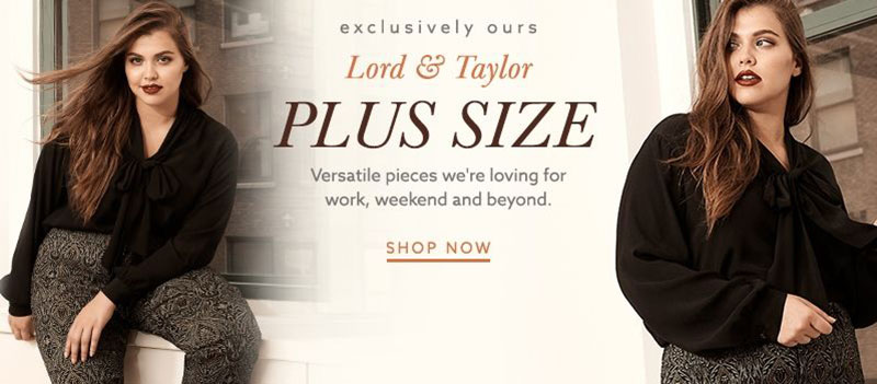
Image Source
#8 Do not be afraid to use your imagination
The lovely part about advertisements is the rules of physics do not apply to you. You can be as imaginative as you want and in some cases that is just what makes your ad design pop.
Graphic design software today allows us to create the craziest effects on our pictures and using this software to our advantage could be what your advertisement campaign needs.
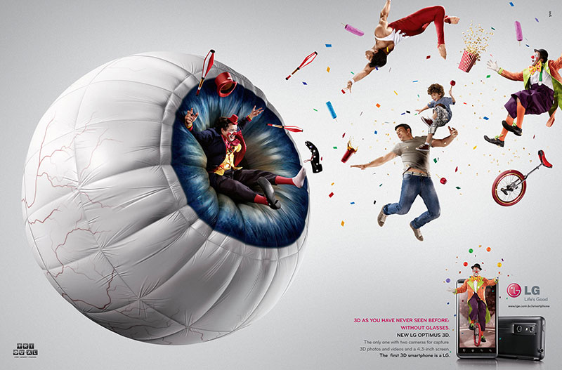
Image Source
Take a look at this awesome LG ad for their new phone’s awesome camera. It is so much more eye-catching than a plain old phone ad that has been done a million times before.
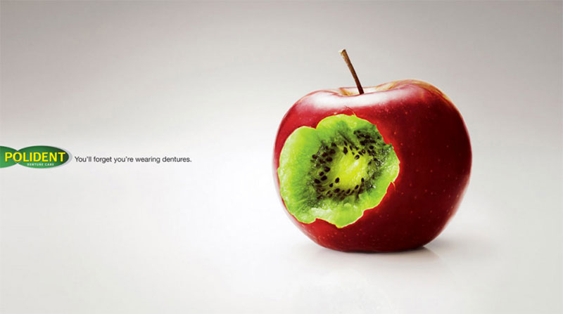
Image Source
Similarly, this Polident (a company that provides dentures) ad is all about getting the teeth you had in your twenties back. Nothing tastes too hard anymore and eating just became easier. Instead of creating an unimaginative ad that everyone else has already got up, they used the cool graphic effects they had at hand to create something far more memorable.
#9 Have a laugh
You want your consumer to love your brand and what better way to do that then to give them a laugh. A funny ad is more memorable and more liked than a serious one.
The reason humor works so well is because it is a positive emotion and who does not want to look at an ad and feel a positive emotion?
Here are some awesome examples-
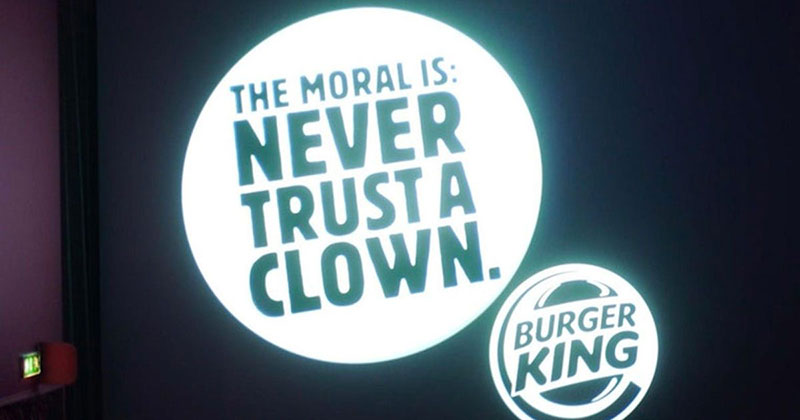
Image Source
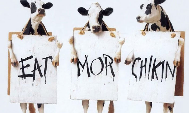
Image Source
The second example from Burger King is part of a long drawn out feud between Burger King and McDonald’s that includes some of the funniest tweets, ads, and comments any brand has ever made. Both brands have profited from their ‘frenemy’ relationship and customers love them for this.
The great part about ads like these is you can even incorporate them into your social media strategy where you can chat acronyms and a more casual approach to connect with your audience.
#10 Do not be afraid to be dramatic
There is nothing wrong with a little bit of exaggeration in your ad. A good hyperbole can get the point across better and faster in a lot of cases. Take this ad for a stain repellant as an example-
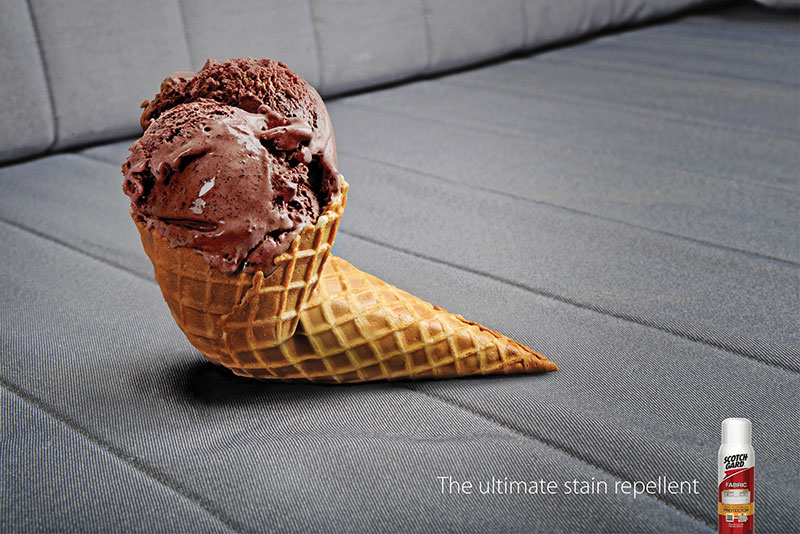
Image Source
The ad is obviously an exaggeration and is in no way misleading. It uses awesome graphic design software to create a funny yet powerful ad to convince viewers to give their product a chance.
#11 A picture is worth a thousand words
You do not always have to include words in your ad design- sometimes a powerful image can tell the whole story.
Take a look at these awesome examples-
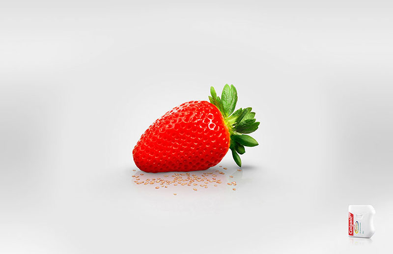
Image Source
This awesome Colgate floss ad is the definition of minimalistic. There are no words involved and you still know exactly what the brand is trying to convey.

Image Source
Second, this Hulu ad brings back memories of shoving popcorn down your throat while binge-watching TV shows, and there were absolutely no words necessary.
#12 [BONUS] Create ads that educate
As you know by now, 70% of users would rather learn about products through content than traditional advertising. With that said, I urge you to start creating educational ads.
I don’t want to go too deep into the ‘content marketing rabbit whole’ but just take a look at Fatjoe’s ads – they are all about providing value to their audience which converts like a charm.
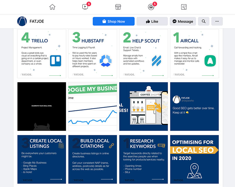
Image Source
Wrapping it up
The average person gets shown over 1,700 banner ads per month but only sees half of them. As the number of ads people are bombarded with keeps increasing, it is important that you make your advertisement design and ad copy eye catching and original.
These tips should give you the foundation you need to create a great ad design so you can stand out from the crowd.
About the Author
 Burkhard Berger is the founder of awesomex™. You can follow him on his path from 0 to 100,000 monthly visitors on www.awesomex.com. His articles include some of the best growth hacking strategies and digital scaling tactics that he has learned from his own successes and failures.
Feel free to follow him on Instagram, Facebook, and Twitter.