Awesome black websites you need for inspiration
Unlock the dark side of web design with these stunning black websites – discover the power of minimalism, contrast, and elegance!
From fashion to technology, find inspiration and take your online presence to the next level.
Let’s embrace the dark side!
Black is a simple hue that is stylish and refined, suggests empowerment, and is devoid of any other colors.
Black is a popular color choice for web design since it highlights the site’s content. The reason for this is that on a black background, all other colors show out much more.
We’ve compiled a list of the top black websites as inspiration since they’re great methods to distinguish yourself from the crowd.
Inspirational Black Websites to Visit
Jack Daniel’s
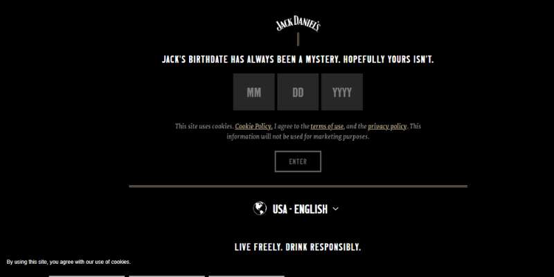
The website for the well-known beverage Jack Daniel’s is all black. The website serves as an example of how various design choices may be made for certain website elements by combining black and white pages.
TPMM
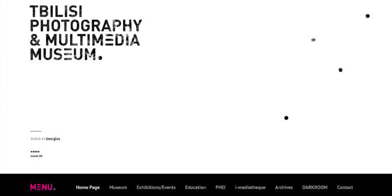
Due to the black-and-white interface, this black website is aesthetically stunning and keeps you thoroughly amused.
GoSqaured

The black background of the website contrasts well with the green, blue, and purple hues utilized on this landing page. The attention of the visitor will be drawn in by this color contrast.
BlackBerry

The majority of the BlackBerry website is designed in black, with some gray background accents that are primarily utilized for the menu and popup windows.
This emphasizes the phone’s beauty and elegance. The website’s dark colors and white lettering provide a stunning contrast throughout.
The Ordinary
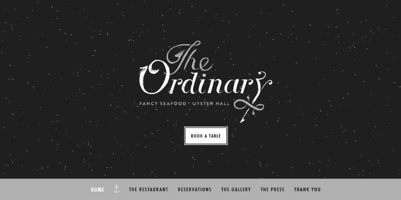
The Ordinary features a black-and-white aesthetic that evokes a night sky full of stars. The black website for The Ordinary has a sophisticated dark background with tasteful white accents. Additionally, it keeps the seafood restaurant’s nautical feel.
Dropbase
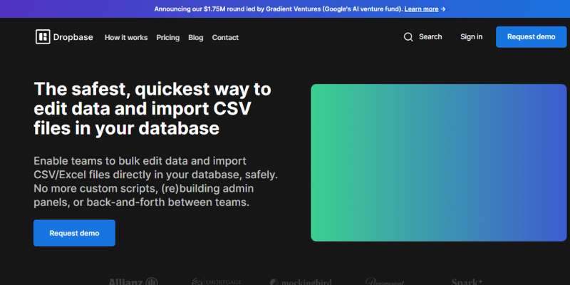
This website is a superb illustration of a dark website with little thrills but excellent design and product presentation.
Fork Spoon

This black website represents a public shop and design studio whose mission is to highlight the value of design via the selection of artifacts and literature, instruction, and practice.
Synthese
Another wonderful example of a dark website is this one. It utilizes both a white background and a black background, and in other places, black is used as an accent color.
Icelandic Fashion Festival
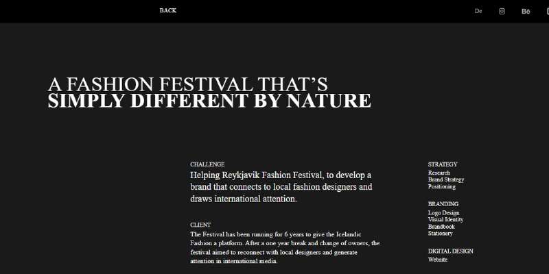
This event has been going on for 6 years, and its major goal is to promote Icelandic fashion. After a one-year hiatus and a change in ownership, the festival hoped to reestablish relationships with regional designers and attract media attention abroad.
Thomas Bosc

Thomas Bosc, an SEO, and Social Media management specialist uses black amazingly in this portfolio website to create a classy, polished company website. His black website is enough to persuade prospective customers on its own.
Anita

This website has a highly recognizable black aesthetic. The website, which focuses mostly on food and drink, has a wonderful aesthetic thanks to a distinctive black-and-white graphic.
Moooi
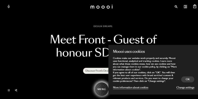
The black website for Moooi was creative and provocative since it used the color black to create an amazing look.
International Women’s Day

The purpose of this webpage is to recognize International Women’s Day. To emphasize its message, the website makes extensive use of the color black.
Leonid Kostetskyi

Leonid Kostetskyi is a talented front-end developer. His prior work and designer skill set are shown on this black website. The website, which is mostly dark but has a portfolio section, may be regarded as an individual’s webpage.
Insurrection

The black website Insurrection aims to inform the public about climate change and its terrible consequences in Iceland. Strong, dark hues effectively showcase the website’s message.
Sam Phlix

Sam is a talented web designer, and his website uses a dark background to make the rest of the content stand out. The website is easy to browse and elegantly simple.
Blake Allen
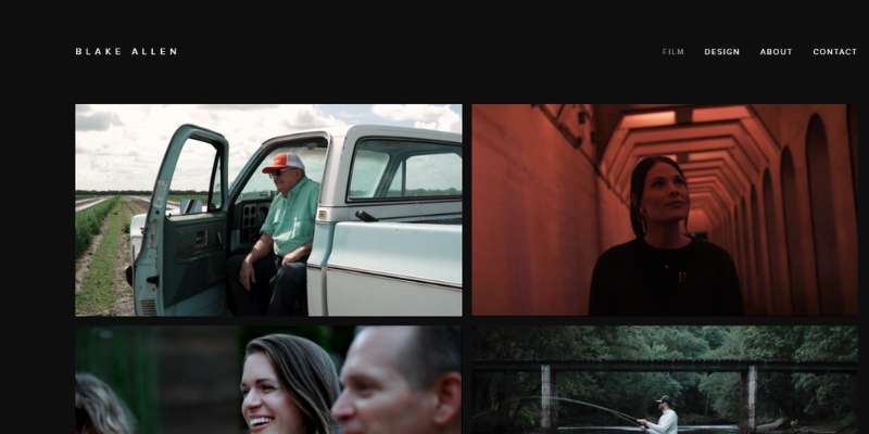
This is another dark website with a straightforward portfolio. The website lacks animations and other features that can make it busy and difficult to browse to be attractive.
The website’s white typeface and black background make it very simple and enjoyable to read. It has a highly sophisticated and simple design.
Void

On this website, Void mostly focuses on animations of space and time. Based on these images, the website constructs a narrative. The page is all dark, which conveys a feeling of mystery.
The page is all dark, which conveys a feeling of mystery. The dark hues are also matched with seductive music and tones. One of these simple, black websites that people like to browse is called Void.
Versions

The Versions website advertises a Mac program, demonstrating how the color black may distinguish a website. The CTA buttons and other parts of this technology-style website stand out because of the usage of contrasting colors.
Clover

The dark style of Clover’s website makes it seem light and unobtrusive. Additionally, they use several dark grey hues that go nicely together.
Esteban Muñoz

One of the top black websites is Esteban’s. If you wish to use this design aesthetic for your own website, it is a fantastic source of inspiration. The website has many graphic design components and a black background. The website’s animations and typographic typefaces go in well with the overall tone of the site.
Airnauts

Airnauts builds responsive websites with interactive and responsive features. The website’s dark background attracts our attention to its most crucial components.
1MD

One of the top dark websites is 1MD. It has a simple, dark website layout. Even though numerous black websites have a light background, this one stands out due to the strong black graphics.
Thomas Rhythm
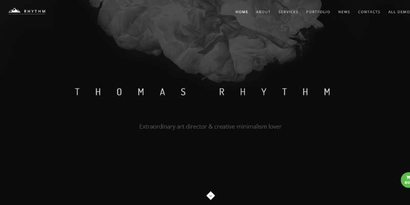
This is another fantastic portfolio website where the dominant color is black. The website for Thomas Rhythm is clean and attractive thanks to the usage of many components. Although the website mostly uses dark colors, there are other attractive design aspects to it.
CONTRATEUR

Their travel photography endeavors are unrestricted and encourage people to travel slowly and ethically. The website has a simple design with a dark background. The website’s planet image is combined with a dark backdrop, giving the impression that you are in space.
Let It Bleed
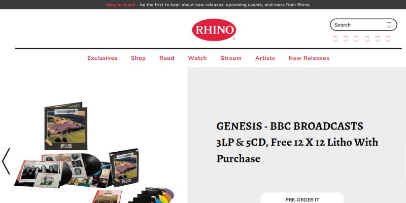
This is a book website that uses a lot of black in the backdrop to draw attention to the book cover. The website’s white topography also stands out a lot.
The following dark websites are also worth checking out:
- lotis
- Openthrive
- Play
- Haptic
- Icon Agency
- Statworx
- Alikimovich
Conclusion on cool black websites
In web design, black is seldom utilized as the dominant hue. But when done well, it may provide amazing visual and design results. Black may be an excellent branding element and helps the visitor concentrate on the artwork and content of the website.
If you want to design original, contemporary, and professional websites, black is a popular option. This color’s power can effectively produce a beautiful and understandable design.
We hope the examples in this post have motivated you to think about building a black website for yourself.
If you enjoyed reading this article about black websites, you should check out this one with the best startup sites.
We also created similar articles like these with animated website designs, spa website designs, dog grooming sites, and coffee shop websites.
And there are several more that you can check out like these relaxing sites, trippy sites, political websites, and weird sites.