How to Choose Brand Colors
Colors can be powerful tools for those who attempt to start a brand. Colors are endowed with meaning, in a sense that they are symbols that send to the prospective clientele a message about the essence of your business. The article that follows is intended to explain in as much detail as possible why colors matter, especially when and if you decide to embark on an exciting and ambitious quest of starting an enterprise and making it a success.
The Importance of Color Palette for Brands
To put it simply, the theory of color has gained its name for a reason. Evidently, it has a lot of science to it. Be neither agitated nor humiliated by this fact. The major principles of color theory are fairly easy to understand, after all. Normally, brand owners use from one to four colors to express the identity of their venture and consult what the professional designers and experts in visual arts call the color wheel.
Choosing colors for your brand is pivotal because of what it entails. Company color schemes will help to shape and, hence, influence all points of contact between the entrepreneur’s representatives and potential customers. By touchpoints, colors of the logo, website, email newsletters, fonts, and design of pages for a brand on social networking platforms are meant. Office design, staff uniforms, storefronts, advertisements, and the design of physical stores are the aspects through which a brand’s color palette transcends the limits of its own in the offline domain.
How to Choose a Color Scheme for Your Brand
Choosing brand colors implicates:
- Defining and rethinking types of color.
- Determining brand identity.
- Choosing your colors based on the decisions and findings you have made during the previous stages.
- Making decisions as to where the colors you have picked should appear.
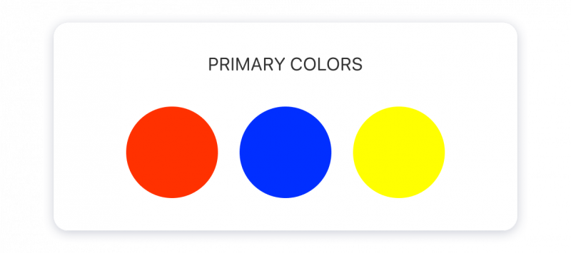
The typology of colors includes hues, shades, tints, and saturations of tones. Color hue is the term to denote how primary colors blend together. The primary colors are red, yellow, and blue. The said colors can form any other color of the spectrum perceivable by a human eye building on how you mix them.
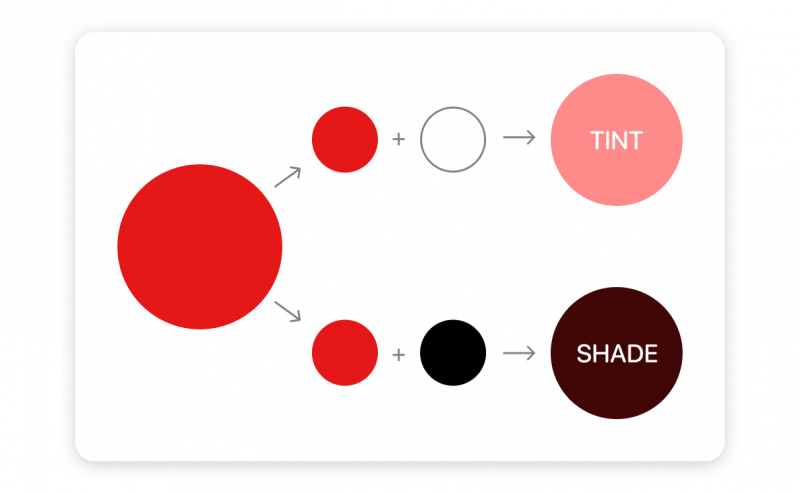
Color shades apply to characterize the amount of black added to a certain color. Color tints designate the opposite process, describing the amount of white added to a color. Adding white produces a more luminous and translucent tint. Saturation brings the shades and tints together. It is possible to think about saturation as the intensity of a given color.
Brand identity can be considered an entity that possesses a set of features alluding to personality traits. Brands can, therefore, be described as virile or effeminate, frolicsome or earnest, palatial or cost-effective, state-of-the-art (innovative) or traditional, vernal or experienced, flamboyant or subtle. Considering each of these pairs of features will help you to make informed decisions about your brand’s identity.
Having invested a substantial amount of effort pondering the types of color, disambiguating your brand’s characteristics, and taking the competitors’ brand colors into account will let you know how to proceed further as you will be establishing your company’s color scheme.
Use the selected colors wisely by properly understanding how and where to put them. Once you have found which colors to integrate while asserting your brand’s identity, the next choice you will have to make concerns how to put the selected palette into operation. The scope of application of chosen brand colors typically coalesces the following components:
- Logo
- Web page and electronic correspondence
- Social network services
- Promotional campaigns
- Points of purchase
- Office supplies
- Employees’ outfits and regalia
- Incidents.
It may be beneficial to test a chosen color scheme on your venture’s social media accounts. Another way to approach the problem of whether the color palette that you have picked is effective is by designing and printing out business cards.
Useful tips for selecting a base color
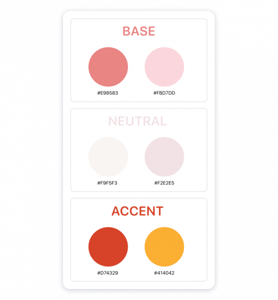
While it has been established that treating your brand like a person can be an effective strategy to pick a color scheme accordingly, it is of paramount importance to decide which of its features is a definitive one. Normally, your brand’s primary color will mirror your brand’s most important quality. Please, bear in mind that the ground color should help to convey a central message of your enterprise and resonate with the target audience that you have decided to address. Choose your accents and neutral colors based on how well they blend with the base color.
Practical recommendations on coming to a decision about the neutral color
A neutral color is a background one, an instrument to divert attention from the base and supplementary colors and unify the two, make them coalesce. In that respect, shades of grey, pastel, and white are some of the most efficient choices. Black is a successful neutral color but, please, bear in mind that it is very vocal and can, therefore, dominate the base and supplementary colors that you have selected.
Helpful guidance on how to pick a supplementary color
Supplementary color, aside from the base color, is the one you will be using most frequently. Selecting accents can be more daunting compared to settling upon a base color. Accent color should not merely be compatible with your brand’s identity. It is also mandatory that your supplementary color be compatible with the base color and align with the color theory principles.
The principles laid out in this section are mere guidelines. It is nice to know and follow them, because, as the maxim goes, it is crucial and obligatory to know the conventions before disobeying them.
Tips for Choosing Brand Colors
Pieces of advice to selecting the best brand colors stand thus:
- Focusing on both the connotative and denotative meanings of colors.
- Considering the competitors’ brand colors.
- Comparing several color pallets by creating several varied mood boards.
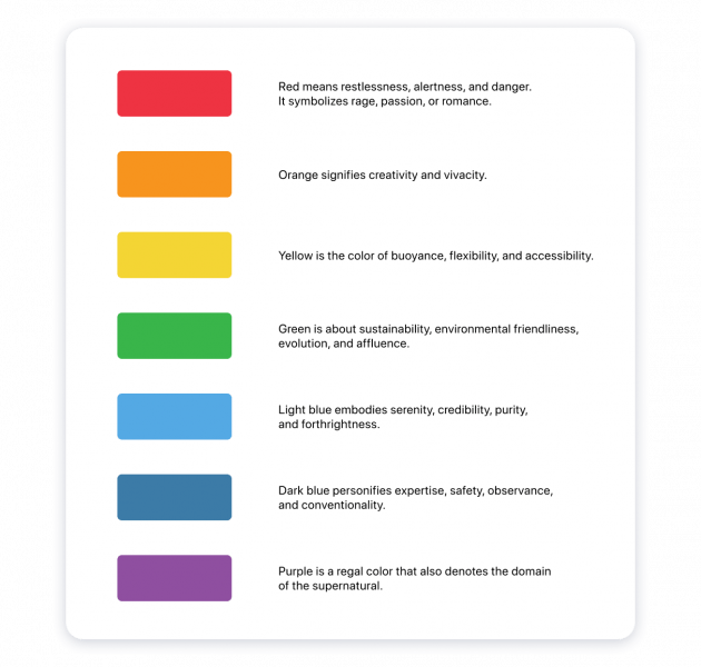
The psychological explanations of colors are as follows:
Either as an online venture or a brick-and-mortar enterprise, your brand’s name would appear among other parties representing your enterprise or area of expertise of choice. Knowing how to pick brand colors and exploit them fluently can massively help to reinforce your brand’s recognizability and discoverability. Distinctness and findability, in turn, translate into recognition, increased brand awareness, and, as a result, the success of your respective enterprise.
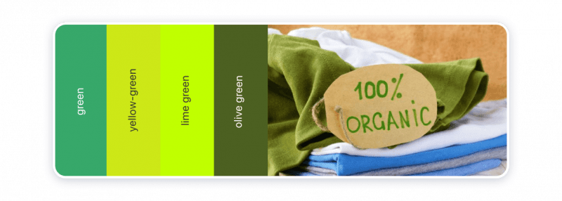
The notion of comparing several color pallets by creating several varied mood boards is relatively self-evident and self-explanatory. Consider the combination of green, yellow-green, lime green, and olive green. The indicate palette would have been a suitable choice for a store selling organic fabrics or environmentally friendly clothes.
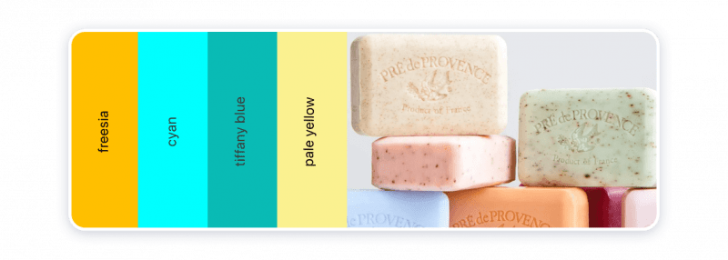
A combination of colors consisting of freesia, cyan, tiffany blue, and pale yellow is an option suitable for bathing products manufacturing business, a stationery shop, or a handmade confectionary. Either of the pallets is inspired by nature, harmonious, visually, and aesthetically pleasing.
Examples of Color Palettes on the Sites of Famous Brands
McDonald’s
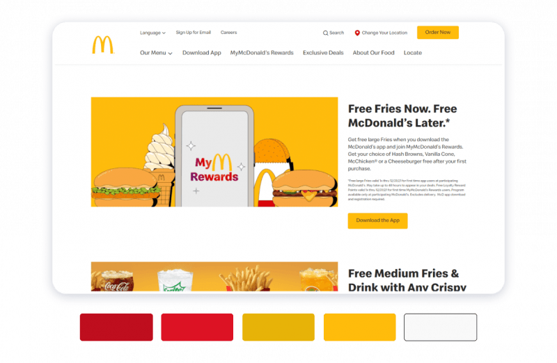
Yellow almost ochre color is the base color that ostensibly and incrementally correlates with McDonald’s. Conviviality, buoyance, and affordability are the personality traits McDonald’s brand has come to associate with. Complimentary red is considered a stimulating color that can boost metabolism and speed up recovery.
Uber

Plain, readable white font on the field of black is part of Uber’s signature design. It is expressive, memorable, and laconic. The design of brand identity as if it invites the visitors of the website to contemplate the things that matter in life the most, which is arriving at a destination where those whom you hold most dear await.
Slack
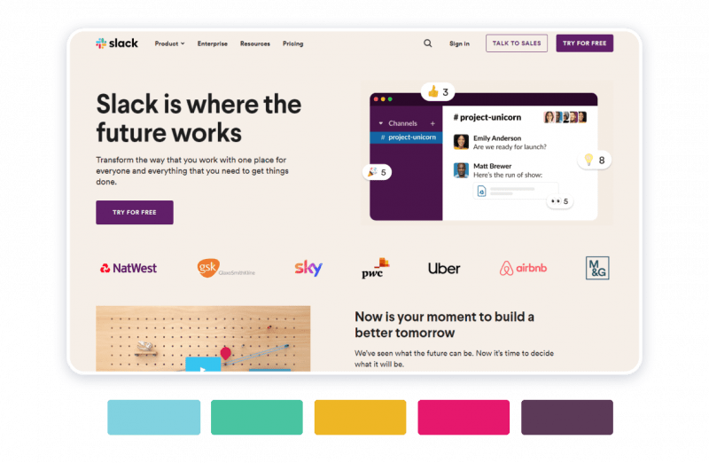
Magenta, azure, green, and yellow are the colors of Slack’s emblem. Light beige is the background color of the company’s website, against which the text in black and logos of other companies using Slack’s services become even more discernible.
Airbnb
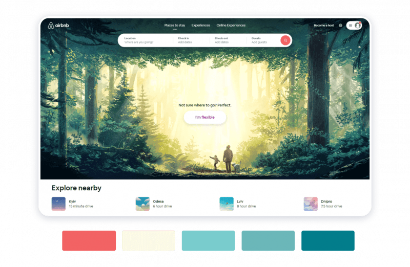
Airbnb logo in white, originally on a field of carroty or deep peach color, appears on a landscape which typically is a landscape image. The brand design invites the visitors of the website to go on an adventure. Thus, the design gets in line with the brand’s mission, which is helping their customers to find loggings at their point of destination.
Rab

Rab’s logo appears on a field of dark grey with a shade of deep blue. The brand is a manufacturer and seller of sports clothes and tourist gear. Light green is a complementary color. White, dark grey-blue, and light green colors taken together mirror the company’s brand identity, which is about encouraging people to travel sustainably, respect nature, and explore the outdoors.
Concluding Thoughts
Do not neglect the meaning of color as you will be attempting to forge your brand identity. Sue the color wheel and explore the principles of the color wheel. Monochromatic, complementary color palettes, color schemes consisting of the colors that appear on the color wheel opposite each other — each of these options is deemed visually appealing. The important thing is to think through your brand’s character and mission and apply the theory of color accordingly.
Weblium allows you to pick any color(s) you like for your website, adjust saturation, hue, and vibrance of your website’s color palette, or completely change it painlessly, with just a few clicks.
The website builder offers you over 300 prefabricated user-definable templates to choose from, and each of those has been created by professional designers, the connoisseurs of visual arts familiar with color theory and knowledgeable about the psychology of colors.