Ecommerce Product Categories: How to Create a Product Category Page
Imagine going to the grocery store to find that apples are in the milk aisle, chips are in the bread aisle, and eggs are in the pasta aisle. You would be so confused as to why these aisles aren’t organized, and it would make it difficult for you to shop at the store. You wouldn’t know how to navigate the store and find what you need.
The same thing occurs when you don’t set up your ecommerce product categories correctly. Without organized, logical, and well-designed category pages, your audience will struggle to browse your site and find what they need.
So, how do you set up your ecommerce product category pages for success? Here are six tips we’ll cover to help you get started:
- Create proper product categories
- Go from general to specific
- Customize your heading tag
- Create category and subcategory pages
- Make sure category page images are consistent
- Add breadcrumb navigation
P.S. Want to get more marketing insight that will help your ecommerce business grow? Subscribe to our email newsletter, Revenue Weekly, to get the latest!
Campaigns managed by WebFX have earned overPartner with Ecommerce masters!
TRANSACTIONS IN THE LAST 5 YEARS
1. Create proper product categories
If you want to be successful with your ecommerce product category pages, start by creating the proper product category. You want to ensure that you’re organizing your products logically, making it easy for people to find what they need.
For example, if you sold shampoo and body scrubs, you wouldn’t put them in the same category. You would put your shampoo under a category like “hair care” and your body scrubs under a category like “body care.”
The success of your category pages starts with organizing your products into the right groups.
When your pages are logical, it makes it easier for users to find what they need fast.
Be careful not to over-organize, though, as it can make it far more difficult for people to explore what they need.
JCPenney offers a great example of how to organize your product category page. Under their Kitchen & Dining section, you can find their products broken down into categories like cookware, gadgets and utensils, and flatware.
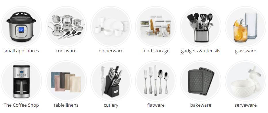
Their ecommerce product category pages are broken down enough that people can choose the right direction for their needs without getting too specific.
2. Go from general to specific
One of the critical components of creating a product category page is to go from general to specific. This tip may seem like common sense, but many businesses mess up this part of their category pages.
When you set up category pages, your categories should start general, so shoppers can continually refine their search until they get to what they need.
For example, a bad product category path would look like this:
Small Appliances > Coffee Maker > Small Appliances > Single Serve Coffee Makers
This example is wrong because it starts by refining the search but then goes back to the broad category. Instead, it should look like this:
Small Appliances > Coffee Maker > Single Serve Coffee Makers > Keurig
As you can see, this path gets more refined until it gets to a specific product or brand.
You can see a great example of this refined product searching on JCPenney’s website.
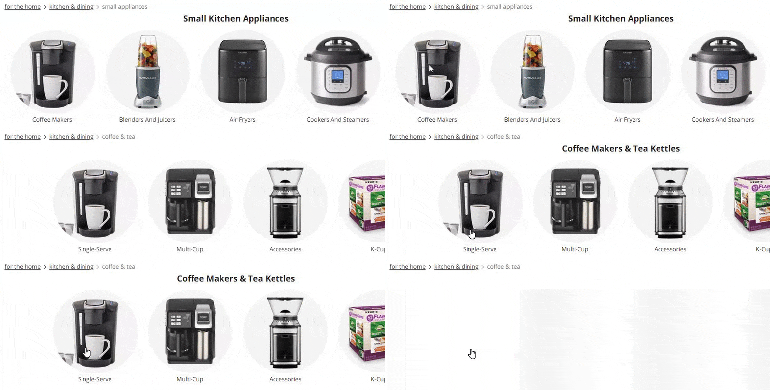
When you set up your category page design, always make sure you’re getting your prospects one step closer to what they want to purchase.
3. Customize your headings
Next on our list of tips for setting up pages with ecommerce product categories is to customize your headings. Headings appear at the top of the page with information about the category page.

While you can take a standard approach with your headings, like using “Women’s Clothes” for your Women’s clothing category page, there’s always room to create something more exciting or creative.
For example, when you go to the “Home” category page on Macy’s website, their heading reads, “What are you shopping for today?”

This heading is different and gets shoppers to think, “What am I shopping for today?” It’s a unique way to keep people engaged and looking for the product they need.
Another approach is to make your heading a graphic to catch people’s attention. In At Home’s category page design, they include images of the products in the categories to grab users’ attention.
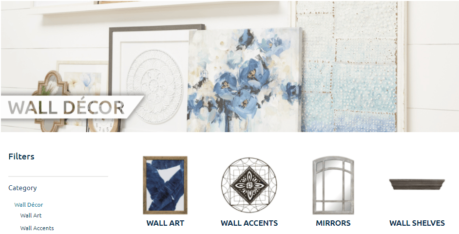
Keep in mind that this advice applies to your whole heading, not your H1 tag. Your H1 tag should accurately describe your page’s content and contain your core target keyword. You have more freedom with your overall heading, though.
For instance, in the example above from Macy’s, the H1 tag is “Women’s,” while “What are you shopping for today?” is the main visual focus of the heading.
If you want to make your product category pages stand out, consider creating more fun and eye-catching headings to draw people in and keep them shopping with your business.
4. Create category and subcategory pages
You have numerous ecommerce product categories, so you must break down your pages into categories and subcategories. This setup enables people to narrow down their focus from a generalized idea to something specific.
Subcategory product pages also enable you to cut straight to the chase for people who have a better idea of what they want.
For example, you may have someone who knows they want a small kitchen appliance. Instead of having to go to the “Kitchen & Dining” category page, they can cut straight to the small kitchen appliances subcategory page to get what they need faster.
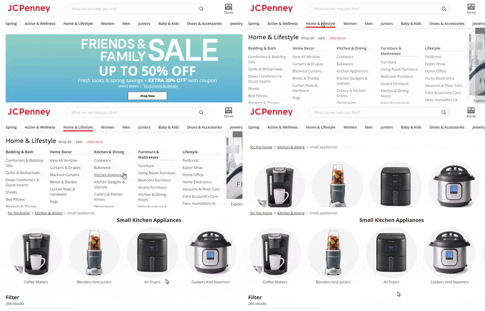
By creating subcategory and category pages, you can help deliver a better shopping experience for your audience that keeps them shopping with your ecommerce business.
5. Make sure category page images are consistent
One of the most essential things about category page design is consistency. People turn to ecommerce product categories when they aren’t sure what they want. It’s a way for them to see what you offer and narrow their focus.
Your product category page is typically filled with images that feature the different products you offer for each category. When you choose your product images, select ones that have a consistent look and feel.
Old Navy is an excellent example of consistent imagery. When you visit their category pages, you’ll find that all the image styles are very similar.
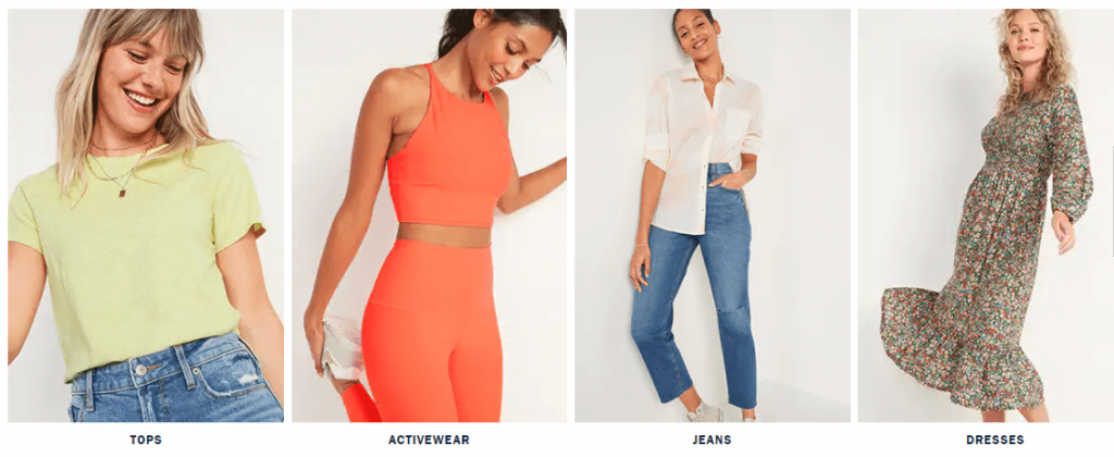
All their category images feature a tan background and have a person modeling the specific subcategory clothes. You don’t see a mixture of modeling and product-only images. Everything is consistent, which gives the page a cohesive and pleasant appearance.
Taking this approach makes it easy for people to concentrate on the product rather than getting distracted by your page’s disorganization. It’s a great way to help you create less cluttered and more consistent pages of your ecommerce product categories.
6. Add breadcrumb navigation
An essential part of category page design is breadcrumb navigation. People who sift through your products using category pages typically aren’t sure what they need yet — they’re browsing around to find the right item.
As they browse different category pages, they may need to backtrack because they haven’t found the correct item yet. That’s where breadcrumb navigation can help. Breadcrumb navigation provides your audience with a path of where they are on your site and enables them to go back to different category pages.
Here’s a prime example from At Home.

If the items under “Plates, Bowls, & Dishes” didn’t have what you needed, you could quickly go back to the “Dinnerware” category page and look for a different subcategory.
Creating breadcrumb navigation enables you to provide a seamless shopping experience for your audience.
Need help creating ecommerce product category pages that rock?
Creating your category pages is a crucial part of helping you deliver a positive shopping experience for prospects. Getting your category pages just right can be a challenge, but it doesn’t have to be. By partnering with WebFX, we can help you develop category page designs that delight shoppers.
With over 25 years of experience, you can feel confident we’ll deliver designs you love. We have an award-winning team of designers and an extensive portfolio that showcases what we can do for your ecommerce business.
Want to get category page designs that drive more sales? Contact us online or call us today at 888-601-5359 to speak with a strategist about our web design services!