Understanding Easing Functions For CSS Animations And Transitions
Have you ever noticed how smooth and delightful animations look on a well-made, professional project? I am reminded of the In Pieces website where animations are used not just for decoration, but they also convey the message about the endangered species in an impactful way. Not only is the animation design and style beautiful, but they also flow nicely and harmoniously. It is precisely that flow in combination with the design and presentation which makes the animation look stunning and natural. That is the power of easing functions, which are also called timing functions.
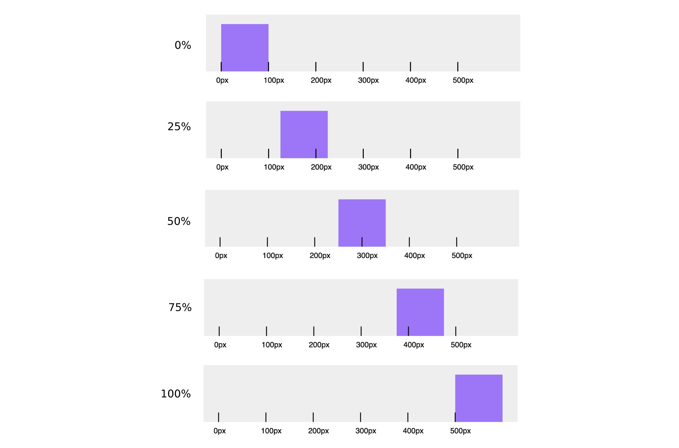
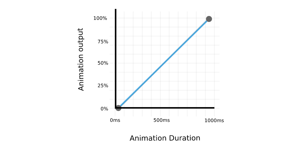
Animation duration determines the amount of time for the animation to go from the first keyframe to the last. The following graph shows the connection between the animation keyframes and duration.
There are many ways in which animation can progress between two keyframes. For example, animation can have a constant speed or it can move quickly at the start and slow down near the end, or move slowly at the start and then speed up until it reaches the end, etc. This rate, or speed is defined with the easing functions (timing functions). If we take a look at the previous graph, the easing function is represented by the shape of the line connecting the two points. We’ve used the linear function (straight line) for the previous example, but we can also use a curve to connect the keyframes.
As you can see, there are lots of possible options and variations for animation easing functions and we’ll take a look at them next.
Types Of Easing Functions
There are three main types of easing functions that can be used in CSS:
- Linear functions (
linear), - Cubic Bézier functions (includes
ease,ease-in,ease-outandease-in-out), - Staircase functions (
steps).
Linear Functions
We’ve covered linear functions in one of the previous examples, so let’s do a quick recap. With the linear timing function, the animation is going through the keyframes at a constant speed. As you might already know, the linear timing function can be easily set in CSS by using the linear keyword.
This is because the first (P0) and last points (P3) are fixed to the start (initial animation state) and the end (final animation state) of the curve, as the animation needs to end on a specified keyframe and within the specified duration. With the two remaining points (P1 and P2), we can fine-tune the curve and easing of the function, resulting with non-linear animation speed.
cubic-bezier(x1, y1, x2, y2)X coordinates (x1 and x2) represent time ratio and are limited to values between 0 and 1 (the animation cannot begin sooner or last longer than specified), while Y coordinates (y1 and y2) represent the animation output and their values, which are usually set somewhere between 0 and 1 but are not limited to that range. We can use the y1 and y2 values that are outside the 0 and 1 range to create bouncing effects.
If the animation consists of several keyframes, defined in CSS @keyframes property, the easing function will be applied to each curve between the two points. If we are applying ease-out function to an animation with 3 keyframes, the animation will accelerate at the start of the first keyframe, and decelerate near the second keyframe and the same motion will be repeated for the next pair of keyframes (second keyframe and the last keyframe).
The following example showcases how various jump terms affect the animation behavior. Various jump terms are applied to the 5-step animation with the same duration.
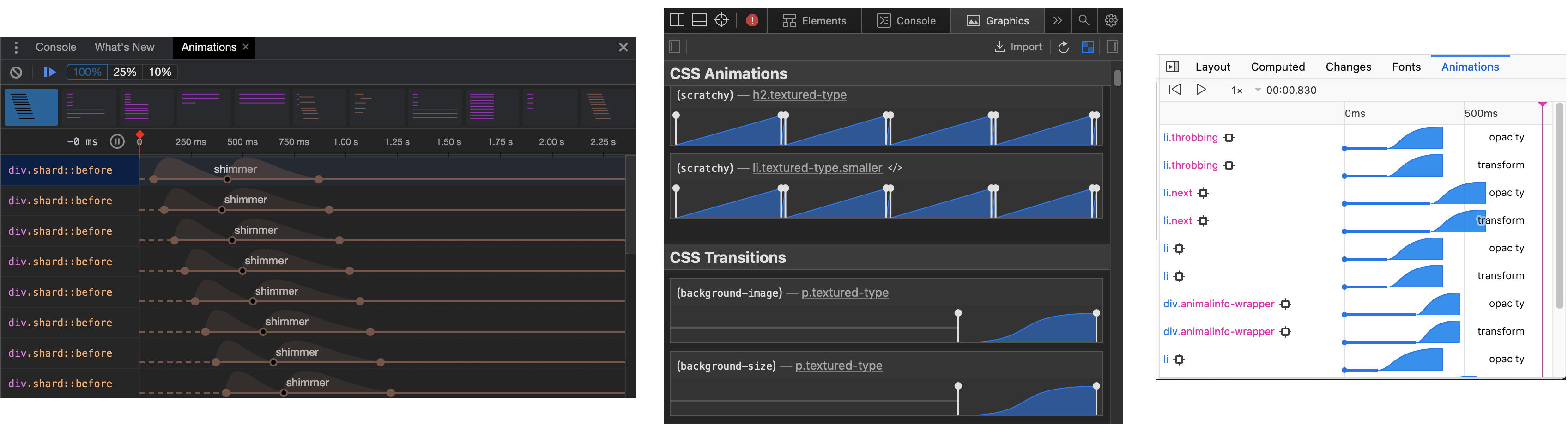
Chrome, Safari and Firefox also offer a dedicated Animations tab in developer tools that offers a more detailed overview, including animation properties, duration, timeline, keyframes, delay, etc.
Useful Tools And Websites
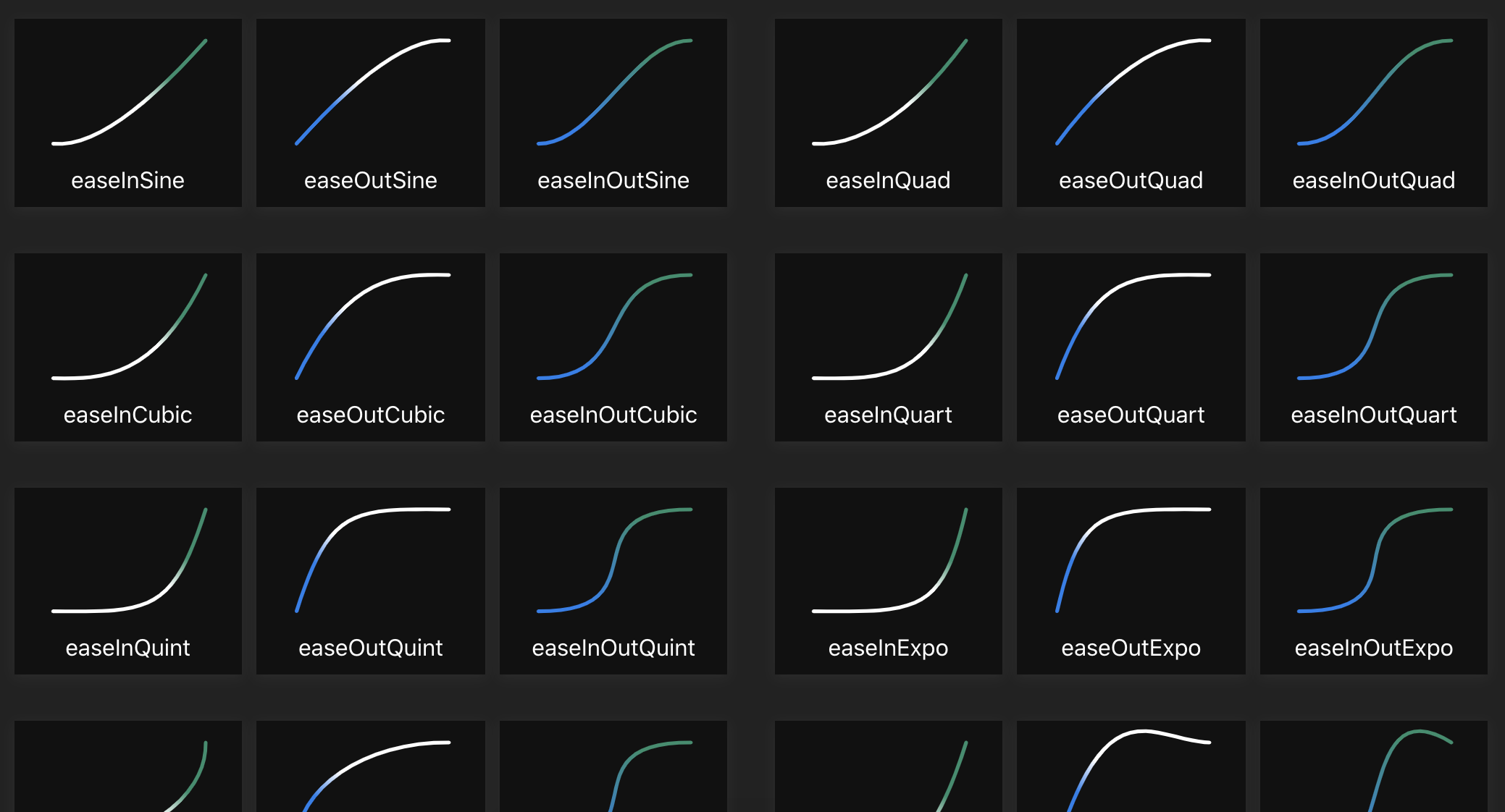
There are plenty of useful online resources and easing presets that can give much more variety to easing functions.
More popular online resources include Easing Functions Cheat Sheet by Andrey Sitnik and Ivan Solovev and CSS Easing Animation Tool by Matthew Lein. These tools offer a wide range of presets that you can use as a foundation for your easing function and then fine-tune the curve to fit your animation timeline.
Animations & Accessibility
When working with easing functions and animations in general, it’s important to address accessibility requirements. Some people prefer browsing the web with reduced motion, so we should provide a proper fallback. This can be easily done with widely-supported prefers-reduced-motion media query. This media query allows us to either remove the animation or assign a different animation based on user preference.
.animated-element {
  animation: /* Regular animation */;
}

@media (prefers-reduced-motion) {
  .animated-element {
    /* Accessible animation with reduced motion */
  }
}
I’ve modified an analog clock example by Alvaro Montoro to include alternative animation for users with prefers-reduced-motion flag set.
See the Pen CSS Analog Clock with prefers reduced motion by Adrian Bece.
On a default animation, the seconds hand of the clock is constantly moving which may cause difficulties for some users. We can easily make the animation much more accessible by changing the animation timing function to steps. In the following example, users with prefers-reduced-motion flag set will be displayed an animation where seconds arm ticks every five seconds.
@media (prefers-reduced-motion) {
  .arm.second {
    animation-timing-function: steps(12);
  }
}
Conclusion
Easing functions, or timing functions, change the animation’s look and feel by affecting the animation rate (speed). Easing functions enable us to create animations that resemble natural motion which can result in improved, more delightful UX and having a better impression on the users. We’ve seen how we can use pre-defined values like linear, ease-out, ease, etc. to quickly add a timing function and how to create custom easing functions with cubic-bezier function for more impressive and impactful animations. We’ve also covered staircase functions that can be used to create “ticking” animation and are rarely used. When creating animations, it’s important to keep accessibility in mind and provide an alternative, less distracting animations with less motion to users with prefers-reduced-motion flag set.
There are plenty of browser and online tools that can simplify and streamline creating custom easing functions, so creating animations with a beautiful flow is easier than ever. If you haven’t done so already, I would recommend experimenting with various easing functions and creating your own easing function library.
References
<easing-function>, MDN Web Docs- “Work With Animations,” MDN Web Docs
- “Web Animations In Safari 13.1,” Antoine Quint, WebKit
- “The Basics Of Easing,” Paul Lewis, Web Fundamentals, Google Developers
- “Inspect Animations,” Kayce Basques, Chrome DevTools, Chrome Developers