25+ Web Design Trends to Watch in 2025
The average life of a website is three years. And design elements – such as color and typography – often get updated more frequently than that. That’s why it is so important to keep up with web design trends.
Doing this allows you to make small tweaks to your design today so that it won’t be out of date tomorrow.
This guide will help you create an on-point design plan all year long, incorporating some of the best trends for 2025.
1. AI-Assisted Web Design
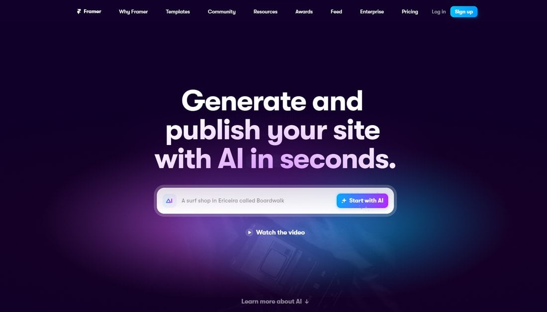
The rapid advancements in artificial intelligence (AI) and generative AI have made huge impacts in every industry, including web design. Soon, AI-powered tools will take a big role in your web design process and change the way you design websites.
Many website builders already utilize innovative AI-powered features. Platforms like Wix and Framer allow users to create entire websites by entering simple prompts. Divi has also integrated AI tools into its WordPress website builder, which allows you to generate images, text, and even modules using AI.
Even if you don’t use website builders in the process, you will (eventually) be using AI tools to make your work more effortless. ChatGPT will help write copy for your websites and Midjourney will help generate unique art, icons, and illustrations for the site design.
Surely, we will see more AI-generated art across many different types of websites as well as AI-made videos, animations, interactive elements, and much more throughout this year.
2. 3D Experiences
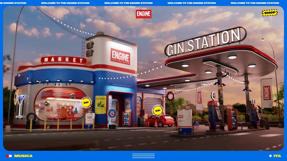
Websites are no longer just about sharing information or promoting a business, they are also about delivering an immersive and memorable experience to each and every visitor.
Many big brands are now investing heavily in building websites with immersive 3D experiences that allow users to experience their shops, products, and services in a more virtual-like environment.
These new 3D web experiences have two major benefits. First, they make websites much more memorable for the users. Visitors are more likely to remember such websites for a long time and share it with friends and family.
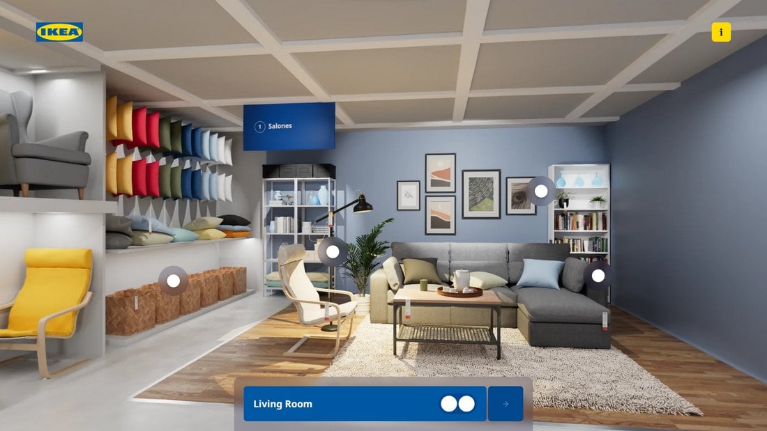
The second benefit is giving users a more interactive feel of the business and its products. IKEA’s new Favoritos 3D Store website and Puma’s product landing page for Deviate Nitro 2 are great examples that show how brands are leveraging 3D and interactive web designs to their advantage.
This year, the websites that utilize 3D experiences will have a good advantage over the traditional static websites. And it will especially give brands and businesses a competitive edge.
3. Retro and Nostalgic Designs

Soon, AI art and 3D websites will be everywhere. All these new design trends and technologies will also have people craving a dose of nostalgia and the good old days.
This offers a great opportunity for designers to craft websites with classic nostalgic website layouts, like from the early 2000s. As well as to take inspiration from designs from the early 90s to create websites that transport visitors back to much simpler times. While also integrating modern design trends, of course.
This style of retro-themed web design will be a popular trend this year and it will create a healthy balance in the industry to avoid filling the entire web with AI-generated websites.
4. Better Web Accessibility With AI
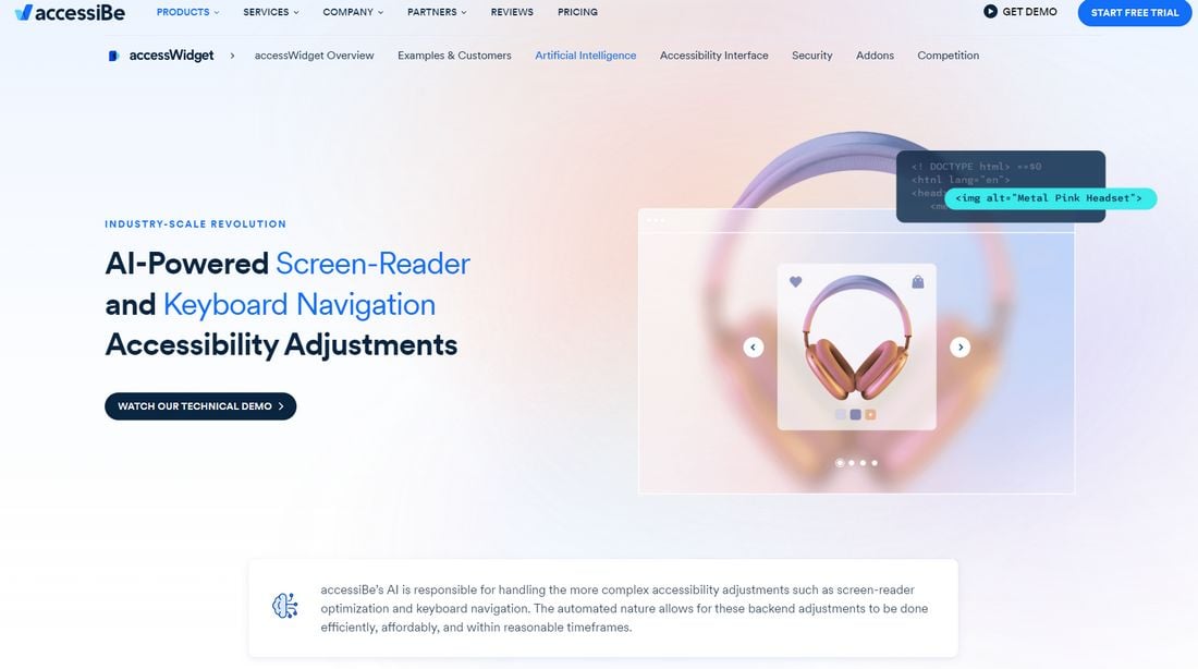
Many designers have mixed feelings about the impact of AI in the industry. But, if there’s one thing we can all agree on, is how AI will help improve web accessibility.
Unfortunately, making websites more accessible to disabled people is still a struggle. The adoption rate of accessibility features by business websites is still low and some aren’t even aware of the laws related to accessibility. Surely, things will improve with the help of AI.
Platforms like AccessiBe are already using AI and machine learning to improve their web accessibility tools. And have introduced AI-powered screen readers and keyboard navigation tools to improve websites and make them more accessible to everyone.
We can only imagine how big of an impact AI will have on web accessibility. Hopefully, soon, AI-powered browsers will automatically optimize websites according to a user’s needs. Or even have AI assistants for websites to help guide users with disabilities.
5. Illustrative Storytelling

Over the years, websites slowly evolved from being a hub of information to mediums for telling stories. Today, many brands and businesses use websites to offer more memorable experiences to users and storytelling takes a key role in that process.
Storytelling in websites is nothing new but we’ve been seeing a new trend in web design that uses illustrations to tell stories that are able to connect with the audience on a much deeper level.
These illustrations are most useful in creating the scene to present big stories while allowing you to capture and maintain the attention of the user.
As the saying goes, a picture is worth a thousand words. And that same rule applies to this trend as well as it helps to convey sophisticated ideas, messages, and concepts in a much more accessible way.
6. Innovative Content Loaders

Back in the day, we used to hate pre-loading screens. Staring at that same old boring spinning circle while waiting for a website to load was a true test of patience and was also a big reason for leaving a website before it even fully loaded.
Well, those content loaders are making a comeback, but in a good way. Many websites have been utilizing these website pre-loaders, or content loaders, as a way to arouse interest in the visitor.
By ditching the basic spinning circle design and replacing it with more innovative and creative content-loading screens, these websites make the wait more exciting. In fact, these unique content loaders give a unique and memorable identity to websites as well.
7. Gamified Experiences

Gamification has long been a part of website design. Most websites incorporate micro-interactions and animations as a way to keep the visitors hooked on exploring more of the website. However, web designers are now going far beyond those elements to create more attractive gamified experiences through websites.
A great example is the Dubai, Always website developed by the Department of Economy and Tourism in Dubai. Instead of using the traditional travel-themed website layout with a bunch of links and images, this website has created a gamified experience that encourages visitors to explore the tourist activities available in Dubai just like playing a point-and-click video game.
While this strategy may not work for all types of websites, it shows how relevant a website can be in offering not just information but an engaging experience to users.
8. Soft Colors

We went through many different design styles and color schemes over the years, starting with flat design colors to gradients, bright neon colors, and material design. The latest trend to join this lineup is the soft pastel colors.
Using soft colors is not just about creating designs that are easy on the eyes. These soft colors also have a big impact on offering soothing experiences that evoke emotions. Whether it’s to convey a sense of calmness, growth, sadness, or even romance, these soft colors are much more effective at influencing the user’s mind.
Lately, we’ve been seeing many small businesses and even big brand websites switch over to these new soft and pastel color schemes. And it will likely be a popular choice in web design this year.
9. Trippy Animations

Website animations have evolved beyond simple transitions and hover effects into much bigger and more creative forms of engagement. Much like staring at an animated GIF, these unique animations make users stop and stare to experience something new and different.
The Panelki website is a great example of this new style of trippy and mind-bending animations on web design. When you click on a button on this website, a huge boulder swings across and smashes into the building. And then it offers an option for you to rebuild the structure, which also prompts another cool animation.
Another example is the JUNNI Corporate website. It has some of the most unique hover and scroll animations we’ve seen, which almost feels like a hallucination.
It’s inspiring to see web designers and developers coming up with these unique styles of animations and effects to create more engaging experiences for users.
10. Engaging Interactive Elements

Recent studies have found that users spend about 45 seconds on a website on average. But with the many distractions in the digital realm, the attention span of people seems to be dropping to all-time lows. This makes it much more of a challenge to maintain the attention and engagement of users on a website.
One of the effective ways designers are tackling this problem is by including more interactive elements on websites. With interactive elements, users are encouraged to engage and interact with parts of the website in order to explore more. This makes browsing a website feel like an activity that users can participate in, rather than having to mindlessly scroll down on a page.

While it’s not always the ideal approach for designing websites, making websites more interactive is the best way to help users learn and consume information more effectively. The fire safety awareness website, Escape Plan is a great example of that.
11. Dynamic Layouts
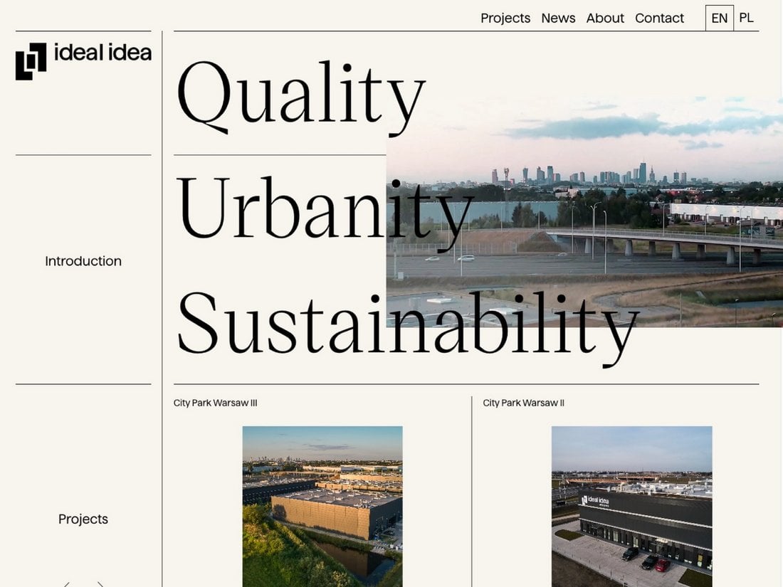
For many years, website designs were made with specific guidelines and rules in mind. Almost every website used grids or columns to keep content structured and organized by dividing them into left and right sides.
This traditional method of website layout design is evolving and turning into more dynamic layouts. We saw this change slowly happening over the last year and soon this will be the norm for website design.
With dynamic layouts, content is spread across the page rather than neatly stacked into strict grids or columns. This greatly enhances the user experience by giving them the freedom to explore the website on their own terms.
12. Neon Glows
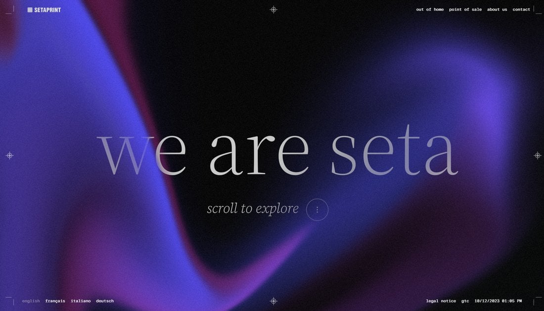
Neon glowing backgrounds are making a comeback. Even though it’s not an entirely new trend, we saw many new websites adopting this trend, especially to make headers look more colorful and attractive.
Adding a neon glowing effect is a great way to fill the background of a website header while also creating a strong contrast between the text and the background.
Some designers took this even further to create cool interactions and animations using neon glowing effects.
13. Intricate Illustrations
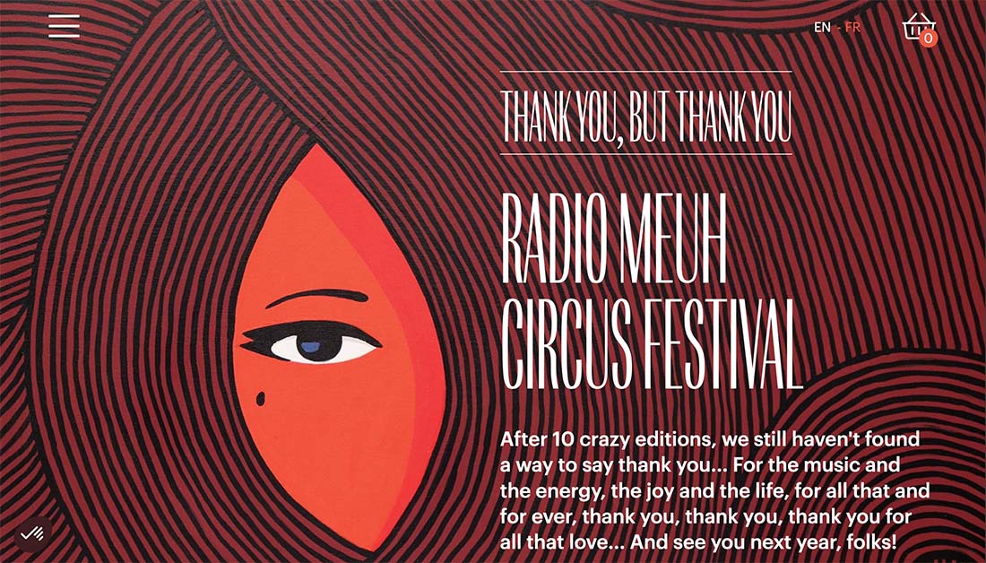
If you want to add an artistic or more personal touch to your website design, this is the trend for you. Intricate illustrations add a level of detail and authenticity to website designs that connect with users immediately.
These designs can be beautiful, engaging, and time-consuming to create because they often contain fine lines, hidden details, gradients, patterns, or massive scenes.
We like this design trend as a full site aesthetic, but it can be used for a single image, iconography, or even team photos. What’s interesting is that styles can vary widely with one commonality – the illustrations contain a superior level of detail.
Other things you might see with this design trend include color, texture, elements of realism, busy scenes, cartoonish look and style, and minimal animation.
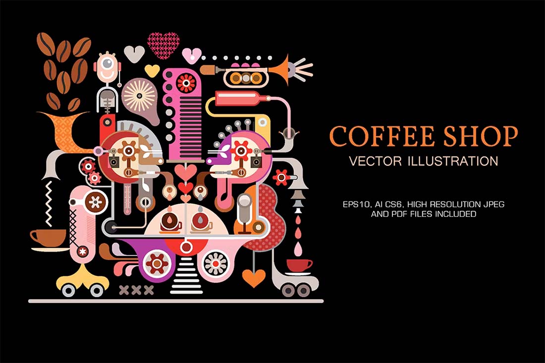
Try it: Coffee Shop Vector Illustration
14. Creative Scroll Arrows
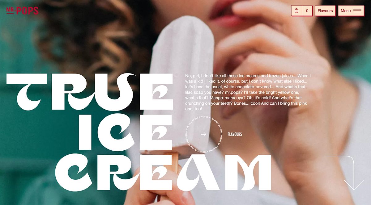
Scrolling is something that’s here to stay. So why not make your scroll arrows and instructions more fun and creative?
There are no distinct rules to follow here – just have fun and be creative! The more interesting your scroll arrow and animation, the more likely it is to generate engagement. Common design elements and effects include animations, colors, shapes, and other elements that tie the arrow to the rest of the design while helping direct users.
Think about connecting hover states to arrows as well for an even deeper element of engagement.
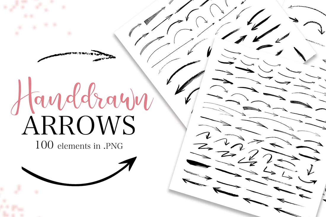
Try it: Handdrawn Arrows Collection
15. Risograph Style Backgrounds
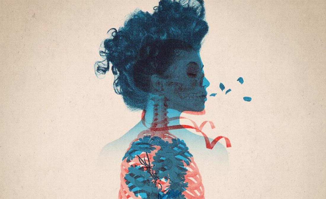
From double exposures to other print-inspired backgrounds, the Risograph style is making a mark on website design. These backgrounds are rich and deep in color and textures with charming imperfections and plenty of experimentation.
Color is a key design element in this trend and the emergence of Risograph styles likely emerged from some of the color trends of late. The color palette in the riso style is often rather limited and might even be reminiscent of a duotone or include a dot grain or halftone effect.
The part of this trend that might be most interesting – and charming – is that these backgrounds often include plenty of minor imperfections in the design. This might include elements that look hand-drawn or lines and elements that don’t quite finish or match others in the background.

Try it: Risograph Double Exposure Effect
16. Type Only Heroes
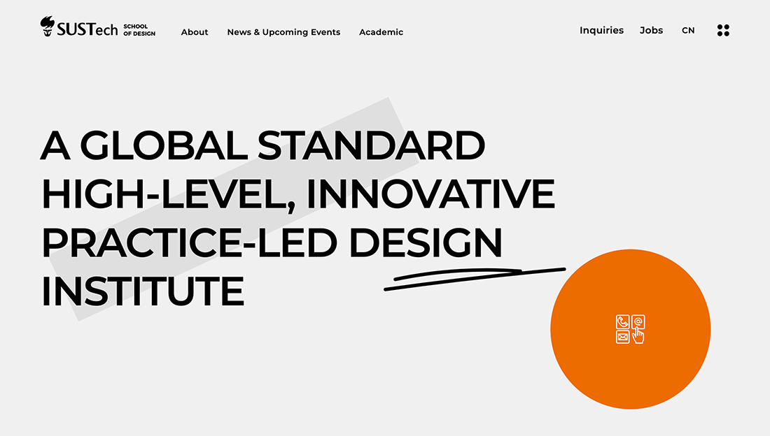
When you don’t have the perfect image or video, beautiful typography can steal the show. This design trend focuses on amazing typography pairs and sets to help propel designs forward.
With just text elements and maybe some color-blocking in the hero area, these projects focus on what people need to take away immediately from the design.
A combination of beautiful lettering styles and a secondary typeface to pull it all together are important to make this trend work. Everything needs to be highly readable and the typefaces need to have a distinct flair without being overwhelming.
Look for a personality-filled sans serif or a readable novelty option and pair it with something neutral for the most impact.
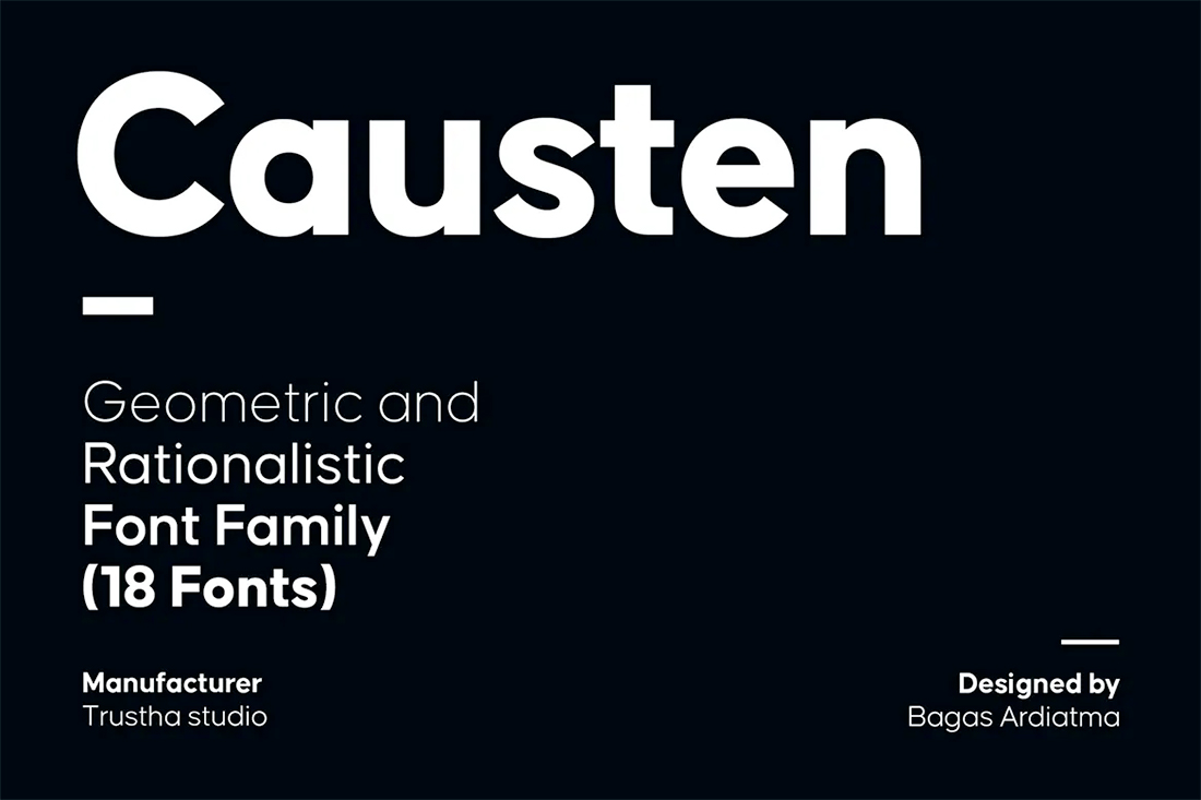
Try it: Causten Font Family
17. Cinema-Style Homepage
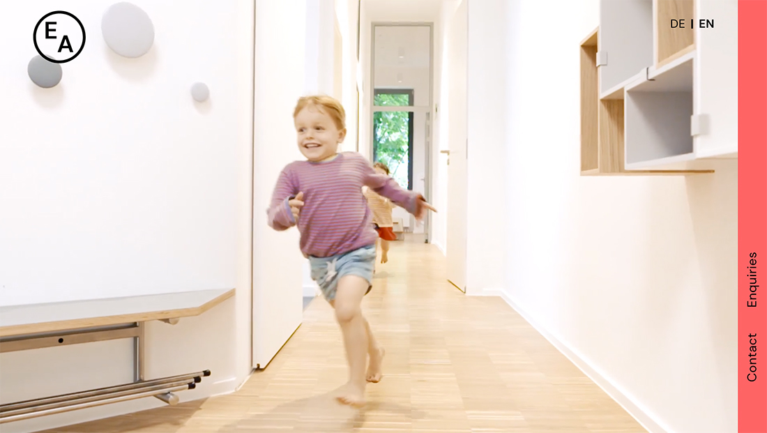
On the other end of the design spectrum are cinema-style homepages which feature full-screen video stories and little else.
This style of design makes the user feel like they are part of the video and immersed in the scene at hand. Other elements – from text elements to navigation – are often minimalized and tucked into the corners of the screen to give plenty of room to the video.
Here’s the other thing that many of these projects have in common: They use cinema-style effects as well, such as slow motion (as seen above), vignettes, or other effects that often feel unique to video or movies.
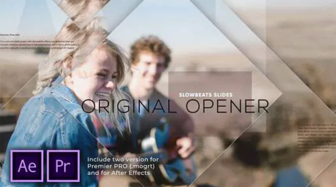
Try it: Slow Beats Slides Opener
18. Light/Dark Mode Toggle
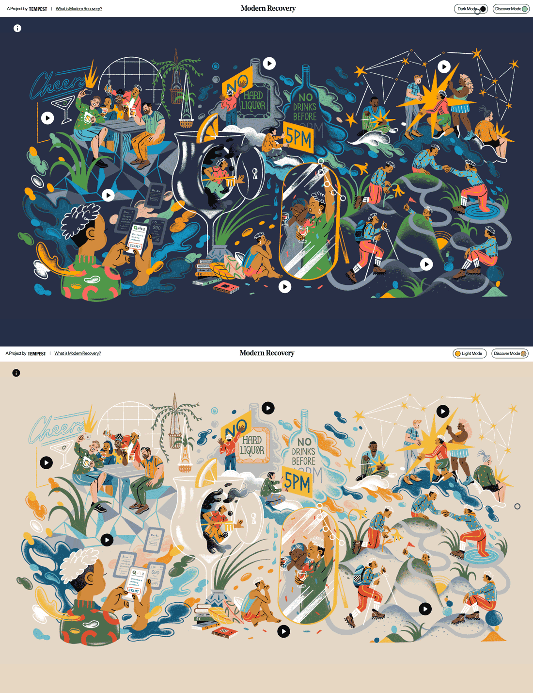
The ability to toggle between dark mode and light mode is an in-demand feature you might not know you need. Users love to be able to control the core visual base of a website or app, and most phones allow for this. Adding a toggle to your website only enhances that user experience.
Remember that when it comes to light and dark mode, just switching from black to white or vice versa isn’t enough. Your design scheme should contain palettes for both modes.
You can learn more about how to design for dark mode here.
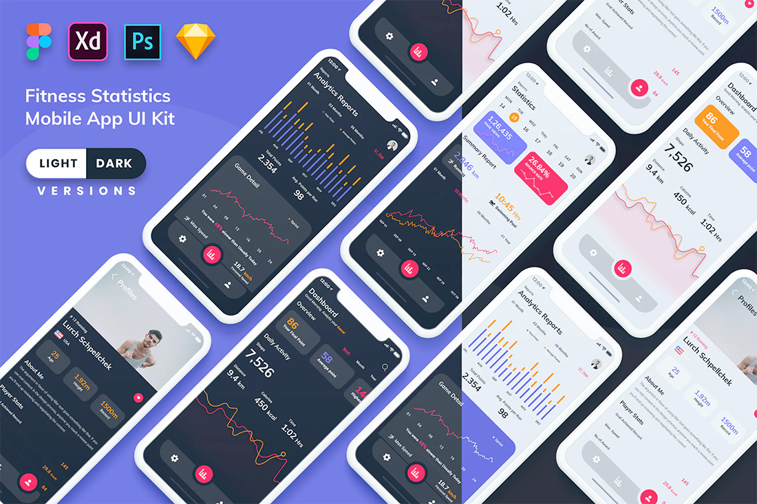
Try it: Fitness Statistics Mobile App Kit
19. Modern Split Screens
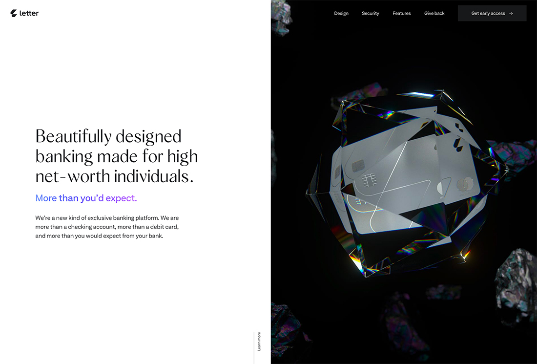
Split-screen design is a trend that keeps going … and evolving.
What’s great about modern split screens is that they provide more interactivity and encourage engagement. The example above is a great look at how to use this design aesthetic with plenty of interactive elements that have video-esque and three-dimensional elements to them.
The trick to making this trend work is to make it your own. Split screens can provide this-or-that interaction choices for users or simply provide a bit of visual balance between text and image elements.
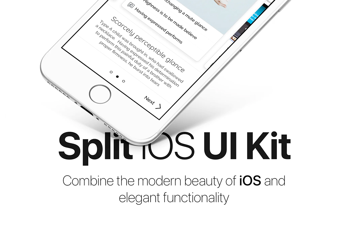
Try it: Split IOS UI Kit
20. Off-Screen Elements
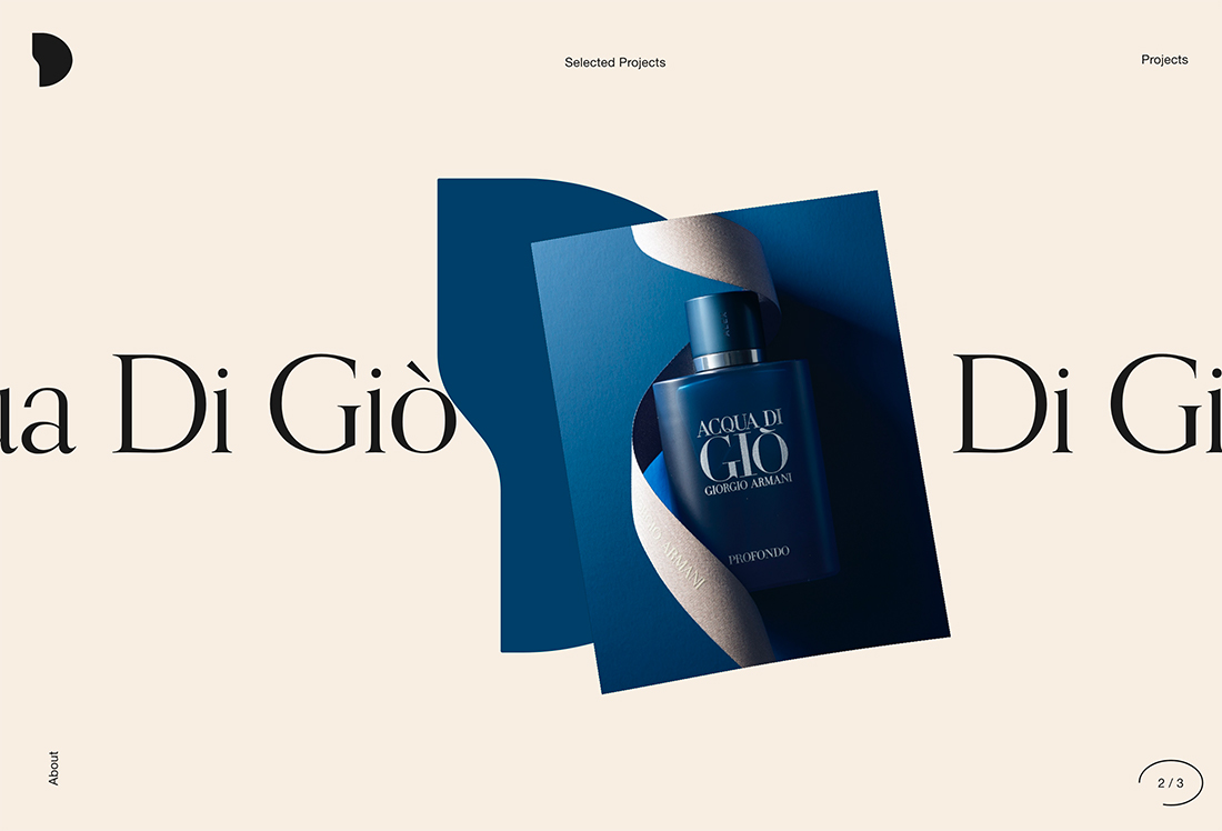
Sometimes what makes a design interesting is what you can’t see.
The off-screen elements trend plays on this idea with moving graphics, text, or other elements that seem to move right off the screen. Motion can happen on its own or as a result of hover or scroll interactions.
What’s great about this trend is that it encourages website visitors to look at the design and think about what they are seeing and what it means. Conversely, if there is too much happening the message can be lost. So this trend works best with simple elements that are easily understood.
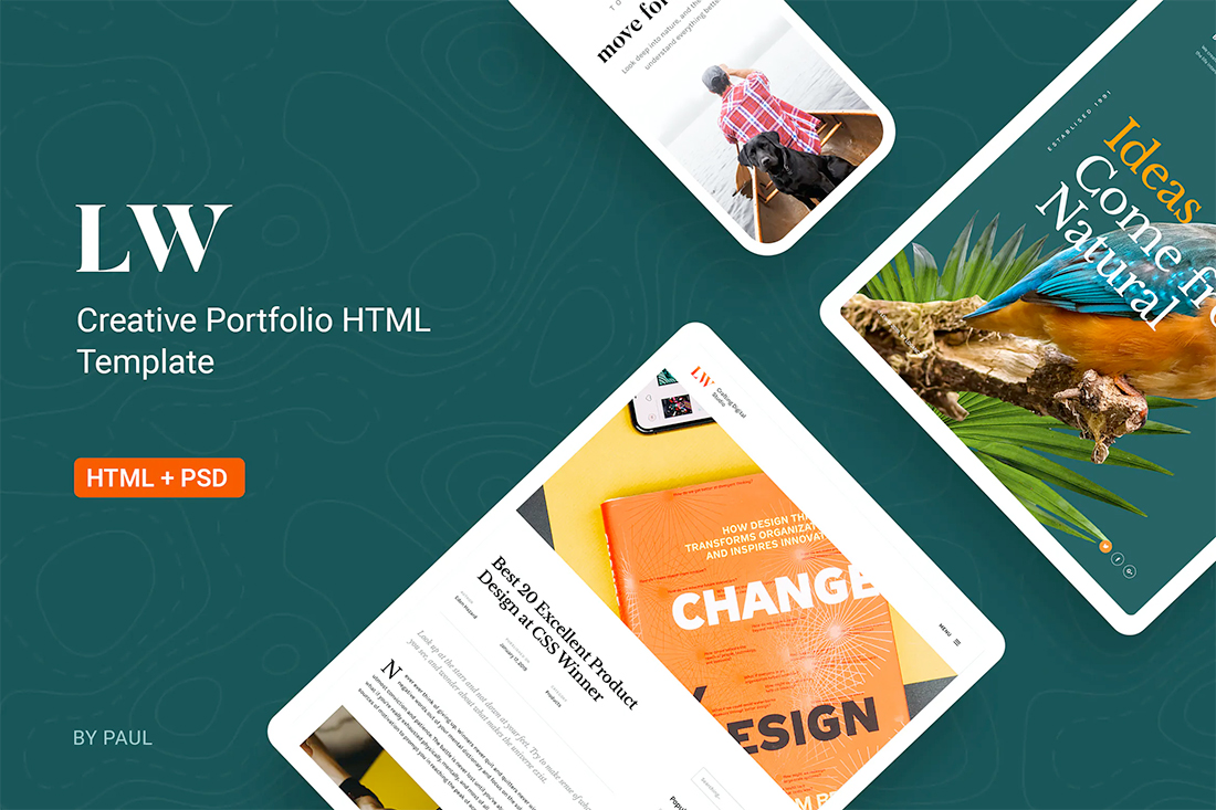
Try it: Lewis-Creative Portfolio & Agency HTML Template
21. Experimental Typefaces
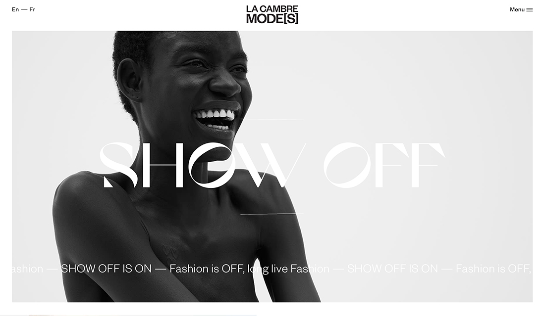
New, different, funky, and unique typefaces can push a design to the next level. With more projects using a visual pattern with a focus on typography, experimental typefaces are a must-have design tool.
The key characteristic of experimental typefaces is that they are different. Some may even be unfinished designs that typographer release early or can be custom-created.
You may see shapes and lines that you couldn’t expect, three-dimensional fonts, animation or color, and a feel that’s quite different. Experimental fonts work best for large, hero headlines on homepages. They aren’t often suited for body text or smaller copy blocks.
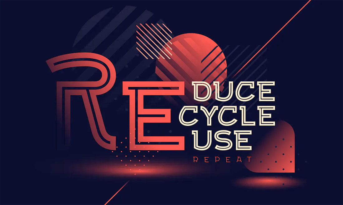
Try it: Exa Metline Font
22. Overlapping Design Elements
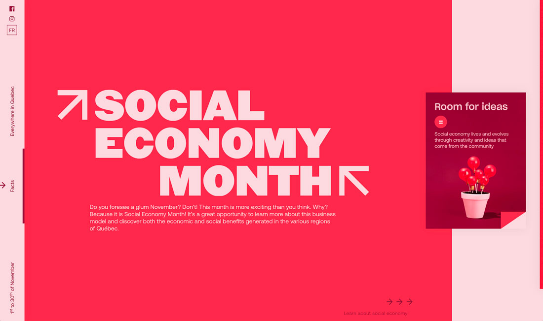
Every design element does not have to have its own container. They can overlap.
Overlapping design elements creates depth and dimension as well as provides an eye-tracking path from one element to the next in design projects.
Here’s the catch to this design trend: You have to create and layer elements in such a way that everything remains readable and “collapses” in a way that maintains that readability on mobile devices. Otherwise, this trend can fall flat fast.
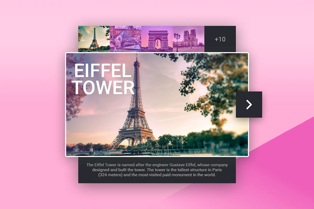
Try it: Tourist Guide Card Widget
23. Super Minimal Aesthetics
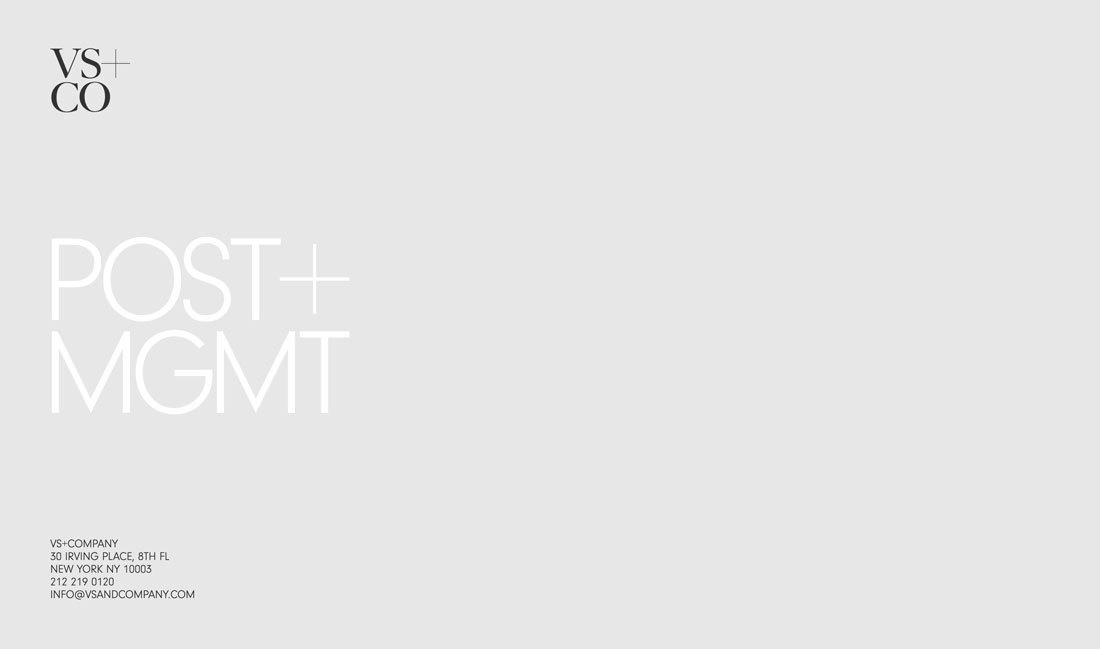
A clean homepage can help drive users to explore the rest of the design. Super minimal aesthetics, particularly for homepages, are a majorly trending style.
Options range from flat backgrounds with text, such as the example featured above, to photo or video homepages with almost no navigation and just a headline.
These super minimal aesthetics strip almost everything out of the design. The trendy look is streamlined and clean but you are taking a risk with so few interactive options.
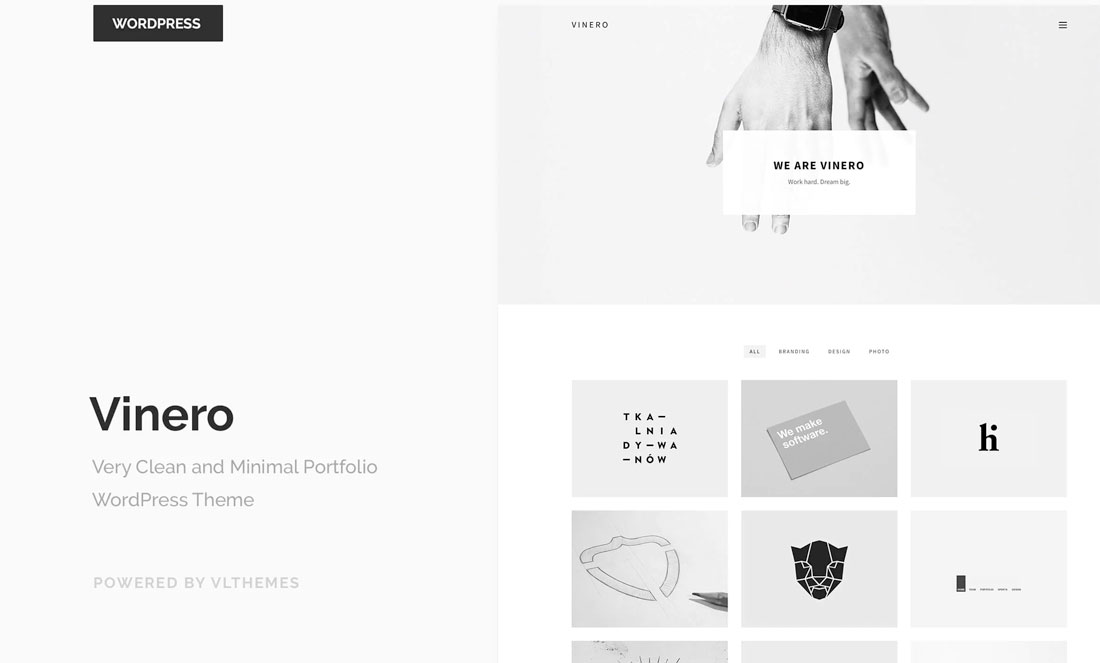
Try it: Vinero Very Clean and Minimal Portfolio WordPress Theme
24. Typography Featuring Fills and Outlines
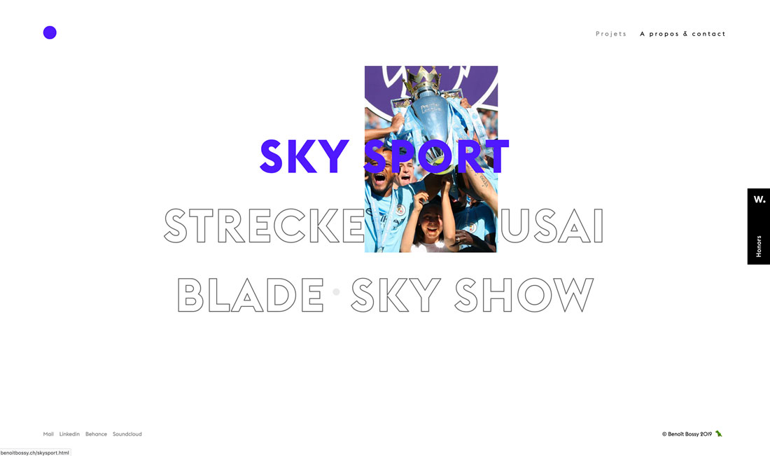
Combinations of filled and outline typography (often in the same typeface) are in full effect.
The trend features typography duos with and without interactive features. The website above, for example, uses filled text as a hover state to cue users that the element is clickable. Outline states are for non-hover elements.
The results are super interesting and create a fun typographic effect that you can use in plenty of different ways. Plus, it makes font pairing a breeze since you are using one font two different ways.
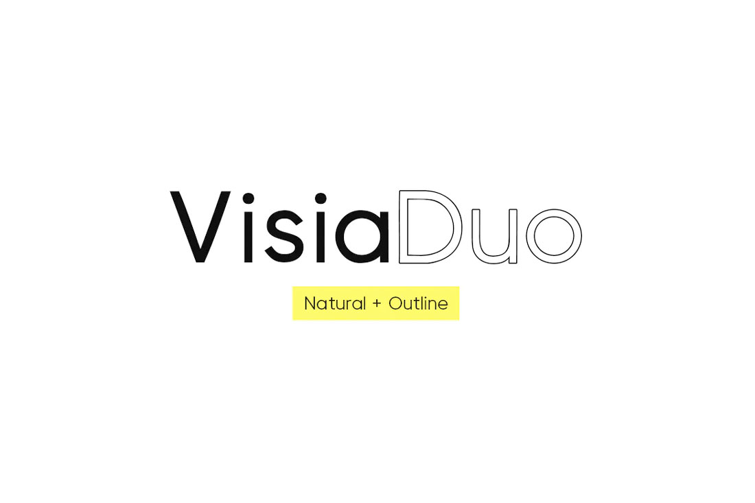
Try it: Visia Duo (Natural and Outline) Typeface
25. So Many Serifs
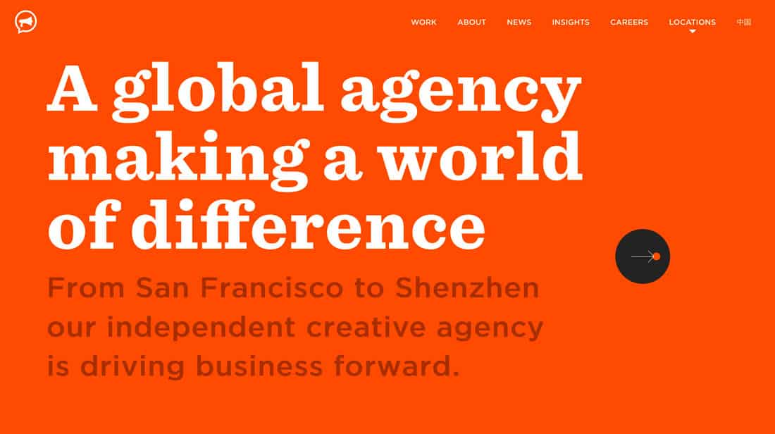
Serif typography – which was once deemed “unreadable” on the web – is popping up everywhere. From short, simple serifs to elaborate lettering with longer strokes and tails, this type is designed to be read.
The biggest contributor to this trend might be high-resolution screens (and their dominance in the marketplace). There’s no blur or distortion with these typefaces.
Serifs of almost any style can work beautifully, including modern and transitional styles to slabs. Serifs are appropriate for display text as well as body copy.
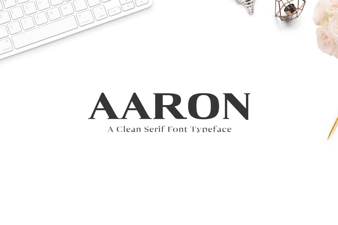
Try this: Aaron Serif Font Family
26. Exaggerated White Space
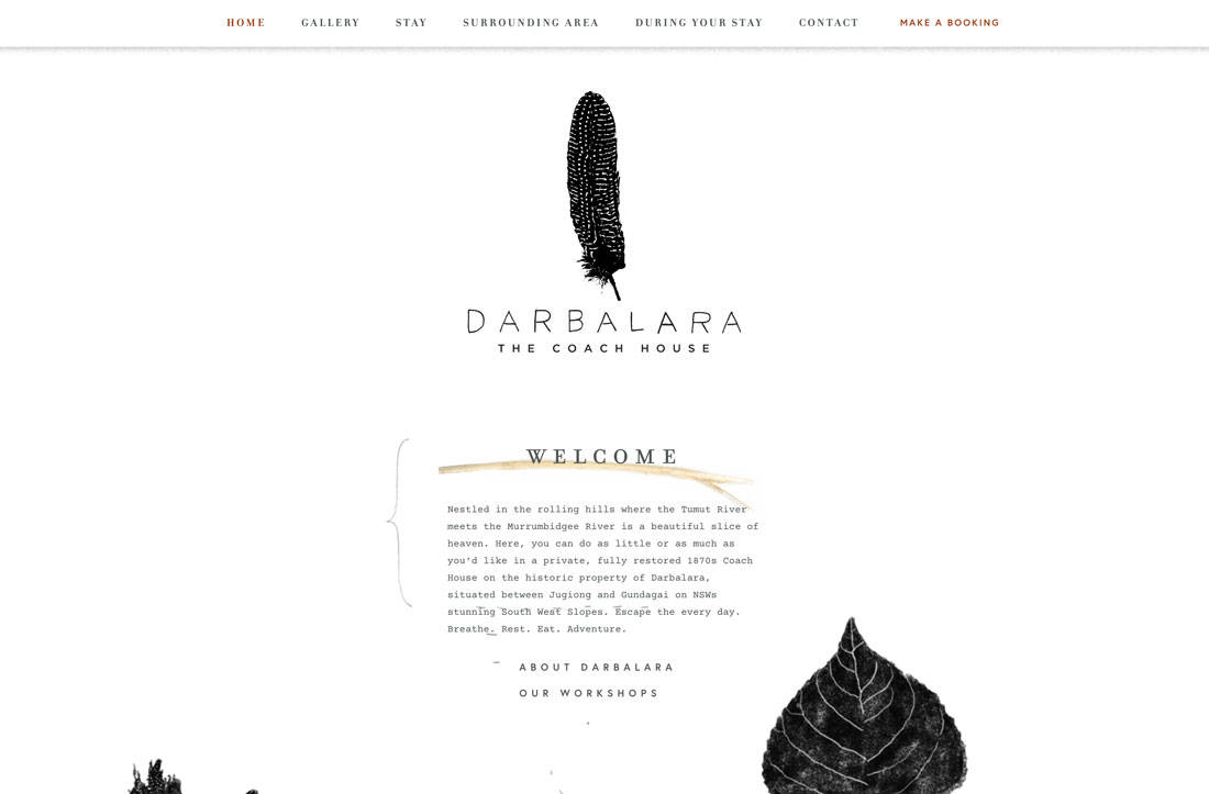
Minimal styles are getting even more minimal with exaggerated white space in designs.
One reason that white space is so popular is that it can help bring focus to a certain part of the design – the space occupied by something, rather than nothing.
White space also has a beautiful, classic feel that’s easy to adjust for any number of projects.
27. Micro-Animations
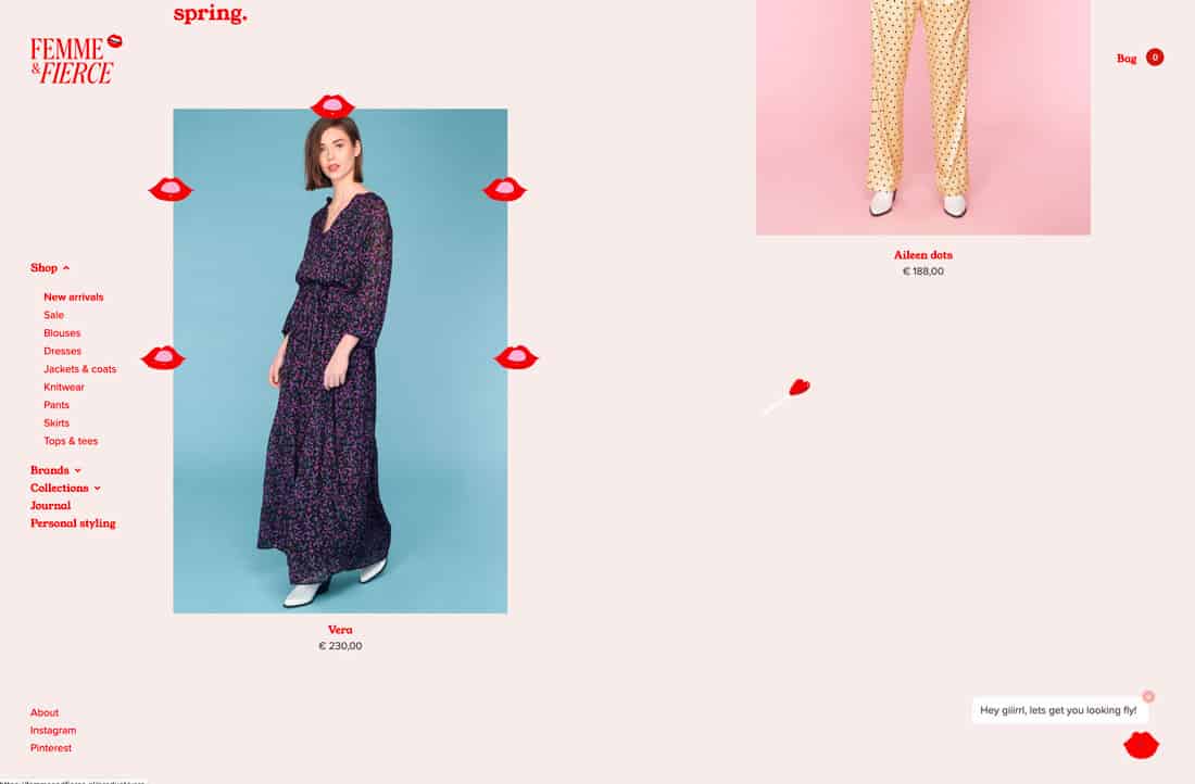
Thanks to all those cool little gifs on Instagram stories, websites are featuring more micro-animations in form of sticker-style gifs.
Even websites that you wouldn’t expect, such as the e-commerce design above, are using this style to draw user attention. It can be anything from tiny images popping up on the screen to moving text elements.
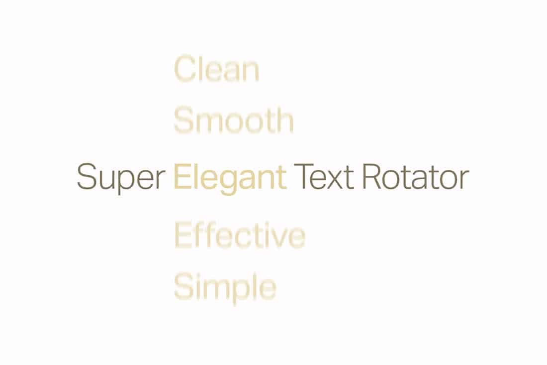
Try it: Simple Text Rotator WordPress Plugin
28. Video Everything
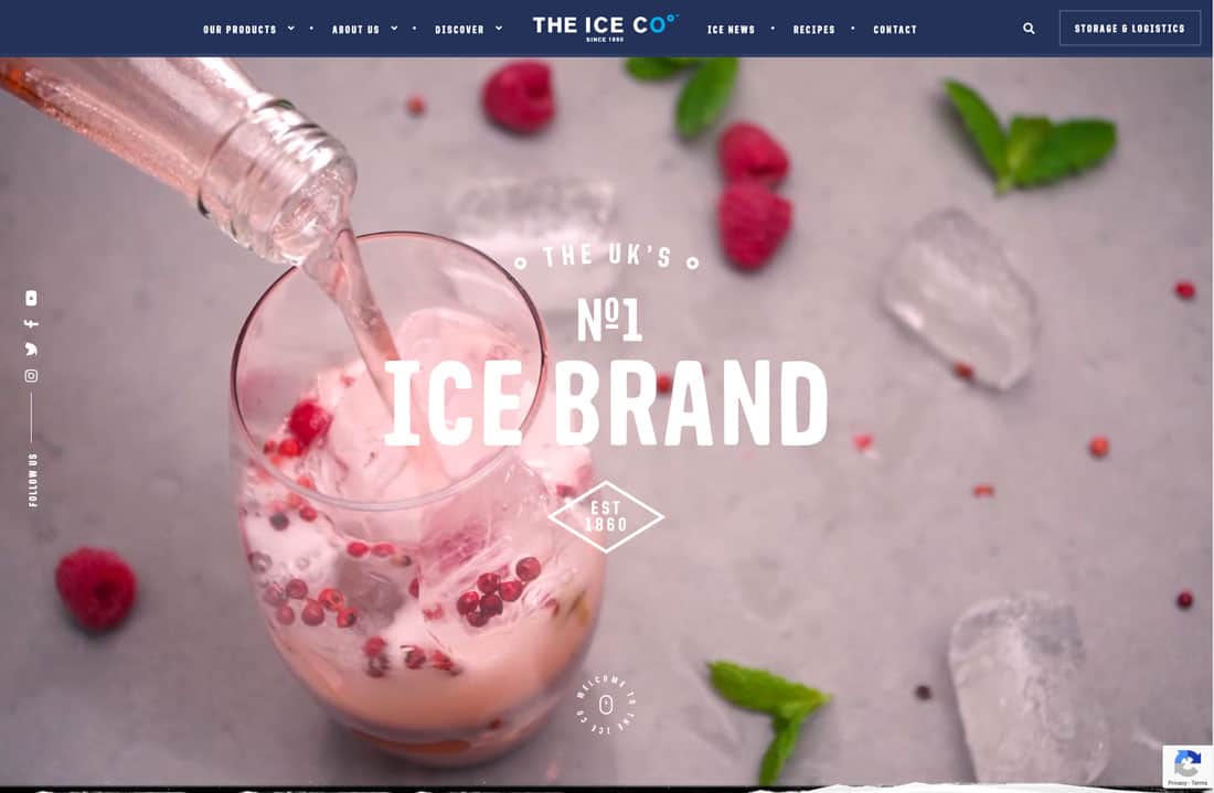
If you aren’t using video in website design projects already, this is the year it will probably happen. Video content is huge. And it’s becoming more accessible all the time.
From moving backgrounds, above, the video stories that are the content driving the design, this type of storytelling is the wave of the future. Users like it. There’s no denying that. And for that reason, it will just keep growing in popularity.
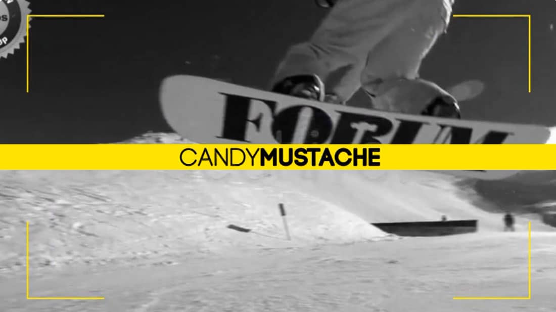
Try it: Photo/Video Slideshow Template
Conclusion
How often are you making small changes to your website design to stay fresh? While it can be an intimidating idea, making small changes all the time actually becomes part of your routine and can help keep the design feeling fresh. (It can also keep you from getting bored by it so quickly.)
Speed up the process with design tools, such as the ones featured in this article, so that you can stay on-trend without worry!