8 Web Design Tips for Converting More Visitors into Customers (+Examples)
To convert as many visitors as possible, you need the joint effort of copywriters, web developers, web designers, and SEO specialists. You can’t nail one of these areas and expect stellar results. They all need to play well with each other, be on-brand, and follow some best practices to help you grow your business.
In this post, we’ll talk about a crucial piece of the puzzle – web design. Let’s take a look at eight ways web design can help you boost your conversion (and even retention) rates.
Balance Functionality with Design
A common mistake a lot of brands make with design is that they forget to align it with what the page in question actually needs to be doing. They follow the same pattern across their entire website and don’t take into account the purpose of each individual landing page.
While cohesion is an important web design practice, you have to pay attention to the functionality of a page as well. The goal is to find a way to align the two.
For example, Affinda’s invoice extractor has done a great job of featuring a USP at the top of the page but also cutting straight to the chase and letting visitors test their product out.
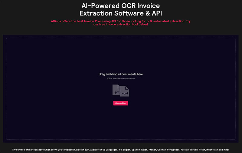
Source: affinda.com
Had they placed functionality last, the tool would have been located at the bottom of the page, preceded by a bunch of optimized copy.
Give Your Visitors What They Want
The people who land on your website all want something for you. Unless we’re talking about direct traffic and repeat visitors, the people who are checking you out for the first time have certain needs and wants.
The better you understand them and align your design to these needs, the higher your chances of converting them. For example, Lydia Elise Millen’s website caters specifically to her audience. Apart from the blog posts, she also features direct paths to her Karen Millen clothing collection and her social media, plus she gives visitors a chance to shop her outfits and recommended products.
Follow a Logical Hierarchy
Your pages also need to follow a specific logical hierarchy. You don’t want to bombard your audience with random information. It needs to be organized according to importance – for the reader, not for your brand.
If you start with elements that highlight your own agenda, chances are most visitors will click off sooner rather than later.
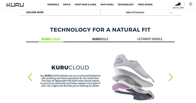
Take a look at this page on orthopedic shoes. It provides a lot of useful information, clearly organized into different sections. Visitors can scroll down at their own leisure and take in what they are actually interested in, as opposed to having to read a whole lot of copy they don’t care about.
Source: kurufootwear.com
Customize CTAs
CTAs are arguably the most important element of any page that strives to convert visitors. It’s the one button that screams “take action now.” Or, at least, that’s what it should be doing.
Good CTAs will stand out. They will be colorful but not garish; they will match the color scheme of the rest of the website; they will be large enough to stand out but not too big, and so on.
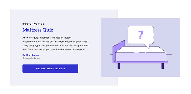
You also want to make sure the CTA highlights the benefits of clicking. For example, this mattress quiz has a great call to action. “Find my expert-backed match” sounds much better than “get started” or even “find the right mattress for you.”
Source: eachnight.com
Use Pop-Ups Cleverly
To boost conversion rates, you sometimes need to grab your visitors’ attention and literally pop an offer right in front of their eyes. This is ideally done when they are about to leave, not when they’ve just arrived, and not while they’re still browsing.
Remember: pop-ups are intrusive. You don’t want to interrupt a visitor, and you don’t want to annoy them. Gently nudge them, for example, about a discount you offer if they sign up for your newsletter.
Technogym has a good pop-up that offers free tailored programs for two months. And you only hear about this offer as you’re about to leave, so a conversion is much more likely. Once you see how good the app is, you’re likely to stick around.
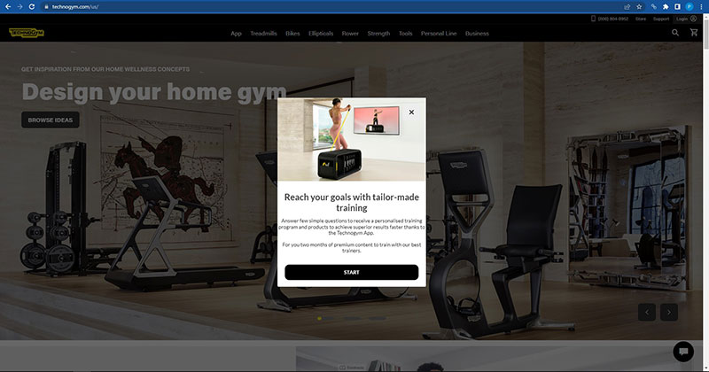
Source: technogym.com
Put a Face on It
Human-centric design can significantly boost your conversion rates. And when we say “human-centric,” we mean design that incorporates humans.
Putting a face on your brand helps visitors identify with it. You’re no longer some faceless business – you are a collection of people. It’s much easier to connect with people than it is to connect with brands as such.
See what KlientBoost has done. They feature a bunch of smiling faces in the hero section of their homepage. It’s much easier to imagine yourself working with these humans than it is to give your trust to a marketing agency you hardly know.
Negative Space Is Not Just White
White space is very important in web design. It helps pull a visitor’s attention where it needs to go, and it makes pages feel lighter and less claustrophobic. It’s easier on loading speeds, and it makes you feel like you’re reading a book. Well, somewhat, at least.
However, don’t forget that negative space does not have to be white. It can actually be very colorful and achieve a cohesive and interesting effect. It just has to be light and muted.
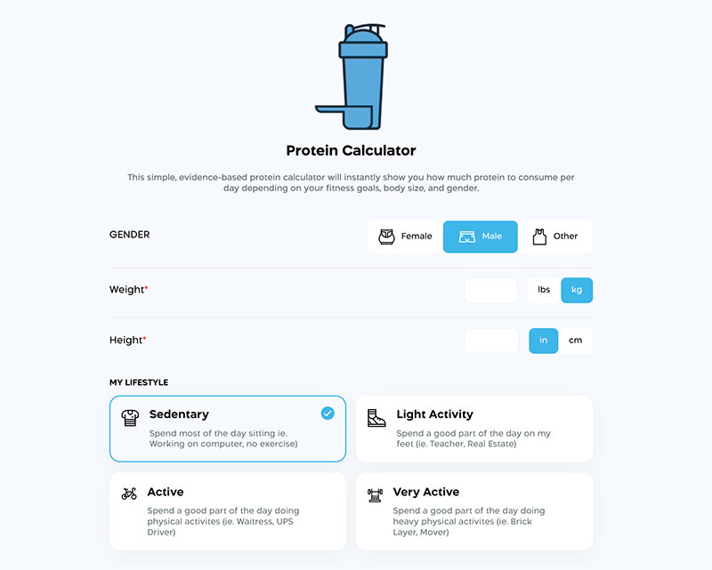
This protein calculator page is a great example. Using a gray-blue for negative space has allowed the designer to use white on the buttons, making them pop much more effectively.
Source: transparentlabs.com
Don’t Forget About Social Proof
Finally, you also want to incorporate some social proof in your design process. It adds an extra layer of credibility and helps visitors get a better grasp of the product or service you’re offering.
Social proof is also much more trustworthy than any copy you, as a brand, can write, as it comes with no hidden agenda. A customer is free to be honest, while you can’t ever market the less-than-great parts of your business.
Tortuga Backpacks, for example, feature several different social proof signals. They show you some customer reviews, but they also tell you which news outlets have featured them, making you more confident in making a purchase from them.
Wrapping Up
With these eight web design tips, you can improve your conversion rates and help your customers feel that much more confident and happy to do business with your brand. Just make sure you align them to your branding and marketing goals.