8 Ecommerce Homepage Best Practices to Keep Leads from Bouncing From Your Site
Did you know that 94% of first impressions relate to web design?
Your homepage is often the first page your audience sees when they discover your business, so, if you don’t have a well-designed ecommerce homepage, you may not make a positive first impression.
But with these eight ecommerce homepage best practices, you’ll be fast on your way to creating a homepage that keeps people browsing on your site longer!
P.S. Want to get the latest tips and tricks for marketing your business online? Join 150,000 subscribers by subscribing to our email list!
Campaigns managed by WebFX have earned overPartner with Ecommerce masters!
TRANSACTIONS IN THE LAST 5 YEARS
Ecommerce homepage design tip #1: Integrate your brand’s style
Your homepage is the face of your website. It can be what keeps your audience engaged or causes them to return to the search results. That’s why integrating your brand’s style is first on our list of ecommerce homepage best practices.
You should have a consistent design for your website throughout, but especially on your homepage. Your ecommerce homepage should immediately give your audience insight into your brand, the products you offer, and how you can address their pain points as a customer.
For example, when you enter Lego’s site, you immediately notice their yellow and red brand colors at the top.

On top of that, you see Lego’s iconic symbols, like their mini figure head, at the top of the page to further solidify their branding.

As you can see, Lego establishes its brand immediately, and you should take a similar approach with your ecommerce homepage design. First, start by establishing your brand’s color scheme.
Your color scheme typically contains three to four colors. You’ll want to carry that color scheme throughout your site to ensure brand consistency.
It’s also crucial that you decide on other design elements like font style and image style to have a cohesive brand image.
Ecommerce homepage design tip #2: Share your value proposition
If you want to create the best ecommerce homepage design for your business, you need to share your value proposition. The value proposition is what you offer that’s attractive to customers.
When people discover your business for the first time, they want to know why they should pick you and what you have to offer.
You need to be clear and upfront with your value proposition. Billie, a women’s beauty company, immediately highlights their value proposition on their homepage by sharing how they offer clean beauty products.

They present their value proposition directly and concisely. You can follow a similar approach with your value proposition. You don’t need to post two paragraphs worth of information about the value of your product. If you can show your value in one sentence, do it!
When you integrate your value proposition into your site, make sure that you’re writing it in a way that focuses on your audience.
Notice how with Billie, they say, “Meet beauty that’s so good, you can’t tell it’s clean.” Billie addresses their audience directly when they highlight their value — you want to take a similar approach.
By highlighting your value proposition, you immediately tell your audience why they should be interested in your brand and learn more about your business.
Ecommerce homepage design tip #3: Keep your homepage clean and organized
Next on our list of ecommerce design best practices is to keep your homepage clean and organized. If shoppers visit your site and are immediately overwhelmed with everything on your page, they will bounce from your site.
To keep leads on your page, you need to organize your homepage so that it doesn’t look cluttered or overwhelming.
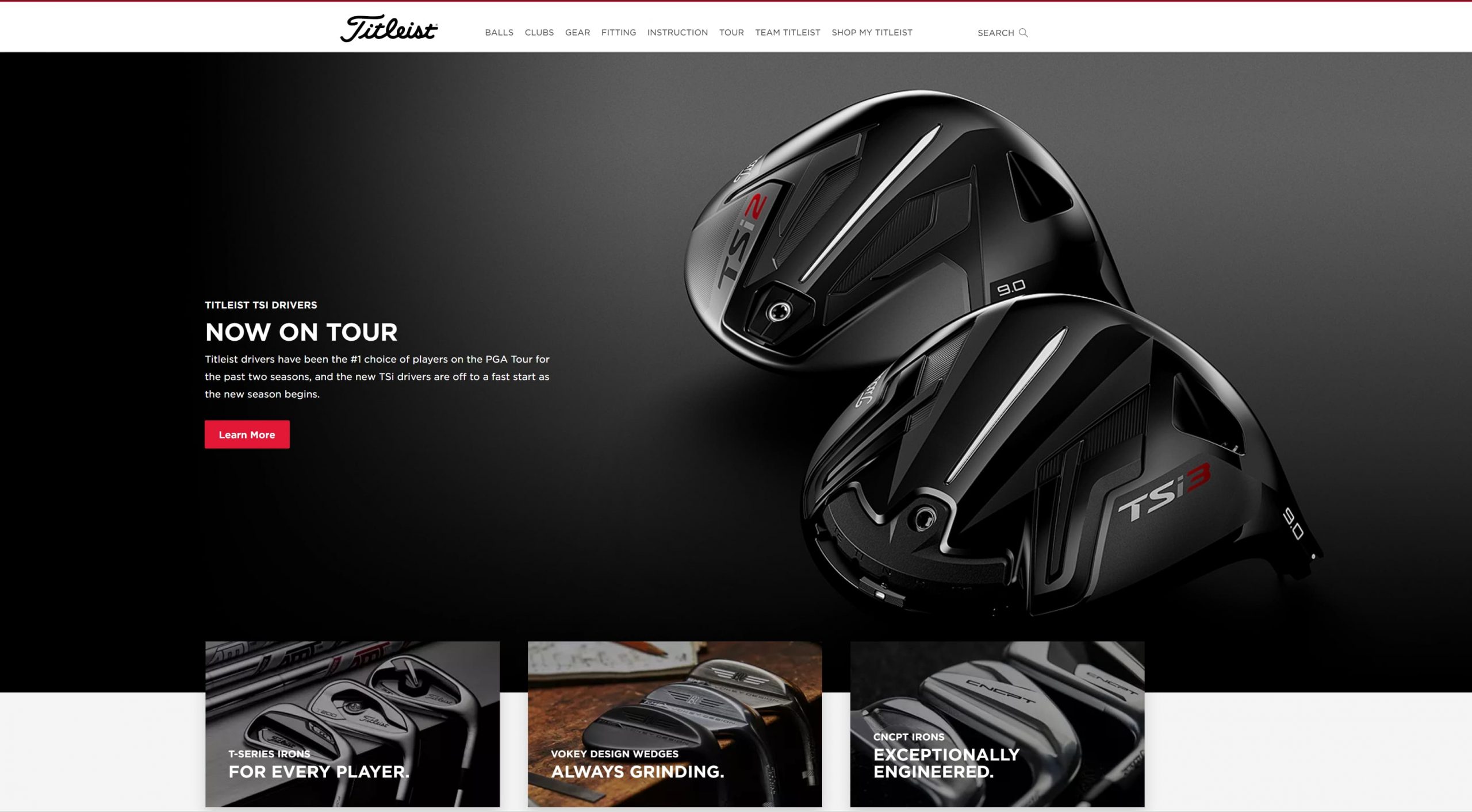
A great way to keep your homepage organized is by utilizing white space. White space is a negative space with no text or visual elements, like photos or videos.
You can see a great example of white space from Titleist. As you scroll through their homepage, you’ll see numerous areas with no text or images. It makes it easy for visitors to scroll through their homepage.

Ecommerce homepage design tip #4: Use high-quality visuals
Using high-quality visuals is next on our list of ecommerce homepage design tips. You don’t want to overwhelm your audience with walls of text, and visuals, like photos and videos help break up text on your site and make your homepage more visually appealing.
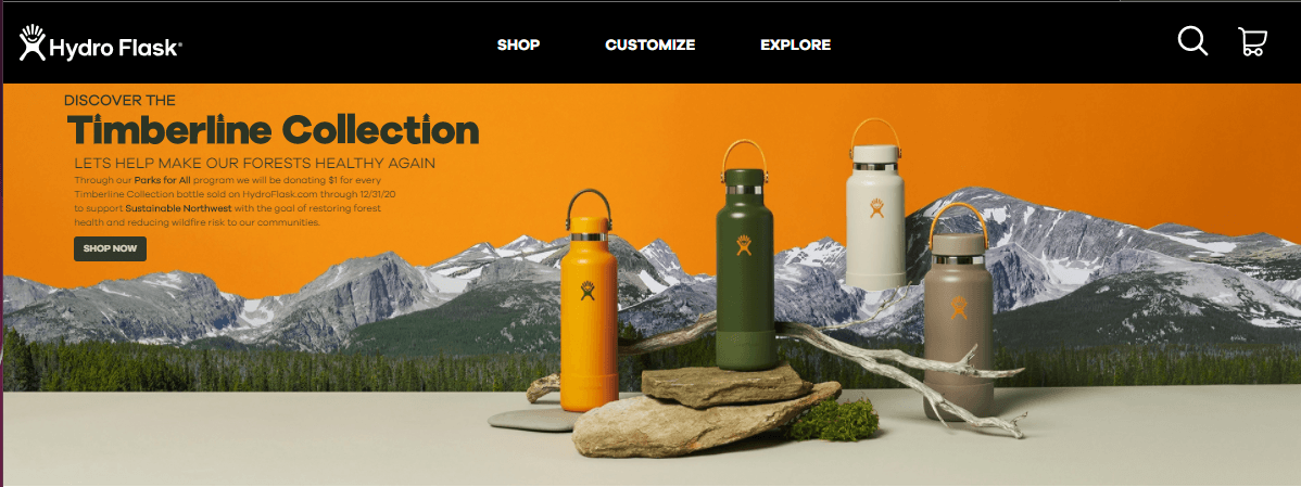
You don’t want to use just any visuals, though. Your visuals must be high-quality and clear, like this example from Hydro Flask.

The featured image on their homepage is high-quality, colorful, and on-brand.
You can add numerous types of visuals to your site’s homepage, including:
- Photos
- Videos
- GIFs
- Infographics
- Graphics
Ecommerce homepage design tip #5: Create an easy-to-use navigation
One of the first things your audience sees when they enter your site is your navigation. If they can’t easily find the products they want, they’ll feel discouraged and bounce from your site.
Your navigation should be organized and straightforward. You’ll want to use broad headings and create subcategories beneath these more general headings to help organize your product.
Chewy’s navigation is an excellent example of one way you can organize your navigation. They chose broad category options like “shop by pet” and “shop by brand” to help their customers find what they need fast.

You could also take an approach like Famous Footwear and use broad headings based on customer bases, like “women,” “men,” and “kids.”

The type of headings you use will depend upon your business and what you offer. Generally, keeping your headings broad will enable you to have more organized navigation that helps shoppers more easily browse your products.
Additionally, make sure you add a search bar to your navigation, so users can search for the products they need and find them fast.

Ecommerce homepage design tip #6: Make sure your homepage is mobile-friendly
If you want to have the best ecommerce homepage, you need to ensure your site is mobile-friendly. If someone visits your ecommerce homepage on a smartphone and isn’t mobile-friendly, they’ll quickly bounce back to the search results.
You need a site that looks great on mobile because 76% of consumers shop on a smartphone. Without a mobile-friendly site, you won’t keep these leads engaged.
Take VYNL for example. Here’s what their site looks like on the desktop:

When you access their mobile site, you get the same great experience scaled down to your device.

To create a mobile-responsive site, you need to integrate responsive design. Responsive design will enable your site to adapt to whatever device a user uses. You can invest in responsive design services from a digital marketing company to help you get your site mobile-friendly!
Ecommerce homepage design tip #7: Make sure your homepage loads quickly
Next on our list of ecommerce homepage best practices is to ensure your site loads quickly. Your audience expects your page to load within two seconds, so if it doesn’t, they may bounce from your site.
To ensure your page loads quickly, use Google PageSpeed Insights to see how quickly your site currently loads. This tool will provide you with information on how to improve your site’s load time so people can shop on your site faster.
Ecommerce homepage design tip #8: Test everything
When you create your ecommerce homepage design, you want to ensure you’re delivering the best experience for your audience. That’s why we’re rounding up this list of ecommerce homepage best practices by talking about testing.
The first version of your homepage won’t always be the best. You may need to tweak some elements to drive better results for your business.
You can test multiple elements on your site, including:
- Your headings
- Your photos
- Your call to action (CTA) button color and style
By testing elements on your site, you’ll produce the best ecommerce homepage design for your audience.
Put these ecommerce homepage best practices to work
Now that you have this list of ecommerce homepage design tips, you can start building an ecommerce website that drives more leads and traffic to your site. If you need help creating an ecommerce site that drives results, look no further than WebFX.
In the past five years alone, we’ve driven over $2.4 billion in sales and over 6.3 million leads for our clients. We’ve also managed over 11.6 million transactions for our clients, too. You can feel confident that our team of 250 marketing experts can help you grow online.
Ready to get started? Contact us online or call us today at 888-601-5359 to speak with a strategist about our ecommerce web design packages!