5 Design Tips for Creating Engaging Email Newsletters
Email marketing is critical to the success of any business. It can help businesses generate leads and build relationships. It can also help businesses nurture existing connections. The ultimate goal of all of these? To convert as many people into paying customers.
Email newsletters are key to email marketing. But for them to be effective, you need to design them the right way. In this article, let’s look at five design tips you should follow. First, though, what exactly are email newsletters?
What Are Email Newsletters?
Email newsletters aim to inform the audience. So, instead of trying to do the hard selling of a product, an email newsletter gives its audience updates about the company. These updates can come in many forms:
- Product launches
- Product feature updates
- Promo announcements
- Event launches
- Brand partnerships
- Company expansion updates
- Updates on the company’s new website
- New content updates
- Round-ups of the content on your website
That’s not to say email newsletters don’t aim to sell at all. Email newsletters, after all, provide company updates to fulfill email marketing’s core function of nurturing existing connections. So when you nurture those connections, you increase your chances of getting your connections to take your desired action. That desired action is, ultimately, for them to make a purchase.
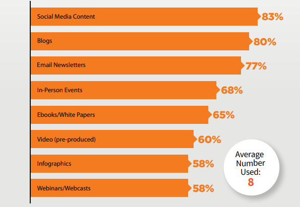
The best part is, email newsletters work. According to the Content Marketing Institute, an astounding 77% of B2B marketers, in particular, believe email newsletters are a top content marketing tactic. It ranks number three, after social media content and blogs:
Source: Content Marketing Institute
There is, however, a downside. Since almost everyone is using email newsletters, you need to find ways for your email newsletters to stand out. A company’s website visitors subscribing through the website email opt-in form is, after all, just one part of the process.
Once you’ve selected your email marketing service, the next part is to get them to engage with the brand through your email newsletter so, hopefully, in the end, they complete a purchase.
5 Design Tips For Engaging Email Newsletters
For your email newsletter to stand out, you need two things: great content and a great design. The company’s content team should meet to come up with excellent email newsletter content ideas. As for you, follow these design tips to create email newsletters that generate engagement for the company’s email campaigns.
1. Keep It Simple
You don’t have to complicate the email newsletter design. It’s just like when you’re creating a new website. The less elements you have there, the better. From a marketer’s perspective, that makes sense. The less elements the viewer sees, the less distractions they have. The less distractions they have, the more likely they will focus on the call-to-action. That means the higher the likelihood they will help you make a sale.
What elements should you include in your email newsletter then? To answer this, I suggest you determine your email newsletter objective. Do you want to announce a product feature update? Then all your email newsletter elements–your copy and visual content—should help you achieve that specific objective. Don’t hesitate to remove anything that doesn’t help you achieve that.
Check out this example:
Source: Stripo
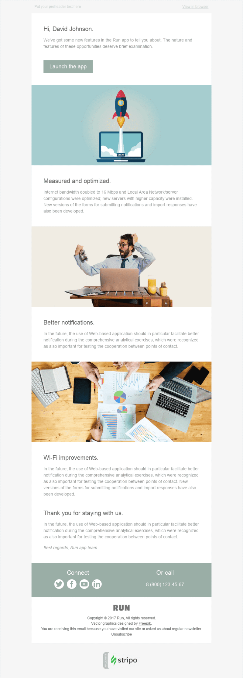
The objective of the email newsletter is to inform subscribers about the new Run app features. All the elements there, then, help the email newsletter achieve just that.
The introductory paragraph, for instance, is short and straightforward. It tells the subscribers what the objective of the email newsletter is. The subheads reflect the benefits subscribers can derive from the new updates it just announced. As for the images, they all just support the copy.
In other words, there’s nothing in the email newsletter that seems out of place.
Pro tip: Send different variations of your email newsletter to your audience. After you send them, email tracking is key. Check which email newsletter design has higher open and engagement rates. So, the next time around, you’ll know exactly the type of design to use.
2. Focus on the Details in Your Visuals
Don’t forget to highlight visual details in your email newsletter. This is particularly important when you’re informing subscribers about the launch of a new product or new product features. According to Seyens, humans are visual creatures. They see presentations with a lot of detailed visual support as more persuasive.
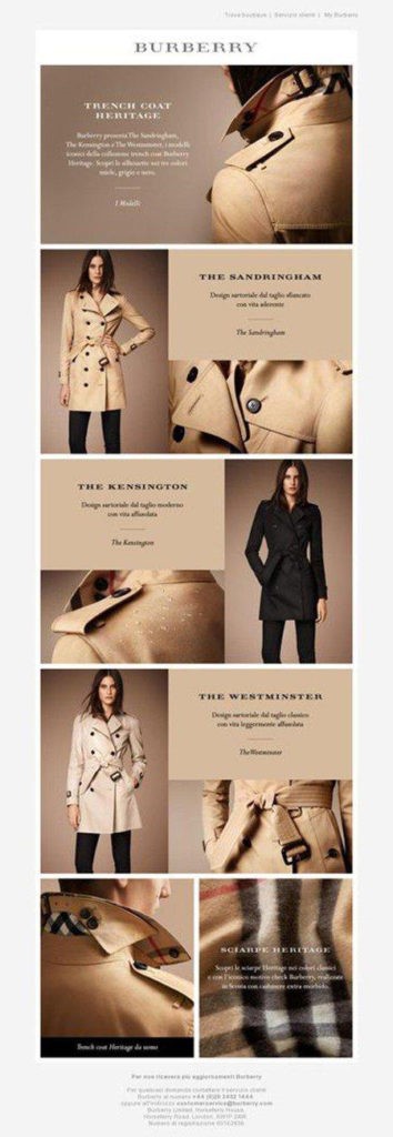
Here’s an example from Burberry. To announce its trench coat Heritage line, it sent this email newsletter to its subscribers:
Source: Aweber
The visuals are amazing. You don’t just get a general view of each trench coat. There are images of trench coat details, too, so you have close-ups of the buttons, the collar, and the belt, among others.
Make sure to ask the content team to be as detail-oriented as possible in the copy, too. The more details they give in the copy, the more informed your subscribers will be. The more informed they are, the higher the chances you will convince them to take the desired action.
3. Leverage Animations
Don’t think email newsletters are only good for still images and copy. You can include animations, too.
There are several reasons you should include animations in your email newsletters. Here are some of those reasons, according to Digital Glue:
- Animations help make brands a lasting impression on audiences.
- Animations are easy to understand.
- Animations boost conversions.
- Animations are fun and entertaining.
- Animations allow you to update content without reshooting.
In other words, animations are both functional and help marketers achieve marketing goals. Besides, they’re not so hard to do nowadays. According to Bloop Animation, you don’t even need to draw well! There’s free software anyone can use to create an animation. Most modern computers can also handle simple 2D animation tasks.
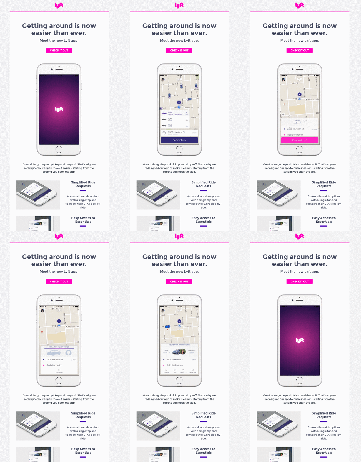
Check out this example from Lyft. To announce the development of the new Lyft app, it sent this email newsletter to people on its mailing list:
Source: The Checker
The animation gives subscribers a glimpse into how the new app works. That gives them the incentive to click on the call to action and check out the app itself.
4. Use Layout to Organize Content
Even if you already remove all the unnecessary elements, email newsletters will usually still end up with a lot of content, both text and visual. If you’re not careful, you might end up with a hodgepodge of elements on a page that don’t make sense.
When designing the email newsletter, then, make sure it follows a layout. You have three basic layouts that form the foundation for a lot of what we see online and offline, according to Mint Twist:
- Standard layout: This is traditionally used in print ads. It uses the Z pattern of page reading
- Ruler layout: This makes use of horizontal or vertical patterns or rows. It follows the F pattern of reading.
- Mondrian layout: This sees scattered blocks in a grid formation on the page.
The key is to pick your layout and organize your content around it. Your choice typically depends on your audience’s preferences. For example, the ruler layout may not be as attractive to young audiences because it looks formal. A Mondrian layout might appeal more to them because with the right content, your email newsletter will look dynamic.
Check out this example:

Source: Canva
The email newsletter is intended for the mostly young audiences of Twitter. That’s why the layout looks edgy and dynamic.
Thanks to the layout, viewers don’t feel overwhelmed even if there are many elements. The white space also helps give the viewers’ eyes a breather. A visual map guides the direction of the viewers’ eyes (see the lines) as they move across the email newsletter.
5. Make Your Design Mobile-Friendly
According to Campaign Monitor, emails that display incorrectly on mobile devices are likely to be deleted in under three seconds. The thing is, 3 in 5 consumers check their emails on the go, according to Email Monday. That’s a lot of potential customers you lose if you don’t make your email newsletter design mobile-friendly.
Don’t worry. It’s not that difficult to make your design mobile-friendly. Here are some tips:
- Leverage visual hierarchy: Don’t make all your fonts of the same sizes. The more important elements should come in a bigger font. If mobile users see the same font sizes, they’ll be overwhelmed and will only end up deleting your email newsletter.
- Use a background that’s easy on the eyes: Don’t choose a black background over black font. The text would be impossible to read.
- Reserve the strong colors for the call-to-action button: You want your readers to focus on the CTA, not ignore it.
- Don’t forget the alt text in images: Not everyone can see images from their phones. When you have that alt text, they’ll know what your images are about.
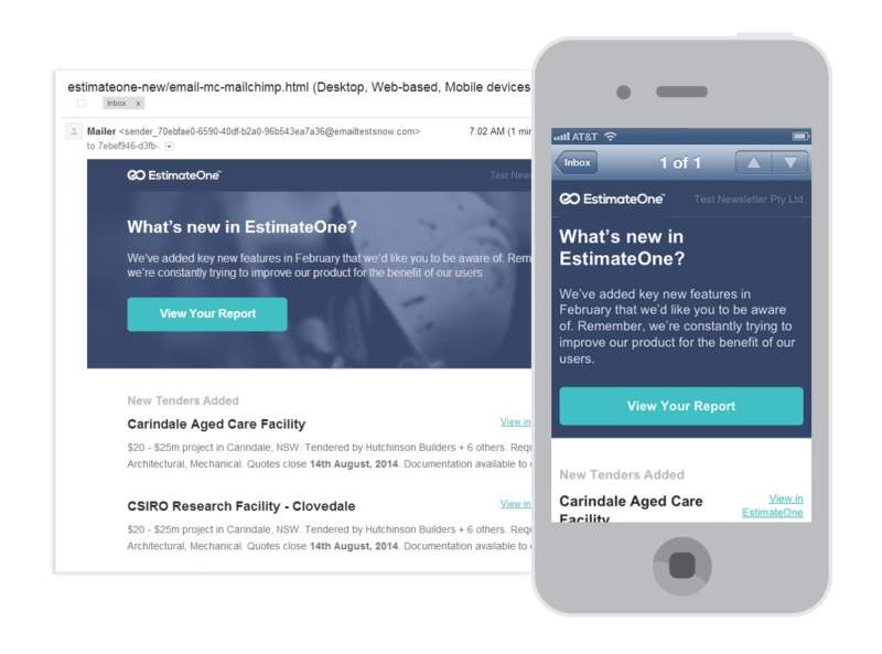
Here’s a great example:
Source: Mailbakery
The text in the email newsletter fits the mobile phone screen perfectly. Viewers don’t get confused thanks to the visual hierarchy that tells them what the most important elements are. The background is easy on the eyes, too, and allows for better readability. Finally, the CTA stands out on the mobile phone screen because of its color.
In Closing
Email marketing is critical to any company’s success. Email newsletters are part and parcel of those email marketing campaigns. Although they don’t do the hard selling like typical marketing emails, they inform audiences about the latest company news. The idea is to nurture relationships to hopefully turn those into paying customers.
But for email newsletters to be effective, they should have great content and a great design. I shared with you five design tips you should follow to boost the engagement of your newsletters. Keep it simple and focus on the details in your visuals. Leverage animations and use layout to organize content. Finally, don’t forget to make your design mobile-friendly.
Follow these tips and your newsletters will achieve the purpose for which they were created in the first place. They’ll engage subscribers and your company will be well on its way to getting those sales.