Amazing fonts similar to Baskerville that you need to have
When working on a brand’s identity, the font is one of the most important decisions you would have to make. One option you can never go wrong with is to choose elegant, timeless sans serifs such as Baskerville or Mrs. Eaves. These fonts can be found on a variety of luxurious designs, but don’t be surprised to find them on urban and upscale items too.
Baskerville, for example, excels in clean typographic compositions. It is probably the most elegant book typeface you can find. John Baskerville created a number-one choice for refined and legible prints. The font solved several lettering concerns. Examples include imbalanced contrast between thin and thick, unsharp lowercases, or improper positioning. It simply brought form and function together.
With this in mind, finding fronts similar to Baskerville is a challenging task. To assist you with it, we have created a list of great Baskerville alternatives you should check in any case:
Fonts similar to Baskerville
Bajka
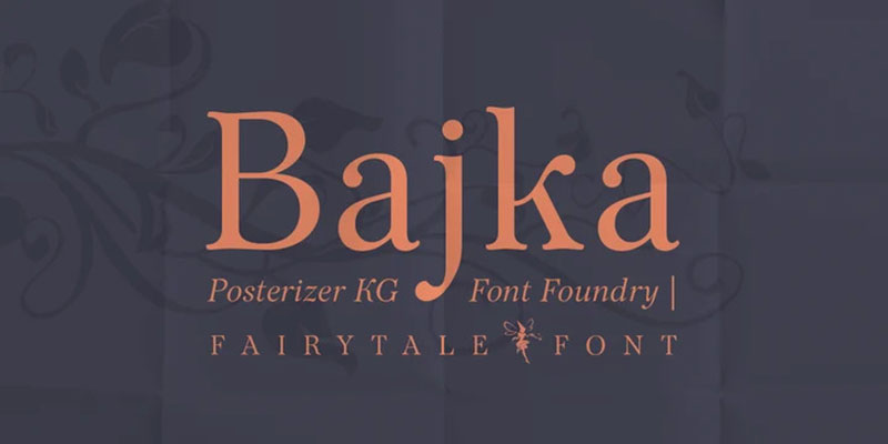
Bajka (a Russian word for a fairytale) is a font family inspired by Baskerville. As indicated by the name, Bajka is mostly used for designing children’s books.
The fonts were presented in 2010 and contain all the classic symbols, weights, dingbats, and ornaments. Cyrillic lettering is also supported.
Le Monde Livre
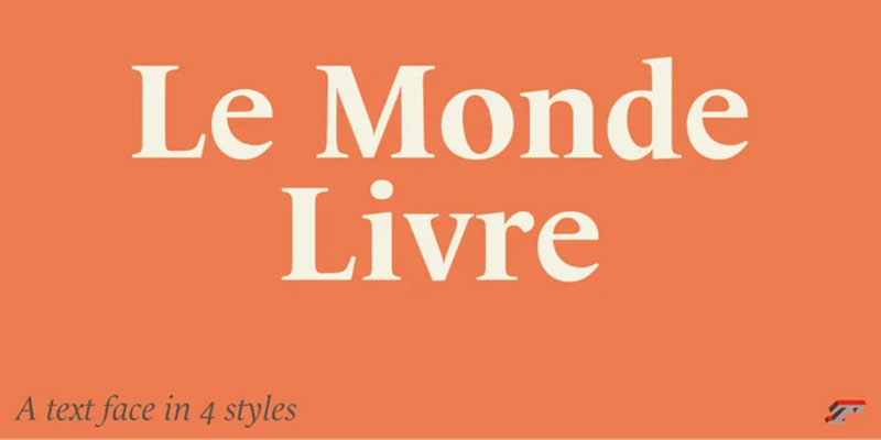
Le Monde is a family of fonts similar to Baskerville that truly revive the practice of manually adjusting each font’s design. Both fonts designed by Jean Francois Porchez (Le Monde Livre and Le Monde Journal) can be used without modern Phototypesetting.
They were created to use on point sizes below 10 points and therefore look very nice on magazines and books. They also have italic versions, but their design is a bit different and more related to Renaissance lettering. For best results, put the two fonts together using Journal for the small sizes and Liver for the large settings. This family will also do an amazing job combined with some of the Typofondrie typefaces.
Libre Baskerville
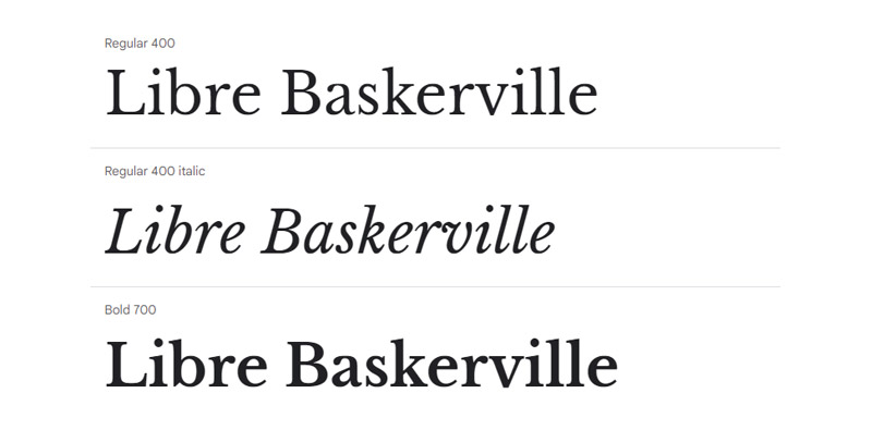
Libre Baskerville is based on the original Baskerville design from 1941 and is primarily used as a web font for 16 px body text. You will like its reduced contrast, taller x-heights, and wider counters, as these enhance its readability.
Monticello
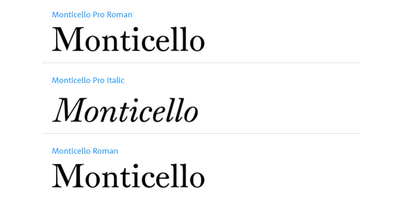
Monticello is a Linotype font created in 1946 by designer C.H. Griffith. The designer looked foremost in Oxford typefaces and James Ronaldson’s Roman No. 1 font. Designer Matthew Carter also made substantial changes to the font between 1965 -1981.
Galaxie Copernicus
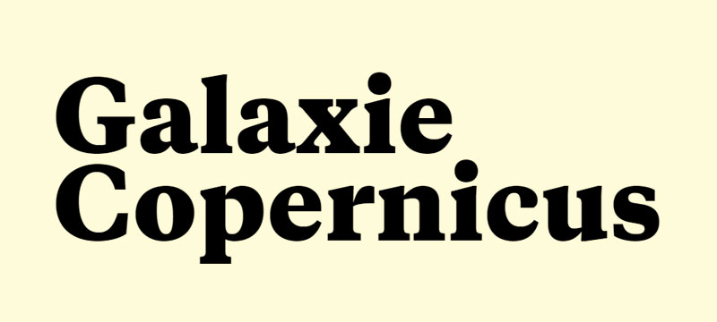
Galaxie Copernicus is a newer Baskerville alternative we met in 2009. The designers are Kris Sowersby and Chester Jenkings. The main influence, on the other hand, is modern Monotype Plantin fonts of the 21st century. There are six weights and italics available: heavy, extra bold, bold, semibold, medium, and book.
Mrs. Eaves
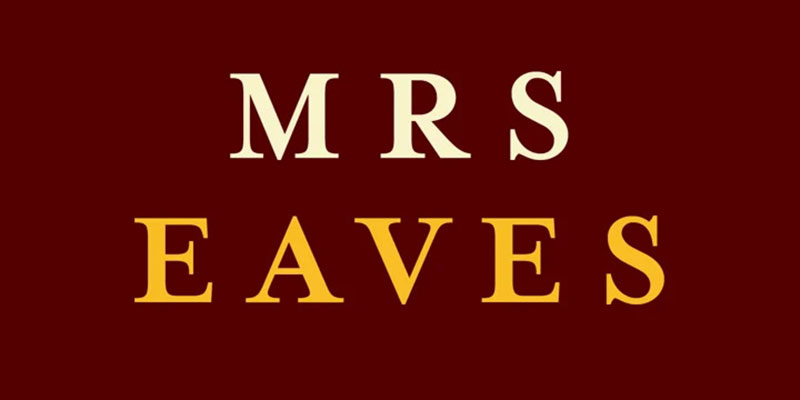
Mrs. Eaves was also designed by Baskerville and named after his wife Sarah Evans. Sarah was also his partner while setting up the whole printing business – Baskerville wanted to honor her contributions. After Baskerville’s death, Sarah completed all of his unfinished volumes and perfected his fonts.
Mrs. Eaves X

Check Mrs. Eaves X if you like Mrs. Eaves but would still have a more distinguishing X height. This version also comes with tighter spacing, as well as shorter descenders and ascenders. It is recommended for all types of designs, but we suggest you try it on smaller point size or with reduced space, just to see how well it aids readability.
There is also Mrs. Eaves XL – a narrower representative of the family with only 92 percent width. It works perfectly as a compact text, and it is very suitable for titles and headlines.
ITC New Baskerville
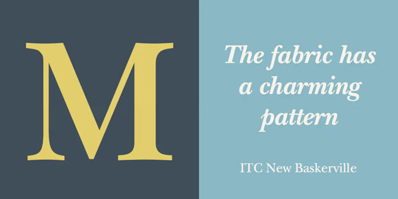
For faithful Baskerville fans, there is also a contemporary font family ITC New Baskerville created between 1706 and 1775. This is a master printing kit from Birmingham delivered by punchcutter John Quaranda.
It was the font used for the folio Bible at Cambridge University. Designers still use it to represent beautifully 18th century neoclassic and rational lettering.
The text looks both appealing and beautiful; the forms are clean and sharp, and the contrast is very high. We recommend you to try it on elegant advertising projects.
Bembo
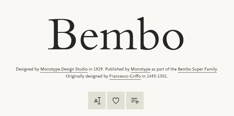
Bembo is also a Renaissance-inspired font, resembling foremost the prints of Aldus Manutius. It was first used to print Pietro Bembo’s De Aetna Book travelogue. The creator was Francesco Griffo, a very popular prolific punchcutter at the time. He is the one who set the basis for all stylish roman types we are using also today.
The font looks conservative and practical enough to be used also for packaging and advertising. There are many old-style figures, small caps, alternate caps, expert characters, and even 31 weights to work with. There is nothing you can’t do with it.
Plantin
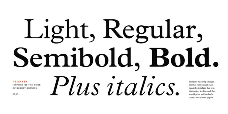
Plantin is another font similar to Baskerville that sought inspiration in the Renaissance. The creators are Frank Hinman and Frits Stelzer, but the person we should thank for it is Robert Granjon. He used it heavily for book prints during the Renaissance and probably inspired what we know today as Times New Roman.
Ingeborg
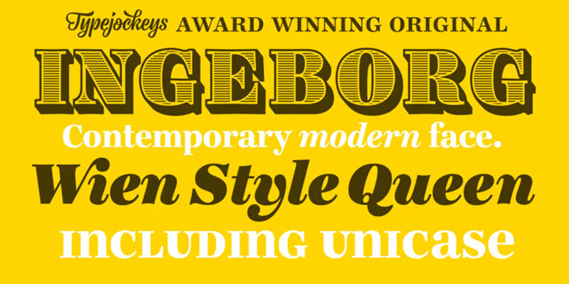
Ingeborg also tried to solve readability issues among the sans serifs fonts. It has historic roots, but it still looks very modern and clean.
What we especially like about it is the functionality and subtleness of its weights, thanks to the high contrast and the vertical stress. Thanks to them, Ingeborg looks very classic and reminds us of the famous Didone typeface.
The weights were also created with practicality in mind, and the reader feels instantly attracted to the text. A good idea would be to combine it with Didone – the two fonts work together in perfect harmony.
Neva
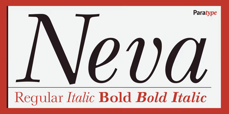
Neva Regular was designed by Pavel Kuzanyan (1901-1992) for the famous Moscow Book. It has strict and simple letterforms, such as those of any classic Russian font. It was even awarded during the 1971 Gutenberg International Type Contest in Leipzig.
You will find this typeface useful for art books, fiction, and similar compositions. It was even awarded during the 1971 International type Design contest in Leipzig. Thanks to ParaType designer Laybov Kuznetsova, you also get some extra bold styles and a fully-digitized version of the font.
If you enjoyed reading this article on Amazing fonts similar to Baskerville, you should check out this one about fonts similar to Avenir.
We also wrote about a few related subjects like the Roblox font and what font does Roblox use, the best 72 free fonts for logos to create modern and creative designs, fonts similar to Futura, fonts similar to Impact, fonts similar to Calibri, fonts similar to Gotham, and fonts similar to Montserrat.