Top 15 Personal Website Examples for Your Inspiration
We live in times when creating a personal website is easier than it has been before. The competition is getting higher every day, and you should keep up with it.
So how to make your skills notable?
Think about it this way: you can get one of the most effective marketing instruments and use it solely to your benefit. And we are here to help you present your expertise properly.
Below you’ll find 15 personal website examples that do their job well. No fuss, no turmoil – only pure professionalism. In several minutes, you’ll know what to include in your site and how to quickly create one from scratch.
Why do personal websites gain popularity?
Your new website is not just some kind of trendy thing – it surely gives you the advantages you can’t get with social media accounts. Let’s find out how it works.
- Complete control over your activities. Supposing you have a social media account that already brings you money. What if you wake up one day and discover your account was banned? With a website, your content and client base are completely your territory and responsibility. You are well aware of what’s going on with your personal brand.
- Content indexed by Google (or other search engines). And it’s more effective than relying all the time on social media algorithms. Your website allows you to directly communicate with your target audience and be more adaptive to the market (not algorithms) changes.
Also, it’s way better for your career if you’re found in Google not through your social media accounts but through a website that you fully control. According to Cision, consider that 57% of employers are less likely to contact a candidate if they can’t find them online and 54% reject candidates after checking their social media profiles. - The best way to stand out so far. A personal website is your private space, and you can do whatever you want with it and be creative. You can build a unique platform and get noticed way faster than with a standard portfolio or PDF resume.
Looking Professional: The Examples of Perfectly-Built Personal Websites
Here they are – great websites transformed into experiences. They all serve one purpose: leaving an impression on visitors.
Seth Godin
Seth is telling a story about himself just with one page. We clearly understand the author’s priority – the Akimbo workshops and a CTA button below the heading. You won’t find a standard header on this site – the navigation menu is located on the left.
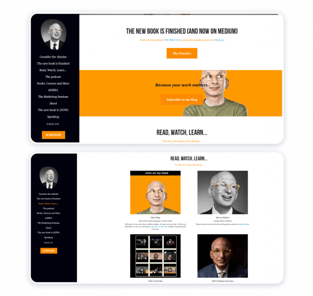
And now, take a look at the information structure. The links to the latest work (a new book) and Seth’s blog go right after the workshops. Then we see more good-to-know links with useful info. And finally, the “About” part is almost at the bottom of the page. In other words, the work goes ahead of the expert’s persona.
Melanie DaVeid
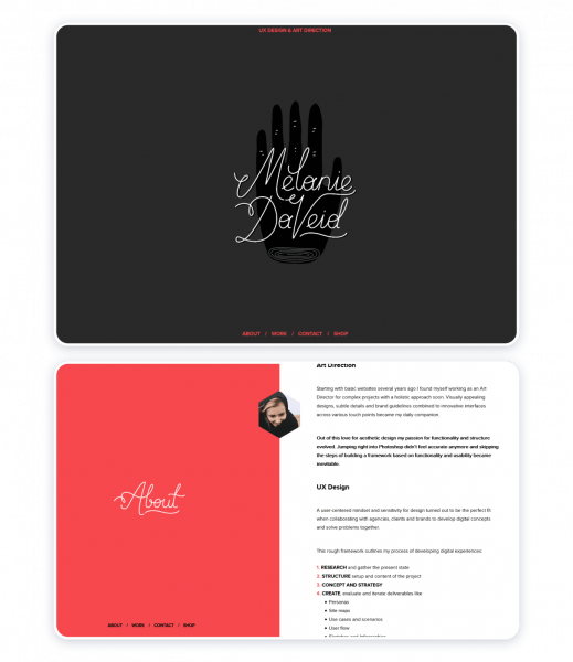
Here you see a very simple but still stylish interface. The site is focused on the work presentation with no navigation complexity. Also, turn your attention to the number of works – there are only four of them. But if you click on the ‘More’ button, each case is described in much detail. This description is vital for those who want to know your expertise better.
Cynthia Johnson
Another simple site but very straight-to-the-point. You won’t pass the main offering – it’s the latest author’s book, and you can buy it straight from the pop-up on.
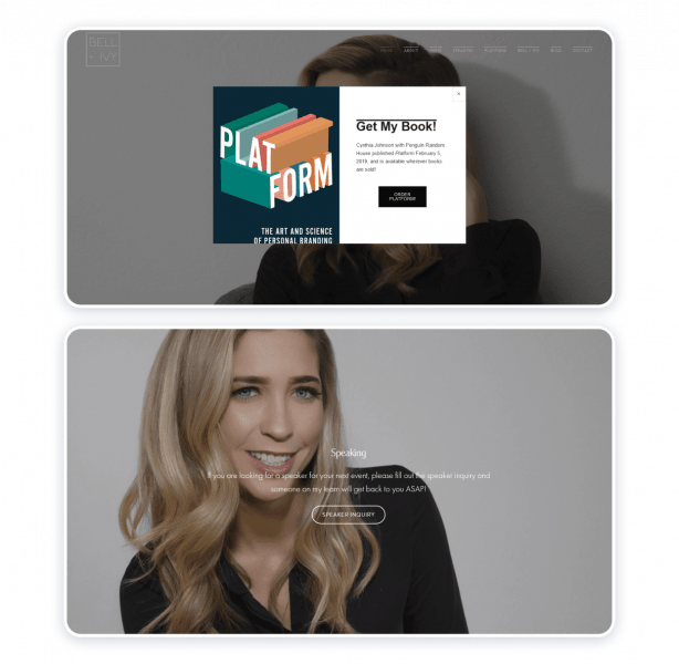
Then we see a monochrome color palette, and each block presents different sides of Cynthia’s expertise. The CTA buttons are placed exactly where they should be: in the book’s and speaker’s blocks.
Louise Whitehouse
This example of the personal website contains separate pages – it’s not a standard landing page. The Overview presents us the general photographer’s style, and you can go to the Portfolio page to look at photo albums more closely.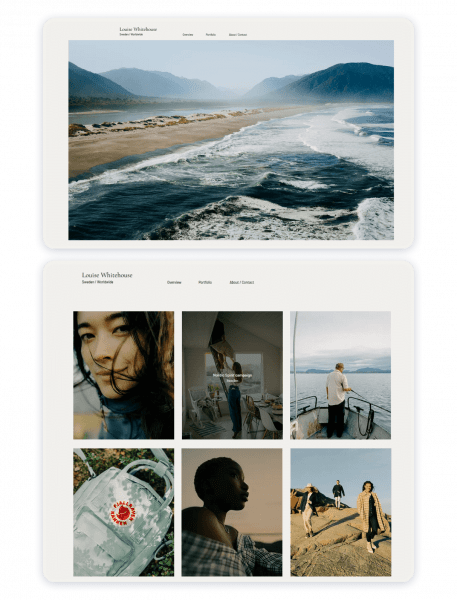
The site has a white background, so all eyes are on the works without any distractions. This focus is extremely important for any kind of portfolio.
Neil Patel
This expert’s name is well-known to everyone who works in the SEO niche. First and foremost, the site is aimed to solve a problem. Do you want more traffic? No more talking – just leave your website’s link.
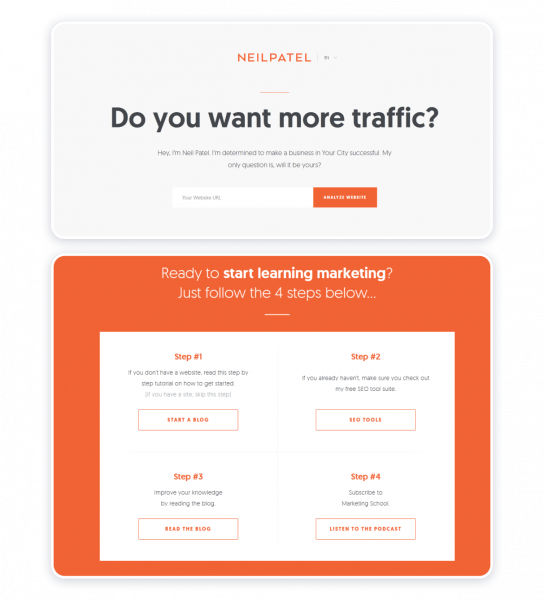
In case you need more information, scroll down the page – you’ll get to know Neil a little closer. And right in the next block, we have another CTA. Then Neil is offering actionable tools to start learning marketing – only from this block, you will get to the knowledge base (a blog, podcast, and SEO tool).
Brandon Johnson
It’s an incredibly imaginative website owned by the planetary scientist. You can guess the author’s specialization with a glance at the visuals. Plus, animations bring the images to life and grasp your attention even more.
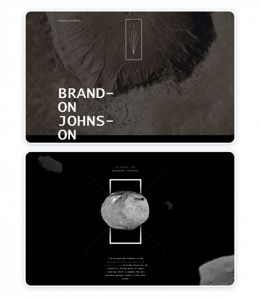
To make a bigger impression, the design includes a multi-layered background. All in all, it’s like visiting a planetarium. But still, the color palette is calm and you can clearly understand what each block is about.
HR Dept.
Yes, you read it right, there are no names mentioned. The website’s owner doesn’t want to share her name – only her works. The whole portfolio is presented on the main page, divided by projects. And that is the main thing, right?
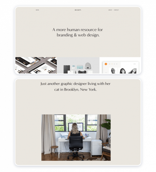
The overall layout is extremely simple and won’t leave you guessing what button to click next.
Verena Michelitsch
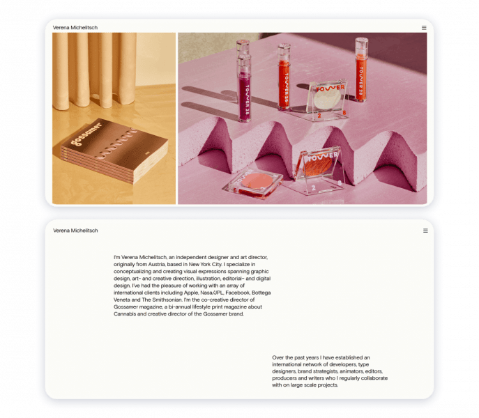
And here is another clear minimalistic portfolio with even less detailing. The main page is a presentation of works looking like a patchwork quilt. And the information about the author is typed with black font on the purely white background.
Charlie Waite
Charlie is accentuating right away that he’s not only a designer – he’s also a husband and father. You realize that there is a personality behind a portfolio. And this personal slogan remains static on the screen throughout all your website journey.
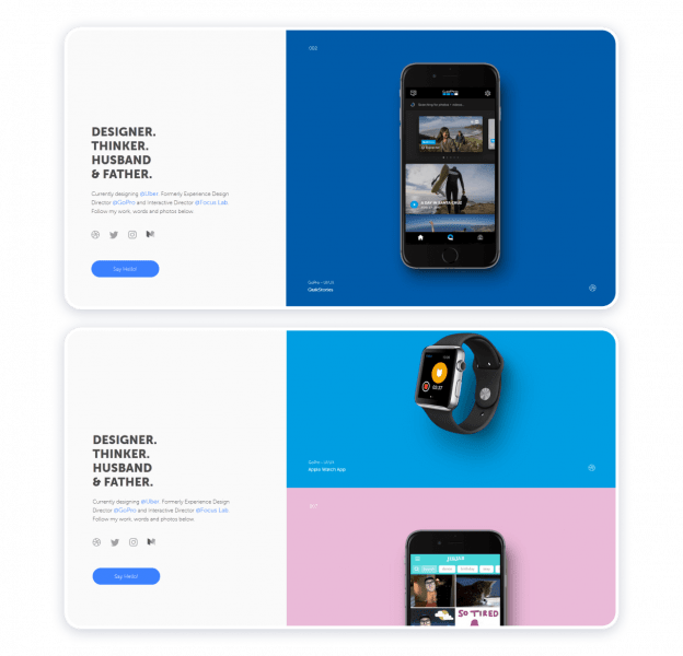
Also, no matter what part of the portfolio you’re reviewing at the moment, contact links are always before your eyes.
Daniel Grindrod
What speaks better for a cinematographer than his video works? Daniel makes the most of this idea and adds a video as a background to the main page. In other words, all you see first is a mix of Daniel’s projects.
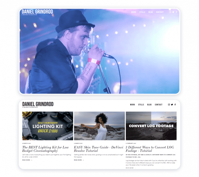
For other pages, the author picked a white background and simple file disposition to draw your attention to the visuals.
Joshua McCartney
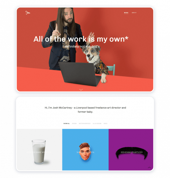
Here comes one of the funniest professional website examples we’ve gathered here. Joshua is an art director, but it’s not only the matter of his artistic work – take a look at the texts. Even work case descriptions are spiced up with some humor. And when you see such an entertaining main page, don’t you want to stay longer and find out more about the author?
Lindsay Ratowsky (fifty coffees)
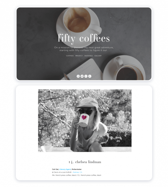
It’s a personal blog that is not aimed to sell or promote anything to you. But still, you can see how the photographer’s personal project can be reflected in a well-crafted website. And once again, we see a simple layout and colors – that’s enough for your voice to be heard and your visuals to be seen.
Pascal van Gemert
It’s the developer’s resume, so you don’t have much visual to present – the secret is in a memorable user experience. This is a landing page, so it’s particularly important to position the blocks in the right order.
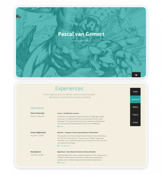
Interestingly, Pascal included the Donate button after his short bio. And a navigation menu is on the right which simplifies the experience.
Laura Baross
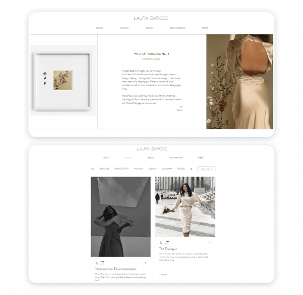
Minimalism is in the spirit of this website: the background and fonts are as simplistic as works themselves. In this case, the light background looks like a part of the designer’s style. It allows including several of Laura’s interests: design, photography, and blogging about sustainable living. You look through the pages but don’t get overwhelmed with all the content because it all serves one light and clear color scheme.
Ellen Skye Riley
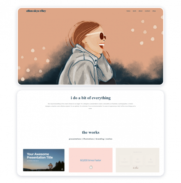
Look at the main picture. This illustration already shows us Ellen’s fun-loving personality and gives us a straightforward clue to her specialization. The website has a link to a small shop, but the main goal is to introduce the author’s craft to the visitor.
7 Lesson Learned After Reviewing These Awesome Personal Website Examples
Now you must be overloaded with all the web design aesthetics we’ve just seen. But the most important thing for today is to understand what you can learn from them.
These are the main take-aways:
- Minimalism. Black, white, and grey are an all-time classic, even for modern website interfaces. If you’re creating a portfolio, these colors are the go-to for the main background theme. And it’s a quick and easy solution if you build a website for the first time (and are overwhelmed with the variety of colors offered).
- Personality. Your experience is important, but despite the work you do and your position, you are a human being in the first place. Just shed some light on your traits, and your website will gain its originality.
- The blocks order. You can’t be all over the place. Even the most creative website has some idea and structure at its core. If you have a key proposal, put it above the fold (the upper part of the home page), then add blocks according to their priority.
- A limited number of work cases. Even the most qualified experts have their starry projects to tell about. Add only the experience you’re proud of – otherwise, the amount of content will become overwhelming for the visitor.
- Branding. Creating your very personal logo distinguishes your expertise no matter how many competitors you have on the market.
- Communication methods. Emails, social media accounts, contact forms – all of them are a good fit for your site, and you should make them visible. Even if you don’t get a client, this person can become one of your followers or blog subscribers. Don’t lose this opportunity!
- Regular updates. Don’t forget to refresh the site’s content with fresh creative pieces or write to your blog regularly (at least 3-4 times a week).
How You Can Implement Your Personal Website Idea
Writers or graphic designers rarely have any coding experience to create a website themselves. And you actually don’t have to learn this skill – you’d better look around and pick the site builder you like.
At Weblium, we’ve prepared several personal website templates for you to start. That means you don’t have to think much about the structure or build it up yourself – just start editing the template of your choice.
This is one of the ready-made Weblium templates.
You can check it in full or start editing right away.
And here are some advantages you gain with Weblium:
- Create a domain from the comfort of your account;
- Get hosting and the SSL certificate by default;
- Collaborate with our smart design supervisor – a tool automatically adjusting your interface;
- Enjoy a mobile version of your website;
- Communicate with our support team 24/7 about any technical or design issues.
Create Your Space to Share Your Skills
So here they are – 15 personal brand websites to inspire your creativity. Is it worth creating one of your own? Definitely yes.
The examples above demonstrate the importance of structure, style, and minimalism, but above all – your individuality. You know your uniqueness more than anyone out there. And Weblium is here to help you portray it with fully-customizable website templates.