How To Create Customer-Centric Landing Pages
Establishing whether there’s a market for a specific product takes a lot of time and effort. Through years of exposure to the nuances of a particular industry, experienced entrepreneurs develop a keen sense for noticing “gaps in the market,” be it for entirely new services or ways to improve on existing products.
Vision typically precedes plenty of legwork. Before securing financing — or pouring their own savings into developing a new product — smart businesses apply serious diligence into establishing product-market fit. They build a value proposition that resonates with their prospective customers. They find out how their competitors managed to build a customer base. They may even go so far as building prototypes and conducting focus groups to get some real data on product feasibility.
Essentially, companies understand the importance of knowing whether their new product has a good chance of being successful before going on the market. The relationship between customer needs and product offering is simply too obvious to ignore.
This begs the question:
“Why are customer needs overlooked in so many other aspects of running a successful business?”
Sure, some of an organization’s moving parts don’t relate directly to the product itself. Nor the customer, for that matter. One could argue that a company’s website doesn’t exist to directly serve the customer. It’s there to provide and obtain information that would contribute to an increase in awareness and revenue.
Why should we consider a customer’s needs when designing a website or landing pages? Does a customer even have needs in this context?
You bet they do!
And as the world of web design matures, the focus has started shifting to understanding what these needs are when it comes to designing the content that drives a sale.
Gone are self-indulgent product stories. Gone are irrelevant, questionable claims. Gone are interfaces that take more than three seconds to load. The era of customer-centric landing pages has dawned. And if your job involves being concerned with metrics like conversion, engagement, and bounce-rates, this is a post that you may want to sit straight up for.
Maintaining Consistency With Ad Copy And Landing Page Content
The needs that landing pages serve aren’t the same as the needs our products serve.
When thinking about creating any kind of customer-centric marketing material, we need to think about their needs outside of the context of the pain points our services will offer.
What we’re talking about here are meta-needs. Those that make their interaction with our landing pages engaging and convenient to the extent that it puts them in a mental and emotional state that’s more receptive to being sold something.
How do we do this? How do we subtly illustrate consideration for our landing page visitors’ needs?
A great way to start is to create consistency between the core message of the advert and the landing page content. If your ad guys are doing their jobs properly, an advert linked to a specific keyword search will hook a potential customer with content that is relevant to their search.
If this results in a click-through, your potential customer has already given you some pretty vital information: your ad copy speaks to their pain point. They believe the promise that your ad copy is making. They’re willing to start a journey with you.
This concept is called “Ad Scent,” and if you are not leveraging this information on your landing page, you’re shooting yourself in the foot.
MarketingSherpa reports that just under 50% of digital marketers understand the importance of a thread between ad copy and landing page, and create a landing page unique to each ad campaign.
Sure, the overhead sounds like a headache, but it’s not rocket science. If you promise something in your ad copy, expand on that promise on your landing page. And not by simply repeating the ad copy using different terms. You’ve already conveyed a core message that speaks to a visitor’s needs. They get it. You sell something they want.
Now is the time to provide them with information and prompts that link their needs to the action you want them to take.
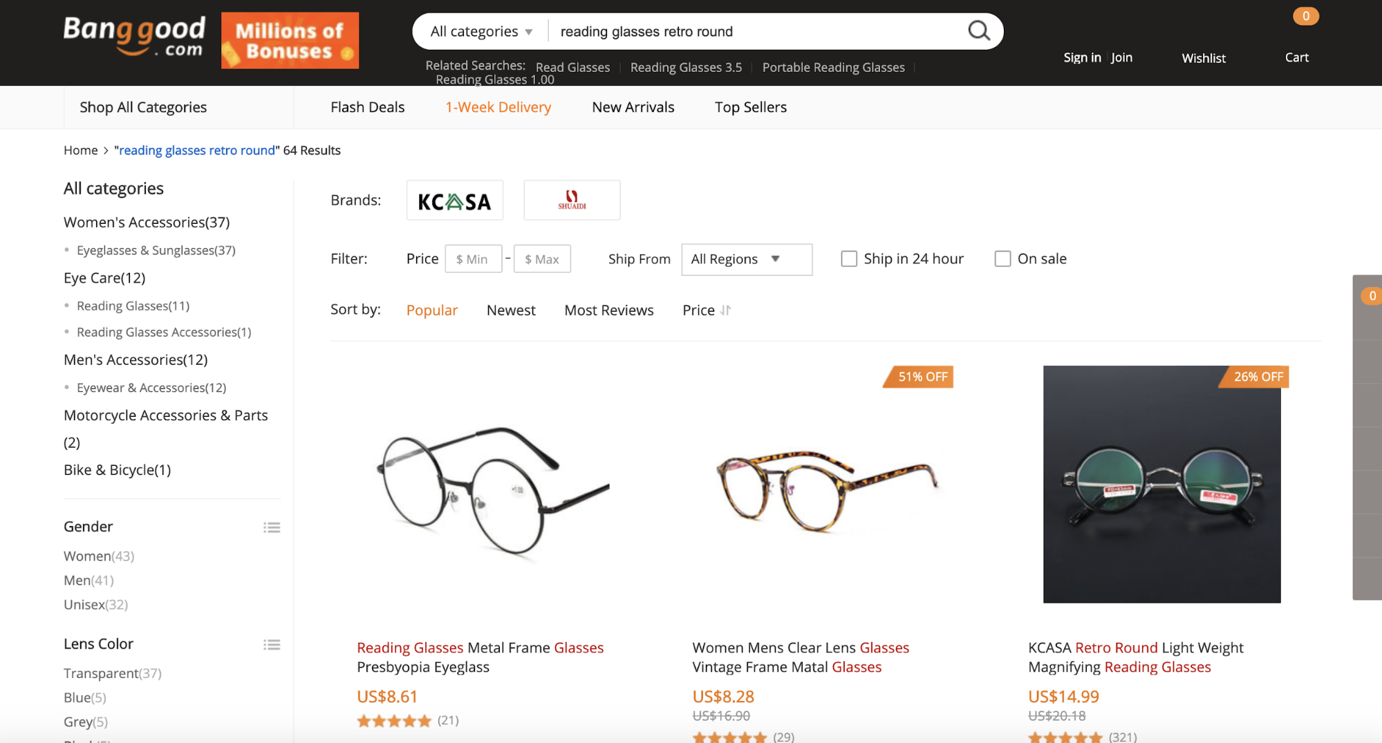
A great example of this is online retailer BangGood. After Googling “Cheap retro reading glasses,” you’re shown a sponsored ad reading: “Buy Cheap reading glasses retro round” and “$100 All Categories Coupon For New Users, Coupon Deals & Unbeatable Deals Every Day.”
Clicking through to this page takes you directly to a product catalog that’s been filtered by our search term. There’s no need to click through multiple categories and subcategories to find the style you want. Plus, highly visible “discount” labels clearly show you how much you’d be saving on each of the products if you make a purchase right away.
This brings us to another interesting concept behind creating engaging landing pages that optimize conversion: urgency.
Leveraging Urgency
Unlike shoppers going through the effort of strolling through a busy street looking for a deal, online shoppers have the option to view other retailers’ discounted wares within seconds of each other.
Few things grab the attention of a semi-motivated customer better than a highly visible countdown timer showing how much time a visitor has to take advantage of a particular “hot deal.” There’s real psychology behind this notion.
Zoma does this exceptionally well on their sales page. A clearly visible, but critically, non-intrusive visual element makes visitors aware of the fact that they have (gasp!) a short period of time left to capitalize on a massive discount.

Sure, shoppers may choose to click around for another hour to find a better deal, but there’s no way this offer is NOT sticking in the backs of their heads.
This is customer-centric design at its best. What’s one thing that will hurry along any customer in their decision making? The feeling that they are one of the few people lucky enough to take advantage of a terrific deal.
Providing Social Proof
Another great thing Zoma does on this landing page is giving visitors something they don’t always know they want: proof that other shoppers were extremely satisfied with the given product.
By now, the importance of social proof is ingrained in the thought processes of every marketer worth their salt, but what many fail to realize is the importance of its visibility and credibility on the landing page.
In Zoma's example, if you go to their sports mattress page a 4.7 star-rating is clearly visible along with a very attractive sample size. Seeing almost 300 reviews is certainly reassuring for a potential customer.
Zoma goes the extra mile by making the review element clickable — an action that, critically, doesn’t take the user away from the landing page, but rather to an anchor on the page.
What are they shown in this space? Simple copy that asks and answers the exact question they were having:
“See why active people love Zoma.”
And directly below this is a beautifully laid-out, uncluttered list of credible reviews by happy customers, all displayed above a floating CTA that prompts the visitor to add the product to their cart.

How many customer needs are being addressed in the space of one click? Let’s see:
- The need to have their consideration validated by their peers;
- Reassurance that the reviews are legit;
- The convenience of instantly taking action without needing to scroll back to a “purchase” area.
None of these needs speak directly of the product itself, but rather leverage customer needs that are intrinsic to their online shopping experience.
Addressing Pain Points
Another aspect of customer-centric design in landing pages involves giving visitors the product information they need rather than the information the company feels is relevant.
This concept speaks to the customer’s desire to instantly understand the value that a product will bring to their lives rather than a convoluted wall of text describing the company’s history, corporate values, and integrity of its staff.
Customers who have followed a link to a landing page want to know what’s in it for them. And they want to know this within seconds of reading the copy.
Marketers need to anticipate the pain points a customer wants addressed. This information should always be readily available, if they’ve done their customer profiling correctly and have a great understanding of their value proposition.
But the kicker is that conveying this value — illustrating clearly how the product will fulfill the customer’s needs — needs to be done in an engaging and easily understandable way.
Engaging Potential Customers
In this context, what does “engaging” mean? While there aren’t any paint-by-numbers answers to this question, there are some general guidelines.
Keep the visual clutter to a minimum. Show only imagery and text that relate directly to the reasons a person may be interested in the product. At first glance, do they care about the years you spent developing the service with the help of industry experts? Do they care about your company’s strategic roadmap?
Nope. They care about one thing:
“How is spending their money on your product going to solve a problem they have?”
A terrific example of this super-simplified, though highly engaging approach to communicating true customer value can be seen on the landing page for Elemental Labs.

Aside from navigation and other peripheral content elements, just over twenty words are visible to the visitor. And in those two sentences, what is communicated to the visitor? How many of their pain points are addressed? How many reasons are they given to be drawn to the CTA?
What the product is and the value it represents to the potential customer is spelled out within seconds of the user landing on this page. Customer-centricity is at the forefront of every aspect of this page’s design.
Using simple, high-quality product visuals aligned with graphic design principles that promote maximum engagement is another way to capitalize on customers-centricity.
This is something that LMNT also does exceptionally well, showing simple, tasteful visuals that show the product in its packaging as well as in use.
This tells an extremely simple visual story that can’t help but connect the customer to a mental impression of actually using the product. There’s no need for a complex sequence of images showing how the sachet is opened, poured, mixed, and then drank.
Wrapping It All Up
Customer-centricity is something that can and should be applied to almost every decision that a business makes. The temptation is always there to only think about customer needs as they interact with the product or service itself, but smart marketers and entrepreneurs understand that customer needs extend beyond their use of the product.
Customers require their time to be respected. They need businesses to understand that their attention span is limited.
They need marketers to grasp that product value isn’t something abstract. It’s something that must be communicated intelligently, without the informational and visual clutter that so often drags attention away from what’s really important:
“In what ways can the product or service make customer lives easier?”
If this question is one of the first that every marketing professional asks themselves ahead of a campaign, they’re starting out on the right path.