Smashing Animations Part 6: Magnificent SVGs With `
I explained recently how I use <symbol>, <use>, and CSS Media Queries to develop what I call adaptive SVGs. Symbols let us define an element once and then use it again and again, making SVG animations easier to maintain, more efficient, and lightweight.
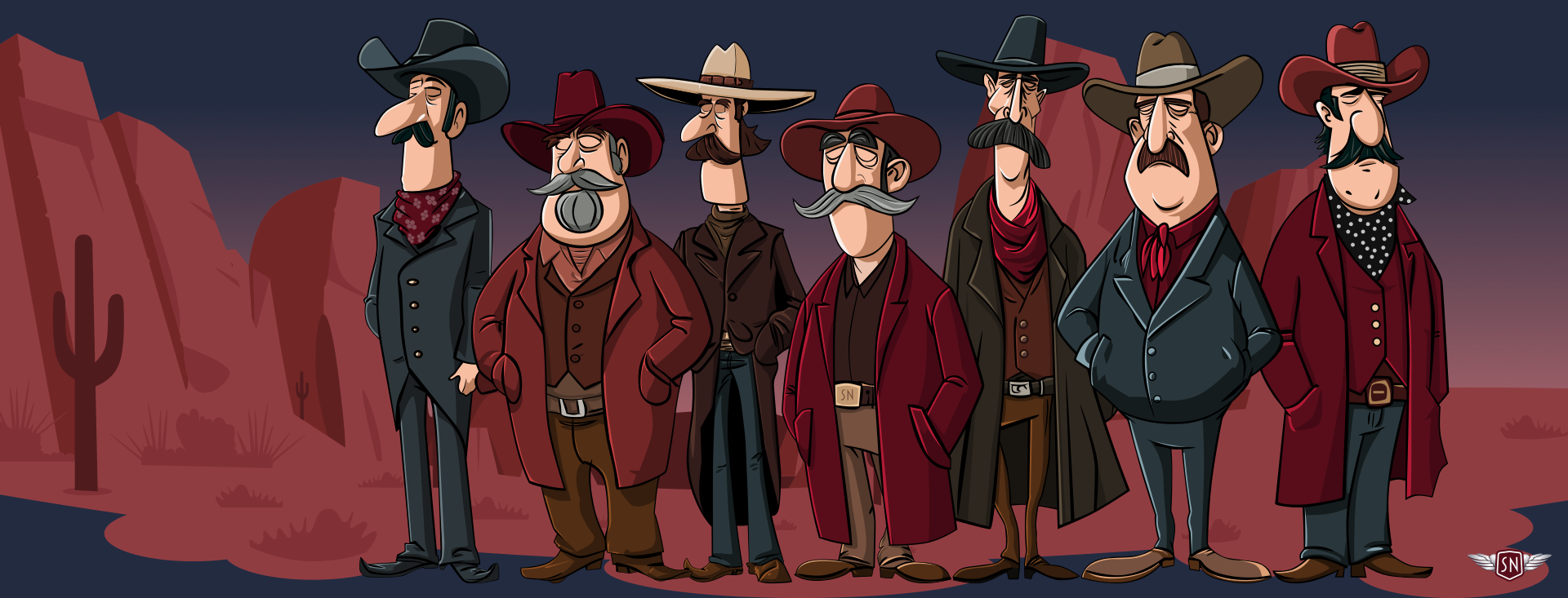
Since I wrote that explanation, I’ve designed and implemented new Magnificent 7 animated graphics across my website. They play on the web design pioneer theme, featuring seven magnificent Old West characters.
<symbol> and <use> let me define a character design and reuse it across multiple SVGs and pages. First, I created my characters and put each into a <symbol> inside a hidden library SVG:
<!-- Symbols library -->
<svg xmlns="http://www.w3.org/2000/svg" style="display:none;">
 <symbol id="outlaw-1">[...]</symbol>
 <symbol id="outlaw-2">[...]</symbol>
 <symbol id="outlaw-3">[...]</symbol>
 <!-- etc. -->
</svg>
Then, I referenced those symbols in two other SVGs, one for large and the other for small screens:
<!-- Large screens -->
<svg xmlns="http://www.w3.org/2000/svg" id="svg-large">
 <use href="outlaw-1" />
 <!-- ... -->
</svg>

<!-- Small screens -->
<svg xmlns="http://www.w3.org/2000/svg" id="svg-small">
 <use href="outlaw-1" />
 <!-- ... -->
</svg>
Elegant. But then came the infuriating. I could reuse the characters, but couldn’t animate or style them. I added CSS rules targeting elements within the symbols referenced by a <use>, but nothing happened. Colours stayed the same, and things that should move stayed static. It felt like I’d run into an invisible barrier, and I had.
When you reference the contents of a symbol with use, a browser creates a copy of it in the Shadow DOM. Each <use> instance becomes its own encapsulated copy of the referenced <symbol>, meaning that CSS from outside can’t break through the barrier to style any elements directly. For example, in normal circumstances, this tapping value triggers a CSS animation:
<g class="outlaw-1-foot tapping">
 <!-- ... -->
</g>
.tapping {
  animation: tapping 1s ease-in-out infinite;
}
But when the same animation is applied to a <use> instance of that same foot, nothing happens:
<symbol id="outlaw-1">
 <g class="outlaw-1-foot"><!-- ... --></g>
</symbol>

<use href="#outlaw-1" class="tapping" />
.tapping {
  animation: tapping 1s ease-in-out infinite;
}
That’s because the <g> inside the <symbol> element is in a protected shadow tree, and the CSS Cascade stops dead at the <use> boundary. This behaviour can be frustrating, but it’s intentional as it ensures that reused symbol content stays consistent and predictable.
While learning how to develop adaptive SVGs, I found all kinds of attempts to work around this behaviour, but most of them sacrificed the reusability that makes SVG so elegant. I didn’t want to duplicate my characters just to make them blink at different times. I wanted a single <symbol> with instances that have their own timings and expressions.

While working on my pioneer animations, I learned that regular CSS values can’t cross the boundary into the Shadow DOM, but CSS Custom Properties can. And even though you can’t directly style elements inside a <symbol>, you can pass custom property values to them. So, when you insert custom properties into an inline style, a browser looks at the cascade, and those styles become available to elements inside the <symbol> being referenced.
I added rotate to an inline style applied to the <symbol> content:
<symbol id="outlaw-1">
  <g class="outlaw-1-foot" style="
    transform-origin: bottom right;
    transform-box: fill-box;
    transform: rotate(var(--foot-rotate));">
    <!-- ... -->
  </g>
</symbol>
Then, defined the foot tapping animation and applied it to the element:
@keyframes tapping {
  0%, 60%, 100% { --foot-rotate: 0deg; }
  20% { --foot-rotate: -5deg; }
  40% { --foot-rotate: 2deg; }
}

use[data-outlaw="1"] {
  --foot-rotate: 0deg;
  animation: tapping 1s ease-in-out infinite;
}
Once I’ve set up a symbol to use CSS Custom Properties, I can pass as many values as I want to any <use> instance. For example, I might define variables for fill, opacity, or transform. What’s elegant is that each <symbol> instance can then have its own set of values.
<g class="eyelids" style="
  fill: var(--eyelids-colour, #f7bea1);
  opacity: var(--eyelids-opacity, 1);
  transform: var(--eyelids-scale, 0);"
>
  <!-- etc. -->
</g>
use[data-outlaw="1"] {
  --eyelids-colour: #f7bea1;
  --eyelids-opacity: 1;
}

use[data-outlaw="2"] {
  --eyelids-colour: #ba7e5e;
  --eyelids-opacity: 0;
}
Support for passing CSS Custom Properties like this is solid, and every contemporary browser handles this behaviour correctly. Let me show you a few ways I’ve been using this technique, starting with a multi-coloured icon system.
A Multi-Coloured Icon SystemWhen I need to maintain a set of icons, I can define an icon once inside a <symbol> and then use custom properties to apply colours and effects. Instead of needing to duplicate SVGs for every theme, each use can carry its own values.

For example, I applied an --icon-fill custom property for the default fill colour of the <path> in this Bluesky icon :
<symbol id="icon-bluesky">
  <path fill="var(--icon-fill, currentColor)" d="..." />
</symbol>
Then, whenever I need to vary how that icon looks — for example, in a <header> and <footer> — I can pass new fill colour values to each instance:
<header>
  <svg xmlns="http://www.w3.org/2000/svg">
    <use href="#icon-bluesky" style="--icon-fill: #2d373b;" />
  </svg>
</header>

<footer>
  <svg xmlns="http://www.w3.org/2000/svg">
    <use href="#icon-bluesky" style="--icon-fill: #590d1a;" />
  </svg>
</footer>
These icons are the same shape but look different thanks to their inline styles.
Data Visualisations With CSS Custom PropertiesWe can use <symbol> and <use> in plenty more practical ways. They’re also helpful for creating lightweight data visualisations, so imagine an infographic about three famous Wild West sheriffs: Wyatt Earp, Pat Garrett, and Bat Masterson.
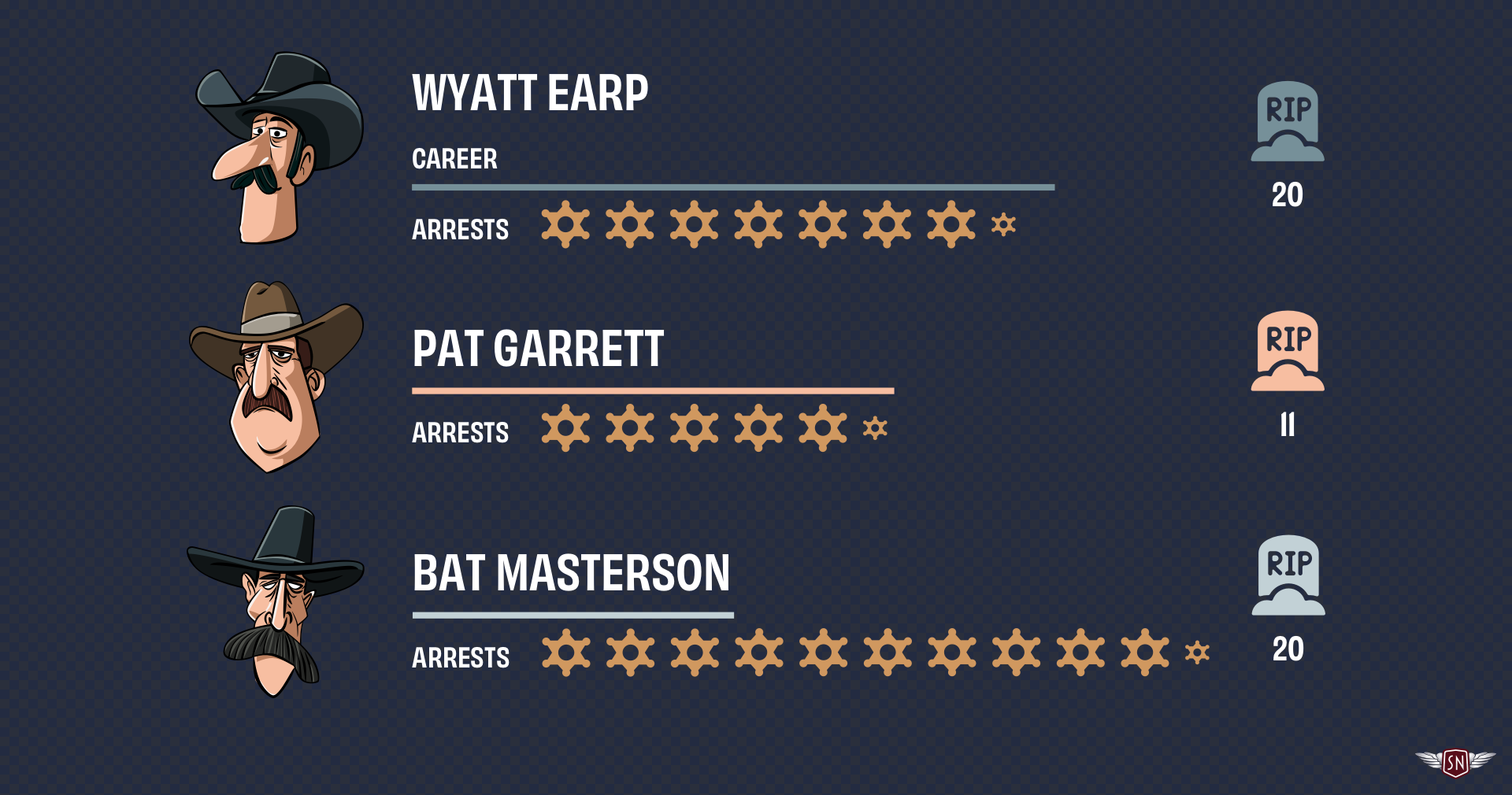
Each sheriff’s profile uses the same set of SVG three symbols: one for a bar representing the length of a sheriff’s career, another to represent the number of arrests made, and one more for the number of kills. Passing custom property values to each <use> instance can vary the bar lengths, arrests scale, and kills colour without duplicating SVGs. I first created symbols for those items:
<svg xmlns="http://www.w3.org/2000/svg" style="display:none;">
  <symbol id="career-bar">
    <rect
      height="10"
      width="var(--career-length, 100)"
      fill="var(--career-colour, #f7bea1)"
    />
  </symbol>

  <symbol id="arrests-badge">
    <path
      fill="var(--arrest-color, #d0985f)"
      transform="scale(var(--arrest-scale, 1))"
    />
  </symbol>

  <symbol id="kills-icon">
    <path fill="var(--kill-colour, #769099)" />
  </symbol>
</svg>
Each symbol accepts one or more values:
--career-lengthadjusts thewidthof the career bar.--career-colourchanges thefillcolour of that bar.--arrest-scalecontrols the arrest badge size.--kill-colourdefines thefillcolour of the kill icon.
I can use these to develop a profile of each sheriff using <use> elements with different inline styles, starting with Wyatt Earp.
<svg xmlns="http://www.w3.org/2000/svg">
  <g id="wyatt-earp">
    <use href="#career-bar" style="--career-length: 400; --career-color: #769099;"/>
    <use href="#arrests-badge" style="--arrest-scale: 2;" />
    <!-- ... -->
    <use href="#arrests-badge" style="--arrest-scale: 2;" />
    <use href="#arrests-badge" style="--arrest-scale: 1;" />
    <use href="#kills-icon" style="--kill-color: #769099;" />
  </g>

  <g id="pat-garrett">
    <use href="#career-bar" style="--career-length: 300; --career-color: #f7bea1;"/>
    <use href="#arrests-badge" style="--arrest-scale: 2;" />
    <!-- ... -->
    <use href="#arrests-badge" style="--arrest-scale: 2;" />
    <use href="#arrests-badge" style="--arrest-scale: 1;" />
    <use href="#kills-icon" style="--kill-color: #f7bea1;" />
  </g>

  <g id="bat-masterson">
    <use href="#career-bar" style="--career-length: 200; --career-color: #c2d1d6;"/>
    <use href="#arrests-badge" style="--arrest-scale: 2;" />
    <!-- ... -->
    <use href="#arrests-badge" style="--arrest-scale: 2;" />
    <use href="#arrests-badge" style="--arrest-scale: 1;" />
    <use href="#kills-icon" style="--kill-color: #c2d1d6;" />
  </g>
</svg>
Each <use> shares the same symbol elements, but the inline variables change their colours and sizes. I can even animate those values to highlight their differences:
@keyframes pulse {
  0%, 100% { --arrest-scale: 1; }
  50% { --arrest-scale: 1.2; }
}

use[href="#arrests-badge"]:hover {
  animation: pulse 1s ease-in-out infinite;
}
CSS Custom Properties aren’t only helpful for styling; they can also channel data between HTML and SVG’s inner geometry, binding visual attributes like colour, length, and scale to semantics like arrest numbers, career length, and kills.
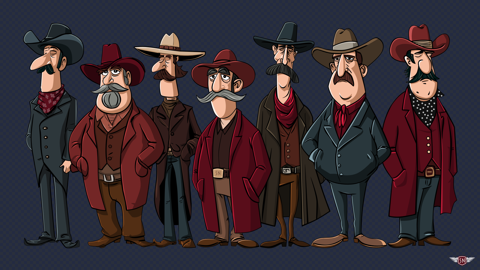
Ambient AnimationsI started learning to animate elements within symbols while creating the animated graphics for my website’s Magnificent 7. To reduce complexity and make my code lighter and more maintainable, I needed to define each character once and reuse it across SVGs:
<!-- Symbols library -->
<svg xmlns="http://www.w3.org/2000/svg" style="display:none;">
  <symbol id="outlaw-1">[…]</symbol>
  <!-- ... -->
</svg>

<!-- Large screens -->
<svg xmlns="http://www.w3.org/2000/svg" id="svg-large">
  <use href="outlaw-1" />
  <!-- ... -->
</svg>

<!-- Small screens -->
<svg xmlns="http://www.w3.org/2000/svg" id="svg-small">
  <use href="outlaw-1" />
  <!-- ... -->
</svg>
But I didn’t want those characters to stay static; I needed subtle movements that would bring them to life. I wanted their eyes to blink, their feet to tap, and their moustache whiskers to twitch. So, to animate these details, I pass animation data to elements inside those symbols using CSS Custom Properties, starting with the blinking.
I implemented the blinking effect by placing an SVG group over the outlaws’ eyes and then changing its opacity.
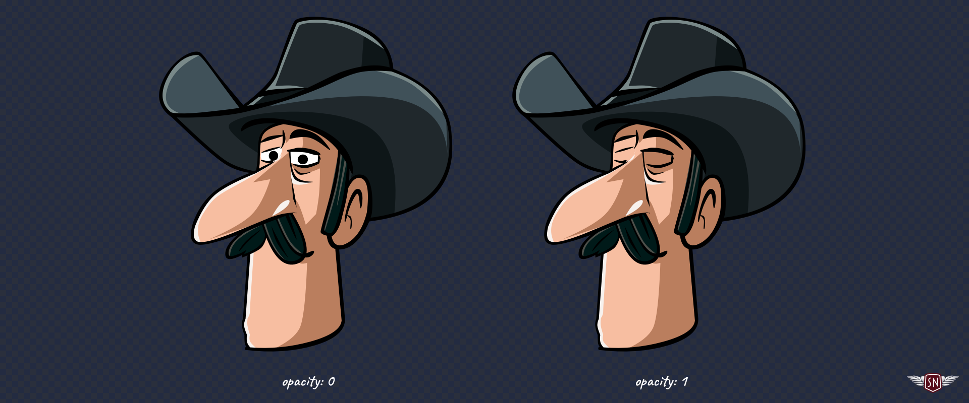
To make this possible, I added an inline style with a CSS Custom Property to the group:
<symbol id="outlaw-1" viewBox="0 0 712 2552">
 <g class="eyelids" style="opacity: var(--eyelids-opacity, 1);">
    <!-- ... -->
  </g>
</symbol>
Then, I defined the blinking animation by changing --eyelids-opacity:
@keyframes blink {
  0%, 92% { --eyelids-opacity: 0; }
  93%, 94% { --eyelids-opacity: 1; }
  95%, 97% { --eyelids-opacity: 0.1; }
  98%, 100% { --eyelids-opacity: 0; }
}
…and applied it to every character:
use[data-outlaw] {
  --blink-duration: 4s;
  --eyelids-opacity: 1;
  animation: blink var(--blink-duration) infinite var(--blink-delay);
}
…so that each character wouldn’t blink at the same time, I set a different --blink-delay before they all start blinking, by passing another Custom Property:
use[data-outlaw="1"] { --blink-delay: 1s; }
use[data-outlaw="2"] { --blink-delay: 2s; }

use[data-outlaw="7"] { --blink-delay: 3s; }
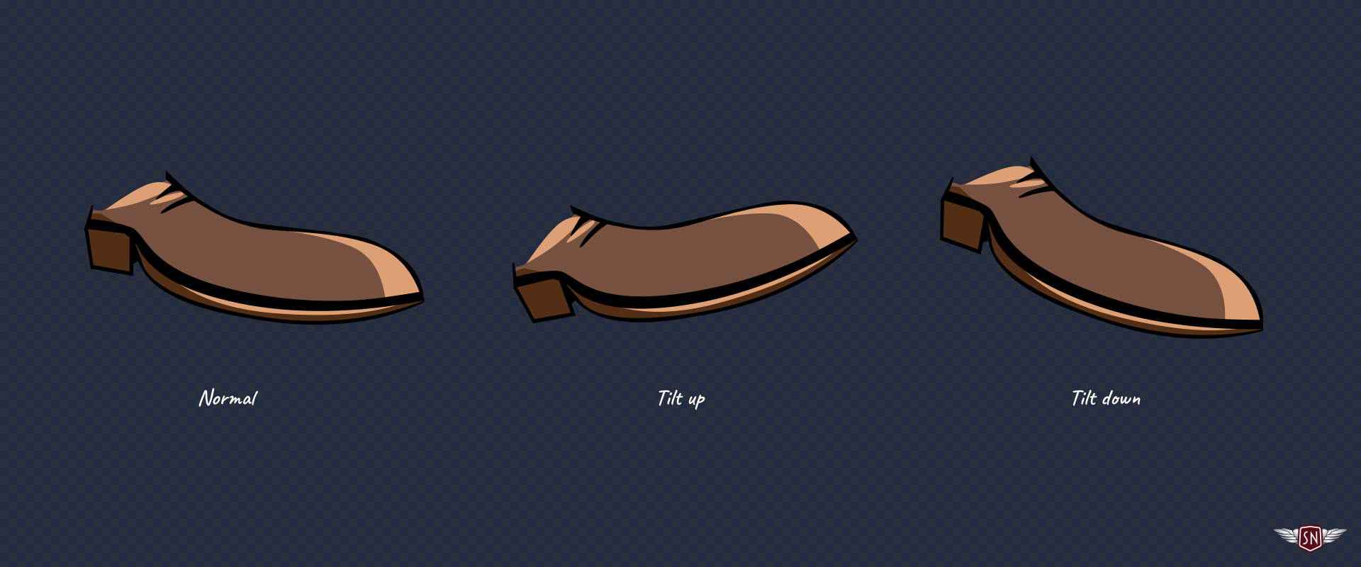
Some of the characters tap their feet, so I added an inline style with a CSS Custom Property to those groups, too:
<symbol id="outlaw-1" viewBox="0 0 712 2552">
  <g class="outlaw-1-foot" style="
    transform-origin: bottom right;
    transform-box: fill-box;
    transform: rotate(var(--foot-rotate));">
  </g>
</symbol>
Defining the foot-tapping animation:
@keyframes tapping {
  0%, 60%, 100% { --foot-rotate: 0deg; }
  20% { --foot-rotate: -5deg; }
  40% { --foot-rotate: 2deg; }
}
And adding those extra Custom Properties to the characters’ declaration:
use[data-outlaw] {
  --blink-duration: 4s;
  --eyelids-opacity: 1;
  --foot-rotate: 0deg;
  animation:
    blink var(--blink-duration) infinite var(--blink-delay),
    tapping 1s ease-in-out infinite;
}
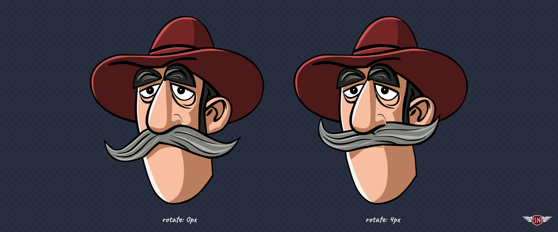
…before finally making the character’s whiskers jiggle via an inline style with a CSS Custom Property which describes how his moustache transforms:
<symbol id="outlaw-1" viewBox="0 0 712 2552">
  <g class="outlaw-1-tashe" style="
    transform: translateX(var(--jiggle-x, 0px));"
  >
    <!-- ... -->
  </g>
</symbol>
Defining the jiggle animation:
@keyframes jiggle {
  0%, 100% { --jiggle-x: 0px; }
  20% { --jiggle-x: -3px; }
  40% { --jiggle-x: 2px; }
  60% { --jiggle-x: -1px; }
  80% { --jiggle-x: 4px; }
}
And adding those properties to the characters’ declaration:
use[data-outlaw] {
  --blink-duration: 4s;
  --eyelids-opacity: 1;
  --foot-rotate: 0deg;
  --jiggle-x: 0px;
  animation:
    blink var(--blink-duration) infinite var(--blink-delay),
    jiggle 1s ease-in-out infinite,
    tapping 1s ease-in-out infinite;
}
With these moving parts, the characters come to life, but my markup remains remarkably lean. By combining several animations into a single declaration, I can choreograph their movements without adding more elements to my SVG. Every outlaw shares the same base <symbol>, and their individuality comes entirely from CSS Custom Properties.
Even though this technique might seem bulletproof, there are a few traps it’s best to avoid:
- CSS Custom Properties only work if they’re referenced with a
var()inside a<symbol>. Forget that, and you’ll wonder why nothing updates. Also, properties that aren’t naturally inherited, likefillortransform, need to usevar()in their value to benefit from the cascade. - It’s always best to include a fallback value alongside a custom property, like
opacity: var(--eyelids-opacity, 1);to ensure SVG elements render correctly even without custom property values applied. - Inline styles set via the
styleattribute take precedence, so if you mix inline and external CSS, remember that Custom Properties follow normal cascade rules. - You can always use DevTools to inspect custom property values. Select a
<use>instance and check the Computed Styles panel to see which custom properties are active.
The <symbol> and <use> elements are among the most elegant but sometimes frustrating aspects of SVG. The Shadow DOM barrier makes animating them trickier, but CSS Custom Properties act as a bridge. They let you pass colour, motion, and personality across that invisible boundary, resulting in cleaner, lighter, and, best of all, fun animations.