5 Reasons Bad Graphic Design is Hurting Your Blog Performance
You’re up for the biggest interview of your life. You’re determined to make a killer first impression.
Would you wear sweatpants? Of course, you wouldn’t.
Why? Because presentation is everything.
Just like you wouldn’t wrap a diamond in toilet paper, don’t wrap high-quality blog content in bad graphic design. You’re only asking people to abandon your blog before they’ve even given it a shot.
Instead, your graphic design should complement your blog, helping to explain complex concepts to the reader, while encouraging conversions.
Unsure what’s going so terribly wrong with your graphic design? This article will break down the five main reasons bad graphic design is seriously hurting your blog’s performance.
The Challenge of Bad Graphic Design
While blogging may be your forte, the visual design of your blog posts helps to ease readability and guide the reader through your points.
Good graphic design will ooze professionalism, aiding navigation, and bolstering your overall brand image.
Using high-quality product images, sleek custom images, and consistent branding, successful bloggers and online business owners use top quality visual design to appeal to their specific target audience while encouraging conversions.
The problem is that nearly half of all content marketers complain that it’s a real challenge to produce consistently high quality graphic design.
Whether it’s due to lack of budget and skills or shoddy graphic designers, 84% of marketers agree that if you don’t have a focus on design, you’ll be outperformed by your competitors.
Not convinced that graphic design makes much difference to your blog’s performance? Read on to see just how badly poor graphic design harms your blog, especially if you hope to make money blogging.
How is Bad Graphic Design Hurting Your Blog Performance?
While the content of your blog may be the star of the show, if your graphic design doesn’t dazzle on the first impression, readers won’t even get to the writing.
Poor graphic design is a real turn-off — it makes your blog look cheap. Not only that, it’s seriously hampering your blog’s performance. Here’s how.
1. Poor graphic design causes high bounce rates
Simply put, if your graphic design is unappealing and uncoordinated, visitors will click off your site.
There are a few reasons that visitors may choose to leave your site due to poor design, but it’s usually something to do with user experience or credibility.
Bad graphic design can interrupt that cadence, making it difficult to read or confusing to look at.
Take this blog post by Goth Gardening:
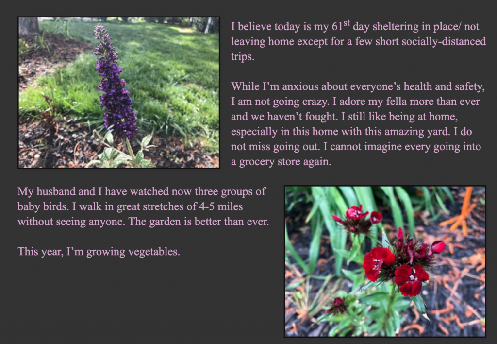
While the photos are original pictures taken by the writer, they bear no relevance to what the content actually says.
On top of this, the alignment makes it difficult to read the paragraphs without having to jump from one side of the page to the other. And the pale pink writing against the gray background is difficult to read.
Rather than struggling through, visitors may simply leave the page due to poor user experience caused by bad graphic design.
Now let’s look at Straw Bale Gardens:
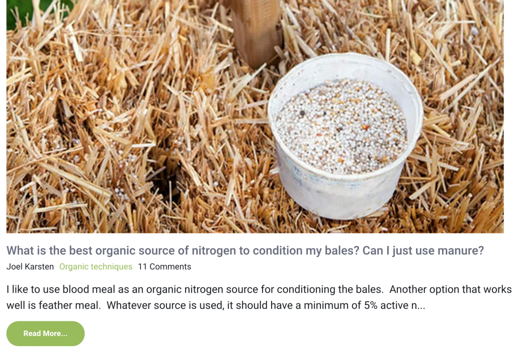
Reading through the blog, the writer is clearly an expert on straw bale garden and home design.
However, the blurred hero images of unknown substances hurt the credibility of the blogger’s expertise.
Readers have no idea what they’re being shown and the writer doesn’t utilize the images to make it clear.
If the readers can’t make head or tail of the hero image, they’re highly unlikely to click the blog and even more unlikely to believe its content.
Instead, choose visually stimulating images that support your message and aid the flow of the website. This can reduce your bounce rate by 45%.
Keep in mind that you don’t have to have a photoshoot for each post you create, and your graphics can be as simple as vector illustrations.
2. Unsophisticated graphic design fails to present a consistent brand image
A consistent brand image gives a professional feel to your blog and builds brand awareness to bolster loyalty.
Especially important for affiliate bloggers, consistency is key to conversions. Consistent branding can increase your conversions by up to 33%. That’s a third of sales you’re missing out on due to inconsistent branding in your graphic design.
Equally, your branding should help to differentiate you from other blogs on the same topic so that your followers can identify your content immediately.
73% of organizations are focusing on design to differentiate their brand this year as it’s one of the best ways to build a tangible brand image. Blogs that don’t focus on using design as a differentiator are missing a key opportunity to separate themselves from the competition.
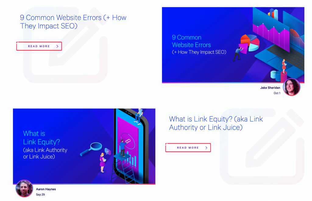
Let’s take a look at Ranking by SEO:

While some of the blog’s writers go to the effort of making custom images, not all of the contributors conform. Instead, some writers simply use stock images to head up blog posts.
Of the custom images that do exist, none have a consistent aesthetic. Each image has a different color palette, font, and illustrative style.
If these images were shared on social media, nobody would know they were advertising Ranking by SEO.
In contrast, check out the consistent custom images used in Loganix’s graphic design:
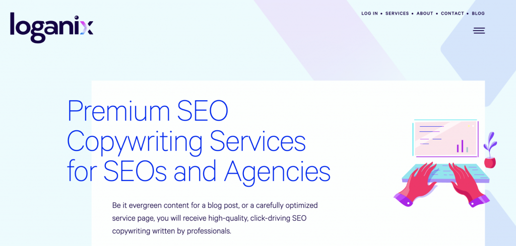
Notice how the company uses the same color palette for its custom images as is used in its logo.
Equally, when you head to the content writing firm’s blog, you’ll see that all custom hero images match the same color palette and illustrative graphic style.
If these images were posted on social media, you’d immediately know they were associated with Loganix.
The problem is that many people believe they don’t have the assets to nurture a consistent image.
If you feel that way, try using free graphic design programs like Canva and PicMonkey to create professional-looking custom images that fit consistently with your blog’s brand image.
3. Pointless graphic design won’t help clarify complex concepts
Write a blog, shove in a few vaguely relevant stock images, and away you go, right? No.
You need to be thoughtful about the graphic design elements within your blogs, otherwise, you miss opportunities to clarify complex ideas.
Worse still, you may overcomplicate your points with poorly-coordinated images and design features.
Check out this image choice on All About Pets:
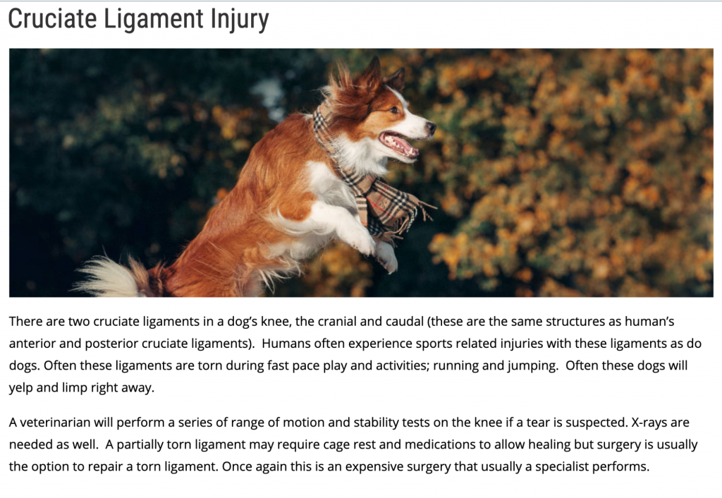
For those who don’t know, a cruciate ligament injury is extremely painful, both in animals and humans. The main signs your dog may have a cruciate ligament injury include stiffness, lameness, and awkwardness when sitting. Basically, the opposite of what the dog is doing in this picture.
The graphic design choice for this blog directly contradicts the paragraph it’s supposed to support. This makes it confusing for readers — should you be watching out for your dog springing around on his back legs?
Let’s compare it to this similar blog by Pittsboro Animal Hospital:
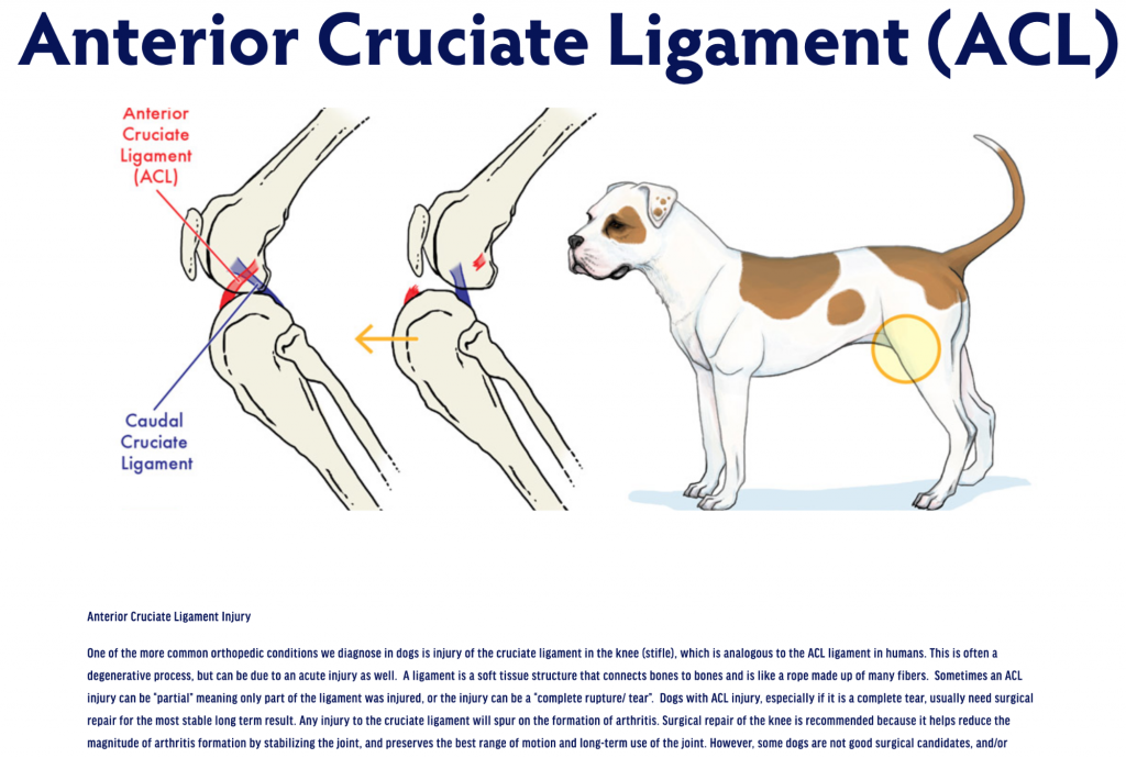
In this case, the custom graphic is used to illustrate the points explained in the blog. Annotated diagrams help to show what the injury looks like and where it may occur on the reader’s animal.
This example of stellar graphic design takes a complex concept and breaks it down using a simplistic diagram. The reader leaves the blog far more informed thanks to a visual explanation of the issue.
4. Unprofessional graphic design lowers quality of your products
If your blog exists to showcase products and push sales, your graphic design should work to enhance the products you’re trying to sell. You should include high quality product images, along with graphics that show that product or service in action.
Bad product images only serve to make your products look low quality.
Take a look at Khan Home Improvement, for example:
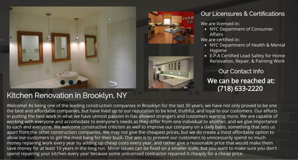
Not only are all the images too small to truly see the quality of the kitchen renovations, the photograph on the left is wonky. What’s more, it’s an image of a bathroom on a blog for kitchen renovations.
The dimly-lit photographs combined with the misuse of images makes the renovations service look inferior and slapdash. The text is difficult to read, both due to its condensed layout and the background image underneath.
As uSERP’s search ranking specialist, Jeremy Moser puts it “Readers don’t want to read long blocks of text. They need something to capture their interest and eye-catching graphics are an excellent way to do so.”
Now check out this sleeker version of product graphic design by NYKB:
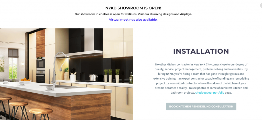
The high resolution image shows a far more professional finish and is large enough to see clearly.
Rather than lots of block text on a dark background, a short explanation complements the image. The use of whitespace makes the text far easier to read.
Overall, thanks to a more professional graphic design, this kitchen renovation contractor gives the impression of a higher quality job. It’s obvious who you’d hire to renovate your kitchen.
5. Thoughtless graphic design misses conversion opportunities
You may not be looking to convert your readers into buyers, but you’re probably still looking to convert your readers into blog subscribers.
The structure and flow of your blog should work to make it easy for your readers to know what to do next. It’s your job to show them their next course of action with clear visual signals.
When considering graphic design elements, think about what visual elements help customers to convert — how are you signposting your subscription or purchase links?
Take a look at this blog post by ManyCam:

Not only are there no images throughout the entire post, there are also no obvious calls-to-action (CTAs). While there are a few affiliate links scattered throughout the text, the webcam company fails to lead readers toward their own product.
Since the educational market is an important target sector for ManyCam, the company is missing a huge opportunity to convert readers of this blog post.
Let’s compare it to language tutor platform, Preply:
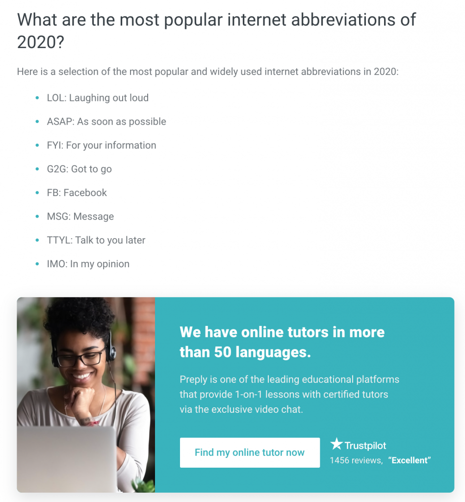
Preply inserts professionally-designed custom CTA images at appropriate breaks throughout this blog post about English colloquialisms.
Readers of this post are likely not native English speakers and are coming to the blog to learn about the English language. This gives Preply a prime opportunity to add a polished, on-brand CTA to find an online tutor.
Notice how the CTA is shaped like a button. CTAs designed like buttons convert 2.3 times more than those that aren’t.
3 Tips to Avoid Bad Graphic Design
Don’t fall into the trap of poor graphic design — it only undermines the hard work you put into writing your blog posts.
Instead, follow these graphic design tips to ensure your blogs have a consistent, professional feel that voices your brand image and encourages engagement.
1. Consistent branding
There’s a reason that 37% of marketers are highly focused on consistency in branding. It’s because it sends a clear message to the reader about who you are and what you’re about.
If you continuously chop and change your blog’s image, readers may get confused about the tone of your message.
Equally, consistent branding helps readers to recognize your brand across all your social media platforms and marketing channels.
2. Use creative graphics to elaborate your points
There are various creative ways to use graphics to explain complex ideas, get your point across, and make your content more shareable.
67% of B2B marketers use infographics — the fourth most used content type. This is because infographics are a great way to break down intense data into easily-visualizable chunks.
Check out this eye catching example from Marketer Hire and how they share statistics on remote work amidst COVID-19:
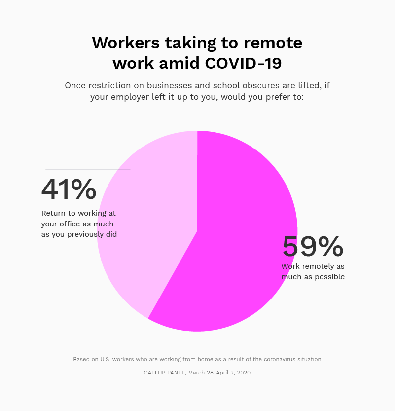
Wouldn’t you rather see statistics and facts in quirky illustrated cartoon form over a dreary black-and-white table?
Another effective way to illustrate your message is to include screenshots. If you’re talking about a particular product, brand, or program, screenshots are perfect for showing how something works immediately.
That’s how local SEO Agency, Ardent Growth, helps to explain local search marketing in its blog:
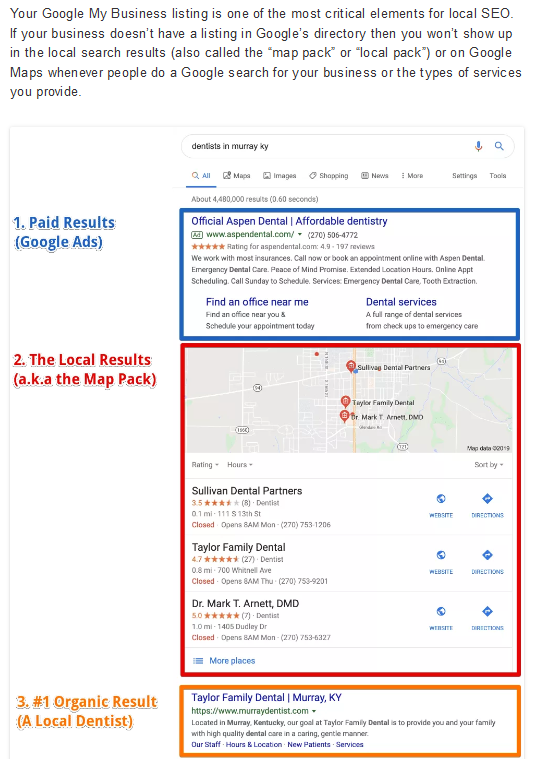
Each paragraph of the blog post gives the reader guidance on how to conduct local search marketing. Screenshots of each step are added to demonstrate these points in action.
3. Avoid stock images
60% of marketers have given up using stock images because they’re simply not engaging. Stock images do little for your blog post beyond adding a bit of color.
Nowadays marketing specialists agree that custom graphics are the best way to reach marketing goals.
While you may not see blogging as a marketing endeavor, you’re still trying to cinch followers and up your readership. Custom images are far more effective at doing this than stock images as they add a personal touch to your blog.
Conclusion
Since it’s obvious that poor graphic design is hampering your blog’s performance, it’s about time you invested in sleeker images and a more professional aesthetic.
While you can always hire a graphic designer, why not try using online graphic design tools like Canva, PicMonkey, Crello, or Venngage? With custom images, infographics, and screenshots, you’ll be able to create a more consistent brand image to differentiate your blog from competing websites.
Photo by Jeroen den Otter on Unsplash
Creator; Adam Enfroy
You can follow him on Facebook, Twitter, and Instagram.