Figma Auto Layout: The Secret to Responsive Design
Designing for multiple screen sizes can get complicated fast.
Whether you’re building a mobile app or a web interface, layouts need to scale, align, and respond to changing content and device dimensions.
That’s where Figma’s Auto Layout feature comes in—and once you start using it, it’s hard to imagine working without it.
Figma Auto Layout lets you create flexible UI components that adapt automatically to content changes, screen sizes, or user interactions.
It’s not just a time-saver—it’s a smarter way to build responsive designs that actually work in real-world scenarios.
What Is Auto Layout in Figma?
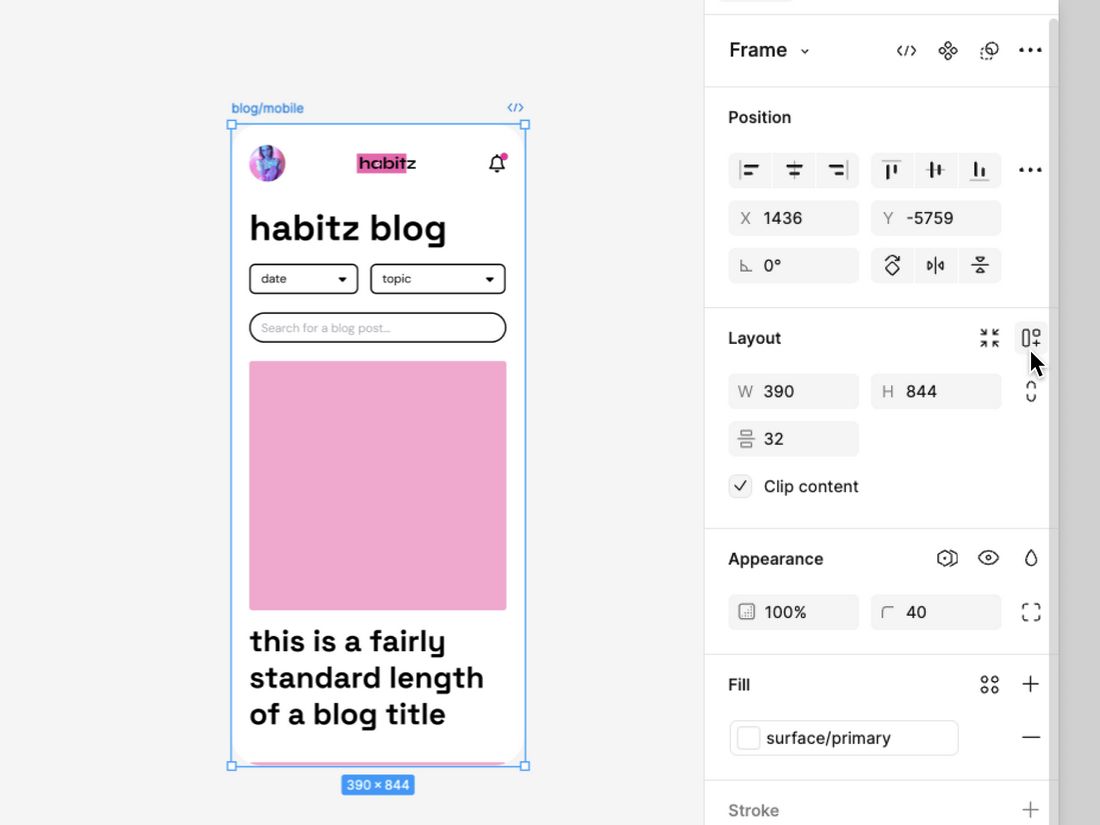
Auto Layout is a feature in Figma that allows you to apply rules to frames or components, so their size and position adjust based on their content or container.
Think of it like CSS Flexbox for UI design. You can define spacing, alignment, padding, and direction (horizontal or vertical), and Figma handles the rest.
For example, a button with Auto Layout can automatically resize when the label text changes, keeping padding consistent and avoiding layout breaks.
It’s ideal for buttons, cards, nav bars, and even full-page layouts.
Why Use Auto Layout?
Figma Auto Layout encourages you to design more like a developer thinks.
Since Auto Layout closely mirrors how real-world interfaces behave (especially when using Flexbox or CSS Grid), it helps bridge the gap between design and development.
Developers can inspect your Figma files and see clearly defined padding, alignment, and spacing—making the handoff more accurate and less reliant on guesswork.
For teams working on scalable design systems, Auto Layout ensures every component behaves predictably.
Auto Layout brings several key benefits to UI design workflows:
Design Responsively
Whether it’s a card that expands with extra text or a form that needs to adjust for tablet and desktop views, Auto Layout makes your designs responsive without having to resize elements manually.
Faster Iteration
Need to change button text or add an icon? With Auto Layout, everything repositions automatically. You spend less time adjusting padding and more time designing.
Better Consistency
Auto Layout enforces spacing rules, so elements align consistently across all instances. This is especially useful in design systems, where consistency is key.
Developer-Friendly Hand-Off
Because Auto Layout mimics real-world behavior (like stacking, spacing, and resizing), developers can more easily translate your designs into code—without guessing margins or pixel values.
How to Use Auto Layout in Figma
Getting started with Auto Layout is simple, but mastering it takes a bit of practice.
Begin by selecting the frame, group, or component you want to make responsive.
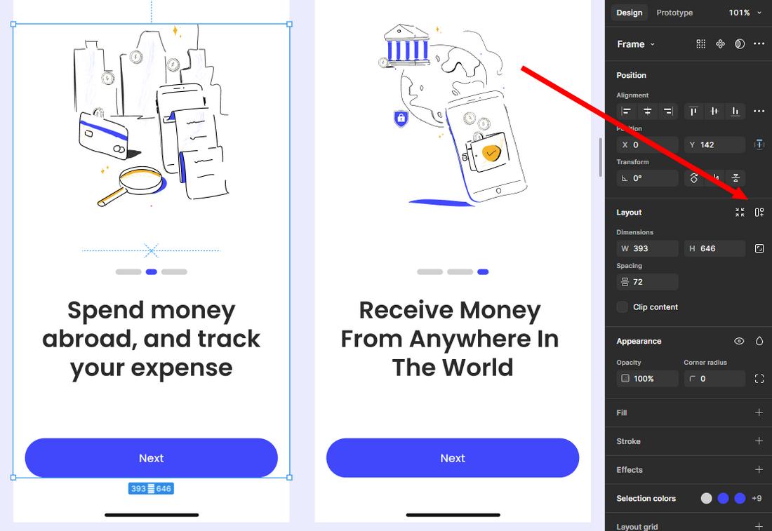
You’ll see the Auto Layout section in the right-hand panel—just click the “+” to apply it. This instantly turns your selection into a flexible container, allowing you to control how its contents behave.
After enabling Auto Layout, choose the layout direction: horizontal (side-by-side) or vertical (stacked). This determines how the child elements will be arranged.
For example, a vertical layout is great for stacking text blocks, while a horizontal layout works well for navigation bars or button groups.
You can also reverse the order if needed, giving you flexibility without rearranging layers manually.
Here’s a quick overview of how it works:
Step 1: Select Your Frame or Component
You can apply Auto Layout to any frame, group, or component. Select the element, then click the “+” next to Auto Layout in the right-hand panel.
Step 2: Choose Direction: Vertical or Horizontal
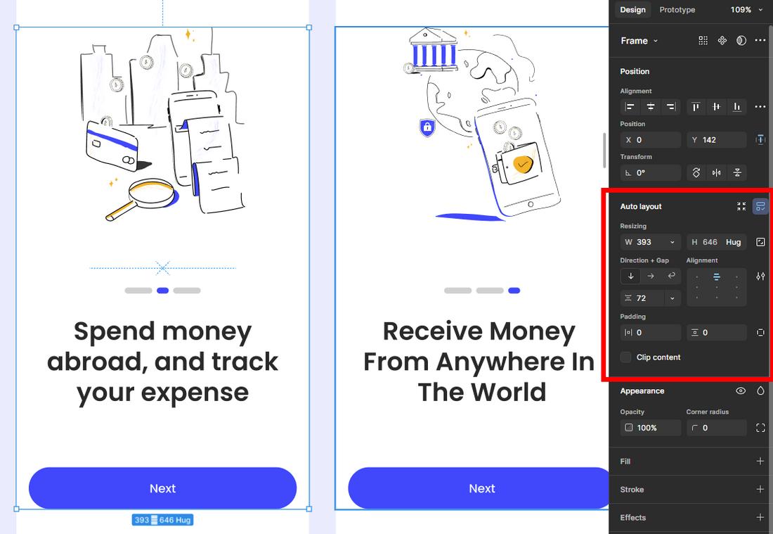
Auto Layout can arrange child elements either vertically (top to bottom) or horizontally (left to right). Choose the direction that fits your layout.
Step 3: Set Spacing and Padding
Define how much space appears between elements (spacing) and between the content and the edge of the container (padding). These values ensure your layout adapts smoothly to content changes.
Step 4: Align Content
You can align items within a frame—start, center, end, or space between. This is especially useful for buttons with icons, or toolbars with multiple controls.
Step 5: Combine Auto Layouts
You can nest Auto Layouts inside each other. For example, a card might have a vertical Auto Layout for stacking a title and description, while its action buttons use a horizontal layout.
10 Tips for Designing with Auto Layout
Once you’ve grasped the basics of Auto Layout, the next step is learning how to make it work smarter for you.
These tips will help you build UI components that not only look good but also behave predictably across devices, screen sizes, and content variations.
1. Use Text-Based Buttons
Buttons are one of the best use cases for Auto Layout. Instead of setting a fixed width, apply Auto Layout to your button and allow the text to define the width, with padding on all sides.
This way, your button will automatically resize when you change the label, keeping everything aligned without manual tweaking.
It’s especially helpful for multilingual apps, where text length may vary.
2. Make Components Flexible With “Hug” and “Fill”
Understanding when to use “hug contents” vs. “fill container” is key to designing flexible components.
Use “hug” when the content should dictate the size (like a badge or tag), and “fill” when you want the element to stretch to the available space (like input fields or layout containers).
You can mix and match these settings within a frame to create smart, responsive behavior.
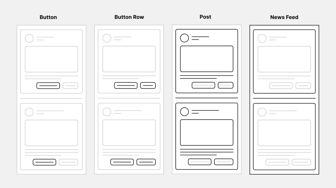
3. Build Responsive Cards and Lists
Cards often need to adapt to different types of content—long titles, multiple images, or varying descriptions.
Use vertical Auto Layout to stack content, and apply consistent spacing between elements. Then, add a nested horizontal Auto Layout for image thumbnails or buttons.
This approach keeps everything aligned and balanced, no matter how much content is inside the card.
4. Test Resizing As You Design
Don’t wait until the end of your design to see how your components respond. As you build, drag the parent frames wider and taller to check how the content behaves.
This is especially useful for mobile and web layouts where screen sizes can vary. Testing early helps you catch alignment issues or rigid components that don’t scale properly.
5. Use Auto Layout in Navigation Bars
Navigation bars can quickly become messy if items aren’t spaced evenly. Use horizontal Auto Layout to align nav links, buttons, or icons with consistent gaps.
You can also add padding and spacing between groups for a tidy, scalable navigation experience that adjusts to different screen widths.
6. Apply Smart Padding and Consistent Spacing
One of Auto Layout’s biggest strengths is maintaining consistent internal spacing.
Use padding to define space between the frame edge and the content, and set a uniform gap between child elements.
This keeps your UI elements visually balanced and reduces guesswork in layout spacing.
7. Use Alignment Tools to Create Structure
Within Auto Layout, you can align items to the start, center, end, or space-between. These settings allow you to control exactly how elements behave in different contexts.
For example, aligning a CTA button to the end of a container ensures it always sits flush with the edge, even if the content above changes.
8. Combine Auto Layout With Constraints
Constraints and Auto Layout can work together to improve responsiveness. Use constraints to anchor elements within their parent frame when resizing the canvas.
For example, you can fix a header’s position to the top while allowing its width to adjust based on screen size. This hybrid approach makes designs feel more dynamic and adaptable.
9. Use Auto Layout With Variants and Design Systems
If you’re building a design system, combining Auto Layout with component variants is incredibly powerful.
For instance, a button component can have small, medium, and large variants—all using the same Auto Layout logic.
This allows you to reuse and scale components efficiently while keeping interactions consistent across your project.
10. Label and Organize Auto Layout Frames
As your design gets more complex, keeping frames organized becomes more important. Name your Auto Layout layers clearly and use consistent naming conventions.
This makes it easier to navigate your file later and is especially helpful when working in teams or handing off files to developers.
Conclusion
Figma’s Auto Layout isn’t just a convenience—it’s a fundamental tool for creating designs that behave like real interfaces. It brings structure, flexibility, and responsiveness to your UI, while simplifying collaboration and handoff to developers.
Whether you’re building a design system, prototyping responsive screens, or just looking to streamline your workflow, Auto Layout can help you move faster and design smarter.