Meet “Smart Interface Design Patterns Checklists” (Deck With 166 Cards)
Every UI component brings along its unique challenges. Inventing a new solution to every problem takes time, and very often it’s really not necessary. We can rely on smart design patterns and ask the right questions ahead of time to avoid issues down the line.
As a little celebration for our 16th birthday, we are happy to finally release our Smart Interface Design Checklists — a deck of 166 cards that are here to help us all keep track of the things we need to consider. Jump to table of contents.
- Jump to the details ↓
- Check the free preview (PDF, 825KB)
- Shipping worldwide now.
- Get the deck of cards right away!
 About The Checklist Cards
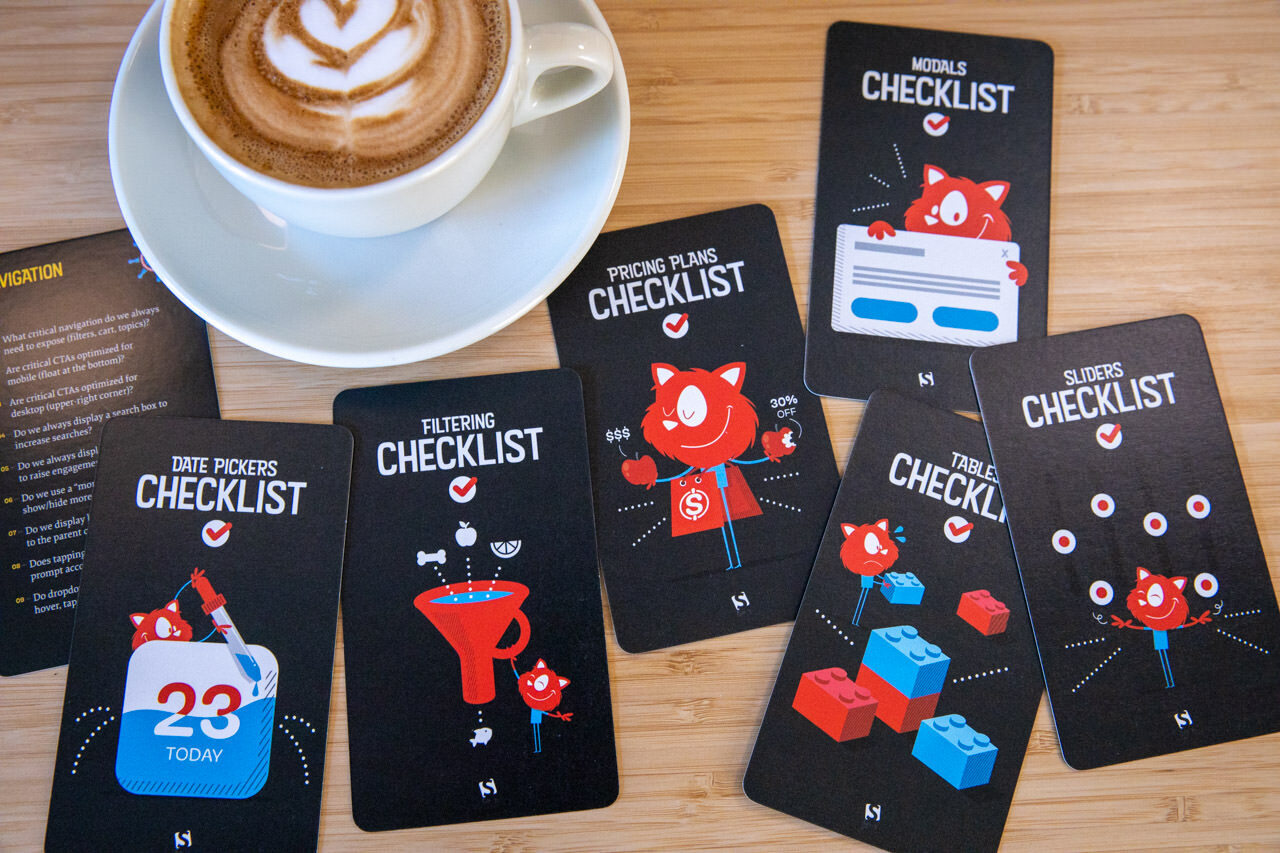
Meet the deck of 166 checklist cards with common questions to ask when tackling any interface challenge. Curated and compiled by yours truly to help us all keep track of all the fine little details to design and build better interfaces, faster. Plus, a good way to not forget anything critical, and avoid costly mistakes down the line.
The cards are beautifully designed by our dear illustrator Ricardo Gimenes and jam-packed with everything you need to keep in mind when designing UI components. This deck of checklist cards is always by your side — on your desk or on your phone when you’re on the go. Check the free preview. (PDF, 825KB)

 The Smart Interface Design Patterns Checklists are a trusty companion on any designer’s desk. Large view.
What’s Inside The Box?
The cards are here to help you make the right design decisions. They don’t provide ultimate answers; you can see them as helpful conversation starters for your design/dev teams to help avoid misunderstandings or confusion down the line. They remind you of things that often get forgotten, overlooked or dismissed.
Here’s an overview of all the topics covered by the deck of checklists:
- Are all our icons large enough to avoid rage taps/clicks (50×50px)?
- Can users double tap on the same spot to undo/restore actions?
- Have we tested for frequency of rage clicks/taps?
- ...and 23 more questions.
- What icon do we choose to indicate expansion?
- Should expanded section collapse automatically?
- Should the user be scrolled automatically when expanded?
- ...and 11 more questions.
- Do drop-downs appear/disappear on hover, tap/click, or both?
- Do nav items appear in a full page/partial overlay or slide-in?
- Can we split the nav vertically for sub-menus on mobile?
- ...and 27 more questions.
- Can we avoid a hamburger icon and show navigation as is?
- What happens when the user opens both search and hamburger?
- Do we expose critical navigation by default on desktop/mobile?
- ...and 20 more questions.
- Do we expose popular or relevant filters by default?
- Do we display the number of expected results for each filter?
- Do we apply filters automatically or manually on “Apply” button?
- ...and 22 more questions.
- Do we repeat sorting at the bottom of the content list?
- Do we include the “Sort by” label separately from the buttons/dropdown?
- Does the default sorting reflect the diversity of all major product types?
- ...and 29 more questions.
- Do we surface frequent hits, popular searches, products or categories at the top of autosuggestions?
- At what characater do we start displaying autosuggestions?
- Do we use look-ahead pattern for search queries?
- ...and 30 more questions.
- Can we display thumbnails or a grid instead of a carousel?
- Is there a way to pause a carousel if it’s auto-rotating?
- How do we choose the sequence of slides?
- ...and 29 more questions.
- Do we add steppers to navigate through columns or rows predictably?
- Do we highlight the cell, row or column on user’s tap/click?
- With rows as cards on mobile, do we expose relevant data for comparison?
- ...and 25 more questions.
How many features do we want to display per plan?
- Do we want to allow customers to switch currency (€/$/£)?
- Can we avoid requiring credit card data for the free trial period?
- ...and 48 more questions.
- Do we provide a text input fallback for precise input?
- Are there any values on a slider that shouldn’t be accepting?
- Should users be able to “lock” some values?
- ...and 16 more questions.
- What presets (‘prev day’/’current day’) do we need for faster navigation?
- Do we use dots color coding for different rates or days?
- How do we avoid displaying unavailable dates or zero-results?
- ...and 17 more questions.
- What’s the entry point to the configurator?
- Should the user automatically move to the next step when finished?
- For every step, do we explain and highlight dependencies?
- ...and 31 more questions.
- Can users switch to see only differences/similarities/all?
- Can the user move columns left and right?
- Should we ask customers to choose preferred attributes?
- ...and 24 more questions.
- How do we expose/highlight critical events (e.g. now/coming up next)?
- Should some events or time segments be available/fixed at all times?
- Do we communicate changes over time with an underlying histogram?
- ...and 21 more questions.
- Do we provide quick jumps between tracks?
- Should we consider flipping the timing header by 90 degrees?
- Do we display what’s happening now and coming up next?
- ...and 21 more questions.
- Do we provide zooming?
- How many levels of depth will zoom provide?
- Would an autocomplete search help users find information faster?
- For charts, can we flip axis to make use of available space?
- ...and 23 more questions.
- What kinds of pricing tiers and discounted tickets (senior, student) do we have?
- Do we have any planes or floors that users need to navigate between?
- Do we calculate and display an experience score for each seat?
- ...and 23 more questions.
- Can we group user data according to low/medium/high priority?
- Can we gradually request more user permissions when we need them?
- Do we ask for permissions only if we are likely to get them?
- ...and 41 more questions.
- Can we avoid intro tours, tooltips, wizards and slideshows as they are usually skipped?
- Do we use empty state to indicate our features?
- When is the right timing to show a particular feature?
- ...and 12 more questions.
- Can we group testimonials by a feature/impact and highlight them together?
- Do we highlight the number of testimonials/reviews prominently?
- Do we display name, photo, title, age, location, role, company, brand logo?
- ...and 33 more questions.
- Will we be using floating labels? If so, are they accessible?
- For a country selector, do we display some countries as frequently used?
- Do we show the number of errors above the "Submit" button and in the tab title as a prefix?
- ...and 73 more questions.
- Do we include any testimonials or stories next to the donation form?
- What suggested donation amounts do we display, and how many?
- Which types of donations do we have: one-off, monthly, quarterly, annually?
- ...and 29 more questions.
- What password requirements do we want/need to implement?
- Do we really need CAPTCHA, or can we use honeypot/time traps instead?
- Do we limit the frequency of password recovery attempts?
- ...and 31 more questions.
- What layout do we use for the page (tabs, accordions, one long page, floating bar)?
- Do we display the final price (incl. standard shipping, taxes, payment fees, currency)?
- What do we display when an item is out of stock (notification via SMS/email)?
- ...and 73 more questions.
- How do we optimize for precise input and fast-forwards (keyboard, buttons)?
- Do we use preview clips, popularity bar, key moments preview?
- Do we persist the position of the video track on refresh?
- ...and 30 more questions
- When should the button become disabled?
- What happens when the user hovers or taps on the disabled button?
- Do we prevent the click via JavaScript by using
aria-disabled? - ...and 32 more questions.
- For every input, do we have exact validation requirements?
- What happens when a user refreshes the page?
- When editing a field that was invalid, do we validate immediately during data entry?
- ...and 47 more questions.
- Can we make the URL more helpful, structured, and human-readable?
- For a sorting direction, does the “Back” button restore the previously set sorting direction?
- If a user jumps abruptly on the page, does the “Back” button bring them to the previous spot on the same page?
- ...and 28 more questions.
- When do we absolutely need to interrupt the user (modal)?
- Do we want to use a modal for critical notifications?
- When do we want to dim the background (modal, lightbox)?
- ...and 55 more questions.
- How many levels of navigation should be accessible directly from the mega-dropdown?
- Do we highlight a selected section (e.g. underlined/background change)?
- How do we extend navigation of necessary (e.g. if more items need to be added)?
- ...and 27 more questions.
166 checklist cards in a sturdy box. The digital version is available as PDF.
About the Author Vitaly Friedman loves beautiful content and doesn’t like to give in easily. When he is not writing, he’s most probably running front-end & UX workshops. He loves solving complex UX, front-end, and performance problems.
- 166 checklist cards on everything from hamburger navigation and carousels to web forms and tables, carefully curated by Vitaly Friedman and designed by Ricardo Gimenes and Ari Stiles,
- Practical examples and guidelines (400 slides),
- Editable text file to adjust for your needs,
- Life-time access to the deck, updated regularly (digital version).
Do you want to equip your entire team with the card deck? Now, that’s a great ide! If you plan to get 5+ decks, you’ll get a friendly 15% discount. Get in touch with help@smashingmagazine.com, and we’ll make it happen!

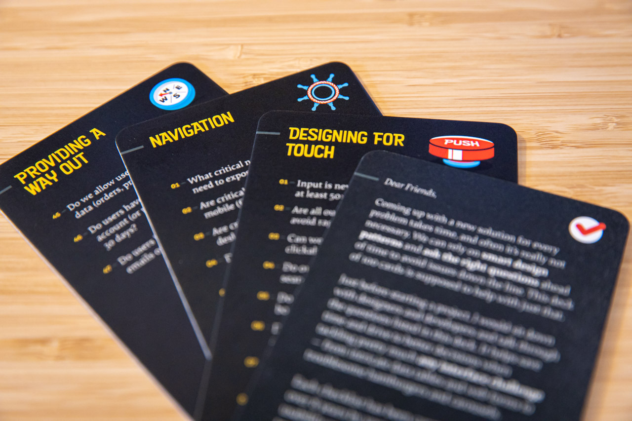
 166 checklist cards to help you ask the right questions at the right time. Large view.
Technical Details
- 166 checklist cards in a sturdy box.
- Practical examples and action points (400 slides).
- Editable text file.
- Life-time access to the updated deck (digital version).
- Free worldwide shipping from Germany.
- Get the checklist cards right away.
Promoting best practices and providing you with practical tips to master your daily coding and design challenges has always been (and will be) at the core of everything we do at Smashing.
In the past few years, we were very lucky to have worked together with some talented, caring people from the web community to publish their wealth of experience as printed books that stand the test of time. Steven, Stefan, and Adam are three of these people. Have you checked out their books already?

Touch Design for Mobile Interfaces
How do we design for touch in 2022?
Add to cart $44

TypeScript In 50 Lessons
Everything you need to know about TypeScript, its type system, generics and its benefits.
Add to cart $44

Form Design Patterns
A practical guide to designing and coding simple and inclusive forms.
Add to cart $44