Web Typography Rules: What You Need to Know
90% of all the information on the web is in writing. That means that typography is a skill that dictates that 90%. That’s a staggering figure that highlights just how important typography is.
It’s absolutely everywhere: blog posts, social media, magazines, reports, books, and so much more.
What this means for you as a designer is that text is your primary means of communication. If you haven’t got your typography skills down, then you’re not going to be able to deliver your ideas to your audience.
Luckily for you, we’ve got a list of useful tips and rules that you can follow to avoid that happening. Even if you’re not the best at typography, follow the information that we’ve laid out here, and you’re going to be fine.
Pick an Industry Standard Font
There are a ludicrous number of fonts to choose from when designing your web typography. Some of these fonts are much better than others, though, so make sure you do your research and pick one that’s proven to get results.
There’s nothing worse than looking at an unreadable squiggly mess on a page, so put some thought into what font you’re using.
Use a Large Front Size

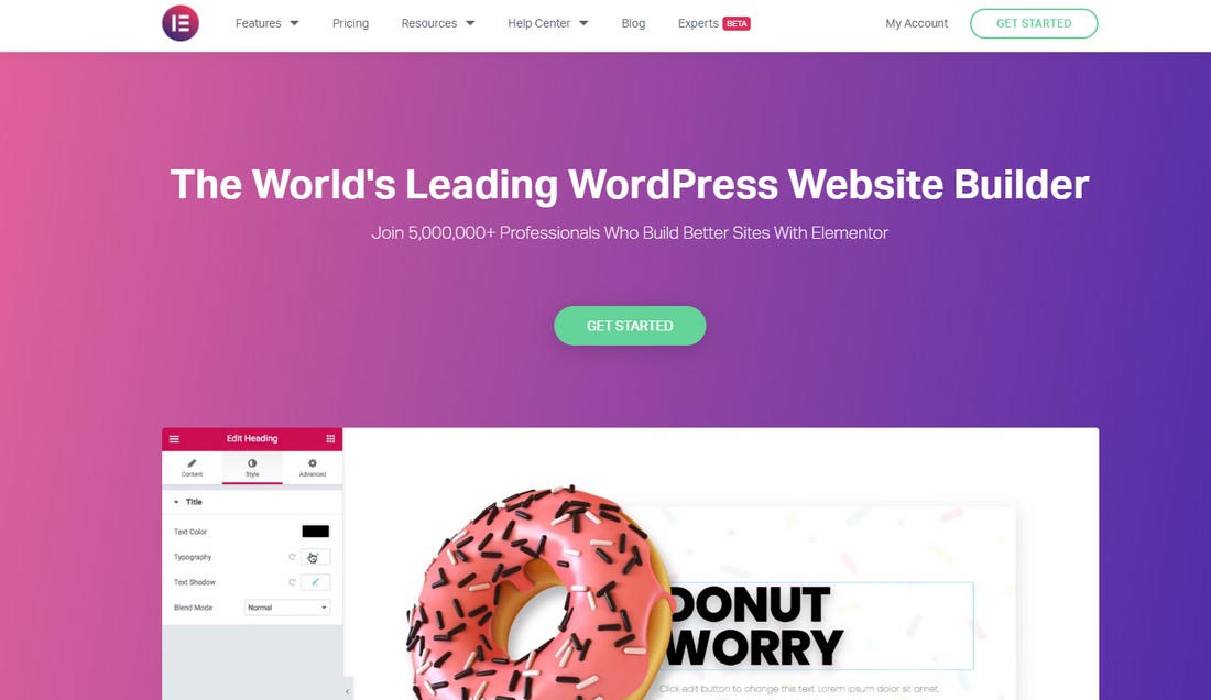
(Example: Elementor)
Back in the day, tiny font sizes used to be all the rage. That might be passible on massive blocky monitors, but people are using phones and tablets to browse the web these days.
You need to make sure that those users can read your content, so pick a big font that’s easily visible as soon as you glance at it.
We’ve found that 15 – 25 px yields the best retention rates, but so long as it’s legible and nice to look at, you shouldn’t have a problem.
Make Your Headings Proportionate
Headings are the signposts of your web typography. It helps the user navigate the page and highlights what information might be important to them.
It’s vital that your headings stand out, so make sure that you’re using at least a 180% increase in size when compared to your body text.
Line Spacing

(Example: Overpass)
There’s nothing more frustrating than trying to read a block of text that has awful line spacing. Not only does it turn the reading into a chore, but it can be incredibly hard to follow.
That’s why you’re going to set your line spacing appropriately. 120 – 145% percent of the overall point size should do it.
Tracking and Kerning
Adding tracking and kerning to your text is going to help it look neater and roomier. What this does is adjust the spacing between letters proportional to the size of the text. The space between the words of a heading versus lines of text isn’t going to be the same.
This can help to keep everything separate for your user, making it easier to navigate through the information.
Don’t Forget Whitespace

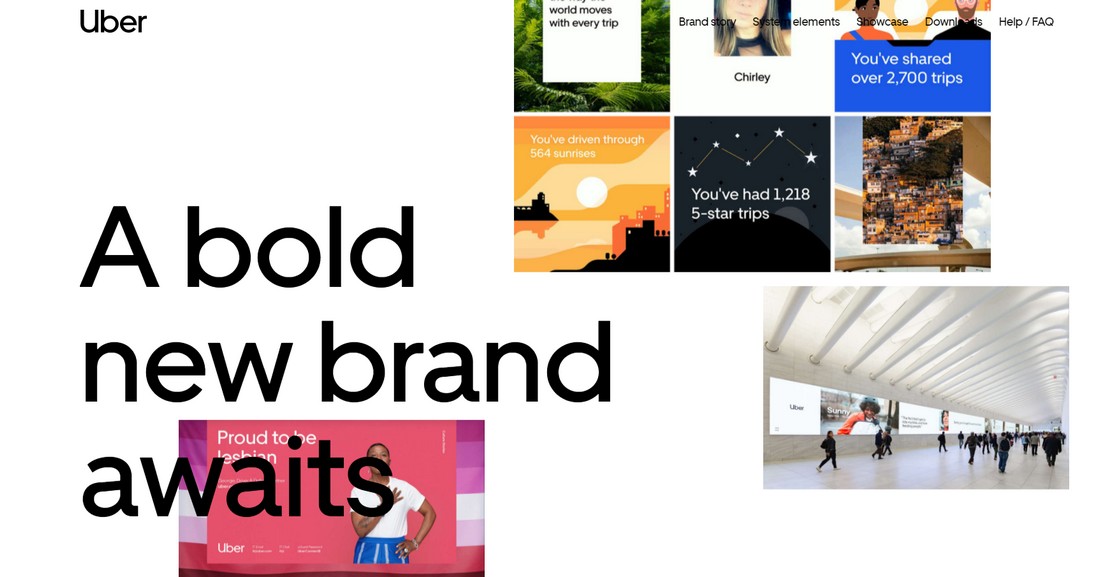
(Example: Uber Brand )
Whitespace is a vital part of web design as a whole, and that includes typography. You need to have some decent whitespace in between your headings and your paragraphs. If you don’t, then the whole thing is going to become a cluster of information, which is exactly what you’re trying to avoid.
Your user’s eyes need places to rest. This doesn’t just go for on the page, but when they read, too. If you don’t have whitespace, they get fatigued. When they get fatigued, they stop reading.
This is the exact opposite of what you’re trying to achieve, so make sure you’re obeying this web typography rule at all times.
Limit Your Line Length
Limiting your line length is an industry-standard practice for a reason. If you’re not doing it, then your page is going to suffer when it comes to professionalism.
45 – 90 characters is a good-sized line length to take that also leaves a lot of room for your personal preference.
One factor you might want to consider when choosing your line length is what device you expect your clients to be using. There’s a clear difference in device usage across services here, and you can get away with longer line lengths with users visiting from bigger machines.
Choose and Stick to One Typeface

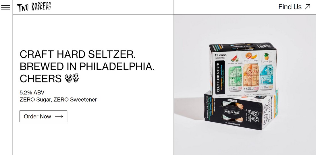
(Example: Two Robbers)
Serifs and sans-serifs. Both of these typefaces have advantages and disadvantages, but you should only be using one.
Determine what your target audience or client is looking for and use that information to influence your decision.
This is completely separate from your font selection, bear in mind. The typeface is a stylistic family of fonts that fall within it.
That being said, you should determine your typeface before your font, and not the other way around.
Structure and Hierarchy
If you don’t have a hierarchy, you descend into chaos and pandemonium. This is as true for typography as it is for life.
We’re not just talking about your H1, H2, H3, and P HTML tags here, but the way in which you present your information, as well.
If you have quotes, links, lists, or anything in between, make sure that it all follows a uniform structure.
If you’re doing a listing page, then you don’t want the links to a resource being halfway through one entry, at the bottom of another, and the top of another.
Further Your Web Typography Education
Web typography is a discipline that cannot be learned in a day. It takes constant practice and exercise to develop your skills, and that’s only one part of the equation.
The industry standard is constantly evolving and changing, meaning that you need to keep up to date with all of those changes.
Keep yourself plugged in and make use of all the practice and educational resources you can find.
Conclusion
Web typography is an overwhelming discipline that can take its toll on even the most seasoned designer. It’s like a muscle, though, and the more you use it, the stronger you’re going to be.
It’s, unfortunately, a massive part of web design, meaning it’s completely unavoidable. You’re going to have to tackle it at some point; we just hope that our tips help you when you get there.