What Happened to Readability? the New Age of Funky Designs
Sometimes a website design trend comes around that just makes you want to pull your hair out. This is one of those trends – beautiful and funky designs with practically unreadable text. (Why would you put text there if you can’t be expected to read it?)
Now that may be a bit of an exaggeration because in most instances you can figure out what the text is supposed to say. But it’s not easy. And the user has to think. Will people stick around to figure out the design?
Let’s take a look at a few different examples of ways designs are “forgetting” about readability.
Example 1: Obscured Text Elements
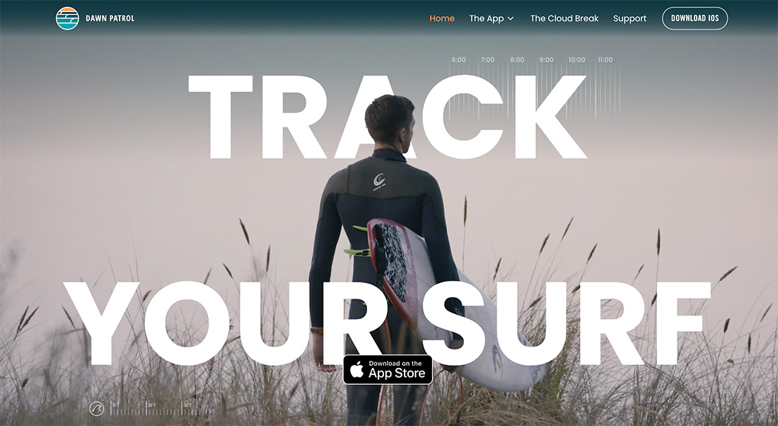
One of the most common readability vs. design techniques is obscuring the text with other elements, such as photos or animated objects.
When done well, you can create layers without any delay in reading the words on the screen. Often this is true because the obstruction is minimal. But more designs are encroaching more and more on text elements to the point where you can figure out the words, but it takes a few extra seconds to think and comprehend.
With people having the attention spans of goldfish, is this a wise design choice?
The other challenge here is responsiveness. On different screen sizes even more of the lettering can be obscured, creating more difficulty for readability.
In the example above, the text is obscured in two locations: The head of the surfer hides a chunk of the A in “track,” while the App Store logo creeps into the bottom line of the text.
Example 2: Text on Text
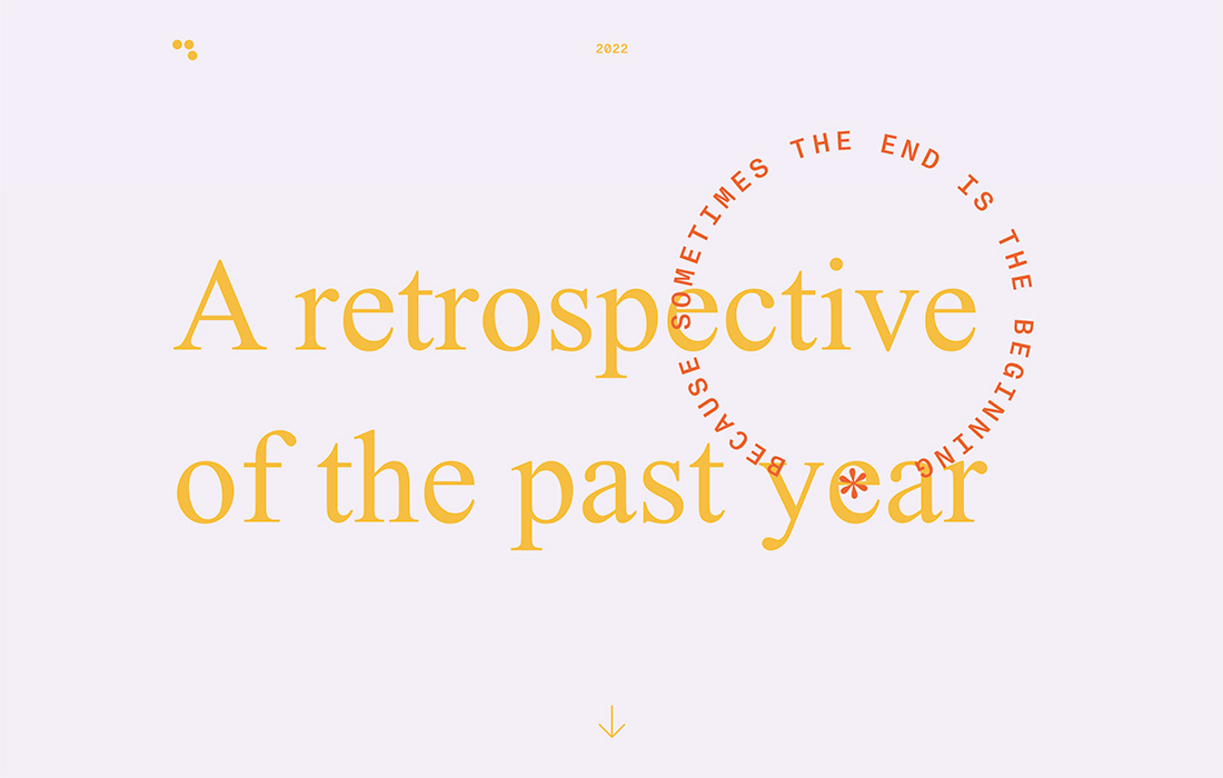
There’s almost nothing more difficult to read than text on top of text. So why are designers doing it?
The example above might provide an answer: Because despite readability, this looks quite nice. The simple background with a block of big yellow text with a smaller circle in orange-red is visually interesting and draws you in.
Only then do you start to think about readability challenges due to color contrast and layers of text on top of each other. Even the tiny “2022” at the top of the screen will rest on top of text elements when scrolling. It’s a lot to digest visually if you are trying to pay attention to the words.
Example 3: Fast Motion
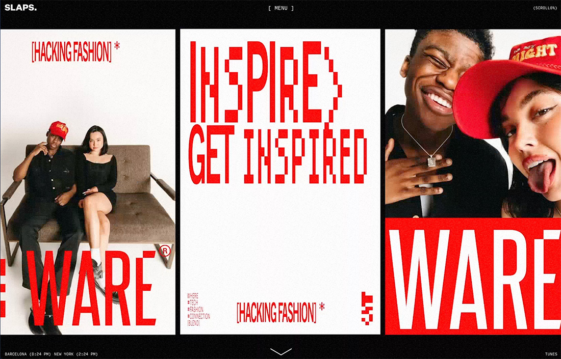
Sometimes there are words that you just assume aren’t for reading. Does that drive you a little crazy?
When words are combined with fast motion. There’s very little chance of reading each text element as it flashes by. This happens a lot on portfolio websites with a lot of work in a video reel.
In the example above, the motion is super-fast, but there are a few pieces that you might like to pause and read. A pause button on the video might be nice for those that want to stop and look a little more closely at some of the projects on the screen. (That would not be a bad element in terms of website accessibility either.)
Example 4: Odd Orientation
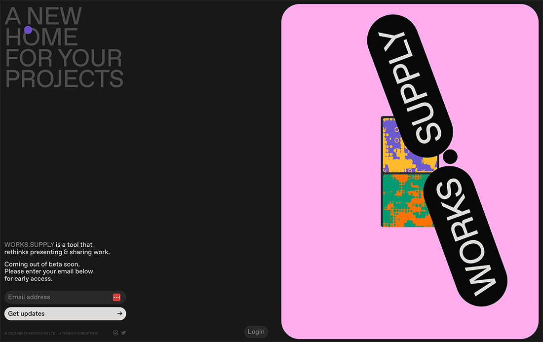
This is a design trend that you see more of in printed projects than websites but is starting to appear more in the digital space – odd orientation of text elements. (Odd would be anything other than a standard left-to-right, top to bottom reading experience.)
The good thing is this will get your attention for sure, and if the words are short – such as those in the example above – readability isn’t sacrificed that much. You may find a flash of delay in reading.
The question with this technique is always “Why?” Does the change in orientation do anything extra for the design or does it only get in the way? Are you creating greater understanding or meaning for the user?
Those are great questions to consider anytime you create a design that has questionable readability.
Example 5: Multiple Layers
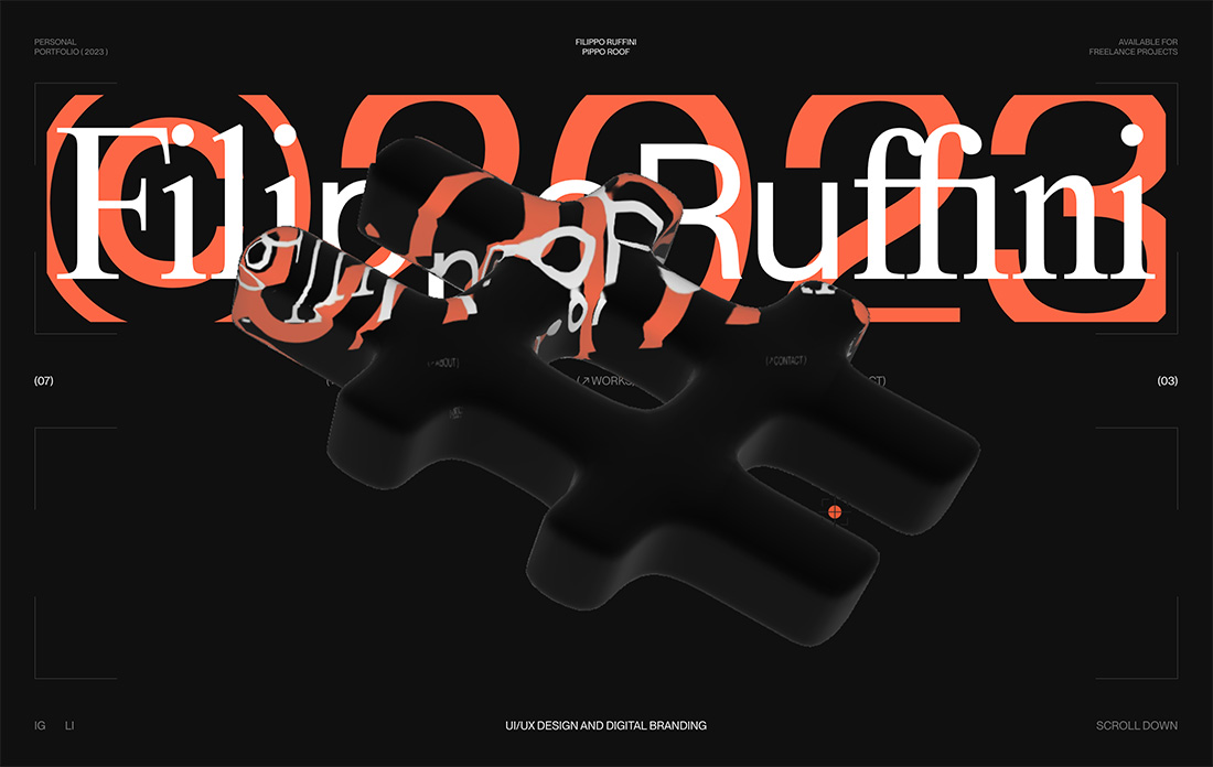
When you look at the example above, you might see a few of the readability concerns we’ve already mentioned grouped into a single package – text on text and obscured letters. There’s also an animation that has a liquid effect moving in the field of reading.
And here’s the kicker, in this example, all of that is happening in the top third of the screen while the rest is fairly bare.
Does it work for you? Are you worried about what the words say?
This design presents a rue reading challenge and might take longer to figure out the words than some of the other examples because you have to read a name (which is innately harder than a common word) and think about it in the fleeting moments when the animation is out of the way.
On the other hand, this design looks cool. Is that enough to sway you in this direction and to make you stick around long enough to figure it out?
Example 6: Experimental Typefaces
Experimental typography can be a wonderful and funky way to showcase a brand or create a mood for a design project. But sometimes these typefaces are a little challenging to read.
The trick is pairing them with easy-to-read options so that the user only has to focus hard on one thing at a time.
In the example above, two sets of funkier typefaces are used, presenting a readability challenge. But the true challenge with this design is the blinking background behind the experimental typefaces. Reading might be super easy with less activity happening around the typefaces.
Example 7: Contrast Challenges
One of the biggest concerns about text on the web is contrast for readability. Having a text color and style that stands out from the background is vital for clear and concise reading. (It’s a key factor for website accessibility as well.)
Commonly, designers are layering text and background elements in a way that impacts readability due to contrast. This happens most frequently when text is layered on, or partially on, a background element that has varying colors in it, often due to motion.
In many cases, such as the example above, the text will be readable on one background and then not on another. You are assuming users will stick around through these changes so that they can read the words. Is that a chance you are comfortable taking?
Conclusion
How important is readability to you when planning a new design project? Would you try a design scheme like one of those featured here?
It’s a true risk for sure, but there are pros and cons to every website design trend. This one just still seems to be a bit up in the air.