Call to Action Examples: 7 CTA Examples to Inspire You
Debbie checks out your business’s website and reads about your services. She likes what she’s seeing and wants to take the next step. But as she continues scrolling down the page, she doesn’t find any indication of how to proceed next.
Since Debbie doesn’t know how to proceed, she leaves your site in frustration. Debbie becomes a lost sale, and you’re left wondering what you could’ve done better.
In this scenario, a call to action (CTA) button would have helped her take the next step.
CTA buttons are critical to guiding your audience towards conversion and earn more sales for your company.
On this page, we’ll answer questions like:
- What is a call to action?
- Why do I need a CTA?
- What are some examples of CTAs?
Keep reading to learn more about creating impactful CTAs that drive clicks and subscribe to our weekly emails to get the latest tips and tricks for marketing your business online!
We don't just want to tell you about the beautiful work we do. We've built over
WE WANT TO SHOW YOU
Websites in industries like yours

What is a call to action?
A call to action is a phrase that tells users what action they will take and how they can proceed next. Call to actions can be within a text or in a button form. They can also be a sentence long or just a short phrase.
Why do I need a CTA?
Having a call-to-action button or using an actionable phrase is critical to guiding your audience to the next step. You need to use CTAs to get your audience to act and tell them how to act.
Without a CTA to guide your audience, you run into a scenario as we shared with Debbie. If people like Debbie like what they see on your site, they need to be told how to take the next step. Your audience won’t know how to proceed without guidance.
Call to action examples: 7 CTA examples for inspiration
Want to know how to create a call to action that generates more clicks? Here are seven examples of top-notch CTAs to help you guide your call to action designs!
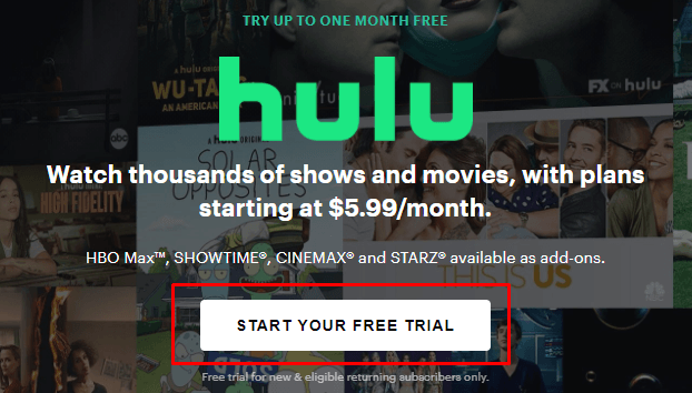
1. Hulu
Hulu has numerous great examples of call-to-action buttons on their site. As soon as you enter their site, you see information about signing up for their services. After reading the information, visitors immediately see a call-to-action button that invites visitors to start their free trial.
As you scroll further down their site, you’ll see information on their site about their bundle options. This information follows with a “Get Bundle” call-to-action button.

Why these call to action examples work: Both CTAs are clear and tell users what will happen if they click on them. These buttons also have phrases that are relevant to the information before them.
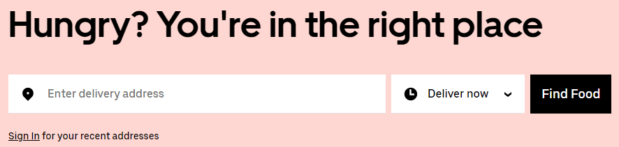
2. Uber Eats
Next on our list of CTA examples comes from Uber Eats. As soon as you visit their site, you see an option to enter your address. Then you can choose when you want your delivery.
This information is followed by a CTA button that states, “Find Food.”
When a person adds an item to their order, they’ll see a prominent CTA button indicating how many items are added to the order and the price.
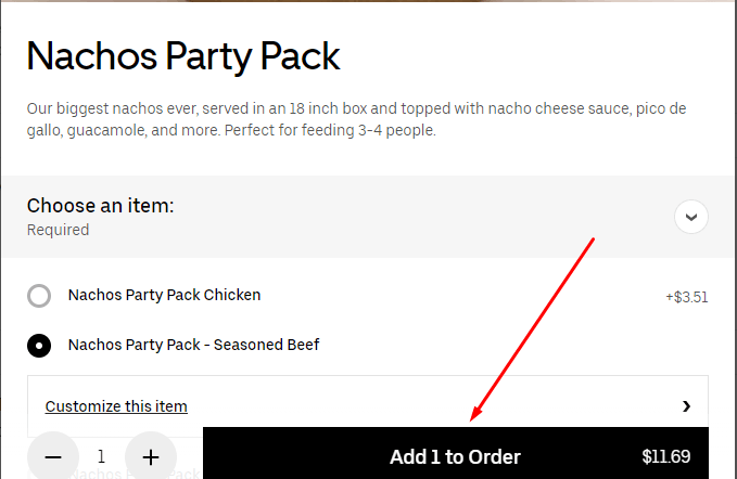
Why these call to action examples work: Uber Eat’s CTAs are intuitive and helpful. Their add to cart button, for example, makes it easy for users to see how much they’re putting in their cart and the total cost. This innovative design creates a better experience for site visitors.
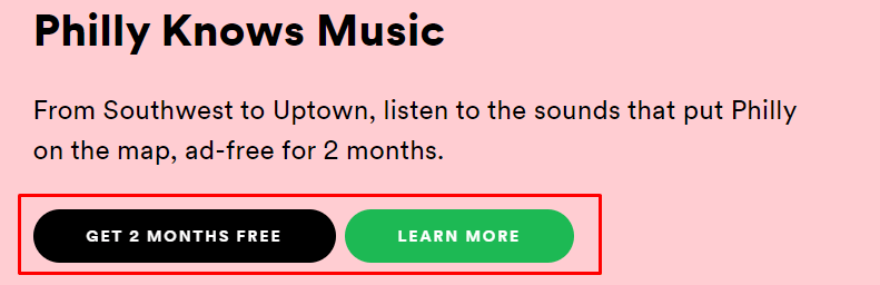
3. Spotify
If you need inspiration for your call to action button, look at Spotify. Spotify utilizes two different colored CTAs on their page that invites people to learn more about their premium music services or dive in and get two months of premium for free.
Then, as you scroll further down the page to look at the plans and pricing, you’ll see a bright green “get started” button for each plan.
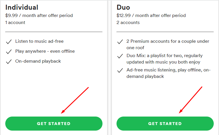
Why these call to action examples work: Spotify’s utilizes different colored CTAs to help users differentiate from actions. This approach is a great way to distinguish areas where you may need to use two CTA buttons to complete two different actions.
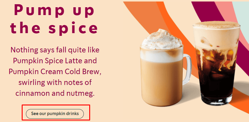
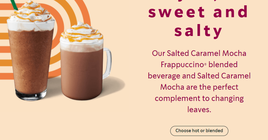
4. Starbucks
If you want to see some examples of call to action, check out Starbucks’s site. Their site is filled with different types of CTAs, and each one guides the user to take a different action.
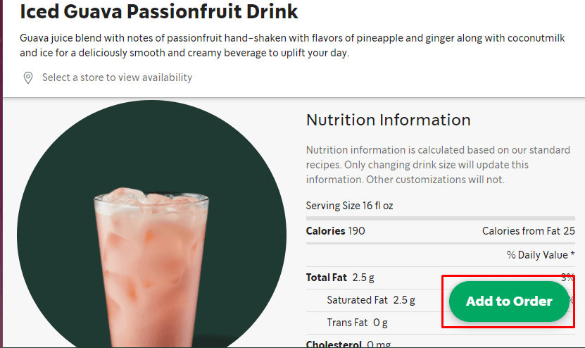
Then, when you check out different drink and food options, you have an “add to order” CTA button that follows you down the page as you scroll to learn more about the food or drink product and modify it to your liking.
Why these call to action examples work: Starbucks’s takes a unique approach with their CTAs instead of sticking to the typical “click here” or “order now.” They use tailored CTAs, like “see our pumpkin drinks,” to help create a more personalized experience for coffee-lovers.
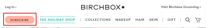
5. Birchbox
If you want to know how to create a call to action, look at Birchbox’s site. They have tons of great CTAs throughout their site that invite users to act.
As soon as you visit Birchbox’s site, you see a CTA at the top that invites users to subscribe to their beauty boxes.
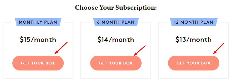
As you scroll further down the page, you’ll see information about their monthly plan options and the cost, followed by CTA buttons that invite visitors to “get your box.”
You can continue scrolling down their page and find more examples of call to action, like this one that encourages them to give the gift of Birchbox to a friend or gift a box to themselves!

Why these call to action examples work: The best thing about Birchbox’s CTA examples is that they stand out on the page. The salmon-colored CTAs pop-off the white background of the page, making it easy for visitors to find the CTAs and act.
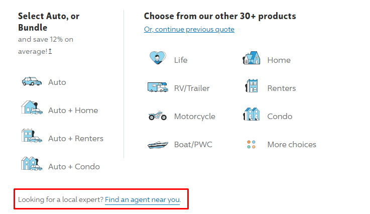
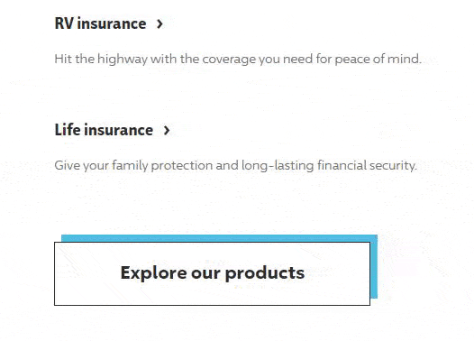
6. Progressive
Next on our list of CTA examples is Progressive. Progressive utilizes both written CTAs and CTA buttons. When you visit their site, you’ll see a written CTA that invites people to find a Progressive agent near them with a link that directs users to search for a local agent.
As you scroll further down the page, you’ll find some interactive CTA buttons that move when you go to click them. These CTAs catch the user’s eye and make the CTAs engaging.
Why these call to action examples work: Utilizing written calls to action is a great way to get users to act without having to have a CTA button on every inch of your site. Additionally, having an interactive CTA draws more attention to your buttons and invites users to click.
7. Houzz
Next on our list of call to action examples is Houzz. Houzz enables you to browse their site and look at home designs that you love so you can find someone who can create a similar space for you. As you look at the different options, you’ll see a “save photo” CTA pop up when you hover over photos.
Houzz uses these CTAs to invite people to create a specialized board of ideas for how they want to remodel their home.
Houzz also uses bright green CTA buttons to help people browsing for inspiration get connected with a professional that can help them create a similar space.

Then, when you sift through the list of professionals and find one you want, Houzz provides you with two CTAs. One invites you to send them a message, while the other enables you to click to call the professionals.
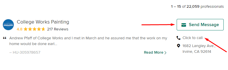
Why these call to action buttons work: Houzz’s CTAs are straight to the point and tell users what will happen when they click. They also use symbols, like the envelope for a message or the heart for loving a room idea, to further accentuate their CTAs.
Let these call to action examples inspire yours!
Now that you’ve seen some CTA examples, you know how to create a call to action that will generate more clicks for your business. But if you don’t have the time to dedicate to designing and crafting click-worthy CTAs, WebFX can help.
We can help you with more than CTAs, too. From design to copywriting, our team of 250+ experts does it all. We’ll help you craft pages that make people want to click on your CTA buttons.
Ready to start? Contact us online or call us today at 888-601-5359 to speak with a strategist about our web design services!