10 Homepage Design Trends Designers Should Follow
There are over 1.8 Billion websites on the internet right now. Any website that you design or develop will be one amongst this vast huge ocean of websites. Hence it is important to design your website in such a way that it stands out.
The visitor should remember your website after they leave. As an internet user, you typically keep browsing various websites, and the majority of them look very similar. You will only remember the ones that particularly stand out on their own.
The question is how do you make your website stand out from the others. One good way of doing this is following the design trends. Just like other designing applications, even websites have their own design trends which come and go. As a designer, you need to keep a tab on them and stay updated about them. Depending on the project on hand, you can apply some of these trends to make your website unique. The homepage is the most important page of the website. It provides the first impression of your website, and as they say, the first impression is the last impression. So you have to put in extra effort to ensure that your homepage is impressive enough for users to continue browsing your website. To help you in this, we are sharing a compiled list of 10 homepage design trends of the year:
1. Modern Minimalism:
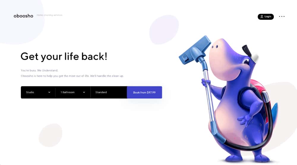
The latest trend of minimalistic design has caught on to website homepages as well. Less is more. The users like it when they are presented with a decluttered homepage to easily find what they are looking for. This is a huge boost to the user interface and even user experience as the users can quickly navigate the website. Simple fonts are used in combination with two or three colors. These are generally the brand colors taken out from their logo. A lot of importance is given to white spaces, making the design look elegant, neat, and clean. Unlike popular belief, designing minimal homepages is also not easy. You would always be tempted to showcase many things on the homepage, but that would make the design look bad. So the designers have to challenge themselves to showcase maximum information using minimum design elements.
2. Switching between Dark & Light Mode:
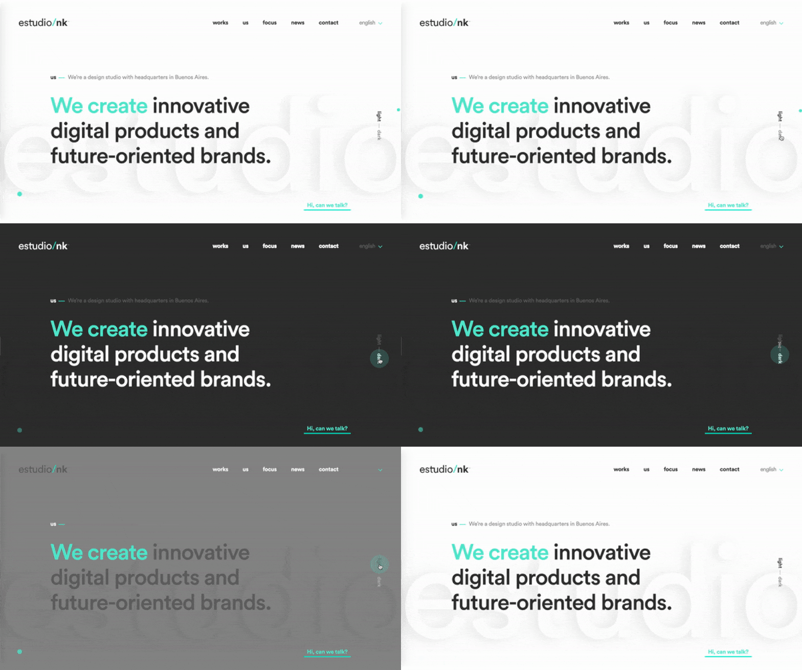
Ever since the IT giants like Twitter, Instagram, and others started providing light and dark themes, users now expect that from almost all web applications, including websites. They have started garnering their prejudices for either the light or the dark mode and want the websites to be presented in that mode. The good news is that there are many ready website themes that provide this option. There are also a good number of plugins that help you achieve this. But the problem is not toggling between the modes; the challenge is to design the website perfectly in two different modes. For the light mode, you need to throw in a lot of white and corresponding colors. For the dark theme, you have to make it bold and alluring. So the designer has to put in the effort of almost designing two different websites. But statistics suggest that it is worth it as more and more users are looking for this option of switching between modes to please their eyes.
3. Embedding Engaging Videos:
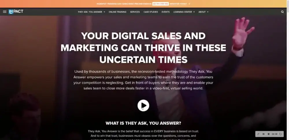
Videos are presently the best form of content generation and consumption. People do not have time to go through all the details of your website and your brand or company. Hence, if you can provide them a nice short video that delivers this information, they would be happy to watch it. With this motive, a lot of websites have started embedding videos on their website headers. They have, in a way, replaced the conventional sliders. Even in terms of videos, brands are experimenting to see what works best. An engaging video with humans talking about something of value or showing something awe-inspiring is the type of videos that work better. Video creation has now become easy, and with good internet speed available across the major part of the globe, videos will play fine on your website. It is advisable that you always embed your video and not upload it on your server. This may increase the loading time of your website by many seconds. Instead, use video platforms like YouTube or Vimeo and call your videos from there.
4. Use of Retro Fonts:
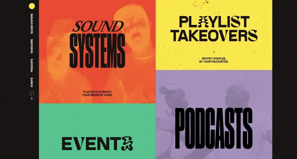
While the above points were more related to development than design, this homepage trend is based purely on design. Retro fonts are the next cool thing in the design industry. Designers use it extensively, be it social media posts, posters, T-shirts, or even logos. No wonder they have found their way in website design as well. The benefit of using a retro font style on a website is that it helps your text stand out on a standalone basis. It is a fine amalgamation of text information and design elements. You need no design any other elements to complement the text. Designers are using retro fonts for the website headers as they are effective in grabbing people’s attention. Apart from that, designers are also trying out creative typography using retro fonts. This gives an extra edge to the creative aspect of your website, providing a good recall value to it. Retro fonts should only be used for headers and sparingly for other content. Do not overdo the design by using these fonts, even for standard text. Rather match it up with a nice serif or cursive font style for the website content.
5. Non-Conventional Scrolling Effect:
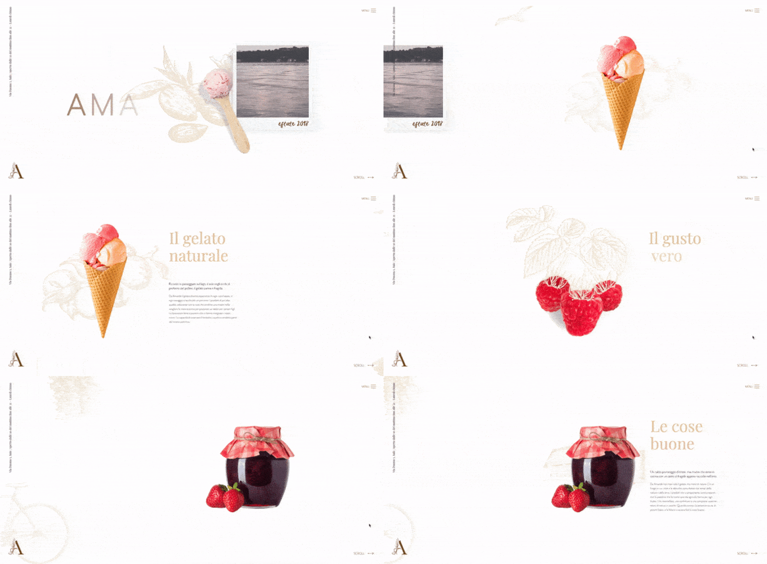
We are so much used to the standard format of scrolling that anything beyond that seems like something very alien and awe-inspiring. This is why designers are trying their hands on horizontal and vertical leaning scrolling, making their website look different. This design trend is catching up on a lot of creative agencies. But just weird scrolling patterns will not cut it out for you. You will also have to match it up with elegant images, text animations, typography, and other such design elements to continue providing a unique website experience that starts from the scrolling effect. Horizontal scrolling is one good example of how you can alter your website and make it look different. Even the standard vertical scrolling can be tweaked to make it look cool. You can try slide scrolling which sort of provides pagination to the website. Your website is divided into several slides, which come up one after another based on the scrolling. This can be nicely used to tell your brand story or showcase your key products or services.
6. Abstract Shapes & Flowing Gradients:
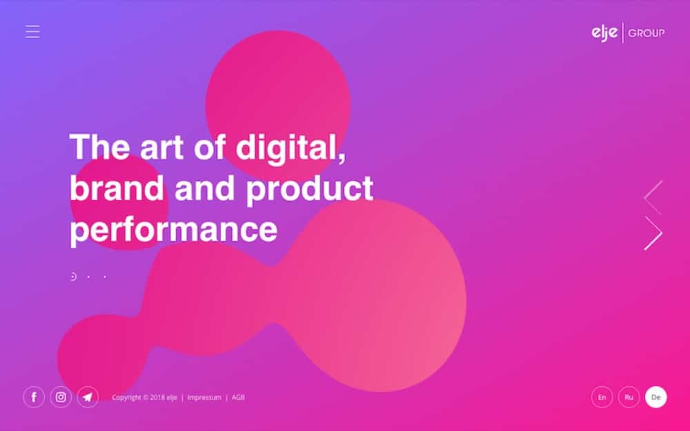
There are two good design trends in this point: abstract shapes and flowing gradients. While many designers use a nice combination of these, you can also use them individually to accentuate your website design. The use of abstract shapes derives its creativity from the abstract art movement. You can use various shapes like geometrical shapes or even random patches along with your text on the website. However, you will be playing with fire in this trend because if you do not get it right, the entire design will look shabby and out of sync with the brand. Hence you need to be really smart and also consistent with your design when using abstract shapes. On the other hand, flowing gradients are a work of beauty. If you get the colors right, these gradients can take your designs to another level. They are highly soothing and set up a perfect background for you to place your text and other design elements. You can combine abstract shapes over such vibrant gradients. Few designers are taking it to the next level by adding animation to the shapes and the gradients. If you are able to do this, then your website will look really beautiful and worth bookmarking.
7. Interactive Storytelling:
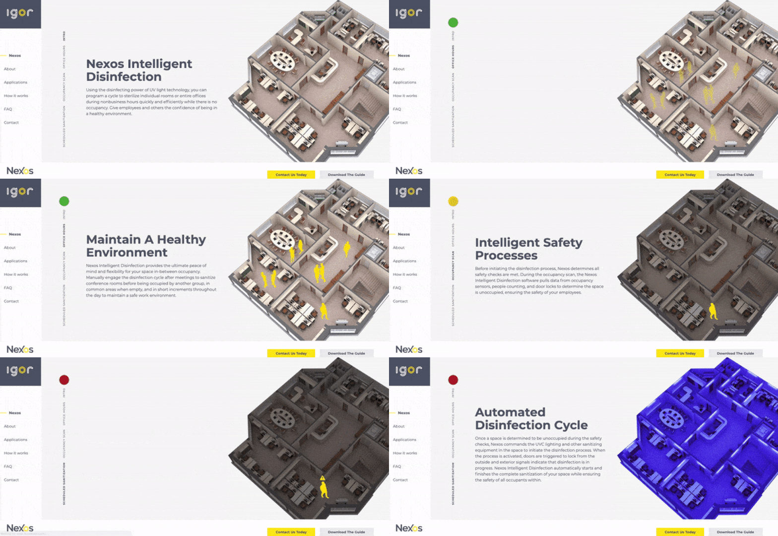
The basic purpose of your website is to tell a story to the visitors. This story could be about your brand, your company, or your products. Website is just a medium to communicate the story. Inspired by this thought, designers have started adding interactive storytelling formats to their websites. However, creating such experiences on a website is time-consuming, resource-heavy, and requires many visualizing skills. That is why we get to see only a few good websites implementing this. But if done correctly, this can become a huge marketing potential for the website. For example, you can narrate your organization’s timeline by making the users click at the right points. The biggest use of this feature is in explaining your products or services, especially when there are multiple steps involved in it. You can design an interactive step-by-step process where the user clicks on the right areas, and new information keeps coming up. This will help the user understand it better and provide you an avenue of selling your product or services more creatively and convincingly. One drawback that these designs face is the mobile compatibility, as you may not be able to execute the storytelling on smaller devices.
8. Detailed Footer:
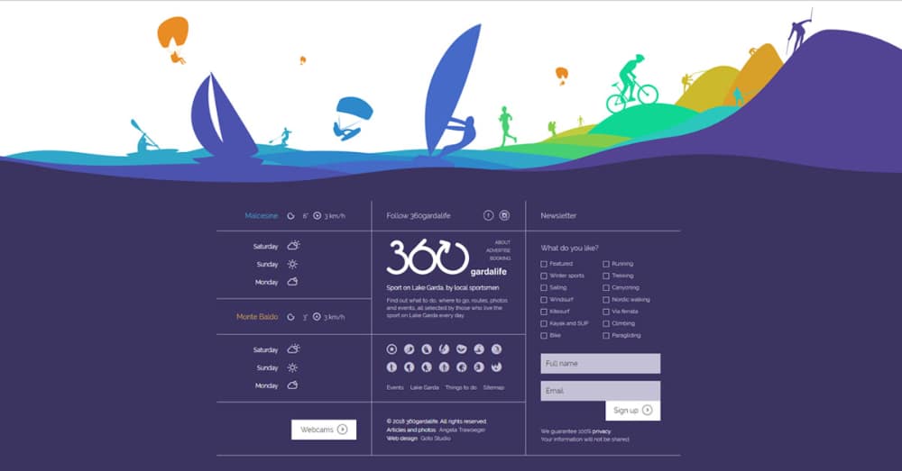
Footers have been one of the most neglected aspects of website designing. Many designers take footers for granted and sprinkle the less important content or links on the footer. However, this trend is changing as both designers and users have started taking the footers more seriously. A new trend of heavy-loaded and long footers is emerging. It provides the developers the space to push in all the related content they want to. This includes a well-designed site map to know what all information is available on the website and how to access that quickly. This is very advantageous from the UI point of view. The user has also gotten smart and generally scrolls down to the footer for getting the quick links. By adding the extra links in the footer, you can also take the load off from the main menu and design it in a much better and visually appealing manner. You can also add contact forms and other call-to-actions in the footer for bettering your user experience.
9. Virtual & Augmented Reality:
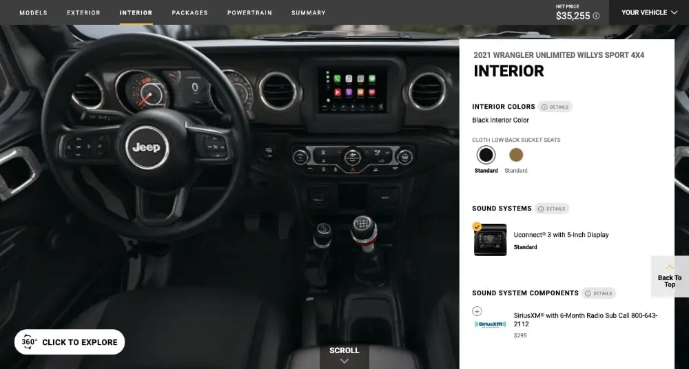
The two biggest trends taking all technology aspects by the storm are virtual reality and augmented reality. Imagine the potential of using these in the website to provide a highly unique and personalized experience to the users. They both are two big website trends in themselves. Generally, they are mostly used on the products page to provide more information about the products or services. But you can also deploy them right on the homepage to save the time and energy of users and directly immerse them in something very different. This works best when you have B2C products that rely heavily on the visual feel. For example, you can ask the user to photograph the wall they want to paint or the room they want to decorate and then provide the products to choose from and advanced customization options. These trends work the best will well-established brands that have the resources to invest in such heavy technologies.
10. 3D Vectors & Illustrations:
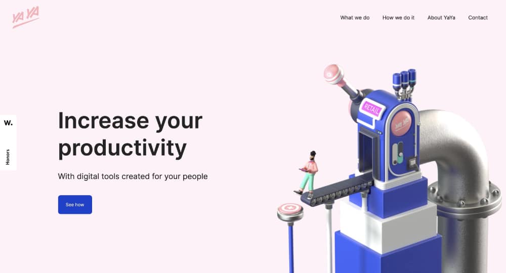
Using 3D design assets is one of the rising trends in website homepage design. This design trend is easy to execute and has a lot of potential to enhance your designs. As a designer, there are two ways to approach this. You can either opt for ready-to-use 3D design assets that are readily available on websites like Freepik. You should tweak them to make them compatible with your brand theme. The other approach is creating 3D illustrations from scratch for the website. This route is time taking and needs heavy resources. But it will allow you the creative freedom of creating concise illustrations which add value to your website and explain the USPs, processes, or services. You can also create a brand mascot that stays throughout the website and helps deliver the right information.
The good part about following design trends is that you stay relevant to the present design world, and also, the users get a good experience. When it comes to designing website homepages, design trends can help you provide a unique and lasting impression. Undoubtedly, well-designed, visually appealing homepages have a better conversion rate and a lesser bounce rate. You can also make use of the above homepage design trends and create highly enriching website homepages.