The 15 Best (And Worst!) Rebrand Examples of 2023 & 2024
Doing a rebrand is a massive undertaking for most companies and often involves taking great risks. That’s usually why we see only a handful of rebrands in a year.
However, we saw so many popular and iconic companies go through massive rebrands over the past few months. And it doesn’t appear to be slowing down. Clearly, we are in the midst of a rebrand season.
Refreshing a brand according to new design standards is always a good thing but not all brands get this part right.
Today, we take a look at some of the best rebrands of the past few months. As well as the worst rebrands that got everything wrong by trying to follow a trend. Let’s dive in.
Best Rebrand Examples
These are the rebrands that deserve an award. They got everything right and ended up better than ever before. Some of these rebrands were long overdue and some were simply impressive to explore.
1. 7UP
PepsiCo’s 7UP rebrand comes seven years after its last major rebrand and it’s one of the best rebrands we’ve seen in years.
Adding an “uplifting” feel with a more modern approach was the main goal of this rebrand and it’s achieved through the brighter green color tone and the retro-style neon vibes mixed with a cool 3D effect that highlights the number seven.
This is a rebrand that not only looks great but also sheds new light on the iconic product, especially to attract younger audiences.
2. Jell-O
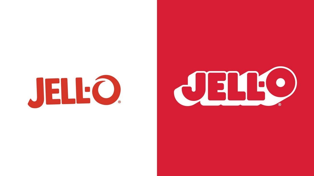
Jell-O is one of the most iconic brands in the US that’s been around since 1845. It went through several rebrands over its 170+ year history but the latest rebranding was a refreshingly good one.
Jell-O’s rebrand comes 10 years after its last brand revamp and it incorporates a few modern design elements while retaining its classic look with subtle retro vibes. Along with the logo design refresh, the packaging designs for all of its product variants were also improved with simple and modernized looks.
3. Eurostar

Train travel giant Eurostar merged with Thalys, another popular train travel company in 2022. This merger introduced a brand new rebranding for the company in 2023.
The rebranded logo design and brand visuals bring these two companies together while also embodying its new vision “to double passenger numbers to 30 million people a year by 2030”.
According to DesignStudio, the agency behind this rebrand, this new logo also gives “Eurostar its star back”.
4. Pepsi
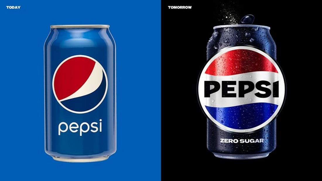
Following its 7UP rebrand, Pepsi also went through a face change. This rebrand included a new and modern logo design as well as big changes to its visual identity.
The new rebrand was introduced as part of Pepsi’s 125th anniversary celebration and it was the first rebrand of the company in 15 years.
The new Pepsi logo has a cool and bold look with more vibrant colors and more stylized typography using all-caps letters.
5. Reddit
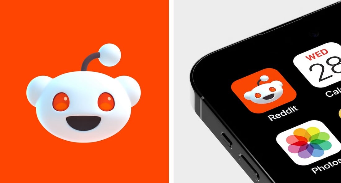
Reddit is going through massive changes making the platform look more modern and fresh. While the latest UI design changes are met with lots of criticism, its rebranded identity in 2023 was quite an impressive achievement.
The new Reddit brand identity refreshed the look of its iconic mascot with a modern and 3D look. It also made adjustments to its typography to give the logo a much cooler look.
6. Prime Video
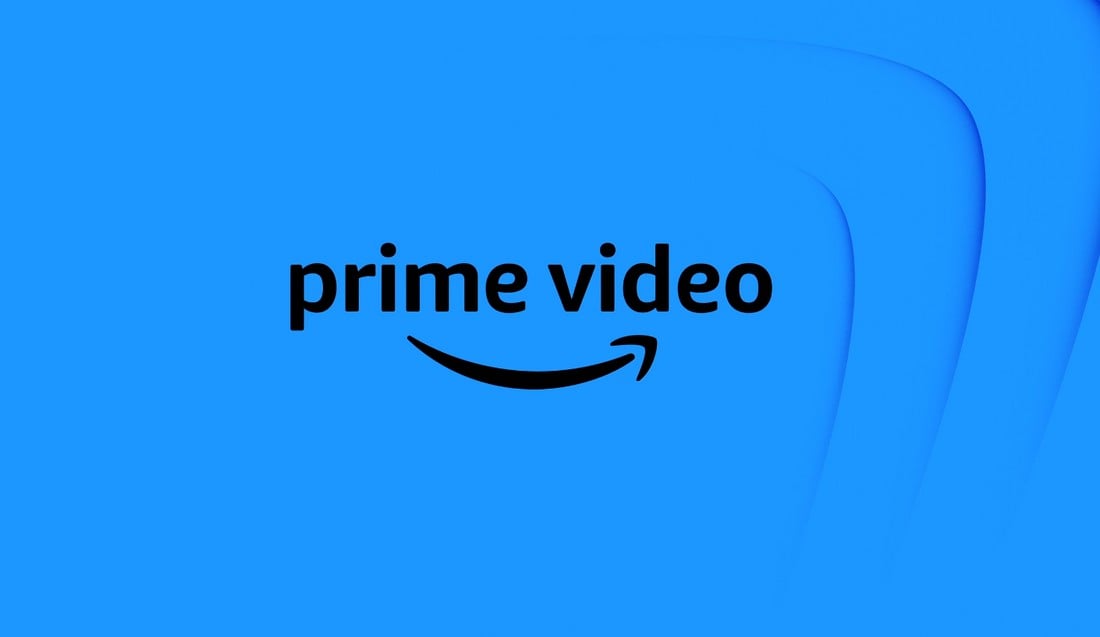
Amazon Prime Video received a very subtle yet much-needed brand refresh in 2023 that added a more dynamic look to the brand and its video streaming platform.
This brand refresh was very subtle. The main purpose of it was to create a more flexible brand identity that can be “modulated” to represent the different types of content available on the platform. And it was achieved by using “the “dimple” of the iconic Amazon smile as a catalyst”.
7. Whatsapp

Whatsapp quietly rolled out a refreshed new look in early 2023. The main purpose of this rebrand was to create a more flexible identity that connects product experience and marketing.
The new brand identity saw increased use of Whatsapp’s green accent color along with more simplified visuals across the board.
8. LG
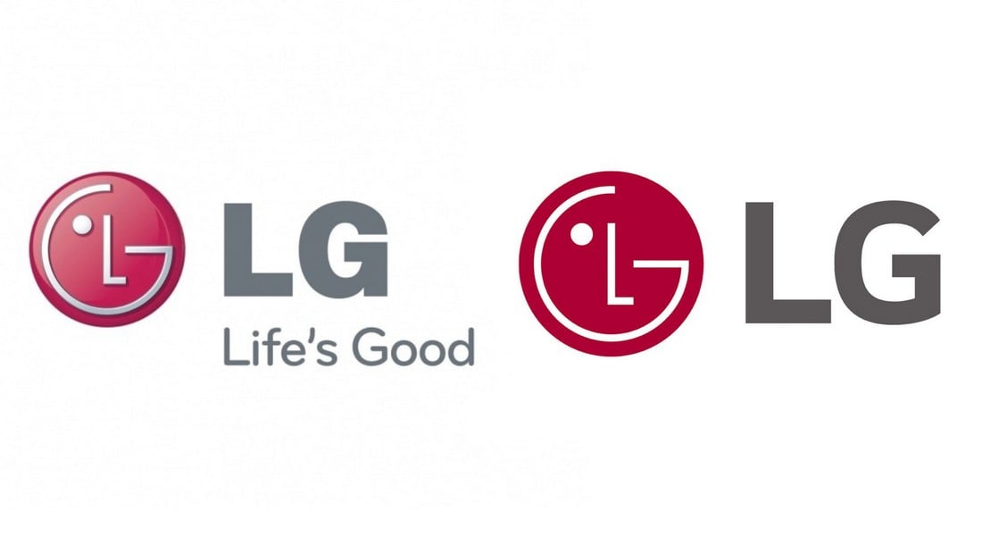
The South Korean consumer technology brand, LG made quite a few changes to its brand in 2023. The biggest change is the transition from its 3D logo to the 2D flat logo design.
This new logo blends well with modern design concepts and it was a much-needed change for the brand. In addition to this logo refresh, the rebrand also brought its “Life’s Good” slogan to the front of its marketing campaign, as a way to attract millennials and Gen Z consumers.
9. Minute Maid
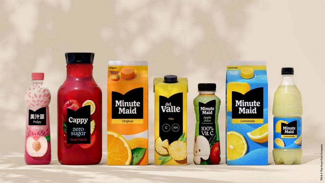
Minute Maid got rid of all the colors and decorative elements in its logo design for the 2023 rebrand. Instead, the brand introduced a minimal and clean logo design that looks great across all of its products and packaging designs.
Similar to most other rebrands we saw recently, this one was also about making the brand identity flexible and more dynamic across its marketing and product designs.
Worst Rebrand Examples
These are the rebrands that felt a bit rushed and got many things wrong in the process. Some of these rebrands felt forced and tried too hard to be hip and edgy, rather than reflecting what the brand represent.
10. X (formerly Twitter)
Twitter went through a massive rebrand following Elon Musk’s acquisition. And it’s arguably the worst rebranding in recent years.
This rebrand completely changed the look and identity of the brand and made the platform unrecognizable by ditching the iconic Twitter bird logo.
The worst part is how this rebrand was rushed to release. Even the new X logo went through multiple changes within a few days.
11. Nokia
Nokia’s rebrand was long overdue. It was its first brand refresh in 45 years. But the company missed the mark with this new design.
While the new logo was quite bold and innovative with its angular style, this edgy logo was more appropriate for an AI-tech startup than a trustworthy phone company that was well-known for making strong and reliable devices.
12. Johnson and Johnson

Johnson and Johnson’s rebrand was one of the biggest rebrands in recent history as it was introduced after using its iconic logo for more than 130 years. Yet it completely destroyed the iconic look of the brand’s identity.
The new logo opted for a simple sans-serif typeface rather than its iconic script letter design. And, as a result, the logo ended up looking too generic and simplistic.
13. Slurpee
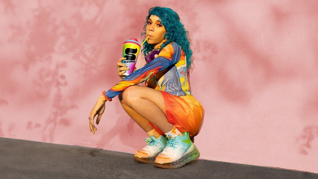
In an attempt to attract the young Gen-Z audiences, 7-Eleven gave an edgier new look to its iconic Slurpee brand. While the old brand visuals needed a new look, this was not the look its loyal fans were expecting.
The new logo symbol creates the “S” letter form in the style of the frozen drink with a combination of a new bubble-graffiti style typeface. Both seem a bit too hip for the biggest Slurpee fans.
14. Western Union
(1000Logos)
From 1988 to 2013, Western Union had one of the most iconic logos ever made. It was instantly recognizable no matter where you go in the world. Then the company refreshed the logo for the modern times in 2013. And then once again in 2019.
And now, in 2023 the company attempted another rebrand once again to try and make the brand relevant. Yet it still fails to capture its iconic look from the 1988 logo.
15. Fanta
(1000Logos)
Fanta was among the many drink brands that went through a rebrand in 2023. Coca-Cola did a fresh new take on the iconic soft drink brand by completely getting rid of the orange shape and its colors and then using a single-color retro-style look featuring just text.
This new look had many of the same elements used in the 7UP’s new look. Yet somehow it failed to capture the fun and playful look of the colorful Fanta logo from 2008.
In Conclusion
There are two important lessons to be learned from the rebrand examples. The first lesson is that rebrands are important for making brand identities relevant and dynamic enough to fit in with modern times.
The second lesson is never to rush those rebrands.