The Bento-Style Rounded Corner Trend: Explored & Explained
Softer, rounded corners are one of the biggest trends in website design right now. This bento style is visually pleasing, easy to accomplish, and takes some of the sharpness out of your design.
There are also plenty of different ways to use this trend so that your projects have a distinct look and feel.
Here, we’ll explore the bento-style rounded corner design trend and all the ways you can make it work for you. Plus, there are plenty of examples for design inspiration.
What is the Bento-Style Design Trend?
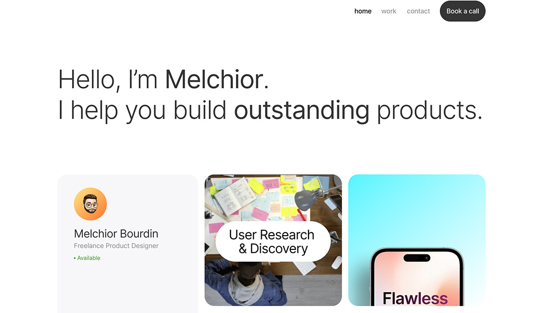
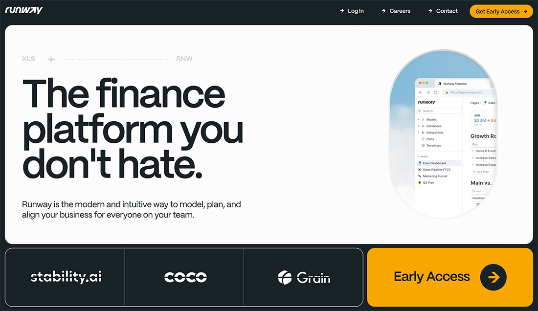

The bento-style design trend gets its name and inspiration from the traditional Japanese bento box, a compartmentalized container used to pack individual portions of food.
This translates into graphic and web design by organizing content or elements within distinct, neatly arranged compartments or sections. Take it another step further and add in rounded corners and edges to container elements so that everything has a neat packaged, design.
This style is optimal for projects that need to group or organize content. Additionally, rounded corners can be used for just about anything to soften the design somewhat so that it does not have hard edges, creating a better flow between content and design.
Characteristics of the Design Trend
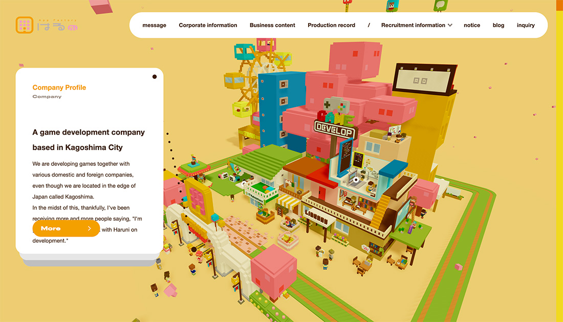
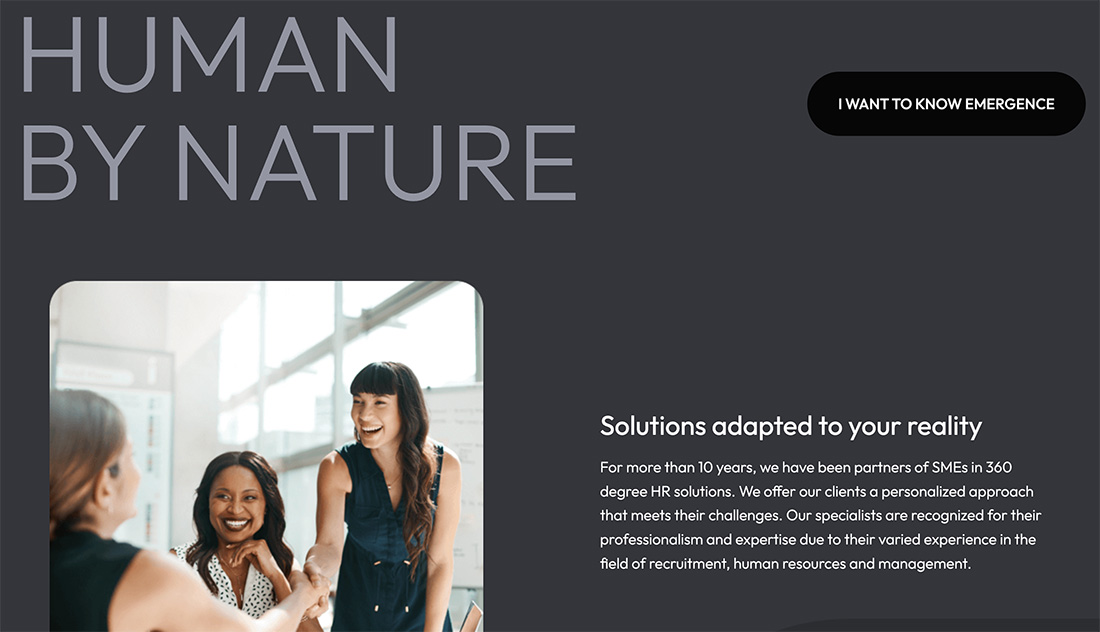
The primary characteristic of this design trend is visual elements and containers with round corners. While you may have to mix and match with some squared-off corners as well, most of the design will feature more curves. This isn’t moving all the way to circular elements though; corners are softer and curved, but not completely round.
You might find other complementary design techniques with rounded corners to create a bento style, but they are not always present.
- Content is organized into separate sections, much like the compartments in a bento box. Each section can hold different types of content, such as images, text, videos, or interactive elements.
- The design has a harmonious and balanced look, using the arrangement of elements and negative space to create a pleasing aesthetic.
- Grid-based layouts to ensure precision and order in organizing content into different compartments.
- Taking cues from the colorful ingredients found in bento boxes, this trend often employs a vibrant color palette to make each compartment visually distinct and appealing.
- Rounded edges can have a playful and whimsical feel, that should go with the overall content of the design.
Tips for Using This Design Trend Well
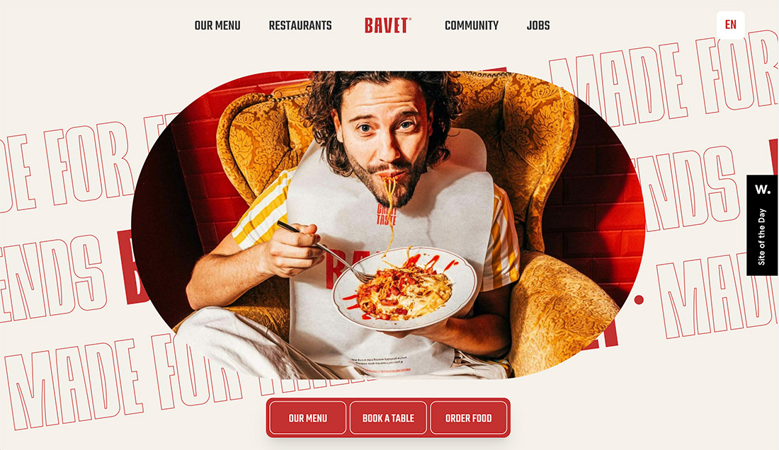
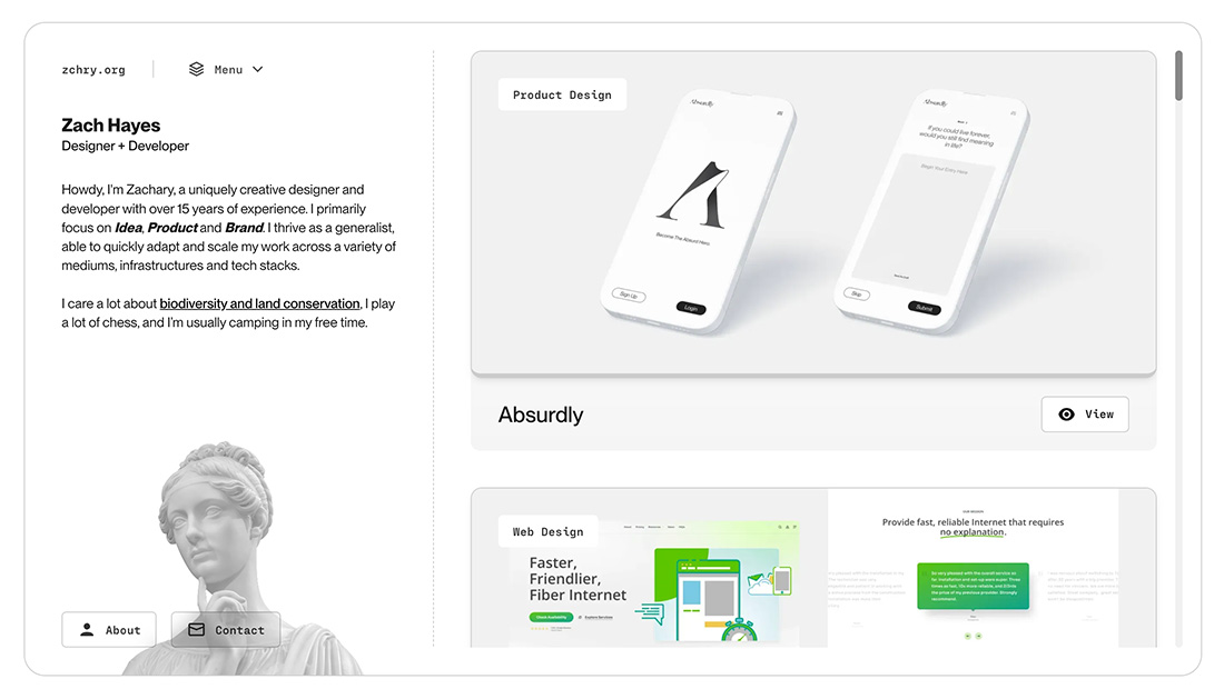
When you are using rounded corners, especially on a grid, you want to think about how all the elements play together in visual harmony. With this style, you’ll often see elements with round corners placed in distinct grid patterns, including modular styles, with consistent spacing between containers.
This creates a nice space for each element, giving it room and ensuring it is easy to access for user interaction. Often, these round-style containers do provide interactivity for users, with hover effects or buttons that lead to other content or information.
A few other tips for using this design style well include:
- Purposeful Compartmentalization: Consider how you want to showcase content and how it can be logically organized. Avoid overcrowding.
- Visual Hierarchy: Establish a clear hierarchy within each compartment with size, color, and typography. This helps guide the viewer’s attention to the most important elements first.
- Grid System: A grid-based layout can help maintain consistency and alignment throughout your design to create a unified feel and visual harmony.
- Play with Roundness: You’ll see from the examples that some designs have a greater degree of roundness for curved edges. There’s no set rule, play with it to find the spot that works best with your overall design scheme.
- Whitespace: Don’t forget about the importance of whitespace. It helps to reduce visual clutter and gives the design room to breathe, contributing to a balanced and elegant look.
- Playfulness with Purpose: While the bento-style trend can be playful it should serve a purpose and align with the content and target audience. Avoid overdoing it if it doesn’t fit the brand or message.
- Don’t Overdo It: You can use this style for every element, but in some cases that can be too much. It is acceptable to mix and match curves and straight edges.
- Accessibility: Don’t forget accessibility guidelines when designing with this style.
5 Examples We Love
Sometimes the greatest motivation for using a design trend is seeing it in action. We love these five examples and each is somewhat different.
Be Relax Spa

This example uses plenty of almost card-like containers with rounded edges in a modular grid. What’s most interesting is that there are a couple of different degrees of roundness in the same grid here, and it works well.
Initiate Architecture
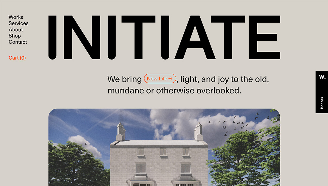
This full design uses a rounded edge for images, but also almost every other container in the design. It has a truly bento-style feel with lots of integrated elements that work together to create a single aesthetic. Note that the design is almost brutalist as well, something you don’t commonly see with rounded edges.
Zorka Agency
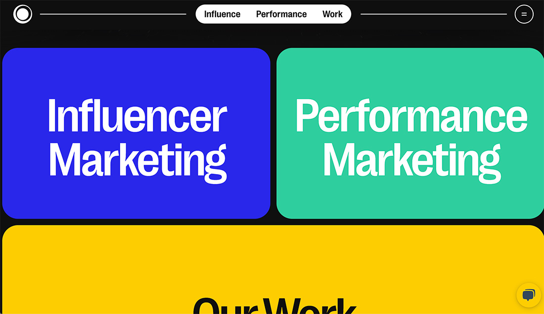
Bright colors, round edges, and stacking containers pull this design together without any imagery on the home page. The result is still visually striking and interesting.
Implied
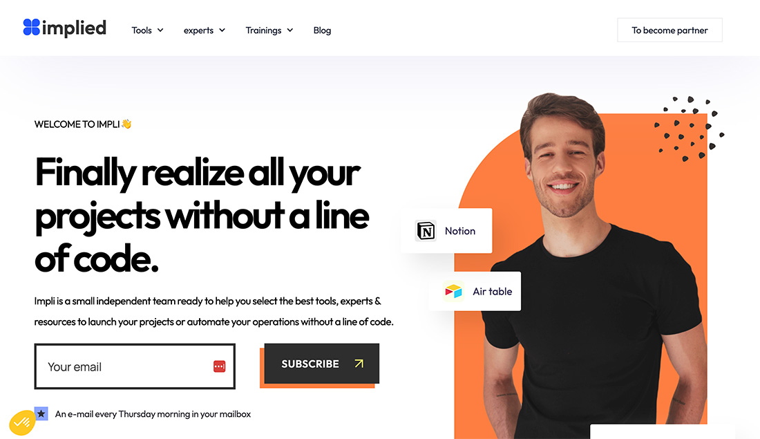
This design uses the mix-and-match approach with containers with square, almost harsh edges and rounded elements. Note the slight curvature on the Notion and Air Table boxes as well as the strong curve on the orange box behind the photo.
Camp Suha
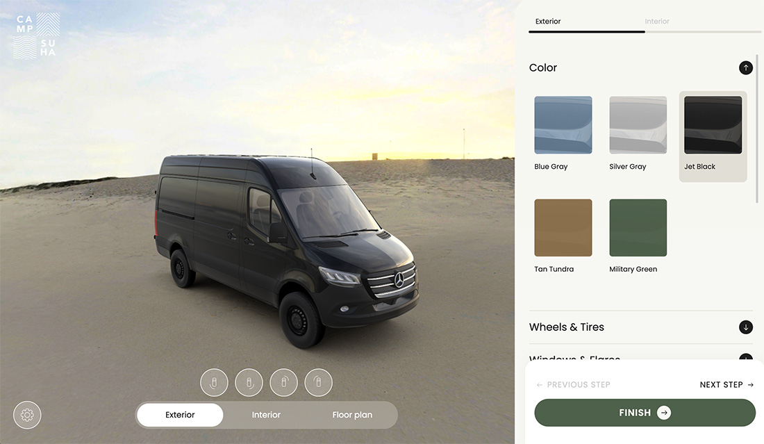
This design trend is one that can extend to almost any type of project. In this example rounded edge elements denote all of the interactive pieces of the design, as the user works to customize the van in the image. This is a great way to signal users as to what elements are in their control.
Conclusion
The Bento-style rounded corner design trend is one that’s pretty simple to use and can be applied to a variety of projects. You can use it just for container elements or plan a more robust, fully bento-style plan that’s great for projects that need superior organization.