7 Strategies to Boost Your Website Conversions as an eCommerce Business
For an eCommerce business, making sales is the name of the game. But sales and conversion rates aren’t the same, so if you want to keep expanding your business, you need to account for this key metric.
The more you improve your conversion rate, the more sales you’ll make. Also, you’ll reduce customer acquisition costs and overall marketing expenses. Keep reading to find out exactly how to do it.
What Is Website Conversion and Its Importance
Website conversion is when your users perform the desired action like:
- Purchasing a product
- Signing up for a service
- Joining an email newsletter
- Sharing content to social media
The percentage of users that perform the action is your conversion rate.
But why is optimizing website conversion important? Website conversion optimization is essential as you lower your customer acquisition costs.
If you increase website conversions, you won’t need to incur lots of expenses with customer retargeting and other similar techniques. Also, the higher your conversion rate, the more sales you make, which is important for an eCommerce business.
7 Steps to Improve Website Conversion
Improving your website conversion involves understanding how your website currently functions and improving upon it. You do this by analyzing your site visitor data so you can understand how users find and interact with your website.
That also helps you identify potential loopholes within your marketing funnel that you can optimize to increase conversions. Let’s look at seven proven strategies to increase website conversions for eCommerce.
1. Analyze Site Visitor Data
To boost your website conversion rate, you need to know how your website is currently performing. The main site visitor data you need to analyze is your:
- Traffic and traffic source data
It’s important to know how much traffic you are getting so you can calculate the percentage of users that convert. Knowing where your traffic comes from is important, too.
- User behavior
How users navigate your website can reveal why your conversion rate is lower than you’d like. If there are certain actions users find difficult, you can address the user experience issues to boost conversions.
- Bounce and cart abandonment rates
If your carts are being abandoned at specific points or your users are navigating away from your landing pages, you can address the issue if you have the data.
- Marketing click-through rates
Knowing how often users click on your promotional material to bring them to your site can help you improve the content. Also, it’s important to know how much of your user base comes to your site via these channels.
- Average order value and return customer percentage
If your conversion rate is high but only on low-order value transactions and you don’t have many repeat customers, you need to know.
Analyzing your site visitor data will allow you to better understand your users and how your website works. With this information, you adjust your site to increase website conversions.
2. Content Aligning With Every Stage of The Funnel
To improve conversions, you need to ensure every stage of the conversion marketing funnel has the right content. If one stage doesn’t have the right content, it can lead to customers abandoning the process. This is why you need to create a content strategy.
The first stage of an eCommerce conversion funnel is ‘Awareness.’ The awareness stage is where customers become aware of your brand. So make sure your blog posts and social media accounts have the right content.
The right content is material that showcases the unique selling points of your brand and the products you have to offer. Make sure your content is high-quality, too. After all, this is also one way you can increase your blog post engagement. You can also get more likes on Instagram, Facebook, or your other social media accounts if your posts offer value.
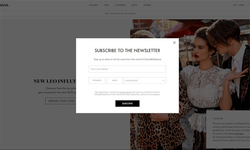
The second stage is “Interest.” In this stage, you need to capitalize on customers that are interested in your brand. For example, if a customer is browsing your eCommerce store, you can ask for their email address via a pop-up. Once you have their email, you can send them promotional material to increase their interest.
Source
The “Desire” stage of the conversion funnel is where you take an interested customer and make them desire your product. You need to convince them your product is exactly what they need. The best way to do this is by improving the content on your product pages.
Make your product images and videos pop, your product descriptions sing, and ensure your reviews are well placed. Also, ensure your customers are aware of any discounts and promotions to further increase their desire for the product.
Finally, you need to ensure the content in the “Action” stage is up to par. The action stage is your checkout process. The Baymard Institute found 69.99% of all eCommerce shopping carts are abandoned, so ensuring the content in this stage is optimized is crucial.
Your checkout process should be quick and easy. But you should also reassure your customers that your checkout process is trustworthy. You can simplify your checkout process by using this simple 4-step formula:
- Checkout page
- Input delivery details
- Input payment details
- Order confirmation
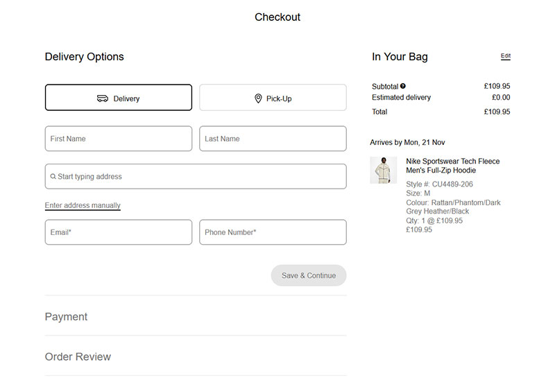
Nike is an excellent example of an eCommerce brand with a simplified checkout. After selecting an item and clicking ‘checkout’, you simply input your delivery and payment information. After successfully inputting this information, you get the order confirmation.
Source
Customers are less likely to abandon a simple, trustworthy checkout process like this. If you follow this example, you will increase your conversions by ensuring your customers purchase the product.
You can also increase website conversions further by providing a guest checkout process. This allows customers to checkout without having to create an account. It hence speeds up the checkout process.
Once they’re done checking out, you can then ask them to create an account. You may even offer a discount for their future purchases if they create an account. This will help you collect the details you need for future marketing campaigns like cross-selling.
3. Focus On Seamless Site Navigation
If your site is hard to navigate, users are less likely to use it long enough to convert. In fact, 42% of people will leave a website if it isn’t easy to navigate. So ensuring your website is intuitive and well laid out for desktop and mobile users is key to boosting conversions.
A prominent, simple search bar is an excellent way to improve navigation. Search bars help customers find the product they want quickly, hence increasing conversions.
Search bar placement is key, though. Most search bars are in the top right corner, like in the example.

Source
Placing the search bar where the user expects it makes the website easier to navigate, as the user doesn’t need to look for it.
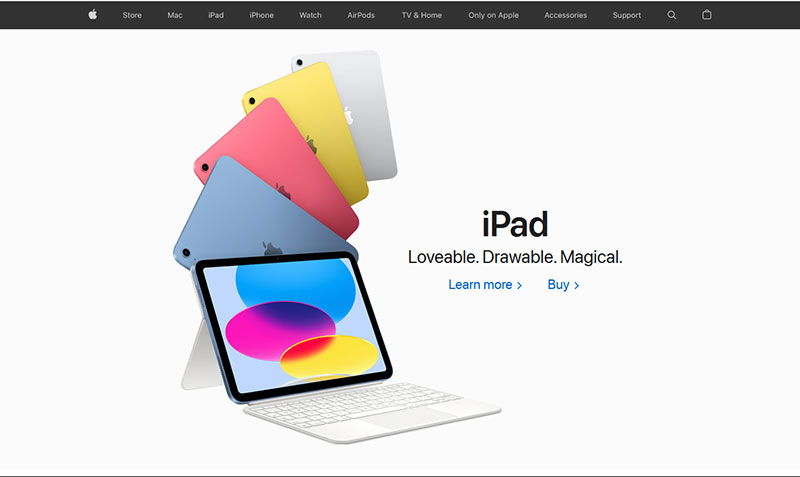
Another way to improve navigation is by organizing your pages correctly. Take a look at how Apple does it:
Source
The design is clean and easy to read, and the pages are organized by product type, so customers can easily find the product they want or browse a category. If you make it easy for customers to find what they want, they are more likely to buy the product.
But make sure you also consider website accessibility. Ensuring your website can be easily accessed and navigated by all will help increase your conversions and improve the customer experience.
4. Persuasive Call To Action
The call to action (CTA) takes the customer to the next stage of the conversion process, so it’s a crucial element of website conversion. A good call to action is persuasive and informs the user of the next step in the conversion process. Location is also crucial for a good CTA; it must be prominent and easy to find.
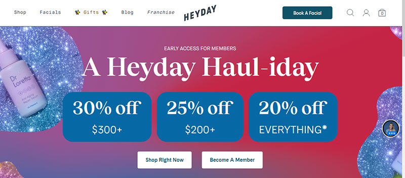
Here’s an example of a great eCommerce call to action:
Source
The call to action is persuasive as it tells the customer the benefits of following the call to action (discounts). Placing the call to action on the landing page makes it impossible to miss and much more likely to be clicked on.
Also, the CTA buttons have a snappy copy that informs the user of where the call to action will bring them.
5. Leverage Live Chats
According to Invesp, customers will spend 60% more per purchase if there is a live chat option. Live chat answers customer product queries, builds rapport and trust, and can provide product recommendations. But to leverage live chat to boost conversions, you need to use it effectively.
A warm greeting is a good place to start. The customer needs to feel welcome and at ease. Informal greetings like “Hi, how can I help” or “Hello, thanks for visiting” are good options.
Training your live chat operators to answer customer queries quickly and thoroughly is also important. The live chat needs to benefit the customer to boost conversions.
Product information, site navigation assistance, and product recommendations need to be emphasized. You can build a course to help your operators using a course platform. Having a standardized protocol will make your live chat service better and more consistent.
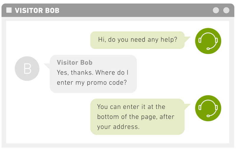
Take a look at this example:
Source
The greeting is warm and friendly, making the customer feel at ease and comfortable with the operator. After the customer asks a question, the operator gives a simple, direct answer. Giving a good answer like this means customers are more likely to convert. In their example, the customer now knows how to input their promo code, making a sale more likely.
Another important thing to consider is response time. If a customer waits for an initial response for too long, they may abandon the process, leading to a potential loss of a sale.
So make sure you allocate the resources to your live chat teams to make a fast response possible. And be sure to use recruitment marketing best practices to hire the best talent and improve your live chat service.
Alternatively, you can invest in chatbots. Chatbots may help you in resolving simple customer queries to speed up conversions. We actually recommend using chatbots alongside live chat agents for the best results.
6. Tap Into Social Proof
Your customers must trust you if you want to boost eCommerce conversions. Trustmary found when a customer is shown a review, the conversion rate increases by 67%.
That’s why customer reviews and testimonials are key components of any eCommerce, B2B, and even SaaS marketing plan. Customer reviews and testimonials are a great way to build trust.
However, you need to use them correctly.
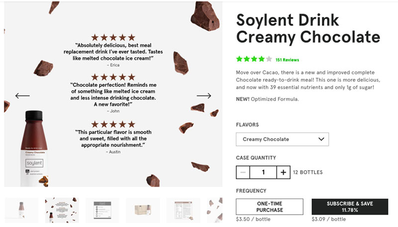
Here’s an example of an eCommerce brand using reviews effectively.
Source
The reviews have been turned into a visually appealing graphic. The graphic has been added to the product gallery, so the customer will see them as they decide whether to buy the product.
Using reviews like this means the customer will gain assurance of the product quality at the right time in the conversion process. Also, the placement makes it more likely that the customer will see the reviews, as not all customers scroll down the page.
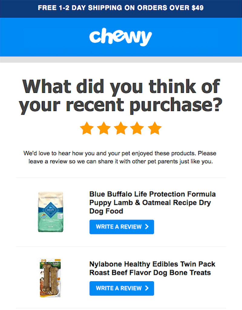
Your reviews need to be authentic. So ask existing customers to leave product reviews and ensure the process is simple and quick. You can also set up a follow-up email campaign asking for feedback from a recent customer. Something like this does the trick.
Source
If you’re struggling to get reviews through this method, incentivizing customers will increase your reviews. A 10% discount code can help incentivize customers as well as increase the likelihood of a repeat sale.
7. Include Simple Web Forms
Web forms help facilitate communication between the customer and the company, which can lead to sales, so your web forms need to be optimized. Simplicity is key; if a form is long and complicated, customers are less likely to fill it in.
Start by considering your questions, are they simple and clear? For example, “contact information” is vague. It is better to be more specific and ask for their email or phone number.
Also, only ask for necessary information; web forms with lots of fields will put off customers.
The next thing to consider is the web form layout. Make sure the design is clean and easy to read. Big text boxes and adequate spacing between the questions are essential as well. Make sure the ‘submit’ button is well placed as well.
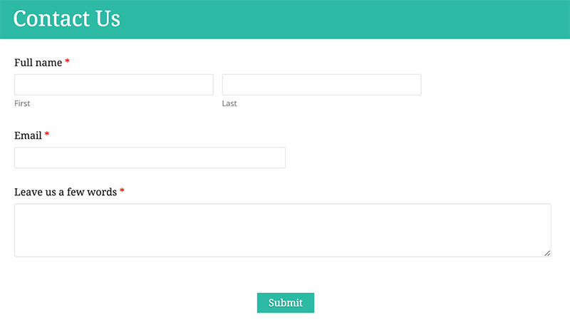
Here’s a contact form as an example:
Source
The questions are clear, and only the essentials are asked. The design is clean and well-spaced. Also, the ‘submit’ button is obvious.
The delivery method of the web form is important as well. If it’s a lead capture form, you can either have the form pop up after a certain amount of time or after a certain action has been performed.
If you decide to have the form pop up, you should make the purpose of the form clear to the customer.
In Conclusion
Boosting your conversion rate will increase your sales by converting more of your users into customers. You won’t have to spend as much on marketing campaigns, and you’ll make your site more enjoyable to use.
Remember, the best way to boost your web conversions is to analyze your site and improve the parts that reduce conversions. The idea is to have an optimized conversion funnel that seamlessly brings customers from the landing page to the checkout. So use these tips to boost your website conversions and turn more of your users into customers!