Choosing a Poster Font: 10 Tips & Ideas
Poster design can be some of the most fun you have as a designer. There’s nothing quite like seeing information for an event or concert hanging in a public location as you move by.
The key to these design projects is font selection. You need typefaces, colors, sizes, and scales that make content easy to read from a distance and up close also.
Here, we’re going to look at some tips and ideas for choosing a poster font so that your projects turn out amazing! (Plus, this post includes some design template examples with great typography that you can download from Envato Elements.)
1. Use Regular or Bold Lettering Styles
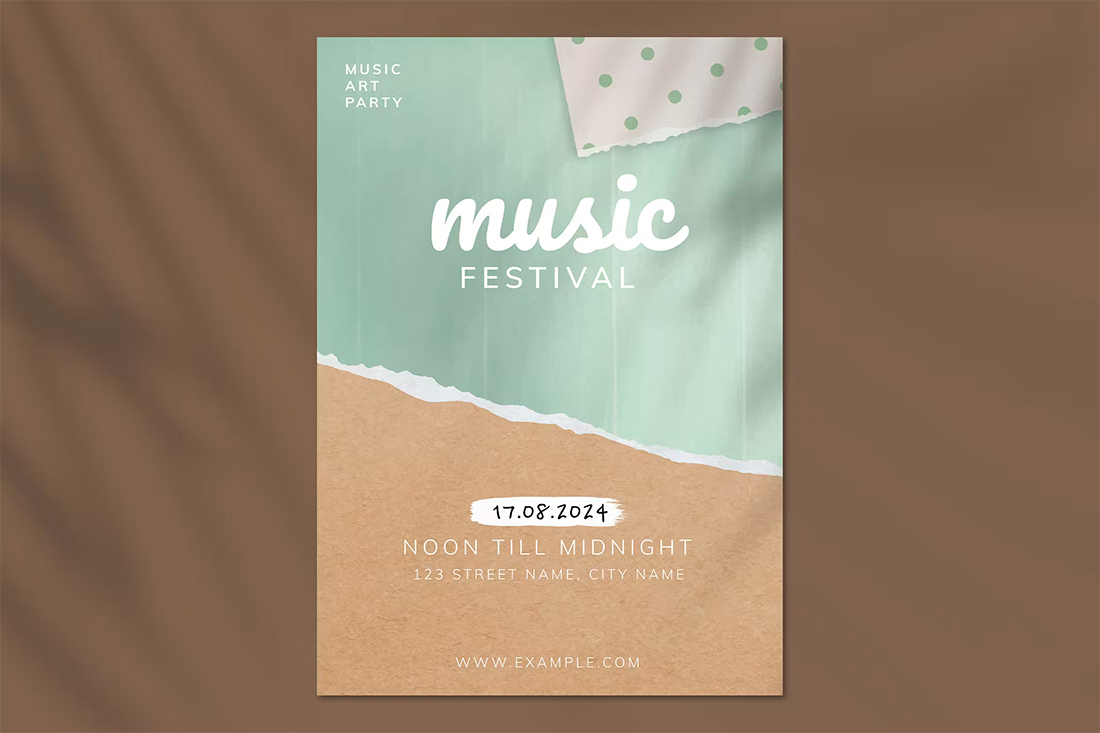
Because readability and legibility are so important for poster design, regular and bold font weights are preferred. You want text that has a thicker stroke, making it easier to read from a distance with letters that aren’t too condensed.
Most font families have multiple weights available to choose from – bold and extra bold are solid choices here. In most cases, you will avoid any styles that are thin.
When choosing a poster font, you will also likely select a serif or sans serif typeface. (Sans serifs are the most popular.) It is unlikely you will use a cursive, novelty, or experimental font due to concerns about readability.
2. Use Short Blocks of Text
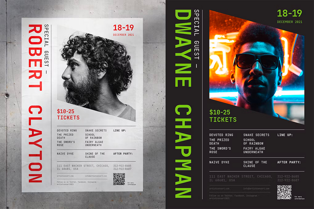
Poster design is not for paragraphs of copy. Short blocks of text – think headlines and subheadlines – should be about all you have here. While you can’t always control the words as a designer, it is essential that you explain the appropriateness and legality of text elements to your team if the poster has too much text.
In addition to short blocks of text, it is also important to create separation between these elements so they are easy to scan at a distance. Note how each text element in the example above seems to have its own defined space. That can make poster typography a lot easier to read.
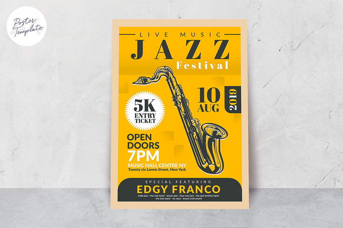
3. Place Text on a Single Color Background
Busy backgrounds and poster text do not mesh. If you plan to have background elements or images that have a lot going on, separate them from text elements. Lettering on a single, solid color background with a lot of color contrast provides optimal readability.
If you do have a busy background, try to put text elements in a box to make reading easier, or consider an even bigger, bolder type option than you might normally use.
4. Leave Plenty of Room Around Text Elements
Nothing aids readability like space. This is especially true for poster design, where it can take a lot of focus on the part of the user to read text from a distance. A good poster design might catch someone’s attention from a significant distance, and you want to ensure that the primary headline is understandable.
Leaving room around blocks of letters, as well as proper leading and kerning, can be just the thing that makes your text shine. Space is also a strong contributor to overall comprehension and readability.
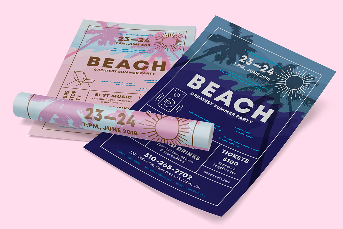
5. Left-Align or Center
The same common reading patterns you use for other design projects apply to poster design as well.
Left-aligned or centered text elements generally are preferred with readable elements moving in an F pattern, from top left across, then down and across, and so on. This is the same reading pattern that many designers use for website design.
With centered text, the more dominant reading pattern is top to bottom without much across-the-poster flow.
Whether you use left- or center-aligned text may come down to how much text you are working with. Left-aligned can work better for more copy blocks, while centered is often preferred for minimal text.
6. Font Sizing Guidelines Matter
When it comes to readability from a distance, you can use these guidelines to help shape your type sizing decisions.
Start with the primary text elements:
- Title: 85 points
- Subheadings: 36 points
- Body text: 24 points
- Captions: 18 points
7. Consider Reading Distance

In addition to general font sizing guidelines, distance to readability can also influence font selection. How far away is the typical user when they read your poster? How close do they ever come to it?
These distances can shift how your design looks. If the text is too small, it can’t be read with ease. If it is too large, there are equal readability concerns.
Then add distance to the equation above:
- To be legible 6 feet use 30 points
- To be legible 10 feet use 48 points
- To be legible 12 feet use 60 points
- To be legible 14 feet use 72 points
8. Be Aware of Color and Fading
One concern that you will have with poster design and typography that you don’t have with many other projects is the potential for color degradation and fading. Because these designs are often outdoors and subject to light and other conditions, elements of the poster can change over time.
The biggest concern here is color. Creating a lot of contrast between text elements and the background is your best defense against potential color changes.
9. Stick to Three Typefaces (Or Less)
Minimize the number of typefaces you use in a poster design to optimize readability as well. Easy-to-read typefaces, plus using only two or three different options will help you create an organized type design that’s easy to read.
Some common serif-sans serif font pairings for poster design include:
- Helvetica and Garamond
- Futura and Bodoni
- Trade Gothic and Clarendon
- Franklin Gothic and Baskerville
- Myriad and Minion
10. Create Visual Text Hierarchy
Text hierarchy will help users choose what to read and in what order, essentially assigning importance to the words on the poster. Repetition, groupings, and size are the biggest contributors to these patterns when you have a limited canvas.
If you only need people to read one thing on the poster, make it big and bold. Use a smaller, but still readable text size for essential details such as time, date, or location. Then the small print can be exactly that.
Conclusion
Poster typography can remind you of the “Goldilocks and the Three Bears” with a bit of a twist. Some fonts are too thin or small, and some fonts are too elaborate, but poster fonts are just right!
When picking out a font for a poster, readability, and scalability are important. Poster design is meant to be read, and having the right fonts can make that a lot easier.