7 Quick CSS Tips to Enhance the Legibility of a Website
Every website requires textual content that a visitor can read and analyze. This content can be in the form of a blog, article, or understandable website content that explains various areas of the website. A visitor on a site reads certain things on the website according to their requirements. But he or she can only read the content when the text on the website is legible and easy to read. Without legibility, the site is just a collection of images, links, and other web elements. Hence, no matter how long or short form it is, the website content should be legible enough. As a web developer, you should know which type of fonts you need, or what kind of space alignment is required. These parameters play an essential role that decides how the textual content appears and breaks itself down on a web page.
These days, web developers use CSS to design everything on a website ranging from its appearance, fonts, and font faces. Here, this blog focuses on specific CSS tips and tricks that you can follow to maintain and enhance the website’s legibility while you use CSS.
1. Units:
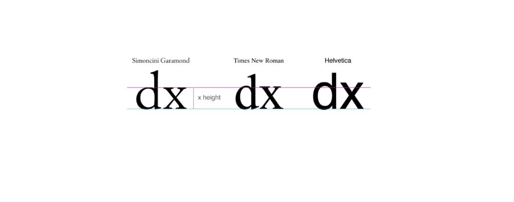
There are various units available that help you manage the font size in a piece of text. You need to understand which unit is useful according to the section of the text on your website or web pages. These units can be determined after you understand how you want to define the structure of the web page and the alignment of the text on it. Factors like dimensions of the viewing device and the reader preferences also need to be considered. Hence, when you think the font-specific units, em and rem are the perfect choices you can rely upon. You can use ems to define the vertical margin settings within paragraphs when the text’s size tends to change. But it tends to create a bottleneck if a serif font is replaced with a sans-serif font in a selected section. Moreover, fonts with the same size can appear different as their families change. Generally, the size of the lower case alphabet “x” refers to the size of the other characters.
When we are using CSS to handle our website’s appearance, we can take up “font-size-adjust” property into consideration and render the fonts of the same size. Due to this, the heights of the characters can match up to the height of the lower case letters. You can use this code snippet to make sure of the factors as mentioned above:
@supports(font-size-adjust: 1;)
{
Article{
Font-size-adjust: 0.5;
{
}
2. Line Height:

The white area between the black text defines typography, and this is applicable when we are about to design a website or web application. We should pay a lot of attention when considering line height, margins, and line breaks. You can determine the font size to optimize the line height by being dependent upon the value of the x-height. By default, the browsers provide the line height as 1.2, which is a value without a specific unit. This value is the correct value for Times New Roman fonts but does not apply similarly to other font faces. The line spacing does not shoot up in a linear way with the font size, and it depends on the parameters like the text type. For the long-form content, specific fonts were tested across with sizes ranging from 8 to 14. And this showed us that the ratio of x-height with line spacing comes down to 37.6. These tests were conducted for the long-form content printed on a piece of paper.
When we consider mobile or screens of other devices, we noticed that the content on the device requires right spacing between the lines of the text. Hence, for digital content, the ratio is maintained to 32. With CSS, you can define this value in the form of code snippet as follows:
P{
Line-height: calc(1ex/0.32);
}
This code lets you have an optimal value irrelevant of whether the font face hails from sans-serif or serif font family. The same value is relevant when the tools related to typography are unavailable.
3. Scale Definition:
In previous subtitles, we adjusted the fonts’ size and used values to determine the height of the line. Going further, we need to determine the typographical scale to put the right amount of spacing between paragraphs when considering long-form content. As we have already established, the line space does not grow in a linear form, but it is subject to variation according to the text’s structure. When considering the titles with huge font sizes, we need to have a larger line-height ratio. We can define this using the following CSS code:
article h1
{
font-size: 2.5em;
line-height: calc(1ex / 0.42);
margin: calc(1ex / 0.42) 0;
}
article h2
{
font-size: 2em;
line-height: calc(1ex / 0.42);
margin: calc(1ex / 0.42) 0;
}
article h3
{
font-size: 1.75em;
line-height: calc(1ex / 0.38);
margin: calc(1ex / 0.38) 0;
}
article h4
{
font-size: 1.5em;
line-height: calc(1ex / 0.37);
margin: calc(1ex / 0.37) 0;
}
article p
{
font-size: 1em;
line-height: calc(1ex / 0.32);
margin: calc(1ex / 0.32) 0;
}
The above code helps you set the line-height according to the font size where titles are concerned. Moreover, long-form content can also benefit from this snippet of the code.
4. Spacing with letters and words:
When working with legibility concerns, we should not forget about the people who have dyslexia and have other learning disabilities and challenges. Research around Developmental dyslexia is still under study, which severely affects the reading ability. While deciding the above-given factors, you should always consider these scientific studies. Your typography can determine the effects and consequences of how the readers read your content.
There has been a clear proof to testify that glyph shapes with high levels of legibility fonts don’t help with reading, but the spacing between the characters does. Hence, we should provide the webpages with the tools that let you increase or decrease the spacing between the characters and change the fonts’ size to enhance readability. You should pay attention that these controls should increase the size between the characters as the font size increases. Likewise goes with the decrease in the font size. You can focus on letter spacing and word spacing using “letter-spacing” and “word-spacing” in the CSS code snippets.
But when you use “letter-spacing,” it does not take conditions into consideration and tends to break the kerning of the fonts. This leads to the rendering of non-optimal spacing on the webpage. To deal with this drawback, we can take up variable fonts to control how the fonts are rendered on the web page. The font designers should parameterize the spacing in a variable. This helps determine the font-weight and shape of the glyph which can scale according to the reader’s changing habits.
5. Width and alignment:
In a digital text format, a paragraph width is defined as the number of characters and spacing on the line. A human eye is used to read around seven to eight letters when it starts reading a piece of text. Moreover, a human eye can only manage reading a few repetitions that appear consecutively. Hence, line breaks in any portion of writing are essential. You have to consider how the focus of the reader moves while reading a piece of a text. It runs from the line ending to the beginning of the next line of the text. Hence, maintaining a certain number of characters based on the type of text is essential. Generally, a paragraph contains lines that contain 60 to 70 characters in one line. The “ch” unit is used to set this value while you assign the paragraph’s width using CSS. Following code in CSS defines the “ch” value:
P
{
Width: 60ch;
Max-width: 100%;
}
The text justification is also crucial when we are dealing with paragraphs. Assistance regarding hyphenation is not optimal when the browsers change. Hence, it should be checked well in advance. If the hyphenation assistance is not available, you should avoid justifying the text as the horizontal space would be an obstacle while you read. We provide you with the CSS code when hyphenation support is available and unavailable:
/* in the case when hyphenation is available:*/
p[lang=”en”]
{
text-align: justify;
hyphens: auto;
}
/*CSS code when you don’t have hyphenation support*/
p[lang=”it”]
{
text-align: left;
hyphens: none;
}
The languages that do not come with native support can have manual hyphenation. You can use various server-side and client-side to inject “‐” factor. This instructs where it can allow the token to be broken. This character is rendered invisible unless it is placed at the end of the line, where it is displayed in the form of a hyphen. To use this, we need to set “hyphens: manual CSS” parameters.
6. Foreground contrast:
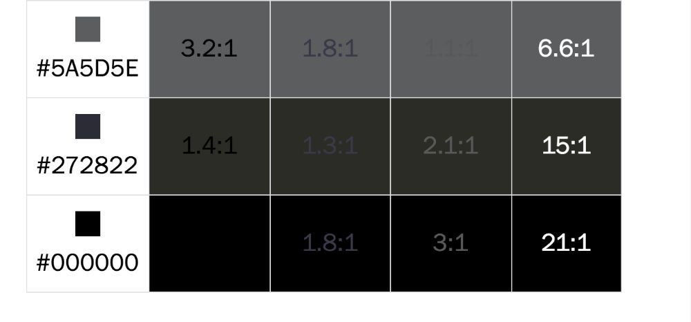
The most fundamental factor to consider when it comes to legibility is the color contrast between the background and the font’s selected color. WCAG, also known as Web Content Accessibility Guidelines, has a particular list of predefined guidelines for various standards. It defines the correct color contrast required between the background and the text on the web application or a website. You can calculate the contrast using various tools that are available for both design and development. There are automatic validators available in the market, but they don’t work as accurately as the real test.
When we use CSS to define the color contrast, we can use a “calc” statement to calculate the font color dynamically to offer the best color contrast. This is calculated while it considers the color of the theme and the background. The CSS code that employs the “Calc” factor is as below:
article
{
–red: 230;
–green: 230;
–blue: 230;
–aa-brightness: (
(var(–red) * 299) +
(var(–green) * 587) +
(var(–blue) * 114)
) / 1000;
–aa-color: calc((var(–aa-brightness) – 128) * -1000);
background: rgb(var(–red), var(–green), var(–blue));
color: rgb(var(–aa-color), var(–aa-color), var(–aa-color));
}
According to the media query parameters, you can also let the user switch between the dark and light themes according to the user preferences. You can use “prefer-color-scheme” in CSS to enable the switching between the light and the dark themes as follows:
@media (prefers-color-scheme: dark)
{
article
{
–red: 30;
–green: 30;
–blue: 30;
}
}
7. Adding shadow to the fonts:

While we have a significant variation between the web fonts to choose from, it is easy to detour from selecting the traditional fonts that define standard approach and consistency. But, there are certain drawbacks that come with choosing the custom web fonts. For instance, all the devices render the fonts in a different way. Apple computers are known to make pixel-perfect fonts using anti-aliasing techniques. But, with Windows, they favor the approach where the legibility is given higher importance. Hence, if you look at the same text on Apple and Windows-based devices, then the fonts may look different to a certain degree.
To get over this issue, web fonts come to rescue. Web fonts render well on the web as they originally appear. But, for newly launched custom web fonts, the fonts don’t render according to our expectations. Hence, they look different on various devices. Sometimes, the fonts look slightly different on changing browsers as well. In such cases, you should apply shadow to the fonts. With the following CSS code, you can implement shadows to the fonts:
h1 { /* Your selector */
font-family:”Some Custom Font”, serif;
text-shadow:0 0 1px transparent;
/* Or, if you need to apply a 0px hard shadow,
* you can use multiple text shadows */
text-shadow:0 0 0 #f00, 0 0 1px transparent;
}
Conclusion:
Reading is an activity full of complexities, and it becomes even more complicated when the reader has reading disabilities. When you are targeting the development of a website, you have to take care of the regular readers, including the readers with disabilities. Hence, this blog discusses the underlying issues to handle using CSS while taking the website legibility into consideration.