Plumber Website Design Can Look Good Too (30 Examples)
You know, I’ve been around the web design scene for quite some time, and there’s something I gotta say – plumber website design can look really good. Trust me on this one.
So, let’s talk about it:
🌊 These sites are making a splash in the design world
🛠️ They’re bringing creativity to a whole new level
👀 They’re defying expectations and looking stylish
That’s right! Today, we’re gonna discuss an article called “Plumber Website Design Can Look Good Too.” I’m telling you, these websites are way more than just pipes and wrenches. They’re pure art!
So, are you ready to dive into the world of plumber websites and see some killer designs?
The best plumbing websites on the internet
GM Plumbing Corporation
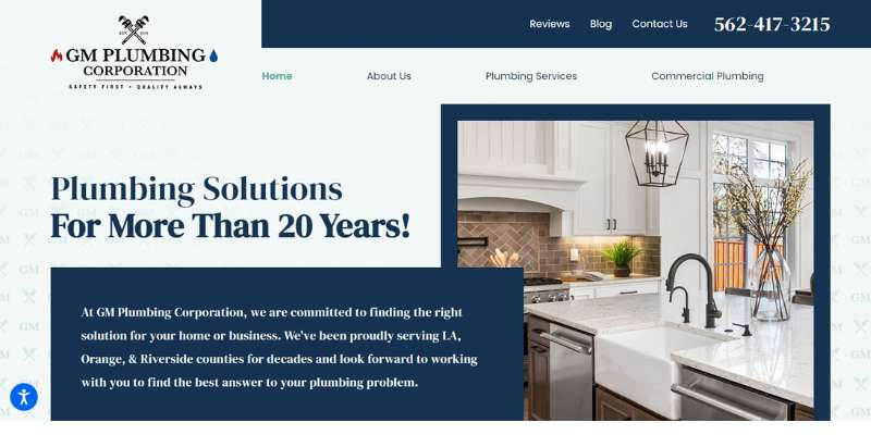
The thing this plumbing website does best is to reassure website visitors that they’ve come to the right place. There is their contact number right up in the header, accompanied by the main services they offer. The plumbing company also selected several quality images to display. The calls to action are clear, and there is a recognizable visual hierarchy.
Go Green Plumbing
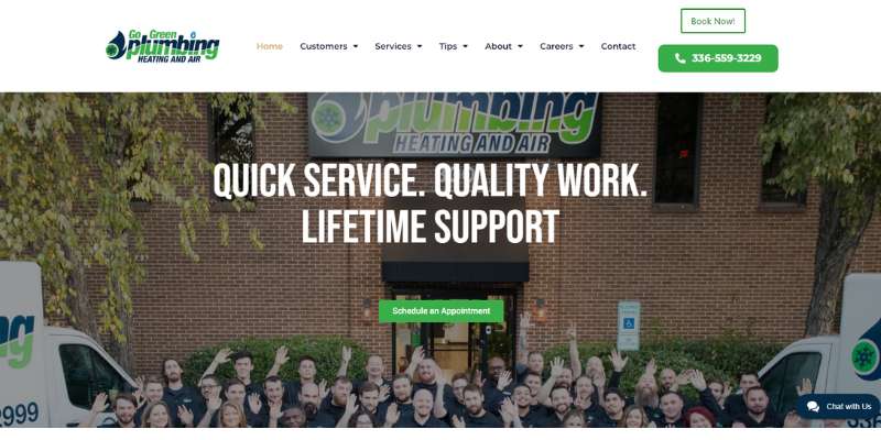
This plumbing website also prefers function over form. Go to the “Services” page, and you will find a nice list of main services followed by brief descriptions of each. There is also information on response time and the employees in charge of each service. The best part about it is that this plumbing website lets you book an appointment directly on the page.
Mr. Rooter Plumbing
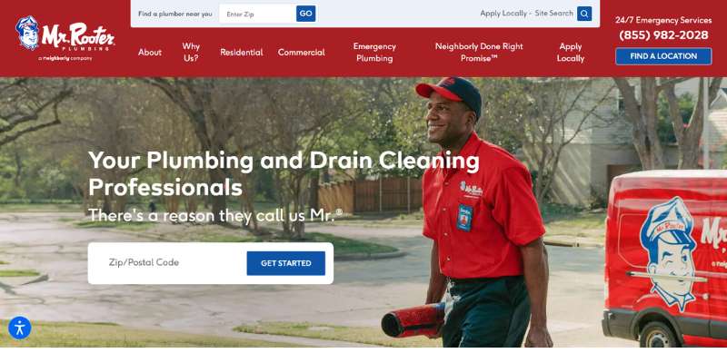
Mr. Rooter Plumbing is what we’d call a truly elegant plumber website. The brand works with trendy features and follows all online innovations. We like the hero header section that gives you all information you need in one place. This plumbing website design is also the perfect example of how to use CTAs without overwhelming visitors.
Impetus Plumbing & Heating
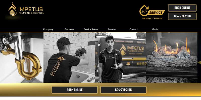
This plumber’s website can brag with great navigation. There is a central homepage that takes you to any page you want within seconds. You can learn a lot from this plumbing website.
Roscoe Brown
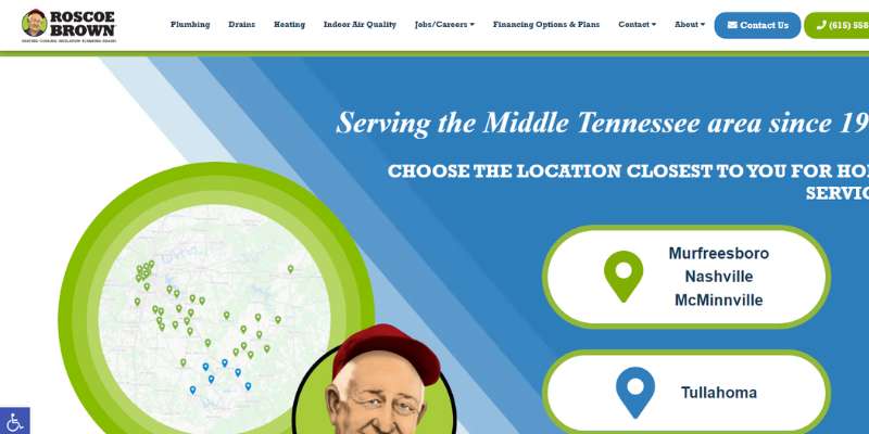
This plumber’s website uses clear buttons as calls to action. Their design is simple, but catchy, especially when it comes to the homepage. The plumbing company also made some smart investments in brand design, as witnessed by its logo and contact details.
Benjamin Franklin Plumbing
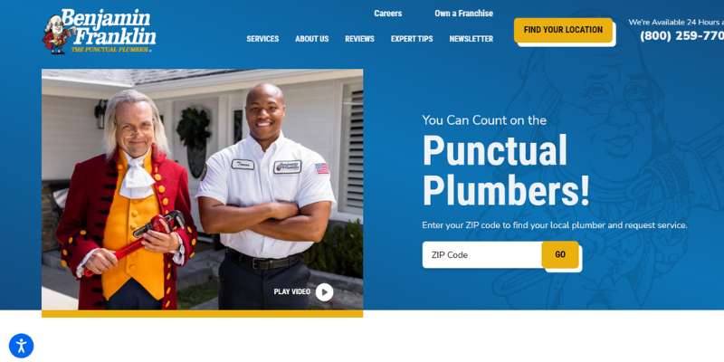
You won’t have trouble navigating this plumbing website. The reason is that it comes with bulleted step-by-step instructions. Navigation through their plumbing services is further facilitated by a powerful search button.
We also like how the company described their plumbing services each on a different page. To attract even more interest, they introduced a blog on professional plumbing topics.
Scott Robillard Plumbing & Heating
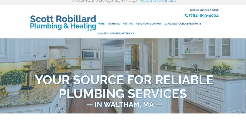
Here comes a plumbing website that was designed with mobile use in mind. Pages render equally well on any screen, and the site also has a click-to-call button for customers.
Superior Plumbing
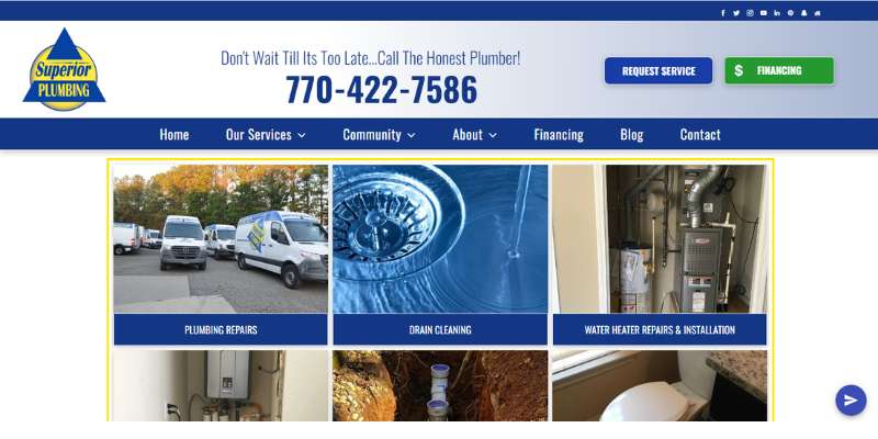
We like the visual effects this plumbing website introduced to engage visitors. The primary color is blue, which also speaks in favor of its quality and sophistication.
As you land on the homepage, you will see 2 calls to action and several phone numbers, as well as useful links to their main services and available jobs. If you are interested to work for them, you can apply on the site. Not that many plumbing websites have this option!
The designers also did an excellent job with clear and flat icons for easy navigation. Branding is also strongly represented with testimonials, community events, and special club offers. Check it out!
Atlas Plumbing NYC
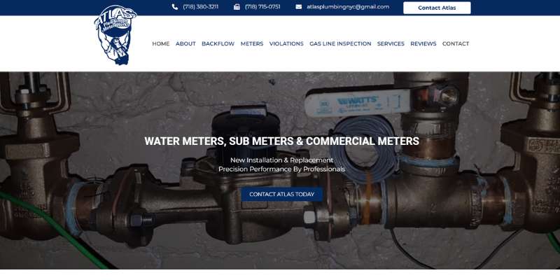
Atlas Plumbing NYC is one of the most innovative plumbing websites on this list. Designers made sure it looks modern and professional. They even showed us that we can be creative even with something as simple as plumbing services.
You will appreciate their smooth animations, sliders, and sticky headers. A very notable feature is parallax scrolling which makes icons hover as you move the pointer on them. The user-friendly design also comes with some amazing images you will enjoy.
Evolution Plumbing
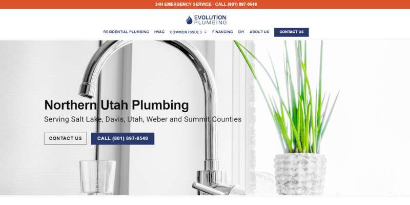
The Utah-based plumbing business also has a website to learn from. Visitors are greeted with detailed contact information. Check their neatly placed orange header to help navigate to emergency services. If you click their call button, you can connect immediately.
Another proof of quality service is pop-up live chat options where questions are immediately answered. If you don’t want to use this option, there is also a service request form you can fill out in a few steps. No wonder their search engine optimization rankings are so great!
The Irish Plumber
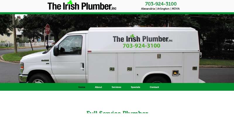
A great plumbing website should foremost be user-friendly, as shown by this example. The prevailing color is green, which makes the site look clean and eco-friendly. Navigation is further supported by sticky menus and descriptive imagery.
Bollano Plumbers
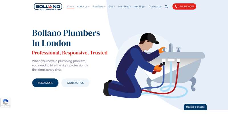
Our UK representative on this list is the Bollano Plumbers website. We invite you to check their SVG animations and consider how you could apply those to your plumbing website.
Guest Plumbing & Heating
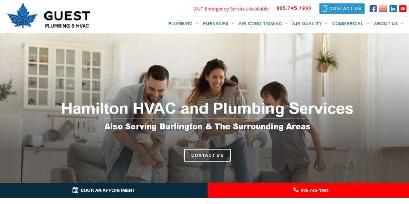
This plumbing website emphasizes the importance of keeping web design and branding consistent. Their logo is available on every page, while parts of it are used on watermarks on each main page. The colors and fonts they use also correspond to the ones on the logo.
Westside Plumbing
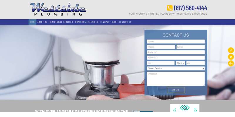
Westside Plumbing is among the best-performing plumbing companies in the US, and for a good reason. They are a symbol of quality and consistency, but they also excel in customer service.
Their plumbing website has excellent search engine rankings. What sets it apart is the easy navigation, clearly delineated services, and a landing page for all the main residential works they offer. There will be a detailed description of everything you need to be done, from garbage disposal repair to faucet repair. It is not always easy to bring such spectrum on one plumbing website, and yet – this company manages!
Best of all – you can select the exact service you need on their request forms. How many plumbing companies do you know that have an option like this?
Mammoth Plumbing
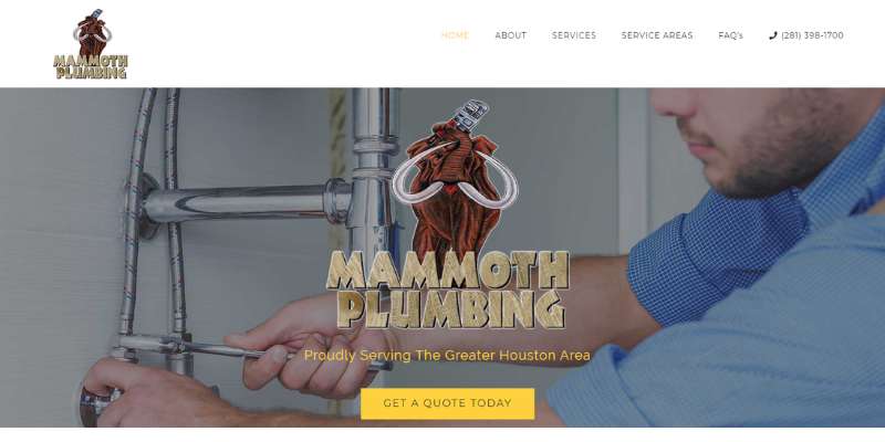
You can also get inspired for your plumbing website by looking at the Mammoth plumbing homepage. They immediately inform visitors that they operate in the Greater Houston area. Next, they lead them toward the services section. Being geo-specific certainly helps with search engine optimization.
Prime Plumbing
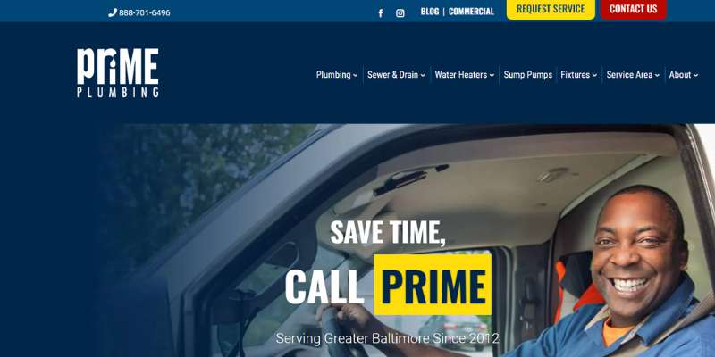
This plumbing website, on the other hand, aims to entertain visitors while informing them. It greets you with a large logo and a catchy slogan, and it guides you immediately to an engaging call to action.
If you are looking to get things done, you can submit a request literally within seconds. This plumbing website design won’t make you scroll through tenths of pages to find what you need.
Ingram Plumbing
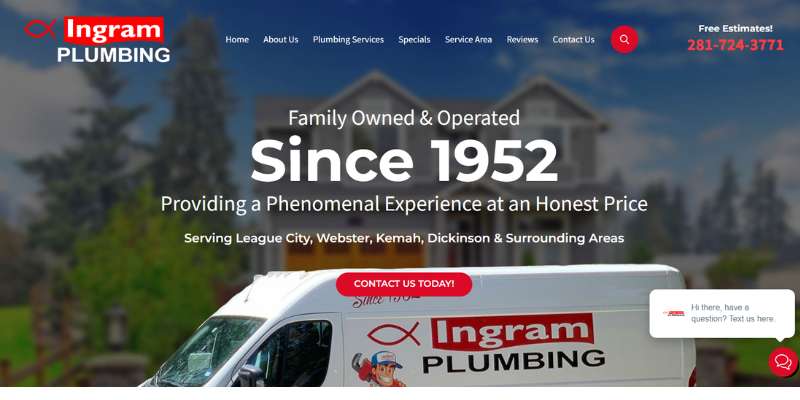
Ingram’s plumbing website doesn’t only offer a plumbing service, but it tells a story. Their plumbing repairs or drain cleaning are paired with pictures of their stuff in action. So it seems that it is great to be part of their team!
The plumbing website is also very professional and easy to navigate. It might provide just the perfect plumbing website template you are looking for!
Modern Plumbing & Heating
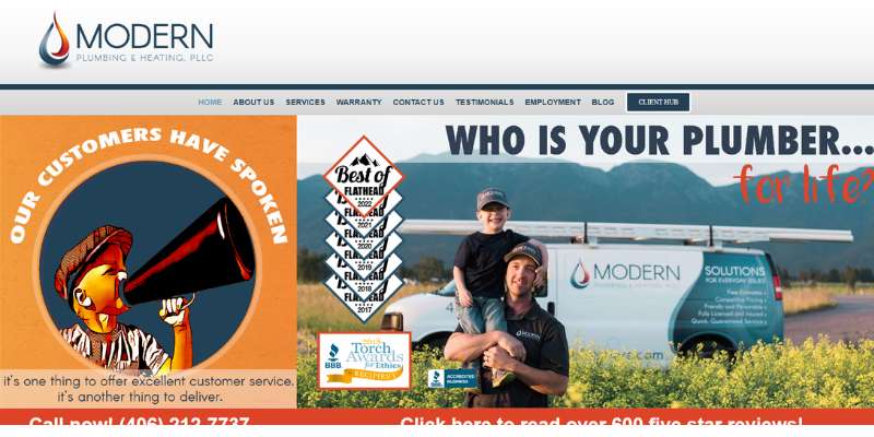
Another thing the best plumbing websites do is promote the awards and certifications of the plumbing company. If you want to do the same, check what this plumbing website does. They even have a page with more than 570 five-star reviews!
Top Shelf Plumbing
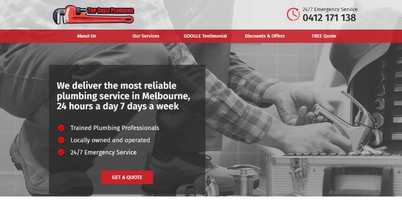
Also, all the best plumbing websites are simple, as proven by Top Shelf. Everything is there, and you will find the service you want with little to no effort. The plumbing company has a strong presence on social media, as made obvious on its website.
Tundra Plumbing
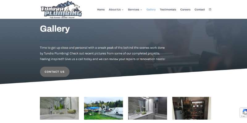
Tundra Plumbing may not be the best-looking plumber website on this list, but they have some major advantages. We’d point out the magnificent gallery of completed projects, as well as the bios of their team members.
Delk Plumbing, Inc.
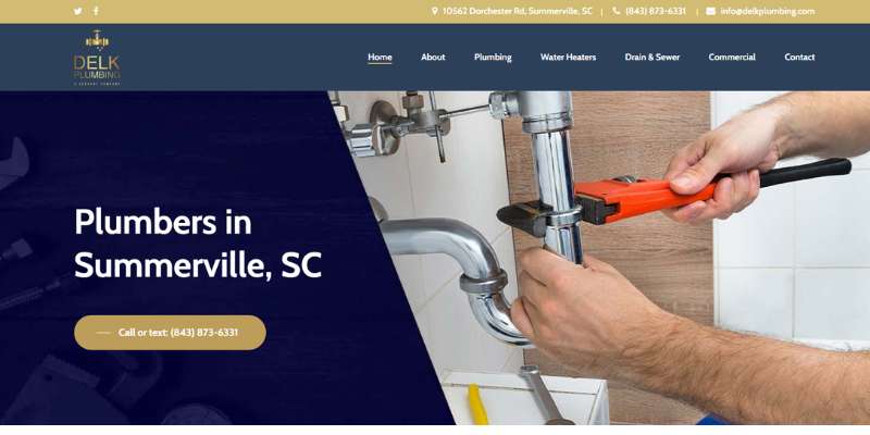
This plumbing website also makes optimum use of customer reviews. You can read these directly on the homepage, while also checking the awards Delk received over the year. The plumbing business inspires trust with the smart use of color and big fonts. Navigating this plumbing website is very time-efficient!
Pom Group Plumbing
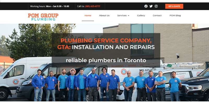
The first thing you will notice on this plumbing website is the multiple social links embedded on top of the homepage. These icons remain visible wherever you navigate on the website.
BDS Plumbing, Inc.
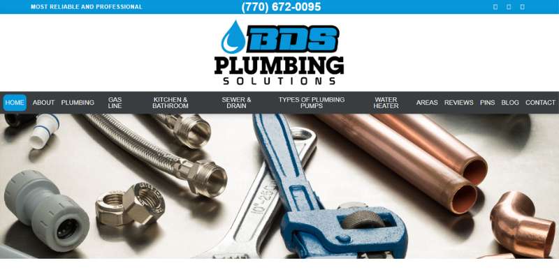
BDS Plumbing follows the ‘less is more’ logic. Their plumbing website won’t overwhelm you with information, but rather point where the information is. Text chunks are expandable, so you only read what you want to know. Smart approach, isn’t it?
Tony LaMartina Plumbing Co. Inc.

How about a catchy background video? This is how potential customers get to know the business and feel welcome from the very first moment.
The plumber website also has an attractive color scheme and cool scrolling animations.
MidCity Plumbers
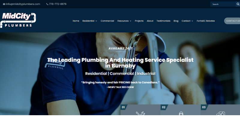
This plumbing website is perfect for those of you looking to inject a vintage vibe into your online presence. MidCity’s plumbing website speaks tones of its brand reputation, especially in the ‘about’ section. Here you can learn more about their values and beliefs, and see images of all team members.
NY Plumbing
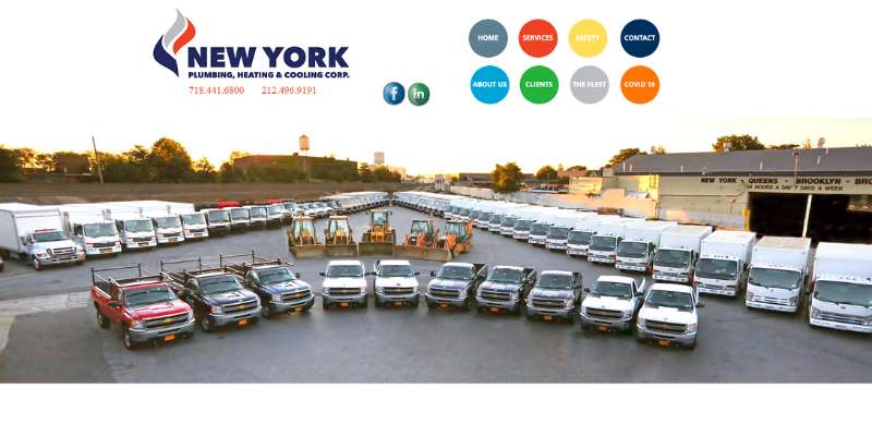
This York plumbing business relies strongly on visual design. You will love their design features, attractive color palette, and clear CTAs.
North Star Plumbing
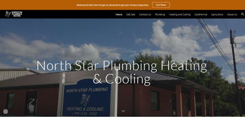
Speaking of New Your plumbing, don’t forget to check how North Star handled their plumber website. They offer breathtaking background images paired with quality written content.
S & E Plumbing
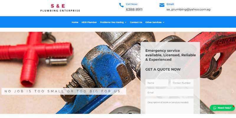
S & E Plumbing’s website has it all: excellent copy, ample white spaces, and beautiful design. They use some of the best icons on this list and don’t compromise on the way they provide information. If you are looking for the perfect plumbing website design, put them on the list right away.
The S&E plumbing company has invested a lot in easy lead generation. They drive conversions with catchy plumbing website design, easy request forms, and simple access. Contact information is displayed creatively and distinctively. In such a way, you can order anything from plumbing heating to drain cleaning within seconds.
FAQs on designing a plumber website
What are the essential elements of a plumber website design?
A successful plumbing website should feature an obvious call to action, interesting aesthetics, and informative, thought-provoking content.
It’s crucial that you highlight your skills and experience while marketing your plumbing services.
You should also check that your site runs quickly on mobile devices and that it is optimized for them. Social proof features, such as reviews and testimonials from satisfied customers, are an effective way to gain the confidence of potential new ones.
How can I make my plumber website user-friendly?
Focus on simplicity and usability to make your plumber website popular. Make sure the navigation is simple and straightforward, and that you use clear, succinct language.
Think about incorporating icons or other visual clues to aid people in navigating your site. Also, make sure that your website is mobile-friendly and has a quick load time.
What colors and fonts are best for a plumber’s website?
The brand identity and intended audience will determine the best color scheme and typeface for a plumber’s website.
Yet, sans-serif typefaces, which are both clean and modern, tend to project an air of professionalism and reliability. Websites for plumbers frequently use blue, green, and orange to convey trust, reliability, and warmth.
How can I showcase my plumbing services on my website?
You can promote your plumbing business online by showcasing your expertise, service areas, and plumbing specialties on your website.
You can show your competence and experience by including case studies and customer success stories.
What types of images and graphics should I use on my plumber website?
A plumber’s website needs high-quality images and graphics that convey the company’s values.
To better explain your plumbing services to site visitors and win their trust, think about including photos of plumbing tools or completed plumbing projects.
How can I optimize my plumber website for search engines?
Do some keyword research and use those terms throughout your plumbing company’s website’s content and meta tags to improve your site’s visibility in search engine results.
Make sure your website is easy to use on mobile devices and loads quickly. If you want to increase your site’s visibility in search engines, you should think about establishing inbound connections from credible resources.
How can I ensure my plumber website is accessible to all users?
You should utilize accessible design techniques such as large, legible fonts, picture alt tags, and keyboard navigation to make your plumber website accessible to all users.
You should also test your website’s accessibility with third-party technologies like screen readers.
What content should I include on my plumber website to engage visitors?
Engaging content for a plumber’s website could contain articles or blog posts about plumbing care and repair, as well as reviews or testimonials from satisfied customers.
To further pique the interest of site visitors, consider including quizzes or polls.
How can I incorporate interactive features on my plumber website?
Online appointment scheduling, chatbots to answer frequently asked questions, and virtual plumbing consultations are all interactive features that can be implemented into a plumber’s website.
Your website’s user engagement and user experience can both benefit from these additions.
What are some best practices for designing a mobile-friendly plumber website?
Using a responsive design that adapts to multiple screen sizes, optimizing photos and media for mobile devices, and ensuring your website loads quickly are all best practices for developing a mobile-friendly plumber website.
Also, make sure your mobile site’s navigation is simple and straightforward.
Final thoughts on these plumber websites
As you saw, it is not all that difficult to be creative with the plumbing services website. If you do some research, you can come up with the best plumbing website design that also generates leads.
What matters is to be consistent and to convey a clear message. Don’t compromise on quality content, and make sure information is visible and easy to access. We hope that the styles we discussed inspired you for your next big project. Now, it is time to attract and amaze your potential customers!
If you enjoyed reading this article about plumber website design, you should check out these:
- Awesome black websites you need for inspiration
- Everything You Need to Know about Virtual Reality in Education
- Top 6 Side Hustles for Creative People