Impressive Museum Website Design to Use as Inspiration
Several pre-made themes are accessible online for usage by museum organizations that would love to have a web presence in the museum industry. By doing so, the hassle of starting from scratch with a website may be avoided.
While it is a great choice, you can also hire skilled designers to create a stunning museum website design for your project. Whatever option you find most convenient is still a fantastic idea to consider looking at these great websites in the museum industry.
Outstanding museum website design
Metropolitan Best Museum of Art
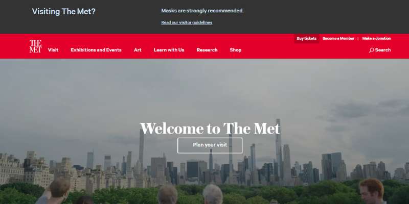
Everyone may explore and appreciate the more than 5000 years of art on display at the Metropolitan Museum. While the content is crucial, attention is drawn to the web design. The banner with the video and the option to “Schedule your visit” draws the most attention.
In keeping with the best practices of efficient web design, CTAs may be included in each block of the main page. The exhibition area, which is presented in a card-like format with a chic slider, further elevates the museum website’s appearance and feel.
The website of the Metropolitan Museum is aesthetically pleasing, up-to-date, interactive, and loaded with content. It is simple to use and gives the impression of visiting a legitimate online museum rather than a library.
You may navigate between sections, discovering something fresh on every page.
Chicago’s Museum of Science and Industry
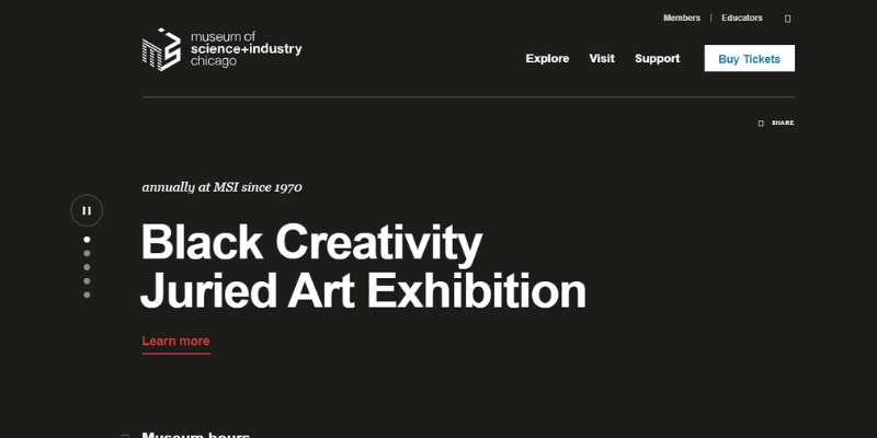
MSI – One of the biggest scientific museums in the world is in Chicago. It is home to more than 400,000 square feet of interactive displays meant to inspire creativity and scientific investigation.
The site for MSI is appealing and creative. The site header makes it easy to identify the key components that visitors are searching for: a clear and straightforward traditional menu, a banner that can be switched, buttons for “Learn more” and “Schedule your visit,” and a short menu with social media links.
The museum website also features a useful, helpful footer. This museum website nicely presents material by using an asymmetrical layout. Social networking connections, a slider, a sticky header, and more are other noteworthy features.
Van Gogh Museum
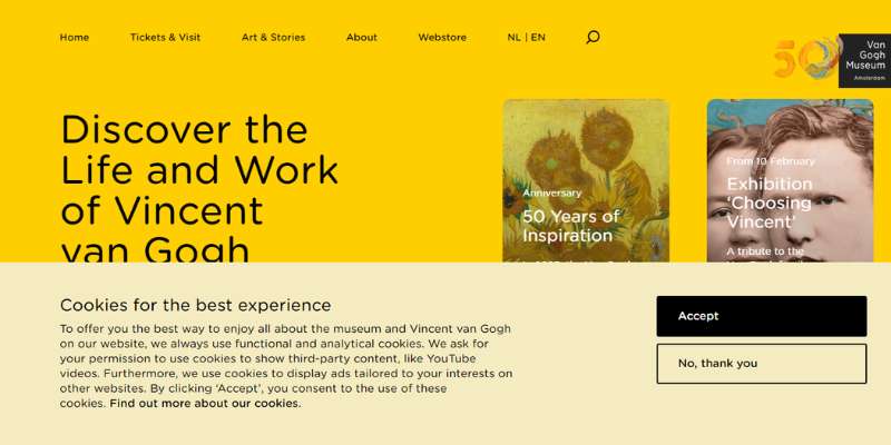
The Van Gogh Museum was founded to preserve Vincent Van Gogh’s work and artistic creations, as well as his life and legacy. Each page’s screen is covered with Vincent van Gogh’s works.
His artwork is scattered across the backgrounds of each page. The homepage of the museum website has a full-screen style, and the site is bold in its use of navigation, using a hamburger menu but oddly positioning it to the left.
To display additional sub-menus, social network links, and newsletters, the Van Gogh Museum also offers an off-canvas menu. Nationality is never a hindrance to promoting knowledge of this museum because of the variety of languages our website provides.
British Museum
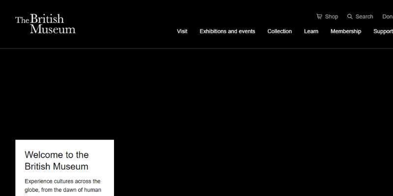
The British Museum seeks to assemble civilizations from across continents and seas under one roof. With a black backdrop and white writing, this museum website stands out.
With the use of GSAP animation, it is much more aesthetically pleasing.
As a result, when you hover over objects, they move coolly and subtly. Together with that, it has a stylish slider for showcasing several collections, a great drop-down menu, clear video integration, social network icons, and much more.
Frans Hals Museum
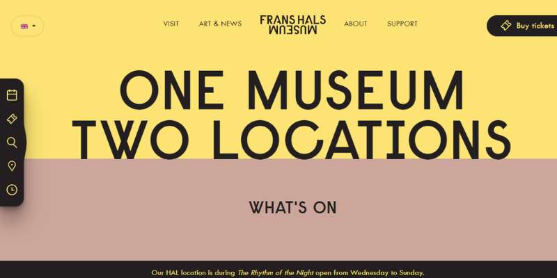
The primary collection of the Frans Hals Museum is his paintings. It features an inspiring web design that is vivid, contemporary, and imaginative. The GSAP animation on the site adds creativity and innovation.
The hero header has an eye-catching logo, a very original drop-down menu, strong font, and animation highlighted events to deliver the headline. With this museum website, finding out more about exhibits and purchasing tickets is as simple as a few clicks.
Generally speaking, the site navigation is well-designed so that you can locate anything you need without having to scroll! The footer’s design has an almost vintage feel to it. You may even pass some time on the Frans Hals museum website by choosing from one of three straightforward games.
National History Museum
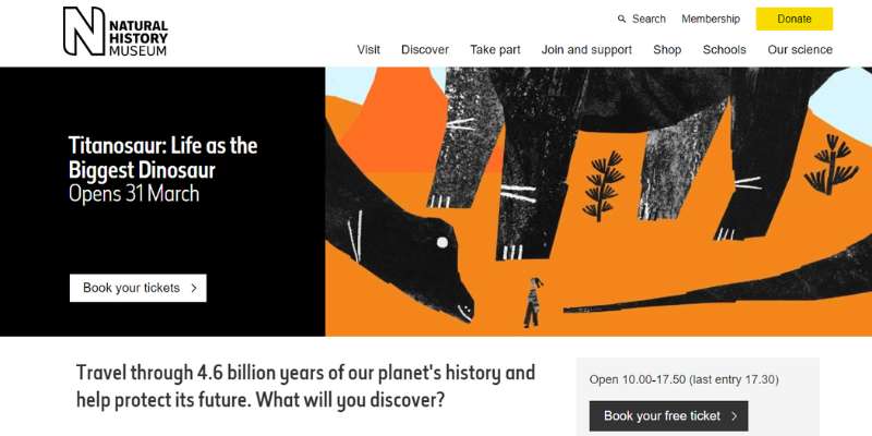
The National History Museum has a fantastic museum website that allows them to showcase exhibits and visitors to quickly browse them.
This museum website has fantastic web components that allow visitors to schedule trips and see exhibitions and activities. The webpage has a wonderful, contemporary look to it. From crystal-clear CTAs, powerful headlines, visual hierarchy, top-notch imagery, and fun scrolling movement. The majority of the talking is done by the powerful picture.
Despite having connections to a large number of sites, the navigation is very straightforward and user-friendly.
National Museums Northern Ireland
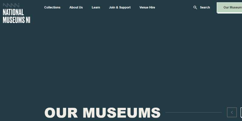
Leading cultural, educational, and tourism locations are housed under National Museums NI. More than a million plants, animals, and geological specimens live there in addition to 20,000 pieces of contemporary art.
A stunning visual display that may be played and stopped serves as the backdrop for the hero scene. Also, the card design pattern makes the future exhibits appear very amazing.
National Museum of African American History and Culture (NMAAHC)
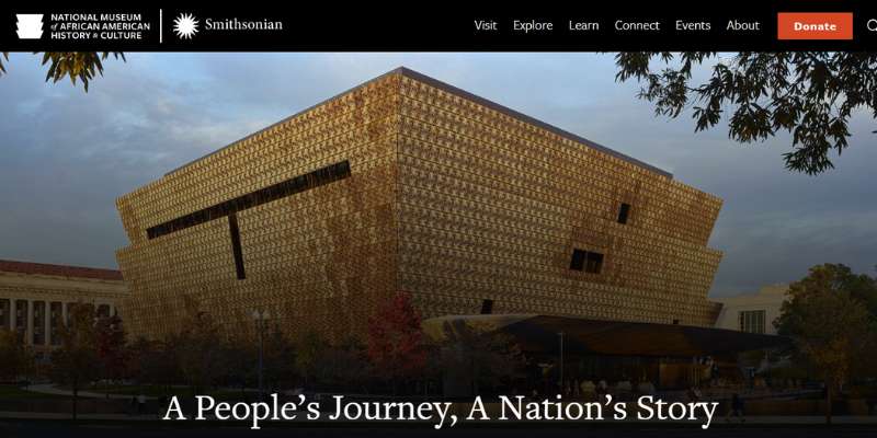
The only national museum dedicated to preserving African American life, history, and culture is the National Museum of African American History and Culture (NMAAHC).
The museum website is very well-built, tidy, contemporary, and attractive. The majority of companies use GSAP animation, however, this institution has never done so. The hero header has a catchy picture, a big title, and simple typography.
Moreover, the sticky header is used for fast and simple navigation. It looks fantastic with white space covering the pages as red is the main color.
National Museum of Asian Art
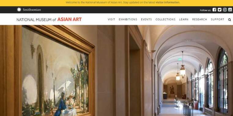
Fresh, contemporary, and simple architecture define the National Museum of Asian Art. This organization is dedicated to preserving, displaying, and understanding outstanding pieces of art.
A straightforward hero scene is finished with a full-width picture on the hero header and a menu display utilizing a drop-down. It is always possible for visitors to access the events page, collections, research, and assistance.
Also, the arts in the art gallery of the National Museum seem appealing because of the larger thumbnails and a smooth slider.
Rijksmuseum
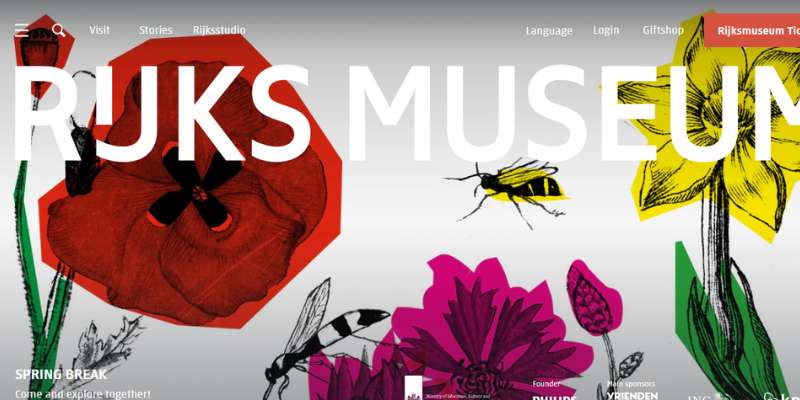
The webpage for the Rijksmuseum is excellent. The Rijksmuseum was one of the first museums to provide all of its photos as high-quality images for viewing and downloading, and you are even permitted to use these images and print them on items like mugs, t-shirts, and tote bags.
The Rijksmuseum website has a very appealing, contemporary, and user-friendly design.
Whitney Museum of American Art
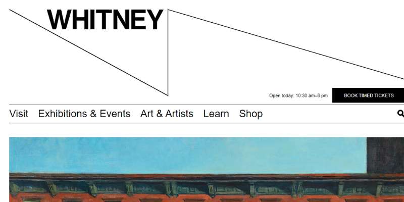
The Whitney is a significant American art museum. This museum website’s big, legible typography and moving design elements are among its best characteristics.
Everything on the art museum website is quite straightforward and obvious; all the crucial CTAs and activities, such as the subscription form and membership signup, are accessible by scrolling.
Museum of Modern Art
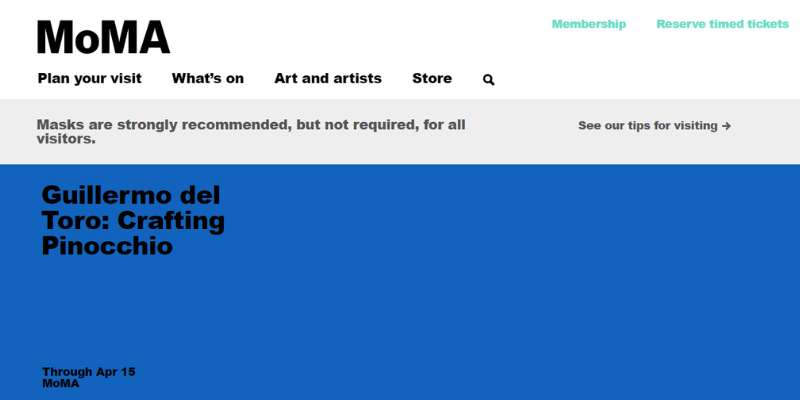
The website of the Museum of Modern Art serves as an example for other organizations designing cutting-edge museum websites. This art museum is in a stunning location that fosters imagination, stimulates thought, and inspires. It strives to present current and modern art to examine themes, ideas, and the arts.
With a simple yet thorough modern design, the modern museum website seeks to accomplish its objectives. The hero header is packed with beneficial components that are prepared to flourish in the museum sector.
It makes use of a good magazine style in the header to present the art appealingly. This art museum website celebrates white space and has a clean, minimalist aesthetic since it is crucial to design.
National Air and Space Museum
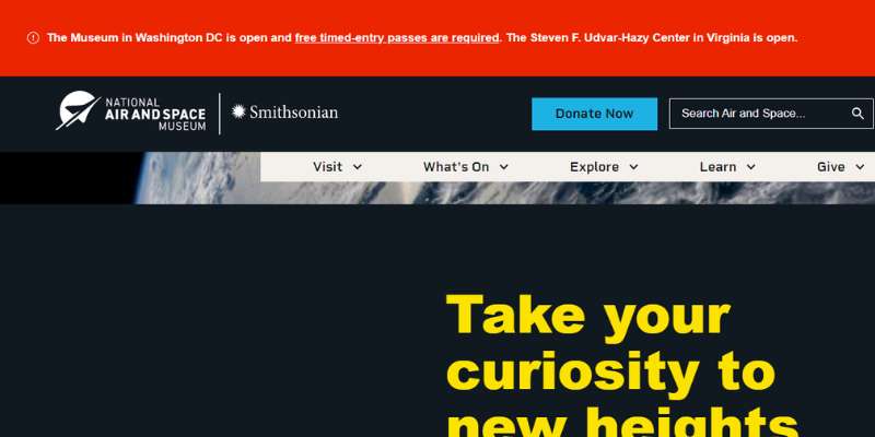
The National Air and Space Museum has a fantastic website. It is the ideal tool for other museums to create creative museum websites. The split-screen structure of the hero header’s excellent web components makes for an outstanding visual show.
When it animates while hovering, it becomes much more intriguing. However, the visual hierarchy and white space give elegance to the design.
Also, it makes use of a beautiful slider to display many events at once. The museum website is more engaging because of the parallax effect.
National Portrait Gallery
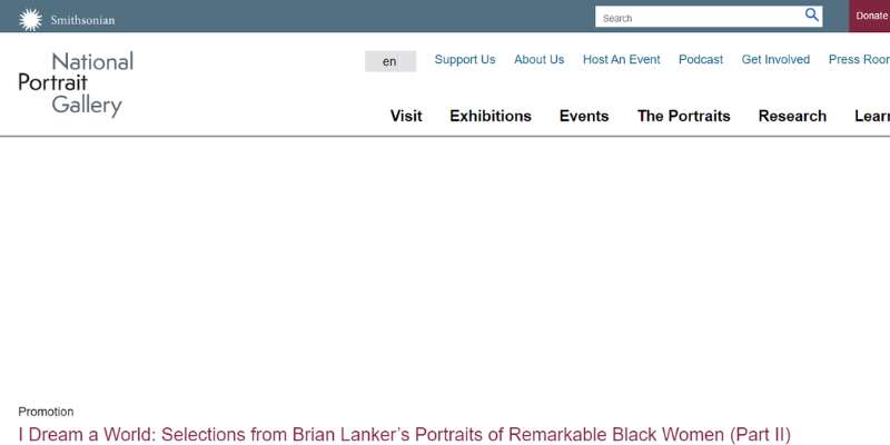
The National Portrait Gallery showcases Americans with extraordinary character and accomplishments. This museum website’s homepage has a simple, minimalistic style overall. Exhibitions are included in the hero header and are flawlessly displayed utilizing a slider.
The museum website also employs a straightforward, tidy structure with white spaces to easily present information about the location and business hours. The highlight portion of the website also has some beautiful portraits.
National Gallery of Art
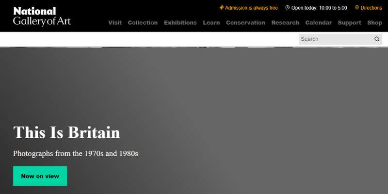
One of the largest collections of paintings in the world is housed in the National Art Gallery. Very appealing and simple is the site design. Visitors may simply reach the artwork they’re interested in thanks to the abundance of painting photos.
On its museum website, users may obtain crucial information like Google Maps to direct them while using public transportation, walking, cycling, or a vehicle. Also, it lists the amenities you may utilize when visiting the museum, such as the exhibits, artwork, performers, research, and more!
Moreover, a slider in the events section displays several forthcoming events.
Scriabin Museum
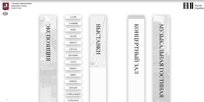
The Alexander Scriabin Museum honors the outstanding Russian composer of the Silver Period. The museum website was designed with cutting-edge features, such as sliders, stunning hover effects, video integration, white space, and more!
The museum website is quick and simple to navigate since it makes use of the sticky header. A stylish drop-down menu is also included in the sub-menus. Also, it acknowledged the significance of social media ties to the development of the institution.
Banbury Museum
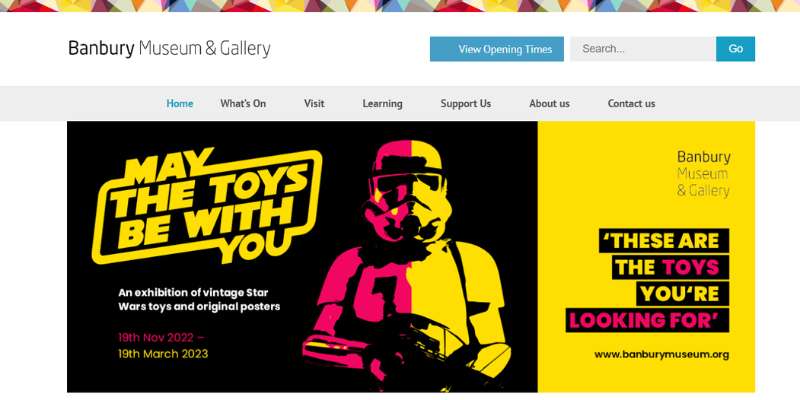
This museum website is one of the greatest examples of a museum website because of its bright, lively aesthetic. This is further aided by visually arresting graphics, which is a simple approach to improving a decent website’s appearance. It sticks out as one of the smaller museums on our list where the website is doing more than it should.
Brussels Museum
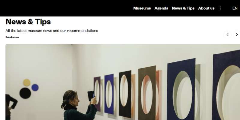
People are often drawn to visuals, thus this museum website included a brief art gallery of photographs to the hero header. Links to social media are also included for simple access to the sites. The navigation in the sidebars also contributes to the website’s user-friendliness. Also, certain site components’ hover effects have an intriguing impact.
The Science Museum
There are many museums here, not just one. The aesthetics of this set of best museum websites are further enhanced by the use of huge, vibrant high quality images. Instead of using flat color blocks, subtle gradients are employed to create a feeling of depth.
Interestingly enough, many of the pages have white writing on dark backgrounds, which provides the exploration of the various parts with a feeling of freshness.
FAQ on designing a museum website
What kind of color scheme should I use for my museum website?
A museum website’s color palette should be consistent with the museum’s logo and convey a feeling of elegance and sophistication.
Consider using complementary hues to create a visually pleasing look. Basic tones such as black, white, and grey are commonly used on museum websites, however, brighter colors can be utilized to highlight specific parts or exhibits.
How can I make my website appear professional and appealing to prospective visitors?
Use high-quality photographs and material, make your website easy to use, and provide clear information about the museum’s exhibitions and events to make it look professional and entertaining.
Consider employing a professional design that includes a custom logo, uniform font, and a simple layout. Provide clear contact information as well as links to social media profiles.
What are some of the fundamental components of a museum website?
A museum website should include information about the museum’s history and mission, a schedule of events, exhibit details and descriptions, hours and admission pricing, and an online store or gift shop.
An interactive map of the museum, a blog, and instructional tools are all possible additions.
How can I make it easier for people looking for certain exhibits or information to traverse my website?
Use clear and simple labels for each page and area, include a search bar, and make sure your menu is easily accessible and arranged to make your website easy to use.
To break up language and make material easier to skim, use headings and subheadings. Consider employing filters and sorting tools to assist visitors in finding the exhibits or information they seek.
How can I present the museum’s exhibits in an interesting and instructive manner?
Use high-quality photographs and films that highlight the nuances and aspects of each exhibit to showcase the museum’s exhibitions in a visually appealing and instructive manner.
To give visitors a closer look, consider using a virtual tour or 360-degree view. You might also include information on each exhibit’s historical or cultural relevance.
What kind of information should I include on my museum website to keep people interested?
Provide relevant and entertaining content linked to the museum’s exhibitions and events to engage visitors.
Consider creating movies or podcasts containing interviews with curators or experts, or writing blog entries or articles about issues linked to the exhibits.
Educational resources such as lesson plans or activity guides could also be included.
How can I improve my website’s visibility and get more people by optimizing it for search engines?
Use relevant keywords in your content, including meta tags and descriptions, utilize alt text for photos, and make sure your website is mobile-friendly and loads quickly to optimize it for search engines.
Try obtaining links to your website from other related websites and promoting your content through social media.
Should my museum’s website contain an online ticketing system, and if so, how should it be designed?
Incorporating an online ticketing system can make purchasing tickets for the museum’s exhibits and events easier for visitors.
Create the system to be user-friendly and simple to use, and just ask for the information required for the transaction.
Consider including a membership or season pass option, as well as clear information regarding payment choices and admittance policies.
How can I make my website mobile-friendly for visitors who use smartphones or tablets to view it?
Choose a responsive design that automatically adjusts to fit the screen size of the device being used to make your website mobile-friendly.
Make sure your website loads swiftly and has readable fonts and photos. Try employing larger buttons and touch-friendly features for a better mobile user experience.
What are some best practices for creating an accessible and functional museum website?
Using a clean and consistent design, prioritizing ease of use and accessibility, providing clear and concise information about the museum’s exhibits and events, and including engaging content to attract and inform visitors are all best practices for designing a user-friendly and effective museum website.
It’s also critical to keep your website up to date with the most recent museum information and to test its usability and performance on a variety of devices and browsers.
Finally, consider incorporating user feedback and making adjustments based on user behavior to continuously improve the usefulness of your website.
Conclusion on museum website design
Before you launch your museum website, check out these amazing ones first. Whatever option works best for you, this list is still a fantastic source of inspiration for your best museum website design.
If you enjoyed reading this article about museum website design, you should read these as well:
- Cool Website Designs: 78 Great Website Design Examples
- 24 Stunning Examples of Top Quality One-Page Website Designs
- 5 Super Helpful Tips for Designing a Visually Appealing Website for a Local Restaurant