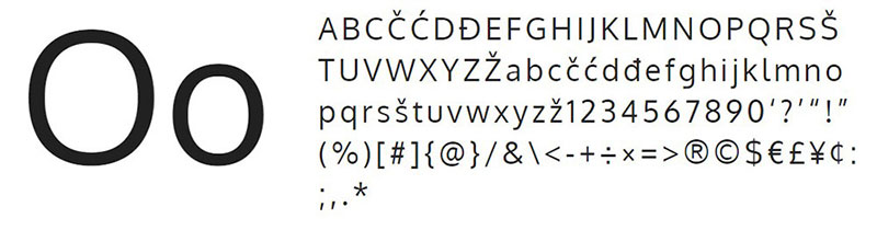
Fonts similar to Lato to use in your awesome designs
Digital design has become a fundamental part of people’s lives. This is involved both in marketing tools and on the websites we visit daily. One of the most important elements of design are fonts, which can create a more user-friendly experience on their own. Thanks to the great popularity that Google Fonts is obtaining, some letters have been established as the standard in design. Lato font is one of the most popular on the site, which makes it necessary for us to have fonts similar to Lato to create harmonious images.
Lato has earned on its own merit being one of the best fonts available on the Google page. First, not everyone becomes part of the Google Fonts catalog; the letters must meet a minimum quality. Lato font family complies with all that is required: be readable and adapt to multiple sizes.
Created in 2010 by Polish designer ŁukaszDziedzic, it was a corporate commission. However, some creative differences between the client and Łukasz were enough reasons for him to publish the typography for everyone.
Currently, Lato can be downloaded from Google Fonts in 18 thickness variants, each with its corresponding italics. There is also an additional version with Latin glyphs. All these options are what make it one of the most versatile fonts available.
Since we will be constantly using it, it is good to have some fonts similar to Lato that allow us to complement any design. Any in the following list is an excellent option to accompany it.
Side note: Do you want to increase your chances of getting a better design job? Get a Graphic Design Specialization from CalArts (California Institute of the Arts). Or maybe you could be interested in a web design specialization. Web Design: Strategy and Information Architecture is a course with great reviews.
Fonts similar to Lato
Open Sans – All-purpose characters
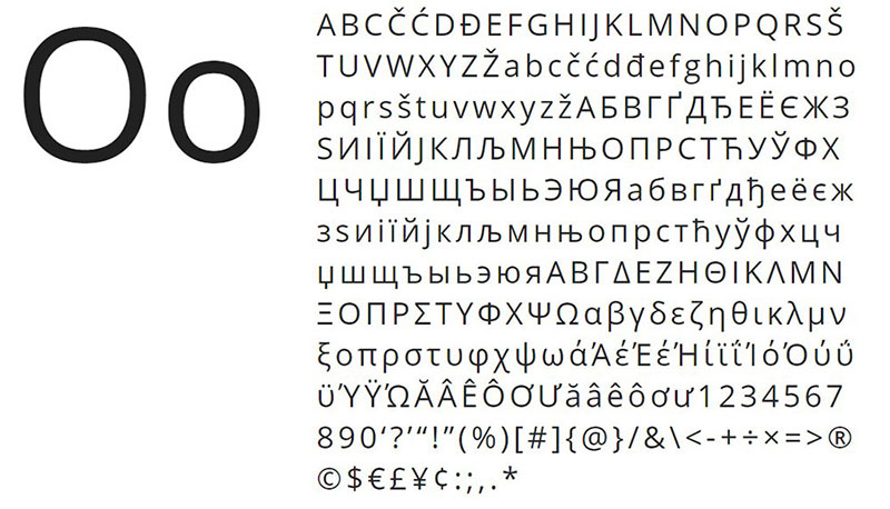
Open Sans places the bar high in terms of the amount of content, as it has 897 different glyphs, including characters from ISO Latin 1 standard, CE Latin, Greek, and Cyrillic.
In terms of design, Open Sans combines very well with Lato due to its organic letters with an elongated vertical design. Open Sans stands out in its compatibility by being easily readable in prints and monitors, which puts it on par with Lato.
Visby CF Geometric Sans Font
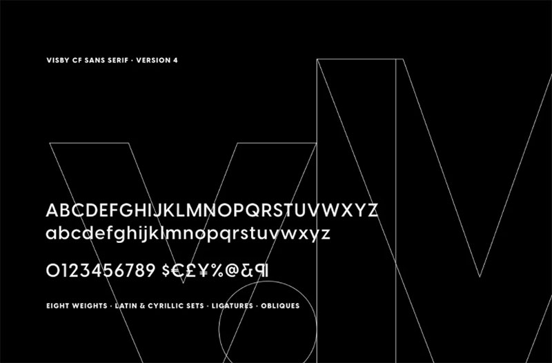
Visby is a geometric typeface inspired by the stark beauty and crisp air of the Arctic. Friendly and charismatic in lowercase; sophisticated and authoritative in uppercase. Hard lines and sharp corners mesh with smooth, rounded letterforms, while humanist nuances add warmth.
Oxygen typeface – Linux adaptability
Although it was born as a font specially designed for the combination of GNU + Linux systems, all its virtues have been transferred to a free-use typeface that adapts to any digital interface.
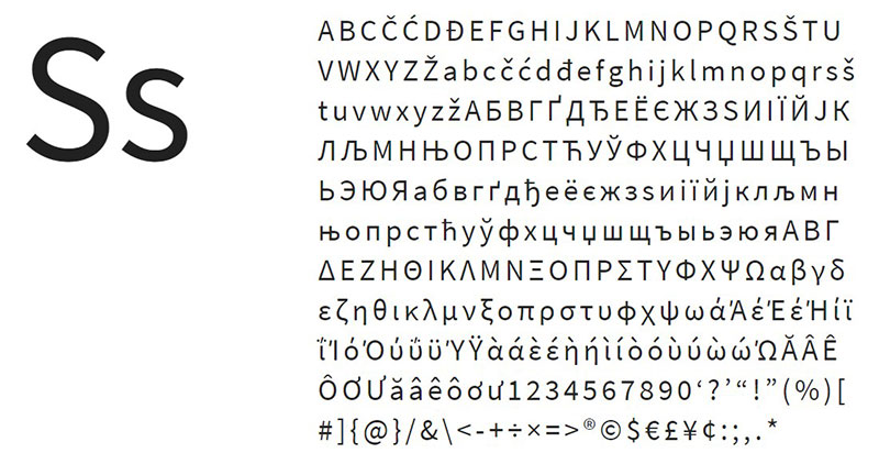
RIPPLE – Minimal & Modern Typeface
RIPPLE is a minimal & modern Sans Serif typeface that will be best suited for creating logotypes, branding, headlines, corporate identities, marketing materials for web & print as well as any type of minimal designs. Please see the included demo graphics to get an idea about the capability of this typeface when used for branding and marketing material design.
PT Sans – From Russia to the world
PT Sans is a Sans Serif typeface with a design that mixes the style of the letters used in Russia during the 20th century and a more contemporary counterpart. The best feature is the number of glyphs it has since it has letters from the Russian Federation, as well as more common ones from the West and Central Europe.
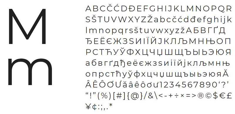
Halton – Modern Sans Serif Typeface
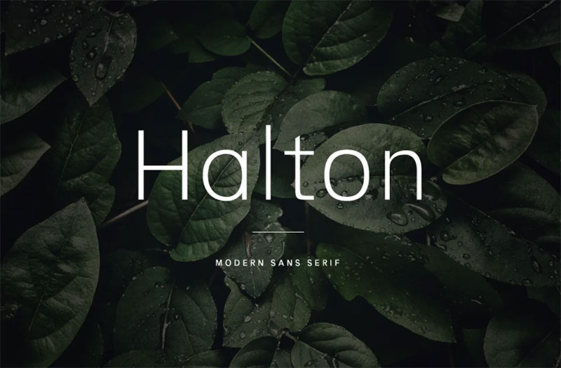
Halton is a minimal and slightly condensed sans serif typeface. It has a little bit of personality and can be used for both headers and body copy. This font family includes all Latin characters (including accents), numbers, special characters, and punctuation.
Raleway – For awesome titles
If we talk about fonts similar to Lato, we cannot miss the classic Raleway. This typeface has become a favorite for headlines since it received an update in 2012 with which nine different thicknesses were included.
Fibon Neue Family
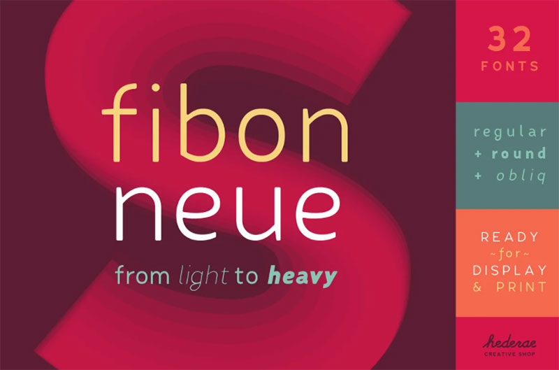
The Fibon Neue typeface is based on Fibon Sans, but brings an improved structure with optical compensations to look more balanced. Low contrast and smooth characters, friendly open counters make it highly legible. Great both for display and print.
Montserrat – With Argentine flavor
Inspired by the typography of a Buenos Aires’ neighborhood, Montserrat is a very formal typeface with defined lines and geometric shapes. The only problem is that it only includes two variants, so it is somewhat limited in its uses, but both “Alternates” and “Subrayada” versions are wonderful if this is what we are searching for our design.
Source Sans Pro – With the Adobe stamp
Source Sans Pro is Adobe’s first open-source typeface, which specializes in a large number of design programs and other computer services. It is normal that, with this history, its typography is suitable for user interfaces.
Today Sans – For lovers of italics
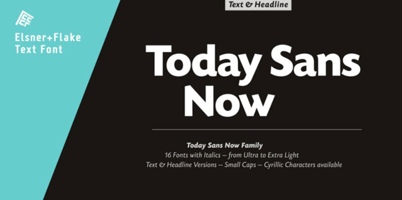
With a wide range of languages (72 in total) and special characters, Today Sans is one of the most striking options when it comes to italics letters.
This typeface was originally designed in 1988, but its bold design in each of its six variants makes it a perfect choice nowadays.
Arimo – The perfect companion
Although we are talking about fonts similar to Lato, we must highlight Arimo font. Steve Matteson was the designer of this typeface whose original purpose was to accompany Arial, but due to its compact structure that adapts to any platform, many developers began to use it in almost any situation.
Nunito Sans – Similar to Lato regular font
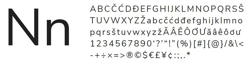
Due to its neutral form, Nunito is a typeface that does not overshadow the other letters that accompany it but does the job of being readable. Originally, the typeface only had its standard version with slightly rounded Sans Serif letters; however, with the passage of time new thicknesses were added, as well as an alternative that eliminated all curves to have completely straight letters.
Avenir – A look into the future
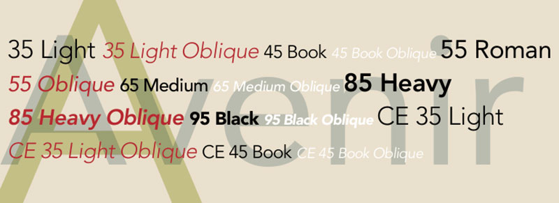
A French variant of the Futura typography, Avenir is born from the concept of the circle to shape each of its glyphs. Avenir has those human characteristics of soft strokes but retains a certain level of order with geometric figures so that it looks good in long texts.
It also has some unique details, such as the imperfect “o” to make it more visible, the two-storey “a”, or the “t” with a curl at the bottom.
Freight Sans – Friendly Appearance
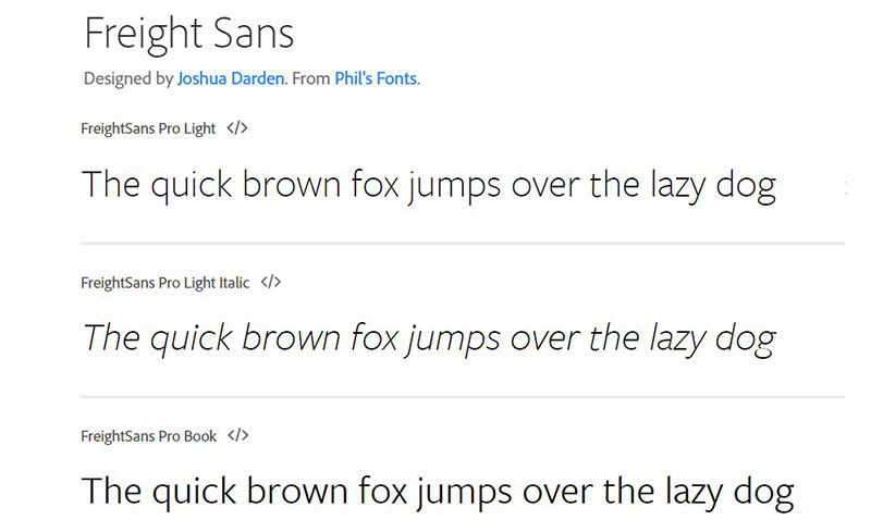
Another humanistic and friendly alternative is that of Freight Sans. This letter is not very rigid in its design, and thanks to the high height of the X-axis, large texts can be written without using much space. A perfect typography for paragraphs, which is complemented by the five variants it has (each with italics).
Myriad Pro – The future is OpenType
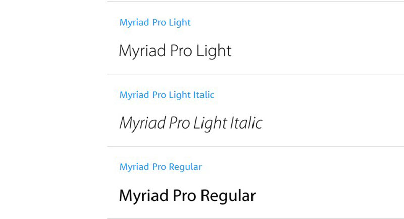
Myriad Pro is an updated version of the font released in 1992 by Adobe, which has been enhanced with OpenType features that allow it to adapt to the user’s different needs.
This typeface has support for Latin-based languages and has a large number of thicknesses to choose from.
As the designs of the Myriad Pro fonts are not as closed as other typefaces, it is comfortable to read. Also, as designers, we will appreciate the number of alternatives it has.
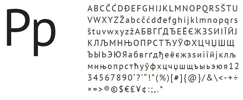
Alto – Don’t get lost in complex information
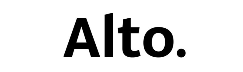
When it comes to topics of great academic or intellectual content, an extravagant font mustn’t distract the reader. Alto is a font family similar to Lato that eliminates any unnecessary detail in the glyphs, which makes it possible for people to focus without problem on the written content.
LD Alena – A monumental design
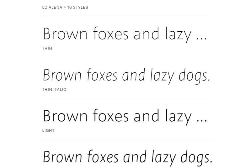
The Swiss designer Rolando Stieger managed to project for the first time, a complete typography work that portrays all the monumentality that the Roman Empire outlined in the beginnings of humanity.
In this way, we can see imposing capital letters, while lower case letters have a more organic and humanistic pattern so as not to take away the relevance of the larger letters. LD Alena also has characters for all Latin based European languages, so it has become one of the great typography classics.
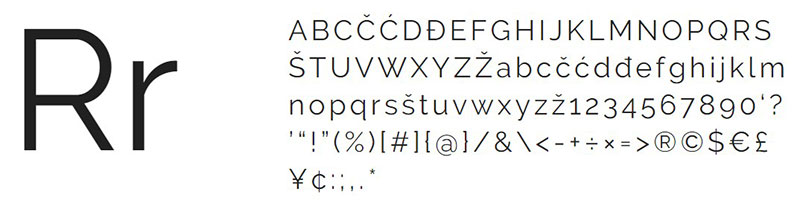
Rival Sans – Versatility in one package
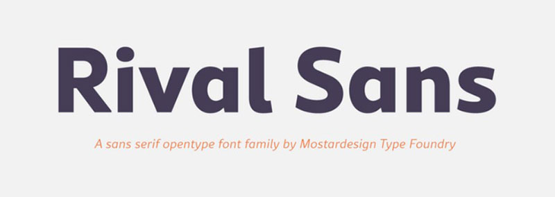
We finalize this list of fonts similar to Lato with one of the most versatile fonts thanks to the number of variants it has. Rival Sans is a 32-fonts family with two styles each, making it one of the pioneers for marketing and graphic design.
The design of Rival Sans is dynamic; each letter has abrupt ends, which gives a sense of movement. Thanks to the small details in the bevels, each text, even those that are not headlines, will overflow energy.
FAQs about fonts similar to Lato
1. What are some fonts similar to Lato that are commonly used in graphic design?
Roboto, Open Sans, Montserrat, and Source Sans Pro are a few fonts that look like Lato and are frequently used in graphic design. These typefaces have qualities in common with Lato, such as being tidy, contemporary, and simple to read.
2. How do the kerning and tracking of Lato compare to other similar fonts?
The distance between characters in a font is referred to as tracking and kerning. Lato has relatively tight kerning and tracking in comparison to other comparable fonts, which can give the impression that it is more condensed and compact. Depending on the intended application and design environment, this could be either advantageous or disadvantageous.
3. What is the difference between Lato and other sans-serif fonts like Helvetica or Arial?
Although they are all sans-serif fonts, Lato, Helvetica, and Arial have different qualities. Lato has a more current and modern appearance compared to Helvetica and Arial, which are more conventional and traditional. Lato is a more adaptable typeface than Arial since it offers a wider range of weights and styles.
4. Can Lato be used for body text or is it better suited for headlines and titles?
Depending on the unique design environment and intended purpose, lato can be used for both body text and headlines. While Lato’s bold and distinctive forms make it stand out as a headline typeface, its clean and legible design makes it appropriate for body content.
5. Are there any free alternatives to Lato that have a similar aesthetic?
Sure, there are free Lato substitutes that look comparable, such Roboto and Open Sans. These fonts can be downloaded from a number of font libraries and are free to use in both personal and professional projects.
6. Is Lato a web-safe font, and how does it perform on different devices and browsers?
Lato functions nicely on a variety of gadgets and browsers and is a web-safe typeface. It is a dependable option for web design projects because it works with all popular browsers and gadgets.
7. What are some good font pairings that work well with Lato for use in design projects?
Roboto, Merriweather, Montserrat, and Playfair Display are a few fonts that blend well with Lato. These fonts enhance Lato’s sleek, contemporary design while bringing a touch of class and sophistication to the whole thing.
8. How does the readability and legibility of Lato compare to other fonts in its category?
When used in body text, Lato is very readable and legible. Even at smaller font sizes, it is clear and easy to read because to its clean style. Yet, it’s crucial to remember that typography is arbitrary and that readability can be affected by a number of elements, including color, contrast, and arrangement.
9. Are there any specific industries or types of projects that Lato is particularly well-suited for?
Lato is a good fit for a variety of enterprises and businesses, including start-ups in the tech sector, advertising firms, and the creative sectors. It is a popular choice for brands and companies who wish to project an air of creativity and forward-thinking thanks to its sleek and contemporary design.
10. What are some tips for using Lato effectively in design projects, such as adjusting its weight, size, and spacing?
Lato should be used with careful thought given to its weight, size, and spacing in design projects. For instance, adding a stronger weight can emphasize certain points and establish hierarchy, while raising the font size can make text easier to read. Improvements in legibility and overall design aesthetic can also be made by adjusting the distance between characters and lines.
If you enjoyed reading this article about fonts similar to Lato, you should check out these articles with fonts similar to Gotham, Garamond, Helvetica, Futura, Times New Roman, Raleway, Bodoni, Roboto, and Optima.