8 Color Selection Rules All Designers Should Follow
Colors are the essence of every design, and your elements can not explain themselves without the right colors. Your end goal and the idea of your design can remain unfulfilled without the right color schemes. When designing according to your idea and preference, you can select any colors you like. Still, when you want to concentrate on technical aspects of graphic design and place everything correctly, you have to follow specific guidelines and rules. There are many theories available to use colors as an essential weapon in designing. And as far as creativity is concerned, you can create any color scheme you want by following a set of guidelines or by avoiding them as well. But there are some universal rules that most designers follow to make their designs attractive and impactful without too much effort. Here, we have incorporated eight essential rules of color selection that every graphic designer should follow to make their designs better.
1. Audience and Demographics:

For any design, the composition and every element are mainly based upon the target audience. There is always a designing cycle where the purpose, end motive, and inspiration act as core wheels. Research is an important part; it gives you a strong foundation for a robust design. Your targeted audience, their preferences, their age group, their cultural values, their location, and every other demographic and behavioral factor are your necessary ingredients to start with. So when it comes to selecting colors that are again the most critical essence of designs, you have to consider your audience and their related information. In the end, you want your design to get approved by your audience, so you must select appropriate colors that highly suit them and influence them for the intended action as well.
2. Color Terminology:
When you select colors and a combination of colors, it’s crucial that you recognize colors precisely. With the help of any two colors, you can create an end number of color combinations, but you can not call every shade of blue just blue. And that’s when color terminology helps you. It is like a dictionary where colors and related concepts are mentioned in a more sophisticated language. Following are the significant color terminology used in design language to address colors more effectively for easier understanding and better communication.
a) Hue:
Hue is what we call color. It is like a synonym of color and a technical term used in designing. It is about the parent color of any color with a particular wavelength of light. All the colors you see on a color wheel are considered as different hues. They are saturated colors without any added whites and blacks. To simplify, colors on the color wheel have their specific hue, but only black, white, and greys don’t have any hues.
b) Tint:
A tint is just a lighter hue that is created by adding some white. Which tint you want to create is all about how much white you add to a certain color.
c) Shade:
A shade is a darker hue that is created by adding some black. Every darker version you see of any color is known as the shade of that color. Every shade has a different name, and you can create several different shades by adding different amounts of black.
d) Tone:
The tone is created by adding grey, both shade, and tint to the hue. In other words, you can say tone smoothly works on the sharpness of any hue. These four terms are closely related to each because tint, shade, and tone are created by adding white, black, and grey to the hue.
e) Value:
Value refers to the lightness and darkness of a color. Value of any color means how much light is reflecting through that color. Hues already have an assigned value to them, but we can manipulate it with lightness and darkness. So, the contrast you see in a black and white photo is because of the value of colors. In designing, highlights and shadows of an image are also the terminologies used for values of colors. And highlights and shadows play a significant role in adding depth and dimensions to the design.
f) Saturation:
Saturation means how strong or weak the color is. High saturated colors have maximum color in them, and low saturated colors have minimum color in them. Grey has zero saturation so, when you add it to any hue, it weakens the color. You can consider every vibrant color as a highly saturated color and every dull color as a low saturated color.
3. The Color Wheel Concept:
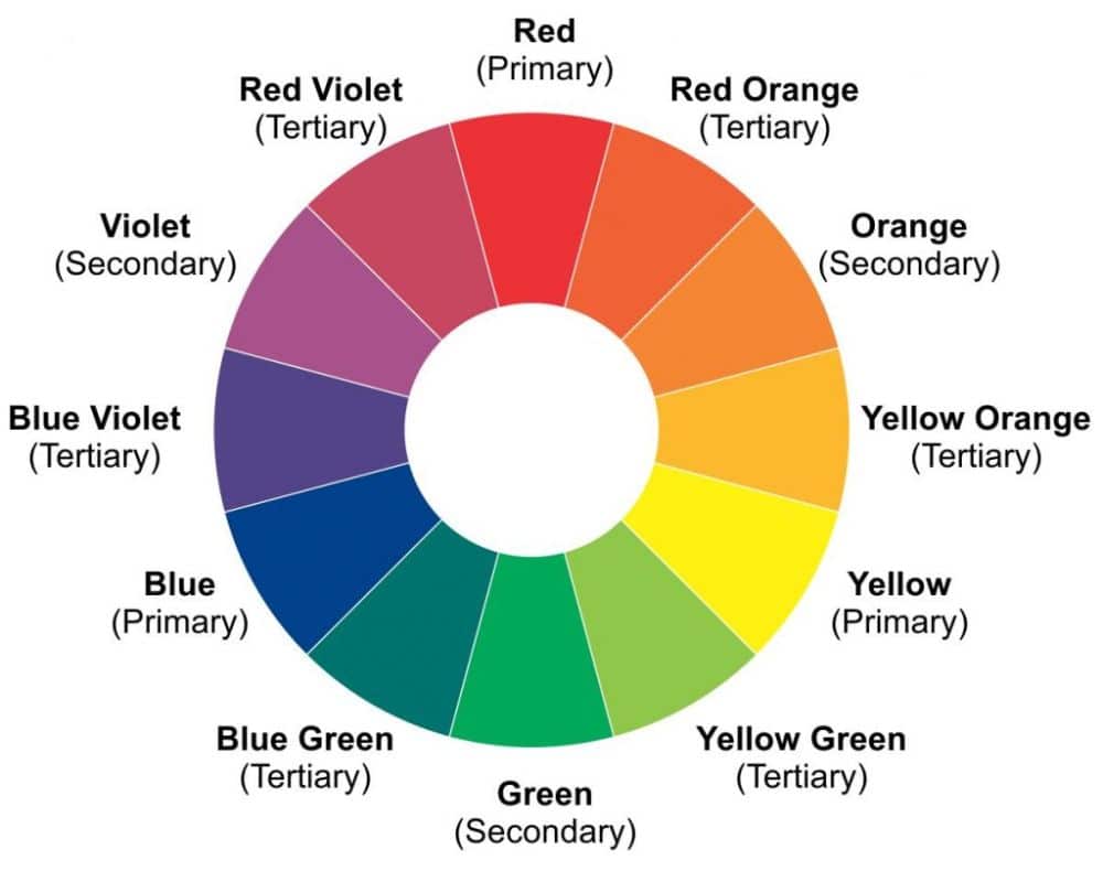
You must have seen the color wheel or must have heard about it somewhere in design terms. A color wheel is a wheel showing different colors and their corresponding relationship with each other. There are three types of colors in the color wheel, primary, secondary and tertiary. Red, blue, and yellow are known as the primary colors, And secondary colors are the colors are derived from mixing primary colors. So, orange, green, and violet are considered secondary colors. In color wheel, tertiary colors are the end achievement of the fusion of primary colors and secondary colors. So, you can consider red-orange, yellow-green, and blue-violet as tertiary colors of the color wheel.
4. Color Combinations:
Color selection theory has some beneficial rules for creating various color combinations of your design. There are four major color pallet rules to create an ideal color pallet for a unique design. You can use one or even multiple rules as well as per your requirement from the below-mentioned rules.
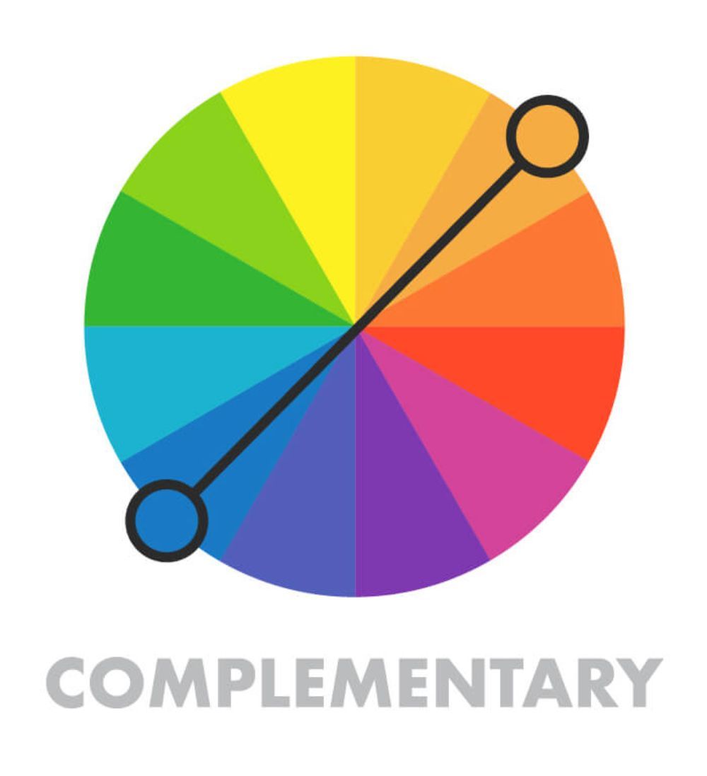
a) Complementary:
If you understand the color wheel concept, it is easier to understand all the color combination rules. The complementary color combination means two colors placed on each other’s opposite side on the color wheel. Two opposite colors give two different types of meaning to your design and contrast as well. Yellow and blue, green, and violet are examples of complementary color combinations.
b) Analogous:
The analogous color combination is a combination of three colors. You can create an analogous color combination by using any three colors sitting next to each other on a color wheel. It can create a modern and unique color pallet for various designs. The analogous color combination perfectly fits contemporary styles of websites, illustrations, infographics, and many useful designs.
c) Triadic:
For more flexibility and creativity, triadic color combination is a great concept. The triadic color combination has three colors placed 120 degrees away from each other on the color wheel. A fusion of colors placed on a triangle shape in a color wheel creates a unique triadic combination in simple words.
d) Monochromatic:
The monochromatic color combination is something you can see everywhere around you. It is a combination of different shades and tones of a single color. The monochrome color combination only requires your understanding of tint, shade, and tone for you to come up with a great color combination for your design.
5. Visual Hierarchy:

If you are creating a user interface design, website design, or any interactive design, then consistency is your essential element. According to the color pallet, your audience can understand each element’s importance, meaning, and purpose from your design. There is a visual hierarchy of every design that helps users to understand things without reading the text. The colors of background, headings, highlights, and subheadings should remain the same on every page or in every design to effectively place the visual hierarchy in your audience’s mind. For any reason, if you are changing your color pallet on every design, it fails the whole purpose of investing time in the selection of color combinations. You need to assign different colors to different elements for making a design with an effective color pallet. If you follow the consistency of colors and theme in your designs, then only you can implant visual hierarchy nicely.
6. Color Psychology:
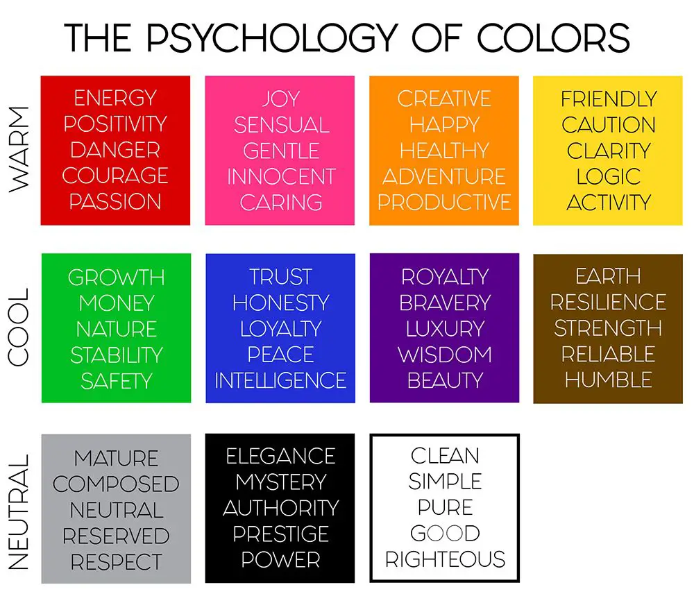
Color psychology is a theory of correlation between colors and the human mind—each color influences a human’s different emotions and behavior. Studies have proved that every color is unique, and it can affect all human minds differently. So whenever you select colors for your design, you must understand what color you are using and what possible emotion it can trigger. You have to study your audience and your competitors as well. Location, age group, social and cultural beliefs, and many other factors play a significant role in selecting colors. Once you understand every color’s meaning and emotion, you have to start using them in your designs to see how your audience reacts to them. The right color in the right design for the right audience can surely create a desirable impact through your designs. So now, let’s take some colors as examples and understand the psychology behind them.
a) Red:
Red is a color for power, anger, and danger. But at the same time, red is also a color of excitement, love, and warmth. You can use red color to creating some alertness, excitement, or urgency in your design.
b) Blue:
Blue is the color of trust, peace, faith, and loyalty. It is also for clarity and depth as blue always represent sky or water. Designers across to globe use blue color to create sincere logos and websites. You can use this color to trigger calmness and faith in your audience’s mind.
c) Black:
The black color is for Emotions related to Fear, death, and pessimism. While black color can influence many negative emotions, it also can show sophistication, security, elegance, and power. Designers use black color smartly to showcase the class and dignity of brand identity.
d) Green:
When you see green, you instantly think about nature and healing. Because green color represents nature, health, money, prosperity, safety, and freshness, you can see widely used green color in the healthcare sector, wealth management system, and nature-related sectors.
7. The 60-30-10 rule
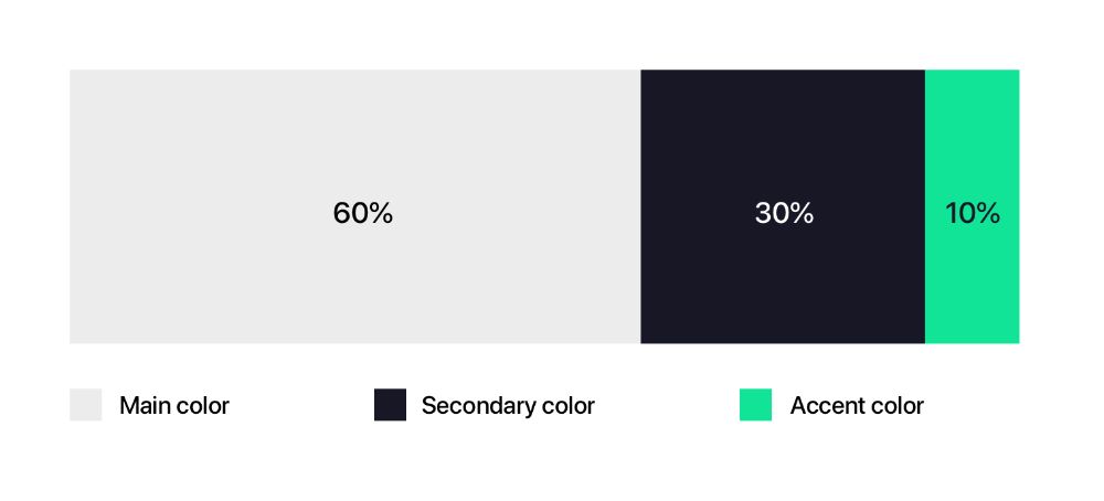
This is a beautiful rule of design. The 60-30-10 rule is indicating the amount of color you should use in your color pallet. 60% of your design should have your primary color, 30% of parts should have another complementary color, and the rest 10% should be in the accent color. This rule can easily make your design well balanced and appealing. It works best to create a viewer-friendly design. By this rule, your design would be easy and comfortable to look at. It helps your audience to move their eye comfortably from one focal point to another. So if you are using this rule for your design, you have to be careful with the color selection because you can’t go loud and over the top with colors in this rule. The background color should be neutral and conducive for the other two colors as well.
8. Printing and Computer Color:
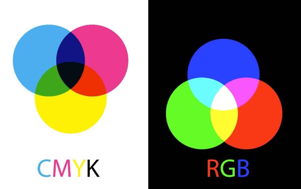
Our computer screen and printing machine use different color systems for creating color spectrum. Television, phone, and computer screens use the RGB color additive color method to create colors for the user. And printer uses CMYK subtractive method to create colors for the printed page. Colors don’t get affected on both mediums, but you can always notice a slight difference between them. So when you are selecting colors and creating a design, always take a preview of CMYK mode as well to avoid disappointments and issues later on.
Creativity comes first, and then creators generate the rules. So there are no rules beyond the design for you to limit yourself. But understanding the available information and taking the available guidance in your design can help you make your design better and save you from many mistakes and disasters. You can notice color selection rules and concepts in many designs around you, and by analyzing them, you can understand better and implement them quickly. According to profound experiences and knowledge, these are just rules created by many designers from all the era to make the work easy for the next generation of designers. It helps you work systematically and makes the process universal so that everywhere communication and techniques become easy to understand and easy to follow. We have tried to cover all the significant rules and concepts of color selection with the necessary information that every designer should follow to create a constructive and desirable design.