The Best Ice Cream Websites Created by Designers
Ice cream is a popular treat eaten by people of all ages worldwide. There’s an endless range of alternatives to satiate any sweet taste, from conventional vanilla to innovative flavors like matcha and black sesame. Many ice cream stores have turned to the internet in today’s digital age to display their distinctive flavors and designs.
Designers can help with this. They can use their creative abilities to design beautiful and interesting websites that not only display delectable food but also attract customers and enhance sales. This post will look at the top ice cream websites made by designers.
We’ll look at the best visually stunning and user-friendly websites that make you want to delve in with a spoon. These websites capture the spirit of ice cream in a way that will have you drooling, from bright and joyful colors to mouth-watering photographs. Thus, whether you prefer classic tastes or unique inventions, join us as we explore the world of the best ice cream websites designed by designers.
The best ice cream websites
Caffe Panna
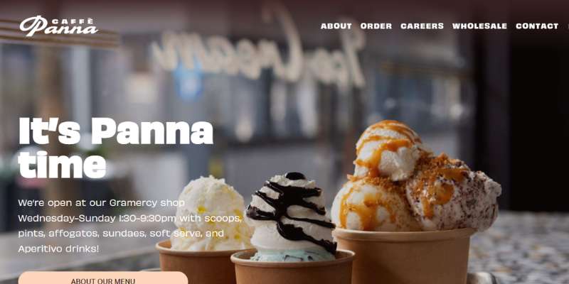
Caffe Panna advertises various staple tastes as well as a range of seasonal varieties on its website. The website’s espresso color scheme, which pays respect to Italian café and coffee culture, and the luscious gelato pictures are certainly guaranteed to whet the appetites of prospective customers.
Subzero Ice Cream
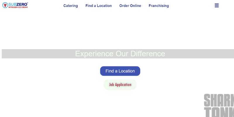
In addition to offering enticing and tasty treats in the actual shop, Subzero Ice Cream also accommodates online ordering. Especially interesting and appealing are several of the pieces’ cartoonish designs, which seem inventive and playful.
Particularly, a buyer may conveniently place an online purchase from the many accessible items. Also, it provides the parlors with crucial information including locations and hours of operation.
In addition, the engaging and original presentation of the brand’s history employs a slick slider.
Dasher and Crank
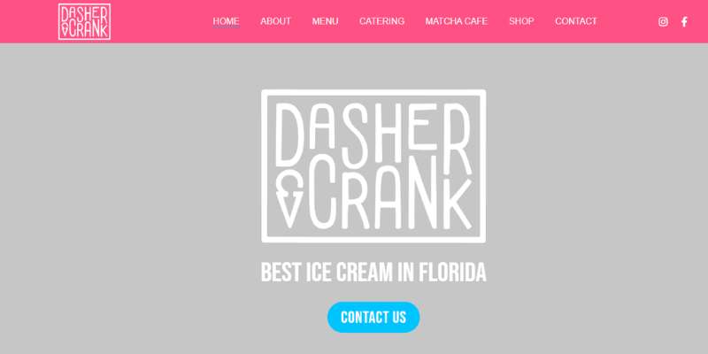
Dasher & Crank is a Miami-based ice cream business with the motto “Life Is Short, Eat Ice Cream.” On its website, it’s also one of the first things you read. With its pastel pink and blue color palette and sticky navigation bar that mimics melting ice cream, the website distinguishes out from the competitors.
Pierres
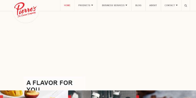
With its beautiful design and convenient functionality, Pierre’s website is a great resource for boosting its online visibility.
Full-width ice cream photos with illustrative CTAs and headlines are shown in the hero scene. The tastes, history, and blog pages may be accessible using large, square pictures in addition to the sticky header.
A second slider is also included to display the various ice cream flavors in their respective containers. A blog page is also available to increase the website’s exposure on search engines.
La New Yorkina
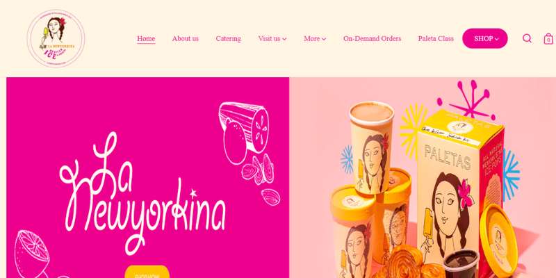
Websites should have a narrative, and La New Yorkina’s does just that on its “About” page by describing the history of the ice cream business, its guiding principles, and its community involvement.
Mister Dips
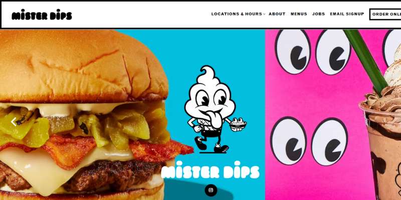
The well-created website of Mister Dips is lively, engaging, and distinctive with pastel brilliant colors, striking culinary photos, and animated cartoons. Mister Dips is also one of the most successful ice cream companies out there so it’s a must to see their ice cream website.
Alden’s Ice Cream
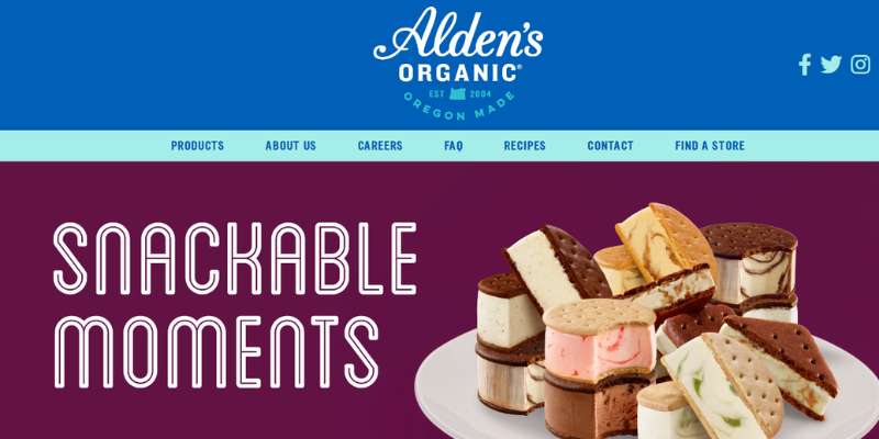
In 2004 Alden’s Ice Cream was established as a supplier of fresh dairy milk. The website has eye-catching colors and excellent information.
Afters Ice Cream
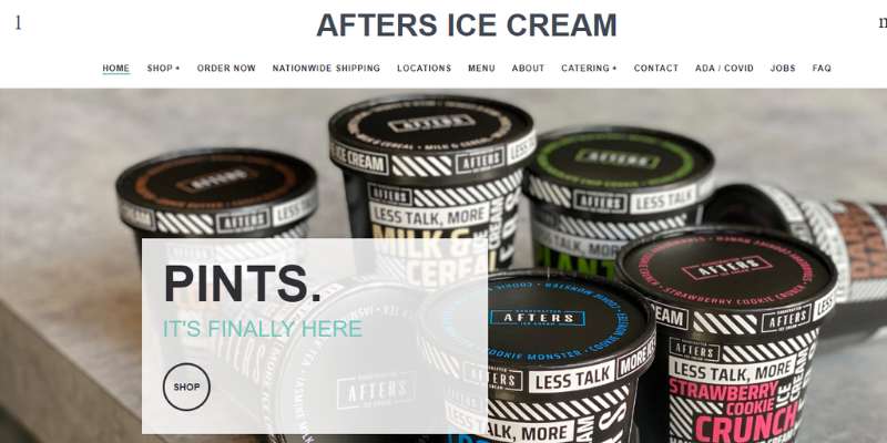
Another straightforward design that might provide designers with some amazing inspiration is Afters Ice Cream. This website has a classy, modern appearance because of its use of black and white as its main colors.
The hero header has a CTA that is descriptive because it is an eCommerce website that conducts online sales.
The menu is accessible and the navigation makes advantage of the fantastic sticky header. Also, it offers ice cream fans a selection of different ice cream tastes.
Penny Lick Ice Cream Company
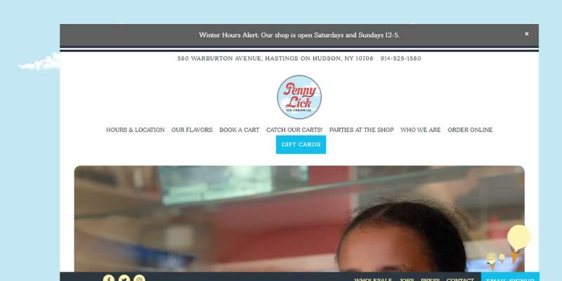
In addition to its physical site, Penny Lick also operates several mobile carts that may be seen throughout the town at festivals, public gatherings, and farmers’ markets. On a specific internet page, information about forthcoming events and where and when to locate the carts are provided.
Pretty Cool Ice Cream
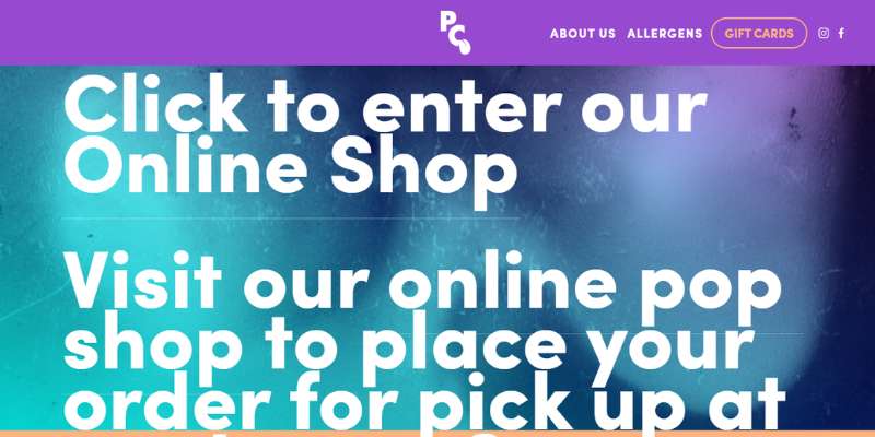
The site of Pretty Cool has a straightforward layout, but the parallax effect gives it a little more flair. The parallax effect is present in all of the parts. It displays the various items against a vivid and colorful backdrop. Moreover, a Google map, a mailing function, and a grid style are used to integrate the Instagram feed.
The Social
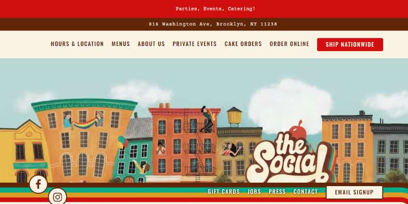
Visitors are drawn in by the restaurant’s retro-inspired logo and colorful panoramic image of borough life to discover more about the restaurant’s history, examine menus, and other things. The co-founders may post available jobs and accept resumes from job seekers directly via the website’s “Jobs” page.
Oat & Mill

One of the stylish but straightforward ice cream websites is Oat & Mill. The masonry layout complements the hero scene well. It’s amazing to show several ice cream photos with the news.
Customers may explore the many flavors, read reviews, and discover the brand’s history and locations by using a sticky header.
Also, it lists forthcoming celebrations and events where ice cream will be served for tasting. The menu, social networking icons, and newsletter are among the other features in the footer.
Haagen Dazs
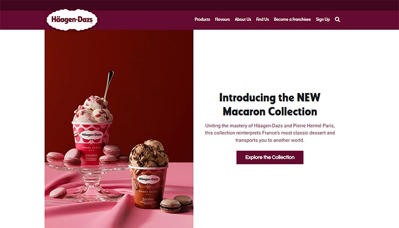
The ice cream brand-specific website for Haagen Dazs is designed simply and neatly. The site features a simple style with a video and picture gallery shown in a masonry format.
Also, the news section, which is delivered in a slider, looks fantastic. It will provide helpful material and aid in search engine optimization with such a function.
It seems that the grid pattern effectively displays the ice cream goods. Also, the scrolling movement gives the product page a touch of originality.
Another masonry layout is used for the store’s page to present a menu with options for opening an ice cream business, buying an existing shop, participating in ice cream shops’ rewards, finding a job, and more.
Big Gay Ice Cream
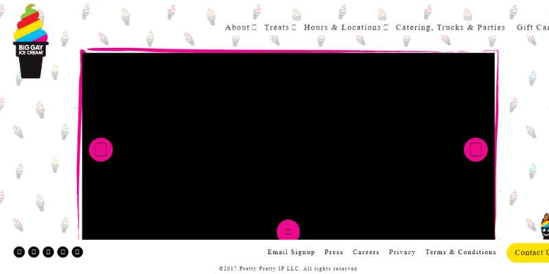
The website offers a lively browsing experience because of its brilliant design elements and graphics. Visitors to the website may acquire vital information including Questions about the ice cream and the business’ charitable endeavors.
Visitors may easily discover the closest location, business hours, and more using the shop finder function.
Paradis Ice Cream
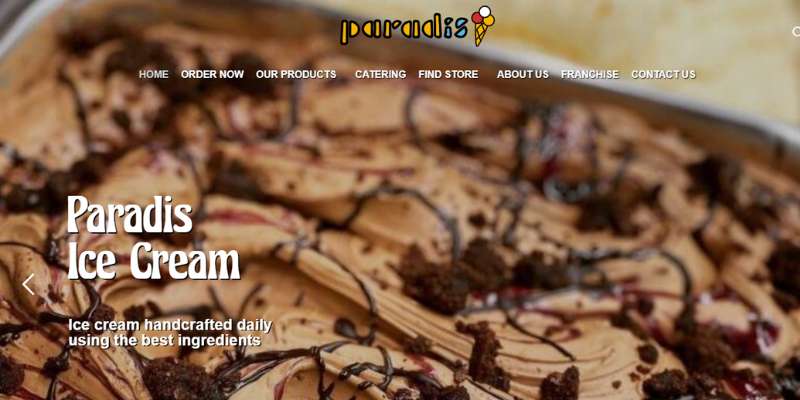
The simple yet trendy sidebar menu from Paradis Ice Cream has a hip and distinctive appearance. A large, full-width picture of the hero scenario is there, along with some informative CTAs and a succinct introduction.
Despite having several sections and components, the site seems cohesive. In a similar vein, the goods page is easily accessible and has a neat appearance.
The availability of the items may be simply checked by a visitor since this brand provides several outlets and catering services. Also, this website makes use of original and inventive font, which elevates the design.
Earnest Ice Cream
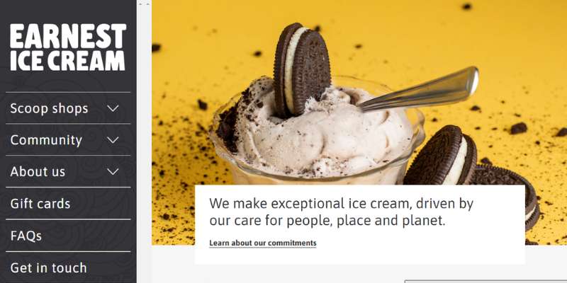
It uses a masonry layout on the hero scene in the menu display, which is different from other ice cream websites. Customers may conveniently check the events, tastes, contact, contributions, and other important sites.
Also, for prospective ice cream lovers, this website offers employment openings. Video integration is included that exposes the brand throughout the web to more clearly promote the brand.
Also included are the off-canvas menu, ice cream flavor, and locations pages, all of which look fantastic.
Rebel Ice Cream
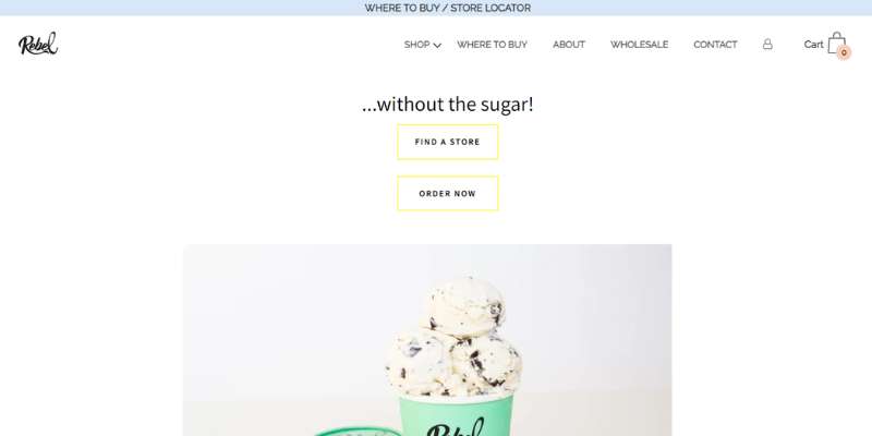
Austin and Courtney developed Rebel Ice Cream after deciding to give up sweets and adopt a healthier diet. The website is attractive, useful, and well-designed.
Kind Kones
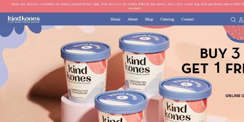
Gentle Kones greets visitors with a lovely site layout. Together with rounded thumbnails highlighting this brand’s possible differentiation from competitors, the hero header has a full-width picture, and a slogan, and is ready to wow visitors.
Caring Cones uses a stylish slider to display client testimonials as proof of the legitimacy of its ice cream businesses. The sticky header of this website incorporates links to the narrative page, menu, locations, catering, ordering page, and contact information.
Van Leeuwen Ice Cream
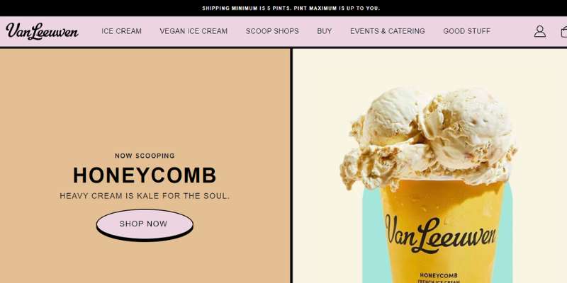
Ben, Pete, and Laura founded Van Leeuwen Ice Cream in 2008. The website features good material and eye-catching colors.
Movenpick
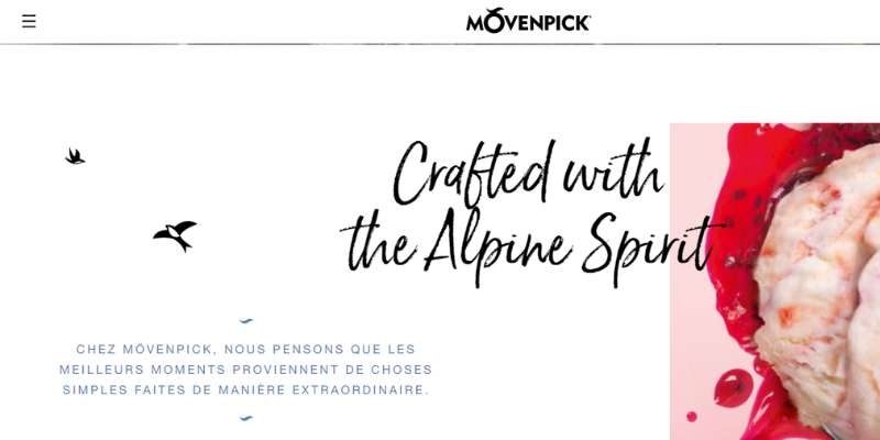
The homepage of the website is attractive and modern. The full-width picture, CTA, and title are all visible in the hero scene. Also, a pre-built layout for the brand introduction and video integration is included.
Another smooth slider is added to the display of the highlighted items to give them a more fascinating appearance. Movenpick embeds several videos on its website since they are more engaging and may help users retain information.
Jeni’s
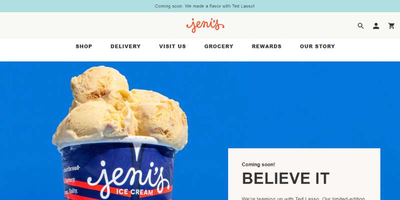
Jeni’s is renowned for its great client satisfaction and well-crafted ice cream production. The website has a fantastic design and eye-catching graphics.
Milk Sugar Love
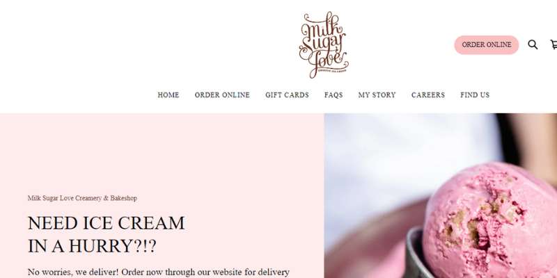
To update the ice cream parlors she had grown up visiting along the Jersey Shore, Emma established Milk Sugar Love. A portion of the website is devoted to popular ice cream flavors over the years.
Milk Sugar Love integrates social media updates directly with Instagram, combining the two marketing channels into one by populating the website footer. Also, visitors to the website may buy gift cards and place online ice cream orders for pickup or delivery.
Gelato & Chill
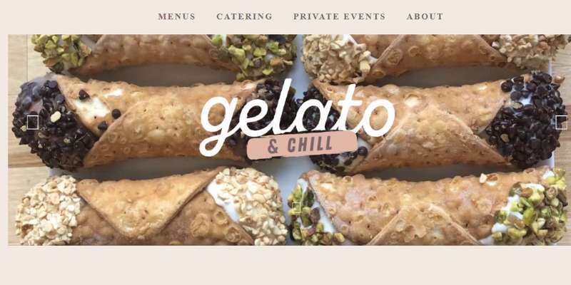
Visitors to the website may read the most recent news coverage, examine the menus, and ask questions about organizing events.
Sweetport Ice Cream

In Shreveport, Louisiana, there is a bustling place called Sweetport Ice Cream. A direct online gift card and product sales are available, but what sets the website apart is the “Our Ice-Cream Truck” page.
In addition to its physical presence, Sweetport Ice Cream’s food truck is available for special parties. Visitors to the website are given the option to complete a thorough inquiry form, including selecting the event’s kind, date, time, and expected attendance.
Nick’s Ice Cream
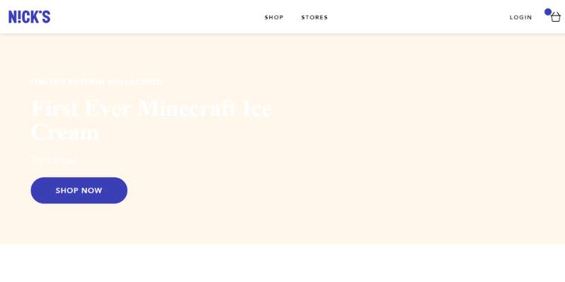
Nicolas Luthman started Nick’s in 2014 after learning that he had pre-diabetes. The website is useful and well-designed.
Coneflower Creamery
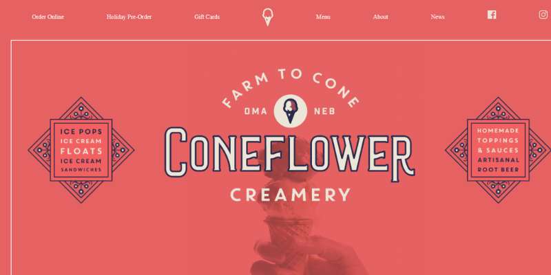
The website for Coneflower Creamery is elegant and simple. The backdrop of the hero scene’s logo-backed ice cream shot is subtly shown. Also, the website features a straightforward menu of the brand’s other menu items and ice cream varieties. The brand’s locations, hours of operation, and local partners are presented.
FAQ on ice cream websites
What kind of information can I find on an ice cream website?
Ice cream websites often feature the flavors and variations of ice cream available, as well as the locations of the shops or stores where they can be purchased. Several websites additionally provide information about the brand’s history or how its ice cream is made.
Can I order ice cream directly from a website?
Some ice cream websites allow you to order online for pickup or delivery. This, however, may not be available in all locations or varieties.
Are there any special promotions or deals available on ice cream websites?
Customers who join up for their email list or follow them on social media can often get special deals or discounts from ice cream websites. Some may also feature limited-time or seasonal offerings.
What should I look for in a good ice cream website?
A excellent ice cream website should be visually beautiful, simple to use, and provide detailed information on the flavors and alternatives available. It should also be mobile-friendly for users who want to use their phones to explore the web.
Can I leave reviews or feedback on an ice cream website?
Several ice cream websites may allow customers to give reviews or feedback about their purchases. This can assist other consumers seeking for recommendations or the company improve its products.
Conclusion on ice cream websites
Using a digital marketing plan is a better technique to boost the ice cream industry. Having a strong website to represent your brand online might help you achieve your company objectives.
If you enjoyed reading this article about ice cream websites, you should read these as well:
- Top SEO Benefits of Building a Responsive Website
- Why Your Design Agency Should Consider Invoice Finance
- Modern cafe websites with inspiring website design