What font does PayPal use on their website?
Ever since it first came out, PayPal has become one of the most popular payment options. Today, you can access it in almost all countries across the world.
Officially called PayPal Holdings Inc., the American online payment platform helps you carry out both personal and business transactions in just a few clicks. This makes it far superior to traditional methods such as checks and money orders.
Although you can find many online transfer services on the Internet, few are as successful as PayPal. What secret lies behind the company’s success? While the idea behind this business is great, it’s just one part of its success. Another one is branding and logo design. PayPal uses a unique design style, relying on blue and white to convey its message. Another notable feature is their distinct font.
What font does PayPal use on its website? In this article, we’ll provide you with a deep insight into this topic. Apart from revealing what font PayPal uses, we’ll also introduce you to the alternatives that look just like it.
A brief description of PayPal

Before we dive into the visual aspects of the company, let’s first look at how it came to be.
PayPal is an online service that allows you to send and receive money online, even without a bank account.
The biggest advantage PayPal has over other payment methods is its added level of security. If you somehow end up being scammed, you can contact the company to reverse your transaction. This is a service most banks don’t provide.
The story of PayPal began in 1998 as Confinity, a security software company. Two years later, it merged with the online bank company X.com.
The company’s direction then changed, focusing instead on money transfers. The project was a massive success from the start and the company’s popularity has been growing ever since.
PayPal helped its customers carry out payments worth over 3 billion dollars in just the first three years. At the time, it boasted over 10 million individual customers and over 2.5 million commercial customers. Today, its customer base is even larger, and the company operates in several countries.
The evolution of PayPal’s logo

PayPal introduced its first logo in 1999. It was rather simple, consisting of white sans-serif letters with a dark blue outline. The company kept this logo for eight years, until 2007.
The PayPal logo between 2007 and 2014

The PayPal logo underwent its first big change in 2007. The idea was to make it easier to recognize for its customers. Thus, the designers decided to color the entire letters instead of just the outlines. The ‘Pay’ part was dark blue while the ‘Pal’ part became light blue. They further stretched the letters, making the gaps and spaces larger.
The PayPal logo since 2014

Still not quite happy with the logo, the company decided to spruce it up in 2014. They reached out to Fuseproject to make their task easier.
The reason for this change was the rise of new devices. While the old logo looked just fine, it wasn’t optimized for mini-screens and large flat monitors.
PayPal understood the importance of keeping up with times, prompting the redesign.
The new logo still resembles the old one. However, the redesign company changed the hues slightly. The biggest change was the addition of PayPal’s unique symbol, the two crossed Ps. This helped the company design its mobile app icon as well.
The idea behind this logo is very innovative. The company chose the crossed Ps to represent its mission to bring people together by offering payment services.
In case you’re wondering why PayPal’s been using blue ever since the start, it’s because of what the color symbolizes. We associate blue with reliability, which is why so many brands use it in their logos.
What font does PayPal use?
The original PayPal font was Verdana. However, the company swapped it for Futura in 2014.
Today, Futura is one of the most used sans-serif fonts in the world. It features smooth edges and the distinctly round letter ‘a’. The font also makes the letter appear wider compared to its predecessor.

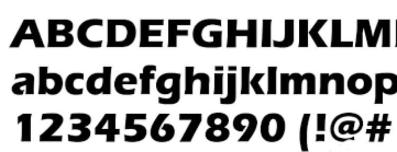
The PayPal website uses PayPal Sans, Helvetica Neue, and Arial.
The odds are you’ve heard of Helvetica Neue and Arial before. But what about PayPal sans? This is a custom font designed exclusively for the company.
Its creator is the Klim Type Foundry. PayPal Sans comprises two sub-families – PayPal Sans Big and PayPal Sans Small.
This custom typeface further comes in 14 unique styles. Apart from the website, you can also find it on all of PayPal’s mobile apps.
What PayPal-like fonts can you use instead?
While the PayPal Sans typeface looks spectacular, you can’t use it without the company’s permission. Luckily, you have several other legal options to consider instead.
These are the 8 typefaces that resemble PayPal Sans:
Bifocals

Bifocals was created by Habib Otang and Teguh Kharyanda. It features four families, offering great versatility for your projects. We recommend using it for headlines, titles, and branding.
Poppins

Created by Ninad Kale, Poppins is a geometric sans-serif font. While PayPal Sans is for exclusive use only, Poppins is available to the public for free. Its captivating curves make it a great choice for websites.
Albert Sans

Albert Sans was created by Andreas Rasmussen. It comes with ten weights, ranging from Thin to Black.
This modern sans-serif font is compatible with the Latin Extended glyph set. What’s more, you can access it in several different languages.
Jones

Jones is a simple sans-serif font with a futuristic touch to it. It includes five weights from Book to Black.
Each weight is compatible with Italics. We recommend using it for UX design, branding, and packaging.
Human Sans

Human Sans was created by the Boston-based Continuum design company in 2016. It comes in seven weights from Thin to Black.
Its simple, elegant design makes it great for many types of projects. We find it particularly useful in web design, logos, and branding.
Overpass

Created by Delve Fonts, Overpass is a free font inspired by the Highway Gothic letterforms. It was designed as an alternative that’s compatible with screens of all sizes.
Gatter Sans

This modern geometric sans-serif font is an excellent choice for posters. You can also put it to great use in UX and digital designs.
Eras

This font was created by Albert Boston and Albert Hollenstein. The International Typeface Corporation then released it in 1976. It’s included in the Google Fonts library, making it a very accessible option. It stands out thanks to its beautiful linear, slightly italic characters.
What font does PayPal use? Our final thoughts
PayPal is one of the best sources of inspiration when it comes to fonts and logo designs. Its unique PayPal Sans typeface has helped the company build great brand recognition and customer loyalty in several different countries. It uses a style that’s both simple and beautiful, which is the current trend in logo design.
But while you can’t use the company’s trademark font, you have many options that come very close to its style. The ones in this article are all great choices that will help your projects succeed.
If you enjoyed reading this article about what font PayPal uses, you should read these as well:
- What font does Instagram use? Check them out in here
- What font does Minecraft use? (Answered)
- What Font Does Twitter Use In The App And Browser? (Answered)