8 Thank You Page Examples to Inspire your Landing Pages

There’s a tendency in people to treat thank you pages as an afterthought (in case you don’t know, thank you page is what appears after someone signs up for something through your landing page). The truth is that thank you pages offer you yet another opportunity to nurture leads, build relationships and increase sales.
You can use the thank you page to:
- Set future expectations
- Share download links
- Share similar resources
- Upsell on offers
- Move them through your sales funnel
- Guide them to relevant pages on your website
But getting a thank you page right isn’t as easy as it seems. And for this reason, I present to you some of the best thank you pages I’ve found, to help you create brilliant landing pages by yourself.
1. SalesForce
SalesForce, a giant in the CRM industry, shows the following thank-you page when someone downloads their Marketing eBook:
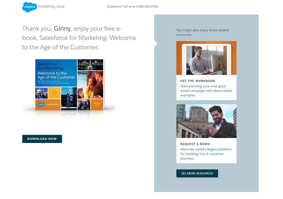
The first commendable aspect of this thank you page is that it’s personalized. When you fill in the form for this eBook’s landing page, you share details like your name and email address. They use the very same information to personalized the thank you section by adding your name when thanking you.
Right below the copy, there’s a clear image of the book which lets the visitor anticipates the ebook and makes his interaction with SalesForce just that bit wee bit smoother.
And quite smartly, SalesForce has dedicated the complete right panel to a ‘related resources’ section. This is a good practice as at this point the visitor’s interest is primed in your offerings and you can use this opportunity to introduce more of your content.
Finally, they also offer a helpline number that visitors can use to clear up any sorts of issues they may have while interacting with the landing page or the thank-you page, which just improves the user experience further.
2. Simply Measured
This next thank you page from Simply Measured (now Sprout Social), assures a visitor that their guide on ‘Best Practices for Reporting’ is on its way:
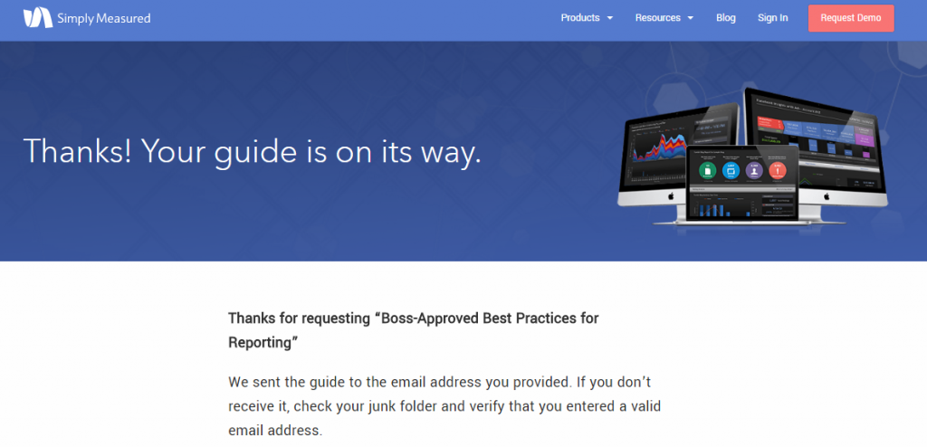
The thank-you page itself is quite simple. It’s got a simple heading which assures you the guide will be delivered.
What really makes this simple thank you page stand out is the copy below the banner. Simply Measured reminds you to check your junk folder if you have trouble receiving the lead magnet in your inbox. And for good measure, because this sort of thing happens quite often.
A lot of emails do end up in the junk or spam folder so it’s a good idea to remind recipients to check these folders. This improves your email deliverability and also open rates.
3. AWeber
AWeber, an email marketing company, displays the following thank you page when you sign up through their landing page for an email writing course:
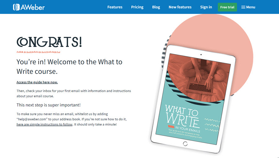
The thank you page starts off by congratulating you for gaining access to the guide and provides an access link right within the thank you page. This saves time for the user and they can get started with the content immediately.
Even then AWeber lets you know they’ll send you an email that’ll have further instructions regarding the course.
They do a great job of clearly laying the next steps for the user. Using the headline ‘This next step is super important!’ they make sure to grab your attention. They, similar to Simply Measured, ask you to white list their email address so you can receive their emails without a worry. This is a great practice.
AWeber makes maximum use of the real estate provided in a thank you page by adding content below the fold also:
Knowing how a user is engaging with their content at this moment, they also add a link to their upcoming webinar which is related to the content you’ve signed up for. This allows AWeber to ‘kill two birds with one stone.’
4. All Seasons Landscaping
When you sign up for All Seasons Landscaping email list, this is the thank you page you see:
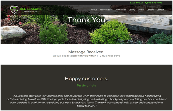
Keeping true to the very fundamental concept of a thank you page, the headline just says ‘Thank You’. What really makes this page worth mentioning is the addition of testimonials.
By using testimonials as social proof, you boost your subscriber’s confidence in your brand. They get to see quotes from other people who’ve had pleasant experiences with a business and that makes them feel better about their decision.
By including reviews, testimonials, and logos from other brands who are customers, you can alleviate any doubts your subscribers or customers may have. They tackle customer objections and prove that your product/service is worth their time.
5. Coppyblogger
Copyblogger, a website dedicated to copywriting, displays the following thank you page upon registering with their website:
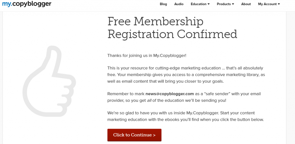
This page does a great job of explaining all the benefits one can actualize after becoming a member, you get access to their marketing library that includes guides and email content that helps bloggers more adept at their jobs.
Similar to some previous examples, this page also nudges the subscriber to mark them as safe senders so their emails get delivered without a hiccup.
To make it just that bit easier for the user, they tell you exactly which email to white list. Providing the email address here also makes it more likely to stick in your memory and makes it easier to spot Copyblogger’s emails in a cluttered inbox.
The page signs off with a strong CTA asking you to continue to follow the next steps in enjoying the Copyblogger membership experience.
6. Acquisio
Acquisio, an AI for digital advertisers, offers the following thank you page when you sign up for one of their webinars:
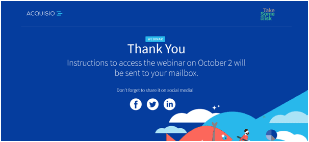
This is a well-designed, minimal thank you page that offers pleasant illustrations along with a pleasing combination of blue and white: colors that tend to have a relaxing effect on the viewer.
What Acquisio does well is adding social sharing options on their thank you page. This allows the users to let their audience know that they’ll be attending a webinar, boosting their credibility and also attracting more attention for the webinar in the process.
Offering sharing options is a good way to leverage your thank you page. They increase the presence of your offers and as an e-commerce marketer/owner, you can use this space to ask people to share items they just bought with friends on social media.
7. Sally’s
Sally’s is a cosmetics company with a diverse line of products. When you sign up for their mailing list, this is the thank you page you see:
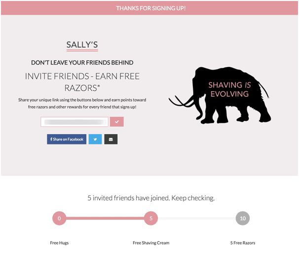
Sally’s thank you page taps into the ever-powerful approach of word-of-mouth marketing. By incentivizing users to earn rewards by spreading the word. You can create a much larger audience for your campaigns.
Here, Sally’s using clever copy tells you quite clearly not to leave your friends behind. You’re invited to earn free razors if your friends sign-up through you.
The best part is, Sally’s keeps their approach warm and friendly by offering you free hugs even if you don’t invite anybody. And the more people you invite, the more awards you can win.
Lastly, they offering social media sharing options as well which allows people to quickly share links with their friends. Making it easy for them to send invitations and also increasing Sally’s presence on social media.
8. AdEspresso
AdEspresso, an ad management tool, redirects you to the following thank you page after you sign up for an ebook:
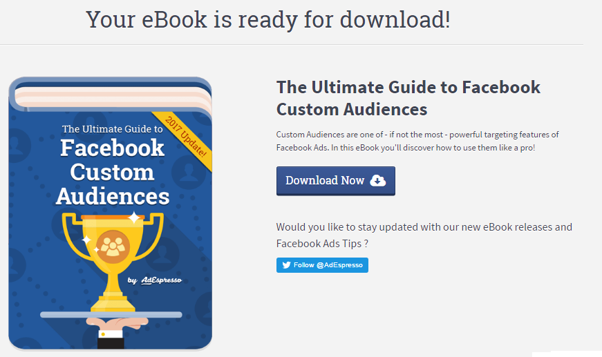
AdEspresso’s designed an attractive graphic for the ebook, which is big enough to get your attention and give you the feeling that you’re signing up for a quality lead magnet.
The does justice to the product, and they put in some effort to convince the visitor that the book is worth the download:
“Customer Audiences are one of – if not the most powerful targeting feature of Facebook Ads. In this eBook, you will discover how to use them like a pro!”
They’ve also positioned their Twitter CTA smartly by asking a question that is likely to get a response makes it more likely that people will follow them on Twitter.
The download CTA grabs the user’s attention and allows them to get quick access to the book.
One thing that could have benefited from some changes is the font of the CTA. While the rest of the thank you page pops and uses consistent fonts, the CTA is in a different one. Not only is it inconsistent with the rest of the page but the font of the Button doesn’t convey the urgency of the action.
Signing off
As you’ve probably now seen from the examples provided that there are many uses to a thank you page and they can be employed to complete a number of tasks, from providing next steps to asking people to share your content on social media. Just remember to design your thank you page with your audience’s preference in mind and you’ll be able to do a lot with this oft-overlooked feature of digital marketing.
Photo by Kevin Butz on Unsplash