The Metallica font and the iconic logo history
Some logos only became popular when used by iconic music bands. That was exactly the case with the Metallica logo. It not only accompanied the greatest heavy metal band of all time but also turned into a symbol of this music genre.
The Metallica music band was formed in 1981 in Los Angeles. The frontman James Hetfield created the band with fellow musician and drummer Lars Ulrich. The band didn’t take long to become popular all around the world, accompanied by some great hits.
In music terms, Metallica did what Microsoft or Apple did in the technology industry. Once a garage band, the group was slowly turning into a nationally recognized brand with six consecutive number 1 album on the US Billboard 200.
In short, the Metallica crew knows very well what they are doing, and they are respected everywhere in the world. To make matters even better, they have one of the most iconic logos ever to be seen in the music or the sports world.
The creation of the Metallica Logo
Even if you are not a Metallica fan, you have seen its mettle and impressive logo. Design experts evaluate it as one of the most memorable and easy-to-identify logos to ever be created. The reason, they claim, is that the logo is simple.
The story of how this logo came to be is just as simple as the logo itself. The person in charge of designing all logos of the band is its creator and main guitarist James Hetfield. He tried his luck several times during the 1980s, but the iconic print appeared only in 1996, on the ‘Death Magnetic’ album cover. It was also Hetfield who created Metallica’s scary guy and ninja star logos.
The meaning of the Metallica logo
The iconic heavy metal band released even four logos so far, but the first version remained the most memorable. Therefore, they applied some modifications in 2008 and continued using it as their leading logotype. The original color palette was monochrome, but it changed occasionally to red and black. In that way, it depicted the energy and the style of the band.
On some occasions, the Metallica logo also featured blue electric flashlights. The intention here was to associate music with nature and to bring the band closer to its audience.
The shape of the Metallica logo
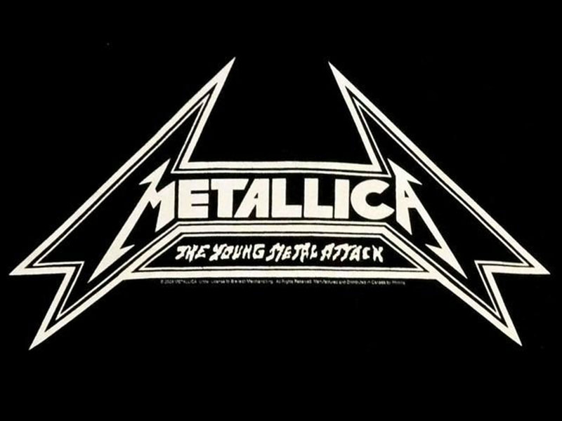
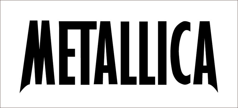
The 1980s Metallica logo, as famous as it is, consists only of the band’s name. And yet, we are talking about hand-drawn, elongated typeface where the first and the last letter make an impression. There is just no way we could forget their sharp, spiky angles and long lines.
Therefore, the Metallica logo is respected also outside the music industry and used for all sorts of branding, such as T-shirts or coffee mugs. It is simply everywhere!
The colors on the Metallica logo
Since they are a heavy metal band, Metallica opted for black and silver as the best colors for their logo. The shades, on the other hand, are maroon and they stand for the prevailing subtle tones of Metallica’s compositions.
The history of the Metallica logo
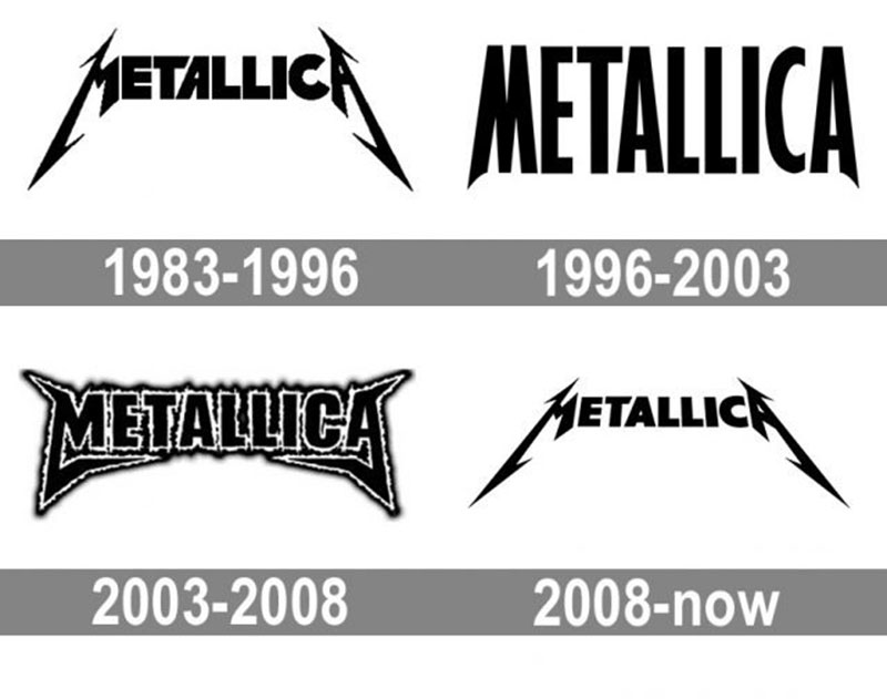
Metallica’s branding developed over the years as much as the band itself. Unfortunately, the artists took some disputed and controversial decisions over the decades. These moves also affected the brand’s consistency.
1983–1996
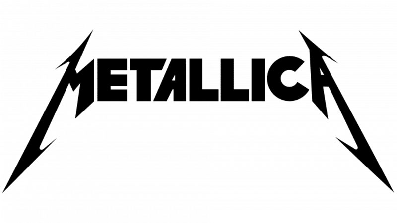
This Metallica logo was used by the Bend for almost a decade, all the way from Kill ‘Em All in 1983 to Metallica in 1991. James Hetfield also ensured that a 3D version of it is used on Master of Puppets, Ride the Lightning, and the Metallica album. The band changed its logo in 2008 and 2016 but is still using the original one as a secondary choice.
In the meantime, all nameplate letters were capitalized and their font changed to traditional Extra Bold sans serif. The only exception is the letter A where the left bar is inclined, and the letter T whose right part is cut diagonally. As a result, the entire logo is harmonized with the iconic flashlights on the first and last letter of the logo.
The Black Album – 1991
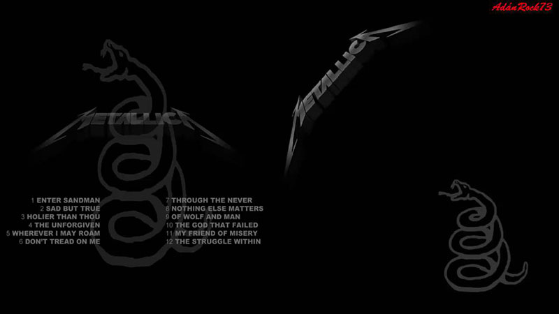
The cover of Metallica’s 1991 Black Album was, as expected, completely black. The logo on it, however, was less black and slightly visible, and it was located in the upper corner. It was at that point that the band changed both the color and the positioning of its most popular logo.
The Metallica logo between 1996 and 2003
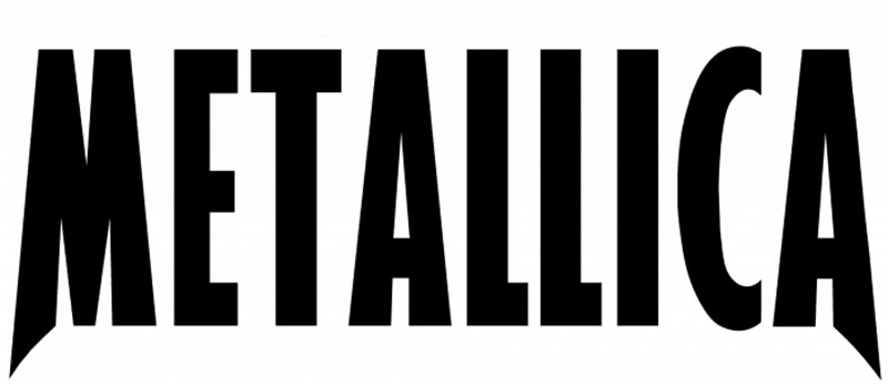
Another redesign of the logo followed in 1996. The band intended to create a more modern and minimalist logo. They removed the flashlights and simplified the inscription. At the same time, they switched to a more condensed sans-serif typeface.
This time, designers elongated the tails of the M and the A as they were in the original version, as those stand for the sharp and unique identity of the brand. They opted for a stylish design that represents their progressive music style. And still, the design didn’t contradict their roots and the traditions they preserve.
The Metallica logo between 2003 and 2008
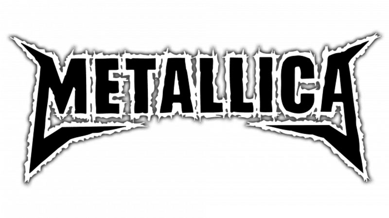
This logo, on the other hand, accompanied the band during the promotion of their St. Anger album. It was never their main logo – Metallica chose to leave it out of the album cover and only used it alongside their 2003 logo. The first time they gave it a priority was on their The Videos Release in 2006.
The St. Anger logo is not Metallica’s luckiest choice, as its details were not that elaborated. The name is bordered by an irregular line with shadows and the letters are distinctive on every image. The only thing that works, nevertheless, is the simplified framing.
The Metallica logo since 2008 onwards
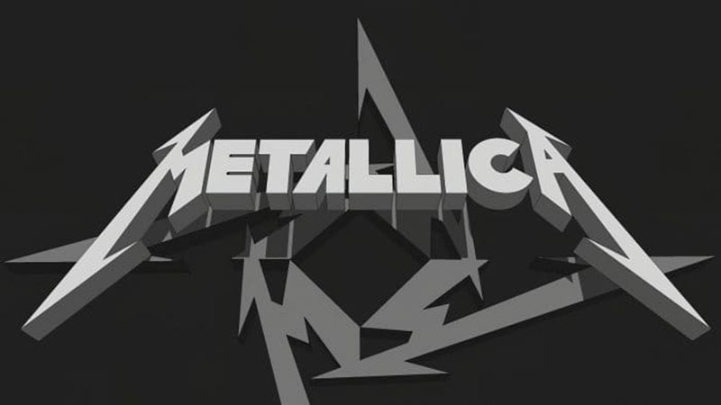
Today’s Metallica logo comes in capital letters only. The ‘M’ and the ‘A’ have elongated sides. The flashlight symbolism is still there, which means most Metallica fans can still identify this logo as soon as they see it.
Being this sharp and remarkable, the Metallica logo doesn’t only stand for this band, but all representatives of heavy metal and rock music. It is indisputably the most successful example of how visual identity can help anyone, anywhere.
The Death Magnetic symbol
Another logo facelift accompanied Metallica’s album Death Magnetic. This time, the task was assigned to the famous San Francisco agency Turner Duckworth. This agency is also the signatory to other ultra-successful logos, such as the ones of Amazon and Coca-Cola. They didn’t change Metallica’s logo but rather created a very similar and stylish emblem based on it.
The fonts used on the Metallica logo
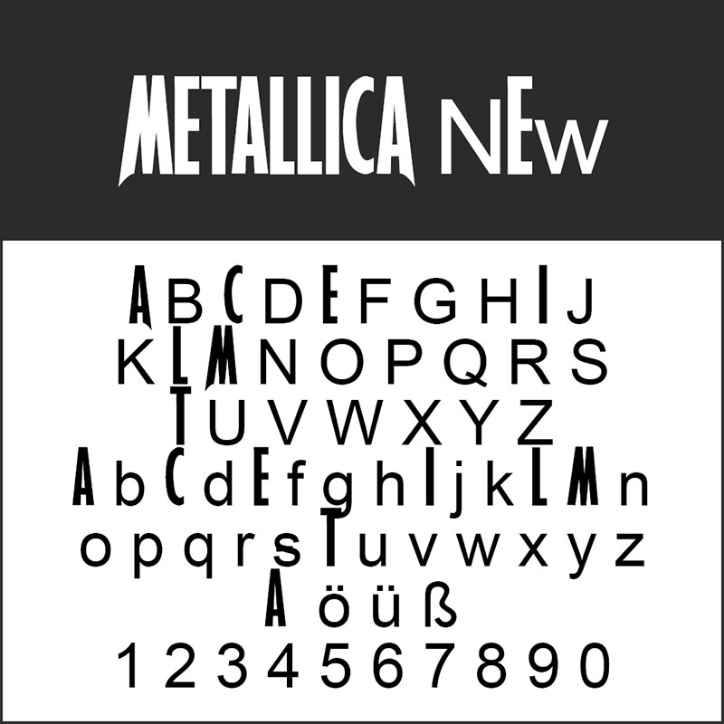
In its essence, the Metallica logo was created with classic sans serif fonts. These fonts were then tweaked and customized in unusual ways, especially when the letters ‘M’ and ‘A’ are concerned. What designers tried to there with the spikes and the lightning was to express the wild emotions Metallica’s songs inspire. The other letters are pretty much average, except for the two different T-s written in the Pastor of Muppets font.
This font is known nowadays as the Metallica font. You can’t use it on larger text passages, but you can still get it for your music logos. If you are a perfectionist, don’t expect too much from this font: there is still a lot to do there for this font to turn into a decent sans serif.
The New Metallica Logo
As expected, many designers worked on improving the Metallica logo typeface over the years. The most prominent result is Metallica New which pretty much works for nothing else than the Metallica logo. You can download it at the following link:
Despite a large number of prominent heavy metal bands in the world, Metallica still stands no competition. It has been the inspiration of millions of fans and prospective musicians worldwide.
Experts claim that Metallica’s logo played a great role in its success – it is simple, and yet recognizable everywhere in the world. It is also one of the few band logos that withstood the pressure of time and weren’t affected by the rebranding ideas the group had over the years.
If you enjoyed reading this article on Metallica font, you should check out this one about fonts similar to Avenir.
We also wrote about a few related subjects like what font does Medium use on its website, the Roblox font and what font does Roblox use, the best 72 free fonts for logos to create modern and creative designs, fonts similar to Futura, fonts similar to Impact, fonts similar to Calibri, fonts similar to Gotham, and fonts similar to Montserrat.