Useful Accessibility And Usability Examples To Help Improve Your Designs
This article is a sponsored by Extensis
This article is ideal for your lunch break. It highlights five quite straightforward (dare I even say simple) graphic communication problems. I then expand on them, showing the problem, remedy, and what can be learned. It will give you an insight into accessibility, also the easily looked-over area of access structures, and usability showing that they are a major factor in so many things, like design, communication, technology, objects, and systems. But we are not done there — I will also help you think about some new ways to make your designs much better and help you consider some aspects that you have never even considered before on your current projects, right now, today.
Adding A Basic Scroll Bar To A User Interface Menu Makes Items Easier To Find And UseIf we look at the menu by clicking on the Fonts drop-down menu in Microsoft Word Mac version 16 or any version of Microsoft Word, we can see that everything looks normal:
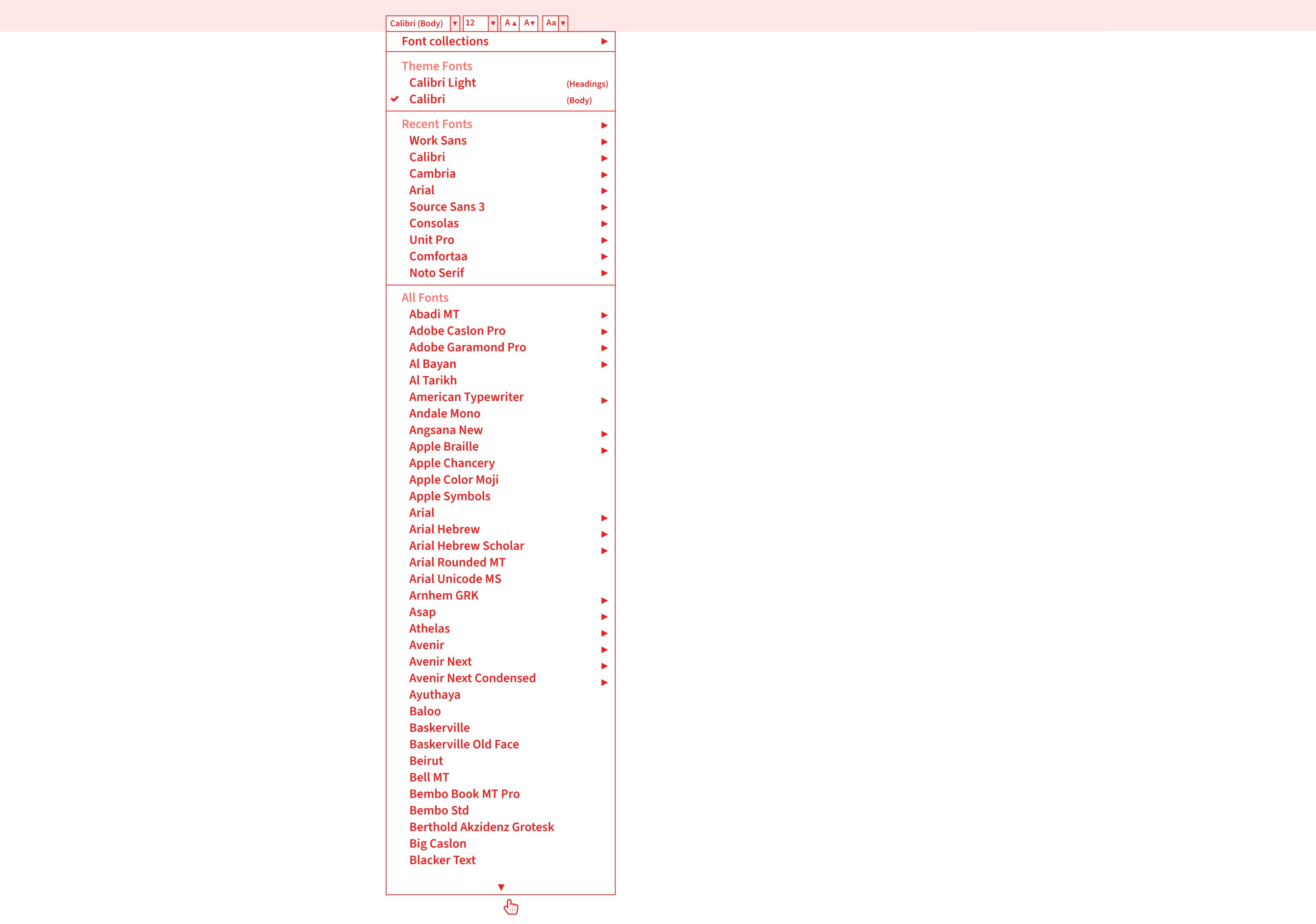
There is a list of fonts installed on the computer in alphabetical order. However, when we go to perform a task using the menu, like going to the font Verdana at the end of the list, we have to move our mouse all the way down to the bottom of the menu list, then hover over the down arrow, then wait 3 or 4 seconds, or more, until it gets to the bottom of the menu, near V, before we can select Verdana. Yes, we could also type the font name at the top, but maybe you are not sure what font you want to use or what it is called.
Problem
It takes many seconds to get to a font that is below B or at the end of the list; the current solution does not allow quick access. Furthermore, if you make a mistake, or your mouse goes off the menu, or if you are not able to control the mouse cursor that well, it will cause the menu to close, and then you have to start this interaction all over again, because if the mouse goes off or clicks out of the menu, it closes it. These issues are certainly not ideal for most of us who are busy and who want to get things done quickly and efficiently, like designers.
The problem of not having a scroll bar is often experienced in website vertical or side-navigation menus (sidenavs). The side-navigation menus might not even need to have a scroll bar, as the content inside the menu is not larger than the vertical screen height. However, if the website or smartphone browser is made a lot shorter vertically in height, there is often no scroll bar shown. So, you cannot scroll to the end of the side navigation’s content within the menu, and you might not even know to try to scroll more vertically, as no scroll bar is shown. Not ideal or great, hey?
Solution
One of the things that would be really easy to do, and is found a lot in software user interfaces and websites, is to add a simple scroll bar to the right of the font menu. How difficult is that to do? Not very. This would allow users to scroll more quickly to the font they want, reducing the time to find and select a font in the menu by at least half (50%). Why do they not do this? I am not really sure.
What Can We Learn?
If the software developers and user interface designers used a scroll bar to the right of the font menu, it would allow users to find any font much quicker, increase workflow productivity, reduce stress, confusion, and enable a much quicker and better interaction. Audit, test users, and find out what people want to do, or else you cannot be sure you have effectively designed the thing. Maybe you are not even aware of the ways users want to use your design, communication, object, or system. That is why it is so important to understand the following:
- What people will want to do with your thing;
- Different people will want to use your design, information, and communication in different ways;
- Different people will want to achieve different things.
As another example, if we compare font organizing software like Font Book on a Mac or the Fonts option in Control Panel on Windows. Yes, we have these two types of software, but do you actually use them to install fonts, or do you install them manually by copying the font files into the Fonts folders? Do you use them to view, compare, and get information about fonts? Can you use this software to manage, organize, and share fonts for your design team? Probably not, as they lack the features.
Well, the creative folks at Extensis have created just what you need: Connect Fonts. It is clearly better than Font Book on a Mac or the Fonts option in Control Panel on Windows for a number of reasons:
- It has a better display of a font’s glyphs;
- It shows the name of the glyph, Unicode value, and Glyph ID;
- It has a better grid display, QuickType, Waterfall, ABC 123, and punctuation (many of these options are not available in Font Book);
- Connect Fonts is a more advanced and technology-advanced software than Font Book on a Mac, or the Fonts option in Control Panel on Windows.
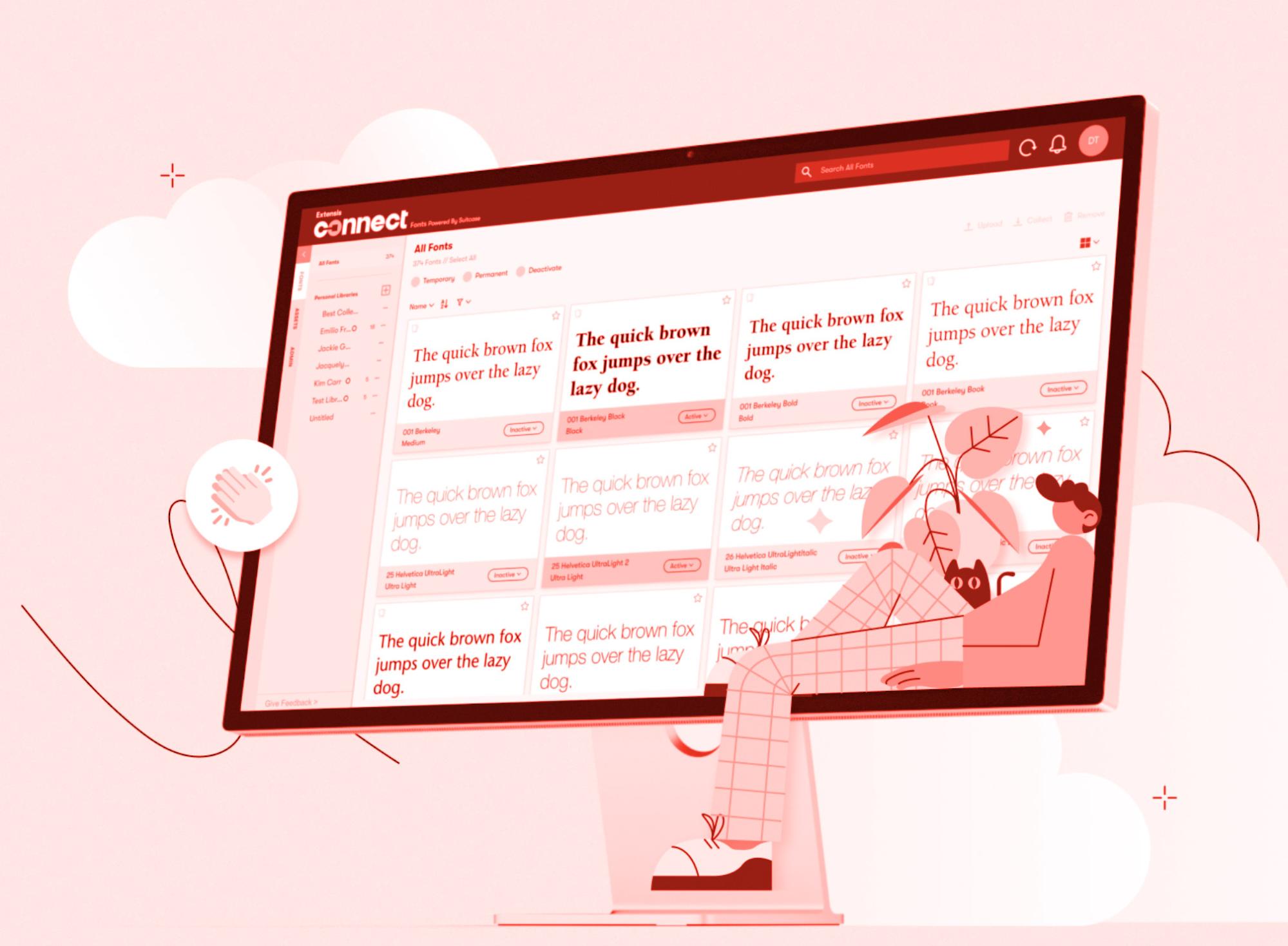
Here are additional features not offered by Font Book on a Mac or the Fonts option in Control Panel on Windows:
- Use a font vault that is a single, secure, managed repository for all your fonts;
- Sort options for all fonts (Name, Postscript Name, Type, Foundry, Class, Family, Version, Font Sense, Classification, Activation, Favourites, Date Added, Location);
- Add Google Fonts;
- Manage Adobe Creative Cloud fonts;
- Zoom in and out;
- All glyph panels and search;
- Glyph information (Name, Unicode, Glyph ID, Keystrokes);
- View categories of glyphs (Entire Font (123 Glyphs), Alphabetic Presentation Forms, Basic Latin, Combining Diacritical Marks, Currency Symbols, Cyrillic, General Punctuation, Geometric Shapes, Greek and Coptic, Latin Extended Additional, Latin Extended-A, Latin Extended-B, Latin-1 Supplement, Letterlike Symbols, Mathematical Operators, Number Forms, Spacing Modifier Letters, Superscripts and Subscripts);
- Desktop and online in browser versions, both connected;
- Cloud libraries and synchronize fonts;
- Setup team libraries across desktop and online versions;
- Share any digital files and documents;
- Font analytics and reports;
- Full admin account settings;
- Very useful for large organizations to control fonts available for use and to manage permissions and rights;
- Add tags.
Also:
- Works with Adobe Creative Cloud, Sketch, Affinity Designer/Photo/Publisher;
- View and preview fonts (Tile, QuickType, Waterfall and customized Waterfall, ABC 123, and punctuation).
An annual review gives interested people information about the business, charity, or organization, promotes what they do, and showcases what they have done in the last year to shareholders and other interested people. We designed an annual review (a printed publication showcasing a charity’s achievements, news, and financial activities for the year) more than ten years ago.
Problem
One of the standout issues that we soon realized from reading, laying out, and designing the annual review, was that there were many mentions of different towns within a country, mentioned throughout the text in the annual review, that the charity supports and works with. However, there was no easy or obvious way to know where they were or how to envisage where they were.
Solution
What was missing that the client had not done or envisaged in the past? A map on the inside back flap of the publication showing where the different towns were within the main country. It is not rocket science — maybe even just good old common sense.
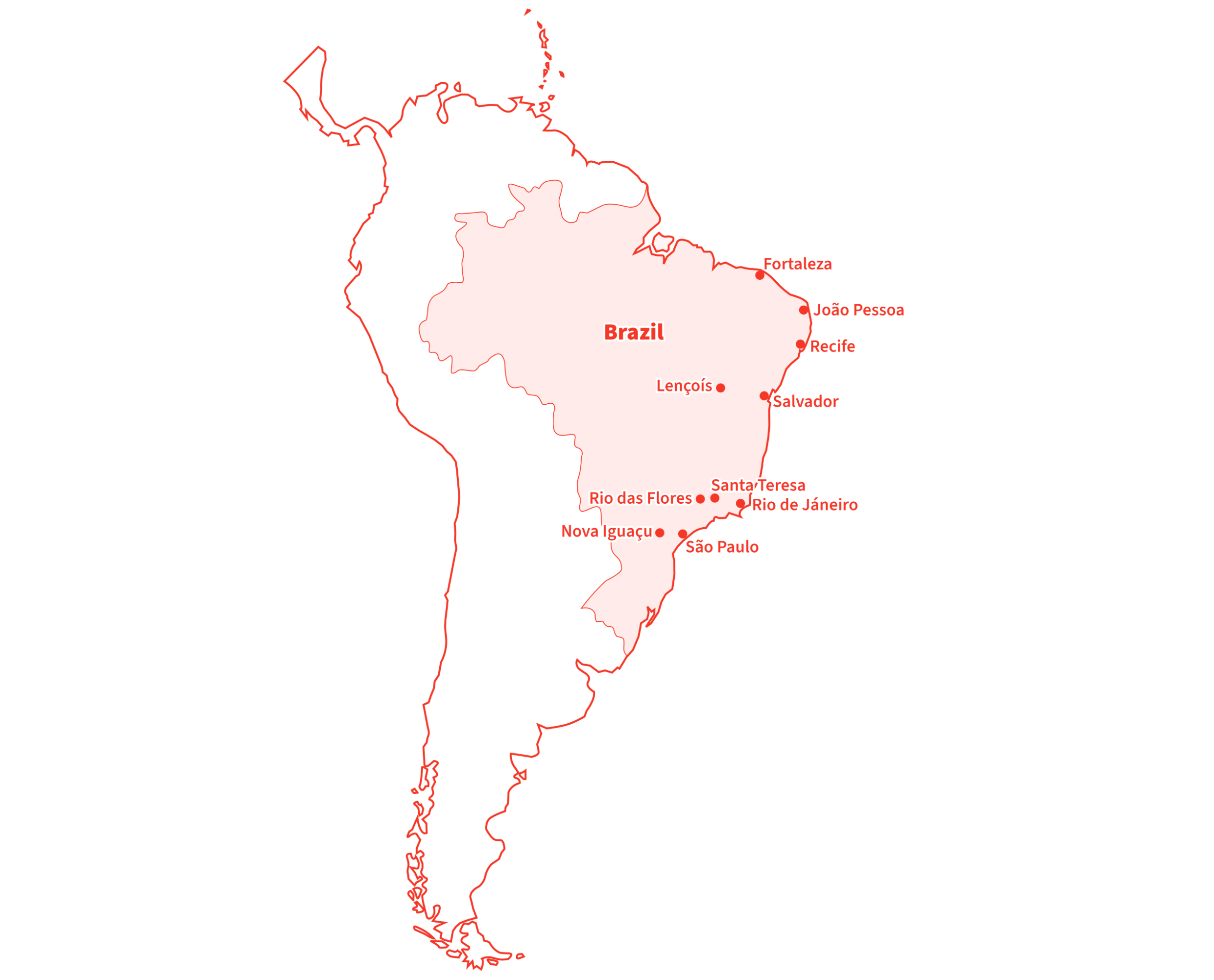
What Can We Learn?
Can you see what we are doing? We tried to envisage and dig out what people will want to do with the thing and see if there is anything we can do to make the communication better, more accessible, and usable, and to better describe and help people to use the annual review. The annual review could have been an electronic PDF or HTML — the same problems exist whatever media. But would you have envisaged or thought about adding a map that the client never even thought about or even asked for? Sometimes, designers have to go the extra mile and push the boat out for their clients in need.
This issue of making information easier to understand and consciously helping people to understand and use it by adding clever features, in this case, a map, has to do with the area of accessibility. It could easily be considered usability because it makes the information and publication more usable; however, it is more about the area of accessibility. Being even more precise and specific, it has to do with things called access structures, as highlighted in 1979 by information designer and educator Robert Waller who runs the Simplification Centre and who has been the Professor of Information Design between 2007–2011 at the well-known Department of Typography & Graphic Communication at the University of Reading in the United Kingdom, just outside London. In the JS Party (Episode #36) podcast Suz Hinton, Safia Abdalla and Kevin Ball have also highlighted that there is more to accessibility than a disability people may have, and what devices they may use to help them.
Access structures are not commonly talked about in the now huge and popular world of accessibility. Yes, we talk of people, their physical issues (vision impairment, aging, dyslexia, physical disabilities, and so on), or what supportive devices they may use to make things easier (magnifying glass, screenreader, vision impairment stick, and so on), or even what legal issues and implications there might be because of bad accessibility. But we rarely talk about adding elements like access structures to help people with their content comprehension, processing and reading style strategies, such as:
- Browse;
- Skim/preview;
- Search/scan;
- Intense study;
- Review.
And to just expand a bit more (if I may?), maybe you have used the audio hosting website SoundCloud. Among many of its great features, it has a search option just the same as any other search option, a horizontal box, then a search button (so nothing unusual or out of the ordinary here yet). It allows users to search through the whole website and content rather than having to go through and read millions of web pages (well, you knew that anyway). Expanding a bit more, when you search, it of course, returns the search results in a vertical list, just like a search on Google, Microsoft, and Twitter. However, on the left of the search results webpage are some really interesting and very useful search refinement options, as follows:
- Everything
The user’s search term searches through everything and the below. - SoundCloud Go+ tracks
If selected, will only search through this offline and ad-free listening service from Soundcloud. There are then two further sub-search filter options:- Added any time,
- Any length.
- Tracks
Apply user’s search to just audio content. There are then two further sub-search filter options:- Added any time,
- Any length,
- To listen to.
- People
Apply user’s search to just people, for example, user/profile account names. There are then nine further sub-search filter options that somehow seem to know the countries associated with your search:- Location. (9 country names associated with your search.)
- Albums
Apply user’s search to albums, for example, collected tracks within a grouped album option. They are then filtered by tag options:- Electronic,
- Techno,
- Hip-Hop & Rap,
- Drum & Bass,
- House,
- Ambient,
- Electronica,
- Dance & EDM,
- Deep House.
- Playlists
Apply user’s search to user-curated playlists collection, once again with the previous filter by tag options:- Same as previous.
So, you might think, well, this is all fairly standard and default stuff. However, not only is a user able to search for something; they are then given many very handy and useful sub-access structures that are very helpful in allowing them to further refine and edit their search term. I cannot stress how useful and important this is. This is basically the definition and whole bowls of what design, accessibility, usability, information, and communication are together.
Think about it. What would you do, and what would the result be if you could only perform a search, i.e. just search for something and then had no further refinement options? Users would not able to further refine what they are trying to do and achieve.
Providing An Electronic Business Card Increases The Chance Of Being Contacted And Getting New BusinessI run a graphic communication design and text editing business in the United Kingdom called User Design, Illustration, and Typesetting, working for book publishers and also other types of organizations. We also do information design, user testing, website design, and research. We contact quite a lot of art, design, and production managers at U.K. book publishers, and one of the things we realized about seven years ago, is that they get a lot of emails every day from people offering the same services and making the same inquiry as us.
Problem
We realized that we need to increase the chance and any chance of our business’s details being used and spread, at and within their organization, and by whatever communication method they use, typically a computer, from staff-to-staff or colleague-to-colleague, to ultimately increase the chance of them contacting us (this is the goal anyway while the reality is another matter, but keep reading).
Solution
What we did, and it is really simple and easy to do (but we hardly ever see anyone do it), we made a link available to a digital business card in PDF, PNG, RTF, and vCard formats, on our homepage and contact us webpages. Do you provide a business card on your website, portfolio, or client’s website? Probably not. It is these types of things we need to try and realize and find out as designers because it improves the chances of communication success, and the ultimate end objective that was to get people to make an inquiry and contact us (an action).
What Can We Learn?
By making our main contact details more easily available and reusable, and in different electronic formats, it makes it quicker and easier to share and exchange our details, and also in different types of software (remember, not all of us like to use the same software program or system) thus leading to more chance of people in organizations contacting us (well, I have already said that three times). Would you have thought of this? How can you apply this to the project you are currently working on? Furthermore, the next important question is how can you measure if it is working and having an impact, or indeed if it is not? It is very important in design and communication to actually know the following:
- What is working and what is not;
- What areas could be optimized and what areas could be better;
- Or what areas are not working well and are underperforming.
Basing design success measurements on what people think or feel is highly subjective, and soooooooooo last century.
The Fastest Internet Speed In 2022 Is Still 4 kbpsCurrent times in 2022 are challenging throughout the world (there is no denying that). Over the last few years, we have noticed the truly awful impact, performance, and results of websites for users, because of lazy loading images, infinite scroll, and content shifting on page load to save on internet data bandwidth usage — both on the user’s end and server-side (that delivers the website).
Problem
In essence, lazy loading means that an image or content will not be loaded until it becomes available or requested by the user in the visible screen area. Because of this lazy (late) loading, users frequently have to wait a few seconds for content to load, even with today’s amazing technology.
Infinite scroll is essentially the same principle as lazy load images, but the non-visible vertical webpage content not in the screen’s visible screen area, is not loaded until you scroll down. Lazy load can also be used with painful pagination features (like go to page 1, 2, 3, 4, 5, 6, 7, 8, 9, 10 as seen on large e-commerce websites and as Vitaly Friedman has outlined in his article, “Perfect Infinite Scroll UX”).
Content shifting on page load basically refers to a mixture of lazy loading content (text, images, and webpage layout) being delayed and loaded late, causing the content, when it does load, to load late, shifting the vertical and horizontal height of the web page’s content, cause elements and call-to-action buttons to shift and move around, as also highlighted by Michael Scharnagl on Smashing Magazine. This issue is especially problematic if you are trying to work quickly on a slowish or sluggish machine or device. However, not even a fast machine seems to make a difference regarding this issue.
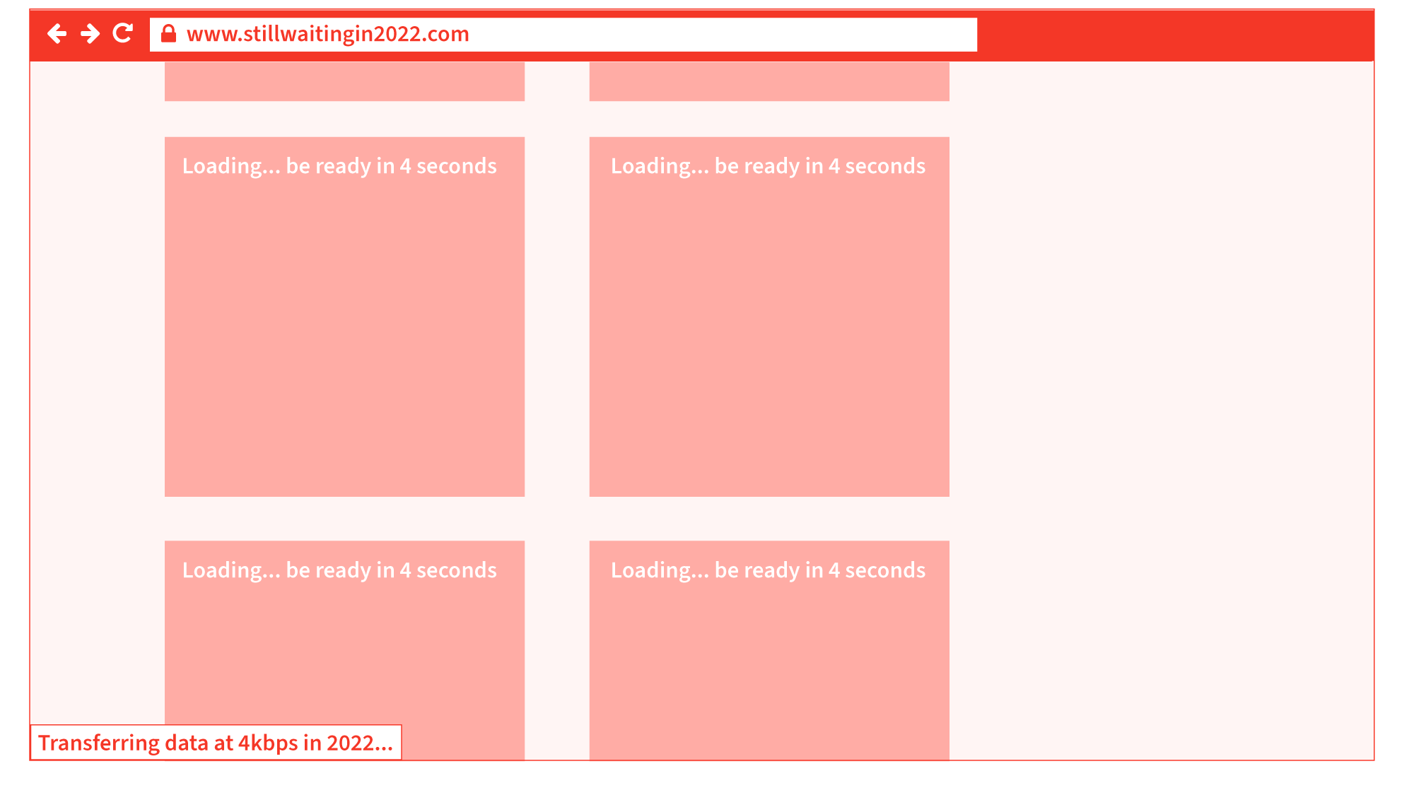
All of these three issues create really bad user interactions, especially with longer-length web pages, although they are promoted and regarded as good webpage performance techniques.
Solution
Give people the content when it should be there and when they need it, as fast as you can. I understand that for very long webpages, some off-visible screen lazy loading and infinite scroll could be beneficial to save on unnecessary loading of content. But for everything else, just give it to users as fast as possible experience. We have incredible technology these days, and let’s not over-design and overthink.
What Can We Learn?
It could be said that when using lazy loading or infinite scroll in 2022, we are still dialing up with 4 kbps modems just like we did back in the year 2000. The amount of times and the delivery of information and images is the same: very, very slow. Nothing has changed. We are still looking at blank or block-colored images waiting for them to load... while 20 years of the internet have passed. The average speed of a computer and mobile internet in 2022 is 30.78 mbps, and we are still getting the same performance as in the year 2000 — as if on 4kbps modems. User experience is what matters, not technical wizardry.
Total Overload Of User’s First Website Interaction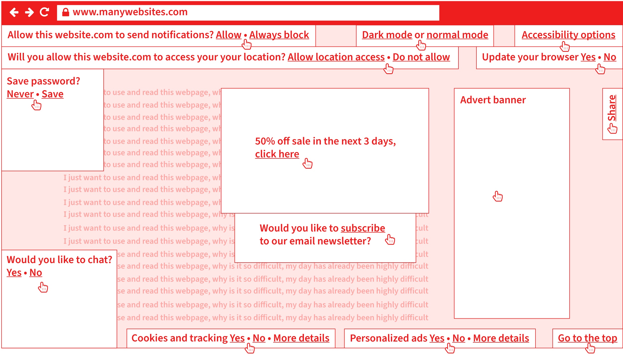
Problem
Another example of bad usability is webpages that have very demanding first-visit user requirements. I am sure you all experience and struggle with the following on a daily basis (maybe you are even doing it now, arghhhh go away cookie policy box? Yes, no?):
- Cookie policy “accept/deny warning box” pops up when you 1st visit a webpage that distracts and blocks natural use.
- Email newsletter box pops up asking if you want to subscribe. That is another thing you have to do, even before you have started to use and read the webpage!
- A “do you want to receive update/news notifications” box appears.
- “Do you want to allow or block access to your physical location” box appears.
- Another box appears asking if you want to save 50% if you order in the next three days.
- A chat box appears asking if you want to chat with someone [well, maybe, but not at the moment].
- Then, finally, a “do you want to save your password” box appears.
Solution
Do not overcomplicate the 1st interaction with your thing. It is a bit like comparing it to bumping into someone when you are in a hurry and have to go, and all they keep doing is talking to you and telling you their life story. If people find their 1st interaction with you displeasing, they will turn away. If you have to provide options like cookie warning boxes, email newsletter subscribe boxes, and other notifications, leave them optional or in a place that everyone knows they can visit, like a universal options link or button in the top right of a webpage, where they can customize and setup these things, as they like.
What Can We Learn?
All of this creates a hard-to-use and over-demanding graphic communication. That distracts, over-complicates, and creates extra barriers to information that are very costly for your business or organization because it increases the chance of your users leaving and rejecting your item. Say goodbye to your users and customers in less than 3 seconds. It gives your brand a bad feeling and experience, and maybe they decide not to order something through your website. These are the everyday realities of bad usability because of your over-demanding and difficult-to-use design, information, and communication. It is not difficult:
- Think about how people will want to use your design.
- Make it as easy and least demanding as possible.
- Test with them in real time.
The next example has to do with measurements such as millimeters (mm), centimeters (cm), and inches (in). It doesn’t bring that much confusion with it, but surprisingly, it can still cause quite a lot of confusion and problems worldwide.
Problem
Measurements such as millimeters (mm), centimeters (cm) and inches (in) may not seem that interesting, but if you were to try to order a polo t-shirt online, you’ll notice that it may take you longer to do than expected. By measuring the width between your armpits across your breast area to get your bust (chest) circumference, and you may have measured 60 cm on the front, i.e. you have to multiply this number by 2 for the whole circumference of 60 cm (front) × 2 (front and back) to get a result of 120 cm.
Let’s say you finally find a polo t-shirt that you really like on a French clothing e-commerce website. You choose the color of the polo t-shirt you like and search for your size (we know that it is 120 cm, this sounds like we’re back in a Maths class, bear with me), but the only available sizes from that French clothing company are the following:
- 2 – XS
- 3 – S
- 4 – M
- 5 – L
- 6 – XL
- 7 – XXL
- 8 – 3XL
- 9 – 4XL
- 10 – 5XL
- 11 – 6XL
The above measurements are a bit helpful but certainly not accurate. They are not accurate because there is still no measurement information in millimeters, centimeters, or inches. However, the information above is a link titled Size guide. Okay, let's give that a go and see what it does. A slide-in panel appears, and there is a drop-down list with the following information:
- 2 – XS = (bust circumference: 87 cm/34 in, pant waist circumference: 73 cm/28 inch).
- 3 – S = (bust circumference: 90–93 cm/35–37 in, pant waist circumference: 77–81 cm/30–31 in).
- 4 – M = (bust circumference: 97–101 cm/38–40 in, pant waist circumference: 85–89 cm/33–35 in).
- 5 – L = (bust circumference: 105–109 cm/41–43 in, pant waist circumference: 93–97 cm/36–38 in).
- 6 – XL = (bust circumference: 113–117 cm/44–46 in, pant waist circumference: 101–106 cm/39–42 in).
- 7 – XXL = (bust circumference: 121–125 cm/48–49 in, pant waist circumference: 111–116 cm/44–46 in).
- 8 – 3XL = (bust circumference: 129 cm/51 in, pant waist circumference: 121 cm/48 in).
- 9 – 4XL = (bust circumference: 134 cm/53 in, pant waist circumference: 126 cm/50 in).
- 10 – 5XL = that now, strangely, in the Size guide slide-in panel seems to say 1XG = (bust circumference: 139 cm/55 in, pant waist circumference: 131 cm/52 in).
- 11 – 6XL = that now, strangely, in the Size guide slide-in panel seems to say 2XG = (bust circumference: 144 cm/57 in, pant waist circumference: 136 cm/54 in).
Are you starting to get a headache? I told you, keep reading and we will find the remedy!
Our bust (chest) circumference, as we know, is 120 cm, so it seems by the information in the above Size guide panel, that this size (entry):
- 7 – XXL = (bust circumference: 121–125 cm / 48–49 in, pant waist circumference: 111–116 cm/44–46 in).
It is going to be a really good and safe size (because it is slightly larger than 120 cm by 1–4 cm). So it seems that there is no problem here, and in fact, the website has given good and flexible information because measurement sizes have been provided in three different measurements: cm, mm and in.
Another related question is whether all clothing websites display their polo t-shirts measurement like the French clothing company above. Well, no. Here is an example from a British clothing company, and we are going to use our pre-measured bust (chest) circumference, which we know is 120 cm once again, to order a different polo t-shirt from the British clothing company. So I have selected a polo t-shirt from the British clothing company’s e-commerce website, and the sizes that it gives are:
- 36
- 38
- 40
- 42
- 44
- 46
If we look at the drop-down list information from the French clothing company, we really cannot see anything that says 36, 38, 40, 42, 44, 46. However, once again, there is a View guide link on this British clothing website, so we click that, and see what happens (as it might be able to give us some more information).
Two options are available:
- Top half (bust, chest),
- Bottom half (waist).
We want the Top half (bust, chest) option because we measured the distance from armpit-to-armpit, then multiplied by 2 to give our total circumference in cm, as previously. The tables say:
Top half (bust, chest)
| 36 | 38 | 40 | 42 | 44 | 46 | |
|---|---|---|---|---|---|---|
| Chest (inches) | 36 | 38 | 40 | 42 | 44 | 46 |
| Chest (cm) | 92 | 97 | 102 | 107 | 112 | 117 |
| XS | S | M | L | XL | XXL | XXXL | |
|---|---|---|---|---|---|---|---|
| Chest (inches) | 32–34 | 35–37 | 38–40 | 41–43 | 44–46 | 47–49 | 50–52 |
| Chest (cm) | 81–86 | 89–94 | 97–102 | 104–109 | 112–117 | 119–124 | 127–132 |
We have to remember that the only available sizes in this polo t-shirt are 36, 38, 40, 42, 44, and 46. So it would seem 46 is the largest size they offer, and the circumference in cm of 46 (inches circumference) is 117 cm circumference. As you can see, 117 cm is not large enough. There is not enough flex (leeway) in this size because we know that our already measured armpit-to-armpit circumference in cm is 120 cm.
Solution
The French clothing company provided a good range of measurements in 2 measurements, inches and cm. The British clothing company, however, provided two tables, and it would be more advisable to actually not offer users the second table because it is basically a whole range table for all their clothing and is not valid for the polo t-shirt we selected, where only 36, 38, 40, 42, 44, 46 were available (yes, it is confusing). If we really want to clarify even more, the initial sizes of 36, 38, 40, 42, 44, and 46 would maybe be better written like this:
- 36 in (92 cm), 38 in (97 cm), 40 in (102 cm), 42 in (107 cm), 44 in (112 cm), 46 in (117 cm).
Then there is much less misunderstanding, and users can relate the values better to their information and size.
What Can We Learn?
Yes, we can learn a lot. The interesting points to note are that the French clothing company’s website offered fairly useful and practical information. The British clothing company initially gave us six measurements in inches (36, 38, 40, 42, 44, 46) that made no sense to us, but when we went to the View guide link, we were able to decode the two tables, although it really was not made blatant (obvious enough) that this range only goes up to 46 inches bust (chest) circumference. And in fact, there were two tables provided, and it could have been very easy to read the second table (one below) and see that there is a size of XXL (119–124). Since the table has been provided, it will be available in XXL (119–124), but, of course, it is not for the polo t-shirt we selected.
Only give information relevant to the product and task, and remove any information that is not applicable or useful, especially when dealing with measurements. Furthermore, and you are going to like this if you are a designer or working in sales, if we consider the further-down-the-line consequences, you could very easily, as people do:
- Make an order thinking the size will be alright when really it is not (we have all done this, hey).
- Type in all your details.
- Pay for it.
- Wait for it to be delivered (maybe missing a day of work, or picking it up from somewhere else, as no one was in where you live).
- Try it on, and it does not fit.
- Get packaging to return it to them undamaged.
- Complete another refund/return form.
- Do more paperwork.
- Send it back to them (maybe missing a day of work, so someone can pick it up from where you live or travel to a post/courier office).
- Check your bank account over the next 30 days to see if you have been refunded.
- Oh, I forgot, what about writing the postal address that the return needs to go to? Do you write it on the front in a pen, print out an A4 page, then sellotape it on, or do you do something else?
As you can see, user errors and mistakes are very time-consuming for the users themselves, and even more costly for the supplier of the product who has to process the return, i.e. giving them masses of more work to do. Good design makes a lot of sense for all involved.
Concluding Observations, What Did We Learn From All Of The Examples?The results of getting good at the accessibility and usability issues previously mentioned are:
- Be a better designer;
- Designs will work better for people;
- Enable people to achieve what they want to with your design and information;
- Designs will increase business success;
- Designs will reduce task interaction time and will allow users to achieve what they want to do faster;
- Reduce stress, confusion, and unnecessary work;
- Increase customer loyalty and quality perception of the brand.
What We Have Explored And Learned In This Article
- Microsoft Word Font Menu
Rather than accepting a design and what is there, we understood and found out how people will want to use the thing. We then looked at a very simple solution to make this as quick and efficient as possible. It leads to increased workflow speed, productivity, better actions, and a reduction in time, stress, and confusion. - Font Software
We saw default operating software that lacked needed features. - Map In An Annual Review
We found out, explored, and understood how people are going to use the thing, interface, content, or system. We then provided a very simple map that improves access to the content to allow easier and more chance of comprehending the information, and to increase the chance of people doing what we intend and enabling it to happen more easily. - Electronic Business Card On Websites
We were able to increase the chances of people doing something (in our case, to contact us) by thinking about how we could make that easier to do by providing different electronic files to help people do this. - Modern (considered) good practice web performance techniques
Current-day website design performance methods, like lazy load and infinite scroll, are rendering websites to load at 4kbps speeds that we had around the year 2000, that is 22 years ago. This makes websites difficult to use and interferes with the user’s original intention and goal. - Total Overload Of User’s First Interaction
We saw many websites requiring a user’s first interaction to deal with, sometimes, 13 option settings and sorting, before they even get a chance to engage and complete their original task. Showing a high amount of information overload and digital information pollution. - Seemingly Straightforward And Assumed Easily Usable Information
When it comes to information, even seemingly very mundane and standard information (if it is not designed, communicated, and provided to users in a logical and easy way) creates masses of problems and work for all involved (as was the case in the online polo t-shirt ordering examples).
How can you simplify (I mean really reduce) the work, energy, and tasks for users to complete and get something done?
- Reduce complexity and demands (for instance, by not bombarding them with options, notifications, and things to sort out, even before they have started their originally intended task).
- Reduce steps, stages, and clicks.
- Strengthen and reduce the complexity and unnecessary difficulty in design, communication, user interfaces, and systems.
- Ask for feedback and try to get good-quality questionnaires.
- Conduct real-time diagnostic user testing.
How would you make your design and information more obvious and easier to access, find, process and scan through for users?
- Search options on a website (enabling people to search through all of your content)?
- Sitemap or index (allow people to quickly find what they are looking for)?
- Navigation menu for a website or contents page for a publication (allows people to get an overview of all of the website or system content).
- Add a map, graph, or data visualization (to help people envisage and see the content in better and different ways)?
- Make the content available as audio (either online or able to transfer to a portable physical device)?
- Could you use heading hierarchy levels like heading 1, heading 2, or heading 3, bullet lists, boxes, or icons to split up, better chunk, and highlight information?
- Do you provide your communication in a range of different medias like online, print, audio, video, braille, large print, and easy read (that will increase the chances of it being used and being used in different people’s most ideal format?).
- What about a conclusion, summary, or recap after a lot of information to help reprocess and reinforce the main points from lengthy content?
- What kind of navigational elements could you use or introduce to help users move and navigate around your system: running heads, breadcrumb navigation, go to the top link, scroll spy elements, where you are a feature, progress indicator, grid or list of thumbnails to give a whole overview?
- How can you help and make users discover and enjoy more of your hopefully useful content and information?
How can you understand, envisage and get to know more about people and their requirements?
- Find out, think, explore, ask and watch people using the thing.
- Ask users and find out what they want to do with your thing.
- How can you make it easier for them to do what they want and achieve what they want as quickly as possible?
- Do user testing and set people tasks to do and see where they struggle and if they can do it within a reasonable amount of time.
- Learn about different people’s needs, like people who are aging, dyslexic, with vision, physical or hearing issues.
- Find out about different categories of people by reading about user personas.
- Better sectioning or navigation features.
How can you provide the information people may want in different formats to allow better and easier use of your information?
- Maybe: HTML, SMS, RTF, PDF, VCARD, TXT, XML?
- How can you allow people to customize your website, interface, or system:
- If people use your website or system a lot, maybe they would like to customize the colors, typeface, or layout to avoid boredom.
- How could you deliver age-specific or more fitting and relevant content (text and images) to this category of users, or other age categories of users?
- How could you allow people to customize your website so they can use it how they wish and use it in their most ideal presentation?
Thank you for reading. I hope you enjoyed the issues raised in this article and how tools like Extensis can help — some show the latetst strategies and methods (sadly, not that advanced) that we have been using here for the past twenty years. Accessibility and usability are really not that difficult — they just need to be done better.