Five Ways to Create a Better Call to Action
Almost every marketer I know says that we need better calls to action.
Let’s start with the why.
Why you need a good call to action
When you tweak CTAs, it can bring a significant lift in your conversions thus improving your sales. The best marketing books would give you the same advice.
HubSpot was able to boost its conversions by 30% by just changing its CTA a bit. Imagine all that you can do with 30% more customers, email subscribers, and conversions.
Here are five ways to optimize your call to action.
Five ways to optimize your call to action
Let’s discuss how to make CTAs stand out in further detail.
1. Make your CTA stand out from other site elements
Your CTA should effectively stand out from the rest of the page. It should be easy to recognize and understand. Visitors should easily make sense of what visitors want and what it represents and why it is on your page. Sometimes a good website builder is all that you need to create great CTAs.
Whenever you design a CTA for a page, think about where you want the visitor’s eyes to go. If you want to highlight the logo make use of whitespace. If you want people to pay attention to the call to action below, add color below and direct their eyes to that particular CTA.
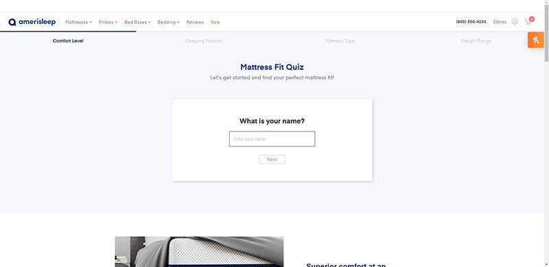
For example, the first thing you notice on this mattress quiz page from Amerisleep is the blank space that asks for your NAME. The page makes effective use of whitespace to draw your attention to the quiz.
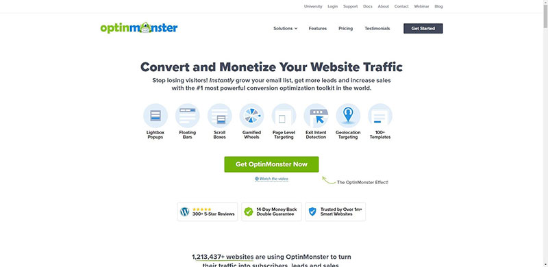
The CTA is designed with a little touch of the site’s original branding and colors. For example, OptinMonster uses an actionable CTA on its page. The CTA stands out from the rest of the page with its bold green color. Notice the little arrow on the side. All of these elements work toward the benefit of the CTA.
The color contrasts with the rest of the background, the negative space highlights the elements and the CTA button.
2. Create urgency to entice visitors to click your CTA
When creating your CTA button, use action-oriented words. Action-oriented copy encourages visitors to click and read further.
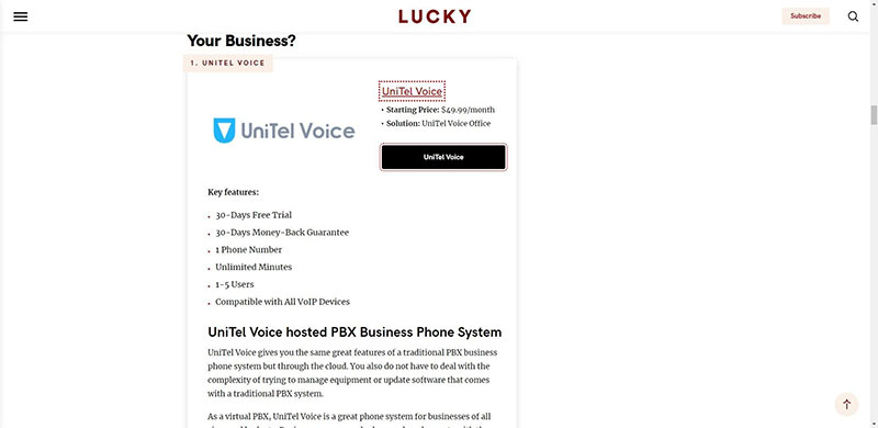
For example, one of the services highlighted in this review of LuckyMag covering ten different hosted PBX platforms is UniTel voice. Notice how the word UniTel Voice is different from the rest of the section with a black background.
It can be a simple phrase like “Get started”. This tells us to click and also informs us there’s more to come if we click. The surrounding copy should also be action-oriented.
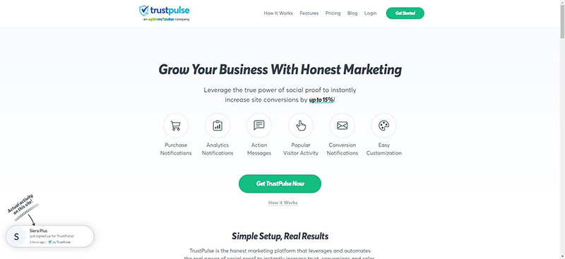
TrustPulse leverages urgency by asking us to check out the power of social proof. Social proof can increase conversions by 15%. Who doesn’t want that, especially when it’s free to sign up?
The visitor is on your page for only a few seconds. Make use of time wisely with your copy.
The statements are all actionable and empower the user to take an action. They give a taste of what the user can miss out on if they fail to click the CTA button.
3. Consider different design elements to make your CTA clickable
In addition to the CTA itself, you have surrounding design elements to pay attention to. Think of elements like text, images, and the site design in itself.
Here in this example, the blue color makes the CTA lift out from the page. It matches the site’s branding, it’s the logo and the site is full of information that points to the CTA button too.
The surrounding text compliments nicely with the content of the blog post which is on welcome to the team kit for new employees.
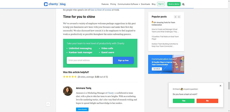
The heading and the copy talk about the experience you will get with the platform. These are all positive statements that retell the brand’s story and set it up more concretely. This provides you with more information.
In addition, the image on the right stands out and doesn’t take away the effectiveness of the CTA button. The image is spaced well and is made up of colors that contrast. To make the CTA and the rest of the copy resonate well with the customer, customer journey mapping can be of great help.
4. Personalize Your CTA to get Most conversions
Your business may consist of many audience groups who visit your site for many reasons. It makes sense to use different CTAs to target these different audience groups.
If you have different audiences also think of the reasons why they visit your site. There’s a clear distinction between products for men and women with different CTA buttons inviting clicks and separating the products.
You can also use different CTAs to differentiate experts and amateurs if you are selling different courses. This helps you generate a higher conversion rate than a generalized CTA button. You should always ask for feedback from your website visitors on what you can do to improve conversions from your CTA.
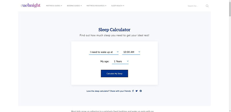
Here’s another example. Each Night has a sleep calculator page where you can enter your time of waking up to calculate the amount of sleep you need for the night. Each person’s answer is unique and Each Night is able to personalize the page in a simple way.
5. Optimize your CTA for mobile viewing
Today 50% of traffic to your sites comes from mobile. Align your CTAs for mobile traffic so that you don’t miss on conversions. Data from Statista points this out.
Even search engines like Google want to give mobile visitors a better experience with the creation of Google AMP pages that are optimized for mobile viewing and load quickly.
Slack has a clear CTA that’s clearly viewable on mobile devices just as it does on webpages.
Open your site on different mobile devices with different screen sizes. You can also go for device selection within WordPress or within the page builder’s front end.
Conduct the Google’s Mobile-Friendly Test:
There’s more in the form of tablets, and other devices. They come in a range of screen sizes.
Tweak your CVTA for mobile viewing.
6. Use whitespace effectively
White space is also called negative space and is the area between design elements. Most aren’t fully aware of its role but designers love it.
Whitespace isn’t simply empty space. It’s a powerful tool that when applied the right way can make your elements shine. If there are multiple visual components on the screen, it’s easy for a CTA button to lose itself on the page or the screen. The right amount of whitespace can draw the users’ attention and make it more noticeable without too much effort.
Whitespace forges a connection between different UI elements. The less whitespace between components the more in touch they look.
Tip 7. Add Some Extra Information
The CTA message should be short. That’s not enough information for a user to make a decision. However, you can help this by providing additional contextual information. It can be a line explaining the next stages. Or reassuring the visitor that the sign is complete in under a minute.
Or that the registration is free. This helps allay click fear and propel them to take action.
Create better CTAs today
Ensuring you have a good call to action can improve your conversions. When creating your CYA it’s important to understand how it gels with your page and adds to its design.
In this post, we outlined several steps to improve and optimize your CTA buttons. To recap.
- Make the CTA button stand out from the rest of the site elements.
- Create urgency to entice visitors to click on the CTA button
- Consider multiple design elements to make the CTA clickable
- Personalize the CTA for different audiences.
- Optimize the CTA for mobile viewing
The next question is to learn how the CTAs stack up against the existing design. You can do that with Google Analytics and set up even tracking or UTM parameters to see how your CTAs are performing.
Keep User Flow in Mind
Big size buttons and bright colors often are good ways to catch attention. However, placing CTAs the right way can get them more attention. User flow is the journey a user takes and the path someone follows to complete a certain task. Users’ flow helps create a UX in a manner that they can go step by step to get the goal they want to get to.
Keep the journey in mind to effectively place the button right when they are most like to click. If the signup button is placed after they read information about the offer on hand, that makes them primed to convert.