Seasonal Web Design Trends to Spice Up Your Projects (+ Where to Design Website Effortlessly)
The field of web design is always evolving. It is no wonder that new web design trends, techniques, and approaches emerge and evolve at the intersection of innovation and creative solutions. Popular designs and inventive UX and UI methods may rapidly become weary and overused. In other words, staying up to date on the newest web design trends is critical for remaining ahead of the game. Today we have compiled a list of seasonal trends and found a place where to design website effortlessly. Are you ready to get familiar with all of these aspects?
12 Seasonal Trends + Where to Design Website At a Fast Pace
Winter
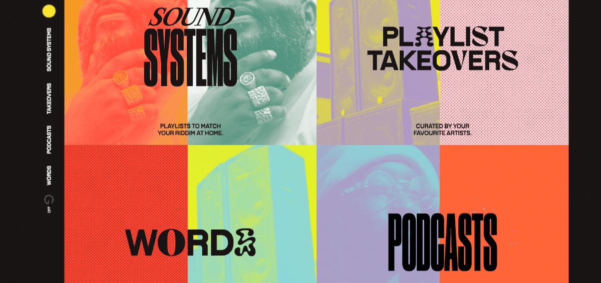
Vintage Typography
Many old things have been fashionable again, only to turn out much more unfashionable afterward. However, it is not about vintage typography. The popularity of such fonts has ebbed and flowed in the same way. So, many designs utilizing retro typography can make a long-lasting impression. Throwback typography, on the other hand, is seeing a revival. We are not seeing the same monotonous typefaces. The visual style and a touch of creativity, on the other hand, are rethinking what vintage typefaces may be.
Source: https://carnival.withspotify.com/
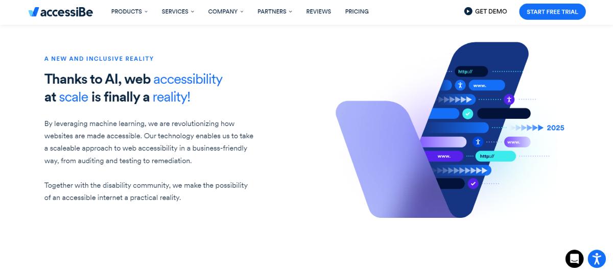
Glassmorphism
Glassmorphism is a rapidly expanding concept. It is a UI design concept that highlights light or dark items on bright backgrounds. A background blur is applied to the items, enabling the background to show through and create the illusion of frosted glass. The essential feature of this approach is the optical illusion caused by diffusion, reflection, and shadow. When paired with modest motion, the glass effect may help a site appear 3D.
Source: https://accessibe.com/
Parallax Effect
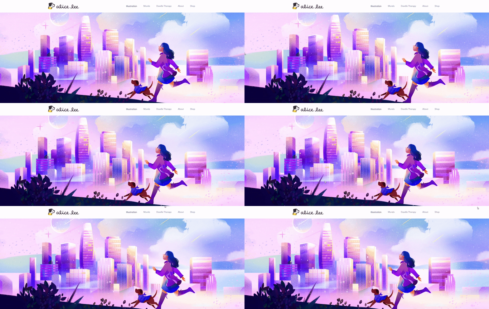
For years, parallax scroll effects have been popular in web design. There are rules that you need to follow to ensure that Parallax is used wisely and without causing distress:
- Do not allow the effects to distract you from essential information.
- Do not make it more difficult for the person to perform a critical task.
- Reduce the number of Parallax effects as much as possible.
- Cut the level of movement inside each instance to a minimum.
- Limit the effects to a specific portion of the screen.
- Make sure people are free to disable Parallax.
If you are asking yourself where to design website using Parallax, it is possible to turn to the MonsterONE subscription. It provides a massive set of ready-made solutions for web designers who want to save time. People who are engaged in promotional activities will also find this service very valuable.
Source: https://www.byalicelee.com/
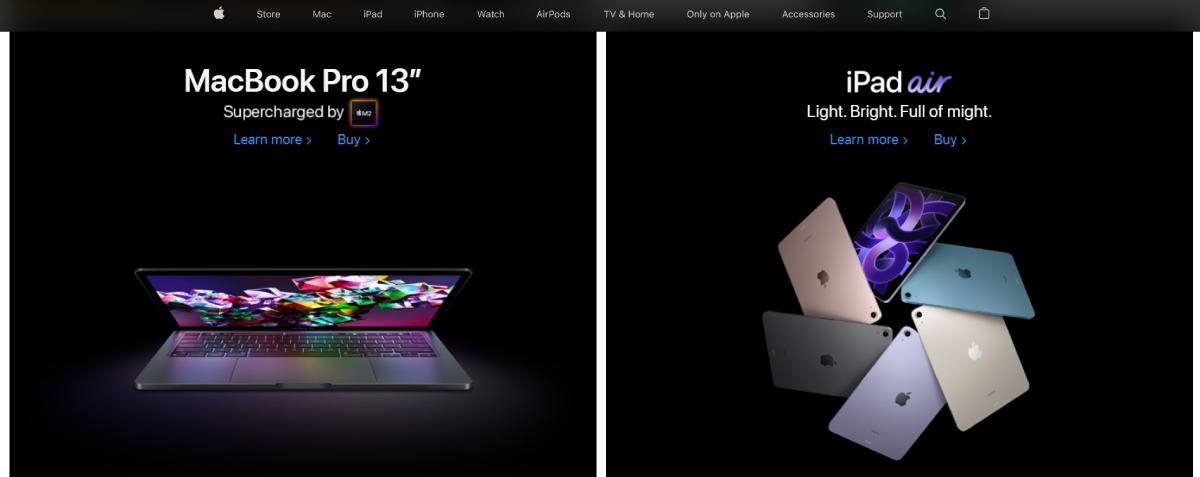
Dark Mode
While this trend is relatively new, the notion of dark mode has existed for a very long time. Some of the world’s early computers employed dark mode to avoid eye strain for developers who spent long periods staring at a screen. The key advantages of adopting dark mode for web design are that it makes visually compelling websites stand out and allows visitors to concentrate more easily on certain pictures or CTAs.
Source: https://www.apple.com/
Spring
One-Page Website Design
One-page resources are not a revolutionary discovery. It has been in existence since 2015. Experts are no longer looking where to design website like this. The concept inspires the idea of less is more as well as the capacity to express your message quickly and effectively. Menu items and navigation are relatively uncommon on these websites. It might be difficult to convey a message if you have to browse through a lot of pages. It is better to continue scrolling down a page and getting the answers to the most significant issues. These are frequently a smart alternative for microsites highlighting a company’s service, portfolio sites, and marketing landing pages for selling a product.
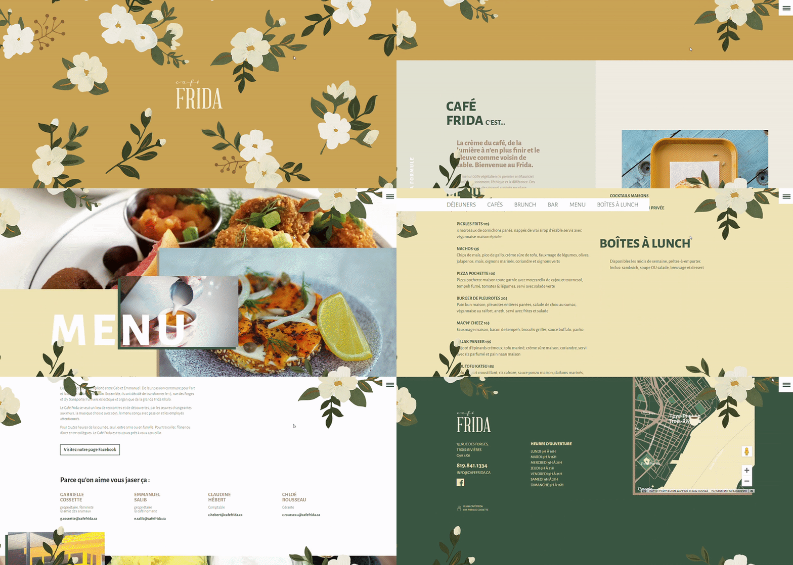
Source: http://cafefrida.ca/
Vibrant Gradients
Gradients are not innovative, but this is a more sophisticated structure. Rich gradients are one of the evolving trends in web design frequently utilized to provide flat pictures with depth. Instagram revived the concept in 2018 with its gradient logo. Gradients have grown with interaction and inventiveness since then. If you are creating a minimalist-looking design, incorporating rich gradients is a great alternative.
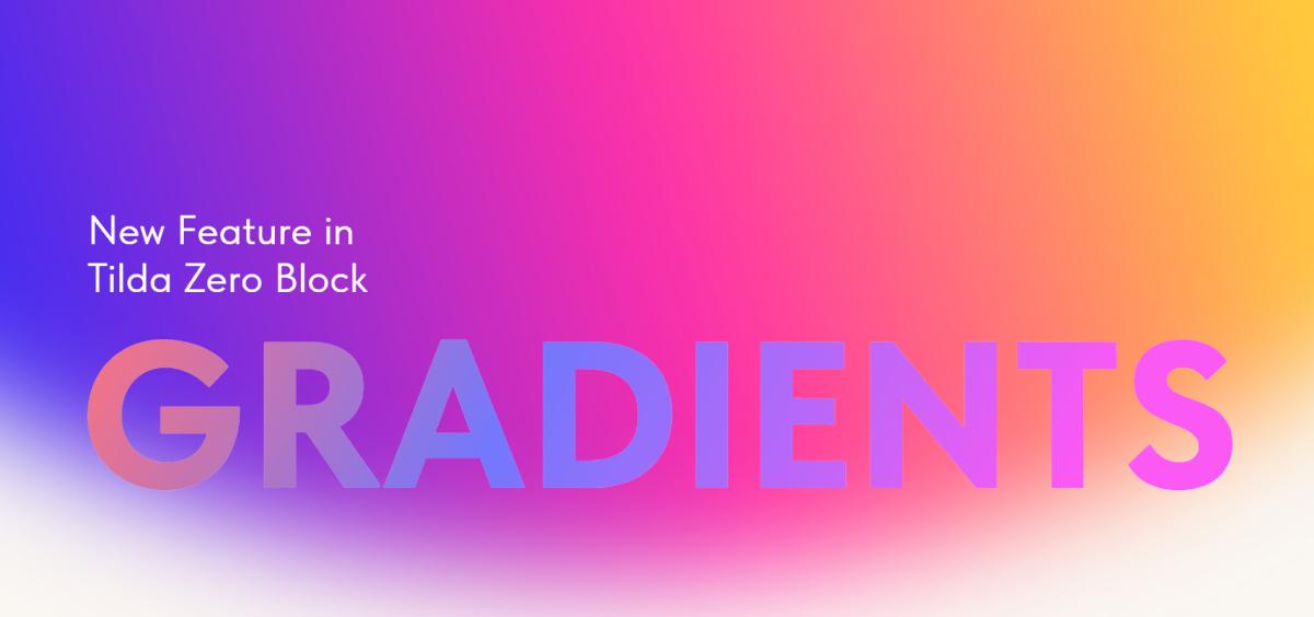
Source: https://blog-en.tilda.cc/gradients-in-zero-block
Layered Effects
A layered look with design tweaks, imagery, and icons that stack and merge is a superb approach to showcase a personalized design. This effect typically creates the required aesthetic appeal in a noteworthy manner.
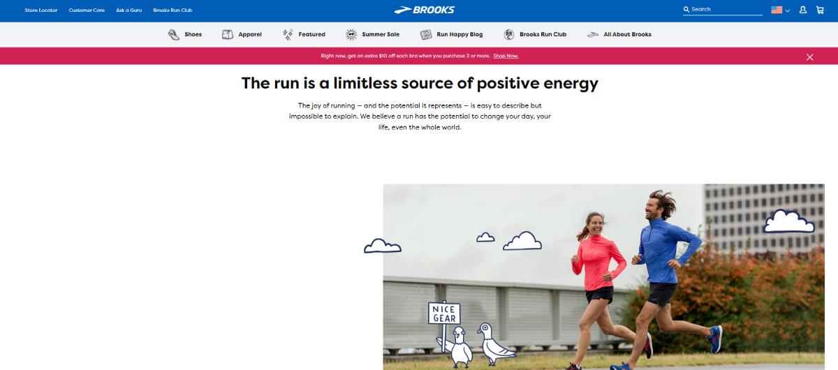
Source: https://www.brooksrunning.com/en_us/meet-brooks/our-purpose/
3D Elements
The 3D design is still thriving in the field of web design. 3D graphics are being utilized widely in UI to improve online interfaces and provide a visually appealing component to websites. 3D design, which uses computer modeling tools to generate three-dimensional elements, is also a prominent trend in extra areas. These include graphic design, typography, and digital art. It may be seen on everything from business websites to individual portfolios.
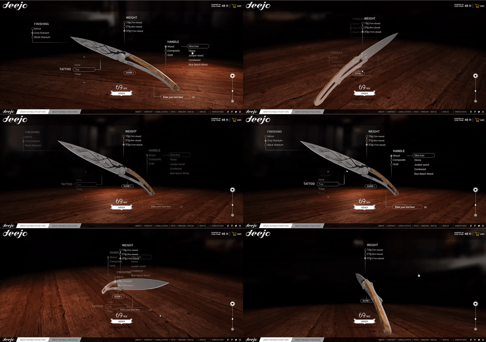
Source: https://my.deejo.com/en/37/titanium/olive/2/none/tree
Summer
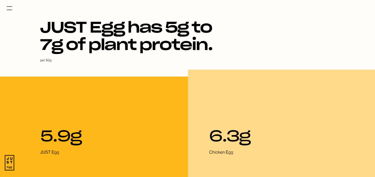
Symmetry and Well-Designed Lines
Perfectionists will love symmetrical site design. They convey a sense of complete balance and equilibrium. Clean lines, horizontal and vertical, and total alignment of the parts are among the trends for summer. One may immerse themselves in what is presented on the page and perform the essential steps with the aid of clear lines and navigation.
Source: https://www.ju.st/learn/human-health
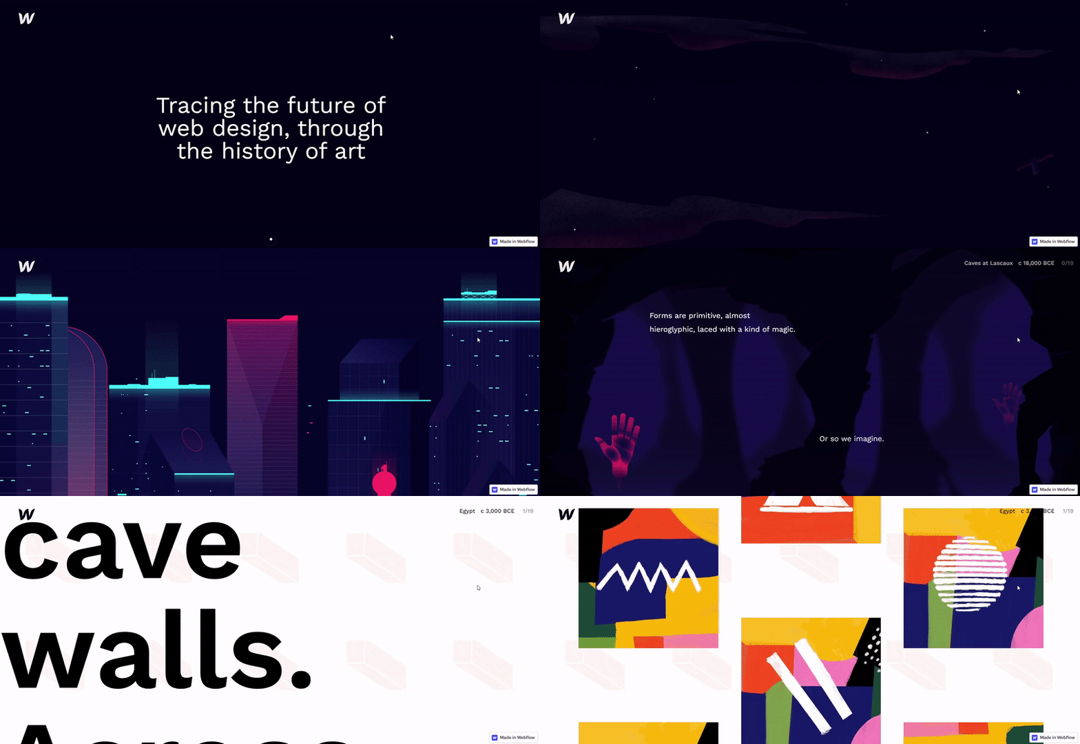
Scrollytelling
Designers expressing ideas through online experiences are becoming increasingly popular. This is where scrollytelling comes in – masterful storytelling by means of visuals that elevates the message and draws you in. The finest scrollytelling methods employ the following ones.
- Keep movement to a minimal area.
- Interactions should be on the individual’s terms, with obvious playback options to play, resume, pause, and stop actions.
- Ensure that any scrollytelling components contribute to the plot rather than take the focus away from vital material.
Source: https://webflow.com/web-design-art-history
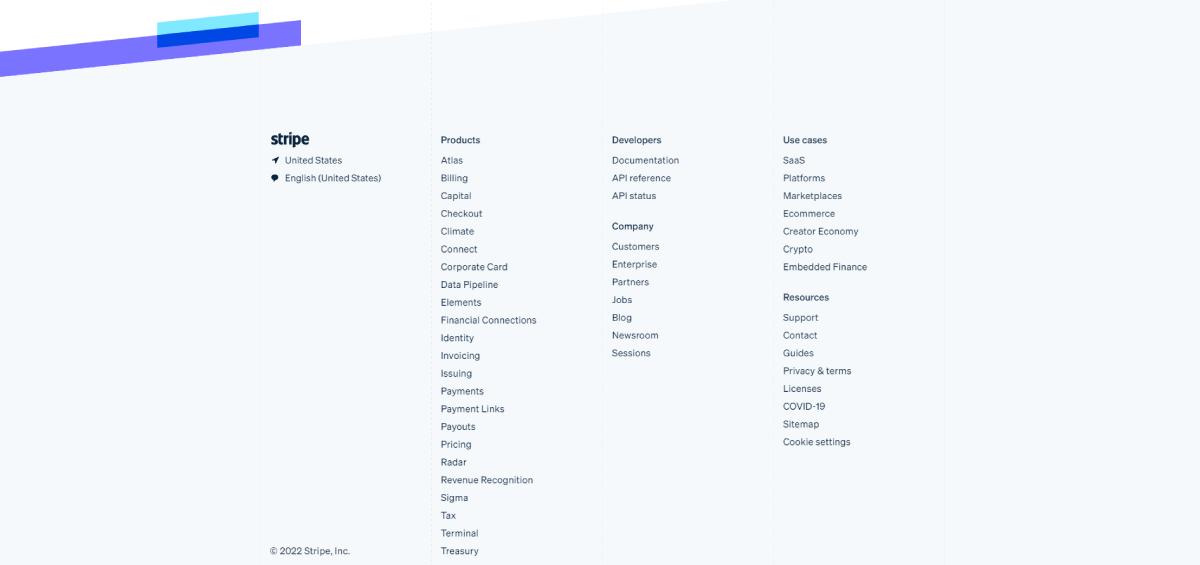
Mega Footers
The use of giant footers is a major web design trend for summer. The footer extends this concept, comparable to a mega menu, with 3-4 columns of menu links organized by category. Copyright information, a link to your privacy policy page, social profile buttons, a newsletter form, and menu links organized. All of these are examples of content to include in your mega footers.
Source: https://stripe.com/
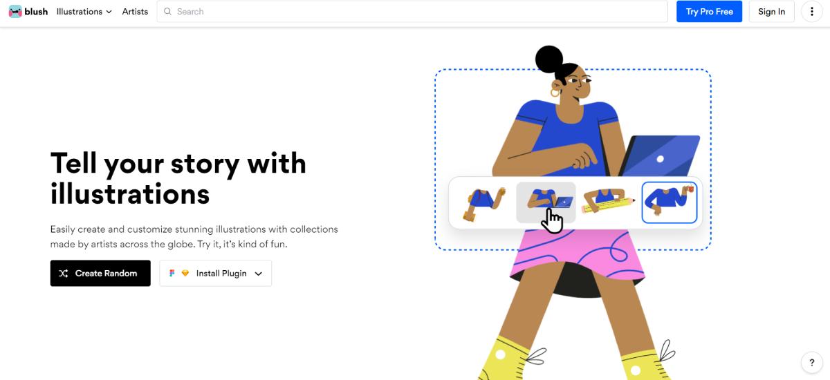
Cartoon Illustrations
There was an era when websites were merely text with a few photos or graphics. Designers are now generating work that engages with consumers on a much more individual level. Cartoon graphics have exploded in popularity as a method to add a touch of emotion to web pages. These graphics provide a lot of imagination and make a business more approachable.
Source: https://blush.design/
Fall
Horizontal Scrolling
Websites using this style, as the name implies, enable viewers to scroll both horizontally and vertically. The major advantages of adopting horizontal scrolling are amazing user engagement. In addition to this, it maximizes screen space for users who utilize wide computer screens. This style is also appropriate for websites that contain more visual information, such as a portfolio, online gallery, or catalog.
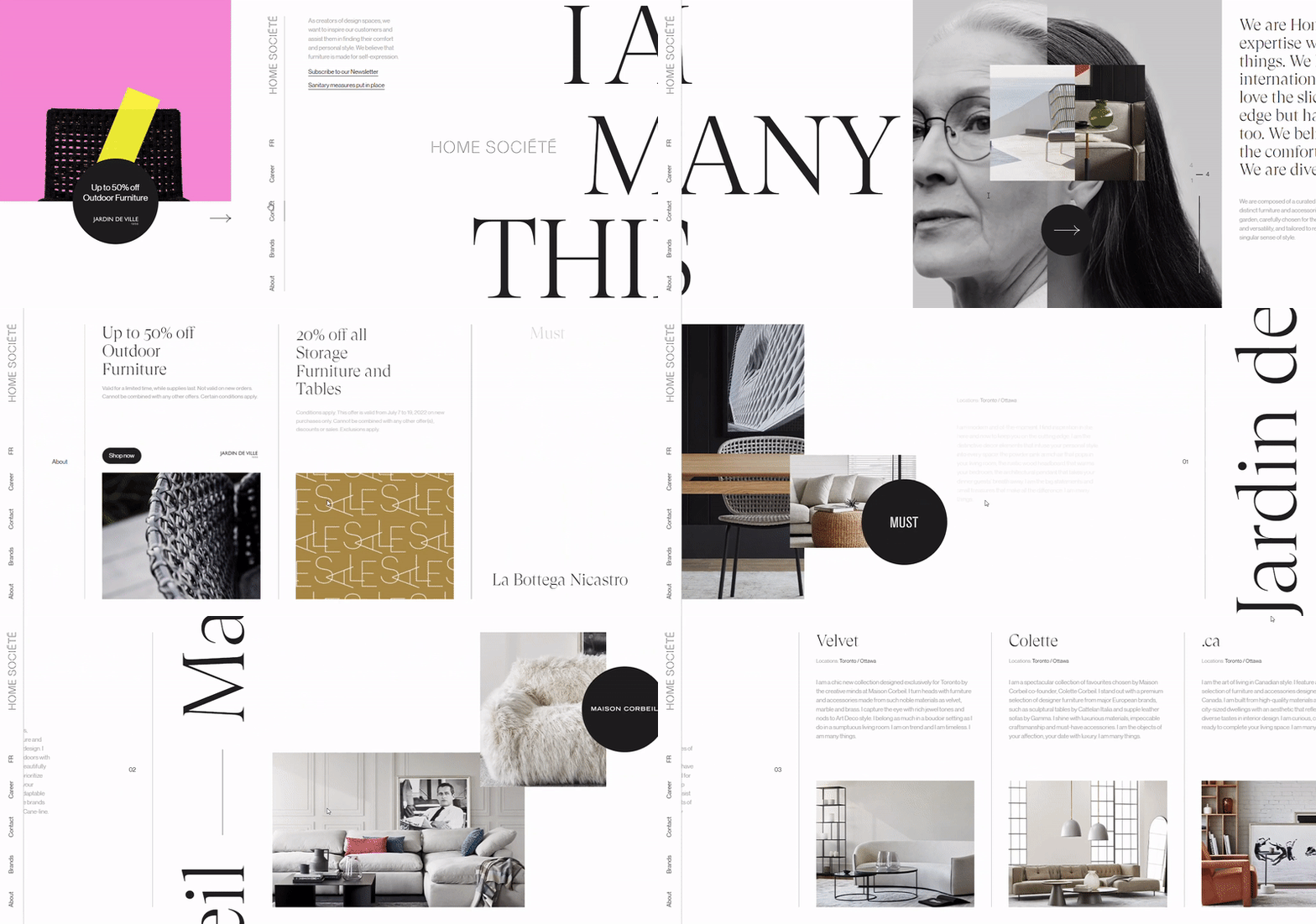
Source: https://homesociete.ca/en/
Geometric Grids
Grids are basic, but they provide a lot of options for how they may be used in a design. Geometric grids are increasing in popularity as a means to arrange a layout while providing a consistent and strong appearance. It is possible to use blocks for both navigation and text components. Large color squares are fascinating to explore and do a great job of holding people’s interest.
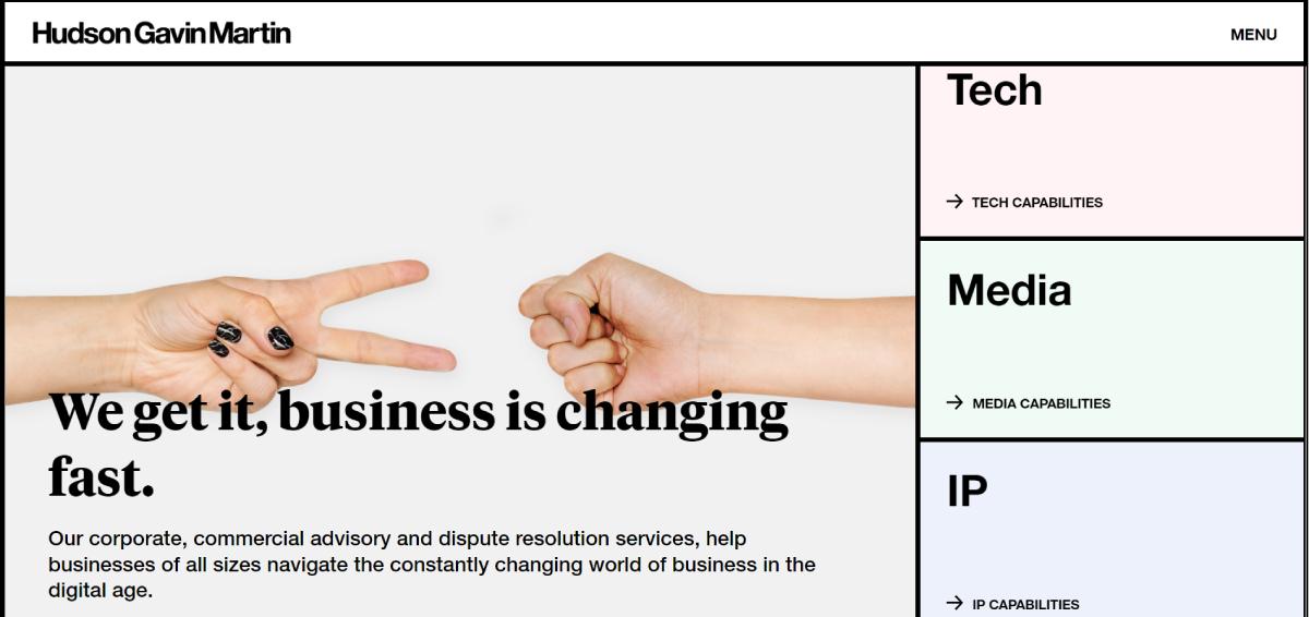
Source: https://www.hgmlegal.com/
Fluid Layouts
The fluid layout style is attractive since it performs effectively in a number of settings. It is possible to present both an educational center and create an eCommerce site. The design also provides a lot of layout versatility. You are free to include multi-column components, photos, videos, lists, and other elements. The eyes of your viewers are led down the page smoothly since parts often move together without sharp divides.
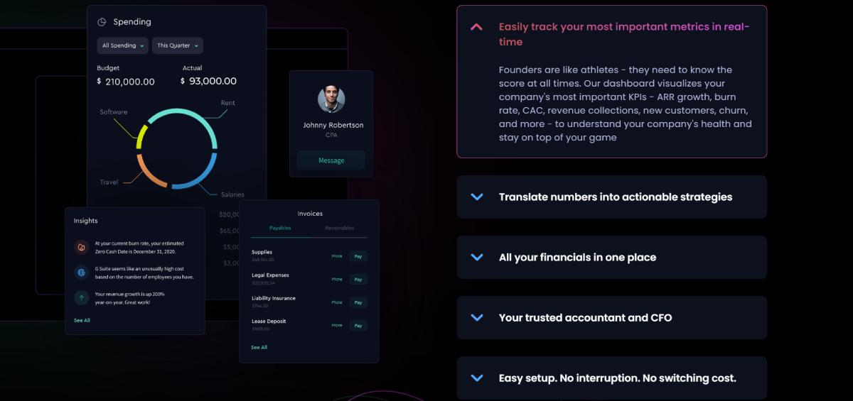
Source: https://flowfi.com/
Positive Site Design
Everyone would admit that the world gets increasingly problematic and gloomy at times. Designers will experiment with colorful, cheerful, and creative designs. Everyone wants to make their lives a bit brighter, and web designers are no exception. To make your web pages more attractive, include more positivity, such as happy faces, calming images, and vibrant colors.
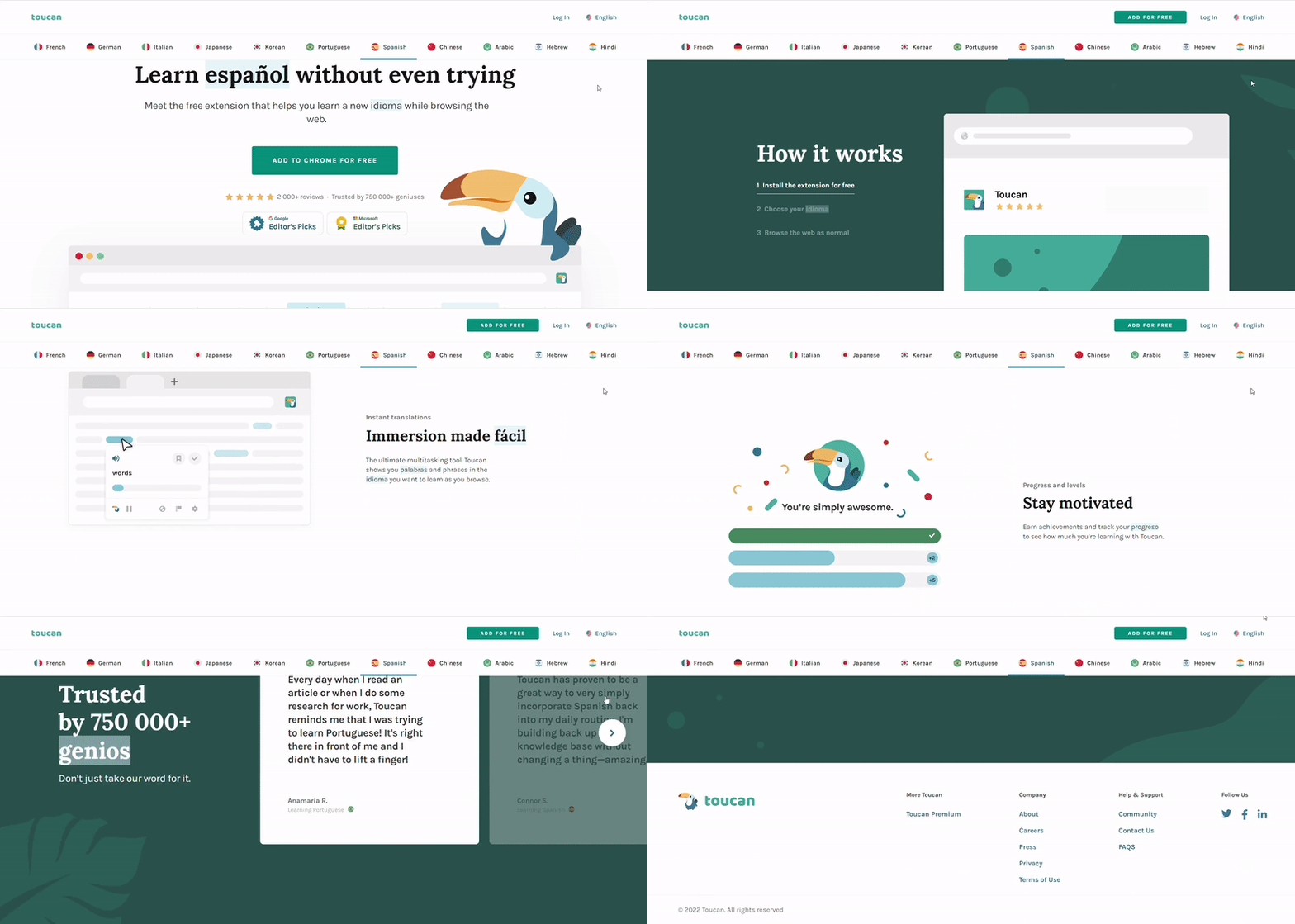
Source: https://jointoucan.com/
A Few Words in Conclusion
People are spending more time on the Internet than it has ever been. They, on the other hand, establish their opinions about a site in 0.05 seconds. As a result, it is critical to engage people, give a distinctive online journey, and weave a human feeling into the digital world. That implies web designers must keep an eye on news and changes in the business. If you want your projects to be current, new, and original, you must follow trends. You will be ready to determine which aspects are obsolete in 2022, which might last for a longer time, and which will be a passing trend. Remember that TemplateMonster is a place where to design website as quickly as possible is not an issue. Thanks for reading!