A Deep Dive Into The Wonderful World Of SVG Displacement Filtering
Even today, the magic, wicked realm of SVG Filter Effects is largely uncharted territory. The art of SVG filtering is still surrounded by an aura of alchemy: you have to bravely dive into a dark world of inconsistencies, your dedication will repeatedly be tested by buggy implementations and nerve-wracking side effects, and you must learn complicated incantations. But, once mastered, it gives you unprecedented power — a means to switch the total appearance of elements and websites by the snap of a finger.
In this article, we’ll be diving into one of the most spectacular filter effects: the SVG feDisplacementMap filter primitive. In order to make it all easier to digest, I’ve divided the article into three parts in which we’ll be exploring:
- how the
feDisplacementMapworks, i.e. how to apply it and how to control its output in a predictable manner; - we’ll then explore methods to create fancy displacement maps in SVG (slightly more interesting as we will start playing with JavaScript);
- and finally, we’ll take a look at some of the methods to animate the filter and create dramatic visual effects.
As this will be a rather long read, the impatient ones may want to check out the demos we’re going to encounter before continuing. All the demos in this article have been optimized for the latest versions of the three major browser engines.
To get the most out of this article, you should already have a basic understanding of SVG filters. If you are a filter novice, you may want to take a short detour to Sara Soueidan’s introduction or head over on to my humble take on the subject first.
Be warned though: not applied properly, SVG Filters can hurt the performance of your site drastically. Always test extensively if you roll out one of the techniques described here.

So what’s a displacement filter? A displacement operation can visually distort any graphic it is applied to. You can create warp effects, twirls or ripples like you would do with a Photoshop distortion filter. Displacement filtering is an important tool in VFX, and most likely you already saw some displacement mapping operations on film and TV, created with a VFX tool like After Effects or GiantRed.
To achieve a distortion effect the filter needs two images as input:
- The actual source graphic should be distorted (from now on just "source");
- The "displacement map" (from now on just "map"). This map contains information on how we want the source to be distorted.
Most of the time, a map will be some Bitmap image, but in the next part, I will demonstrate how to use SVG images or fragments as an input.
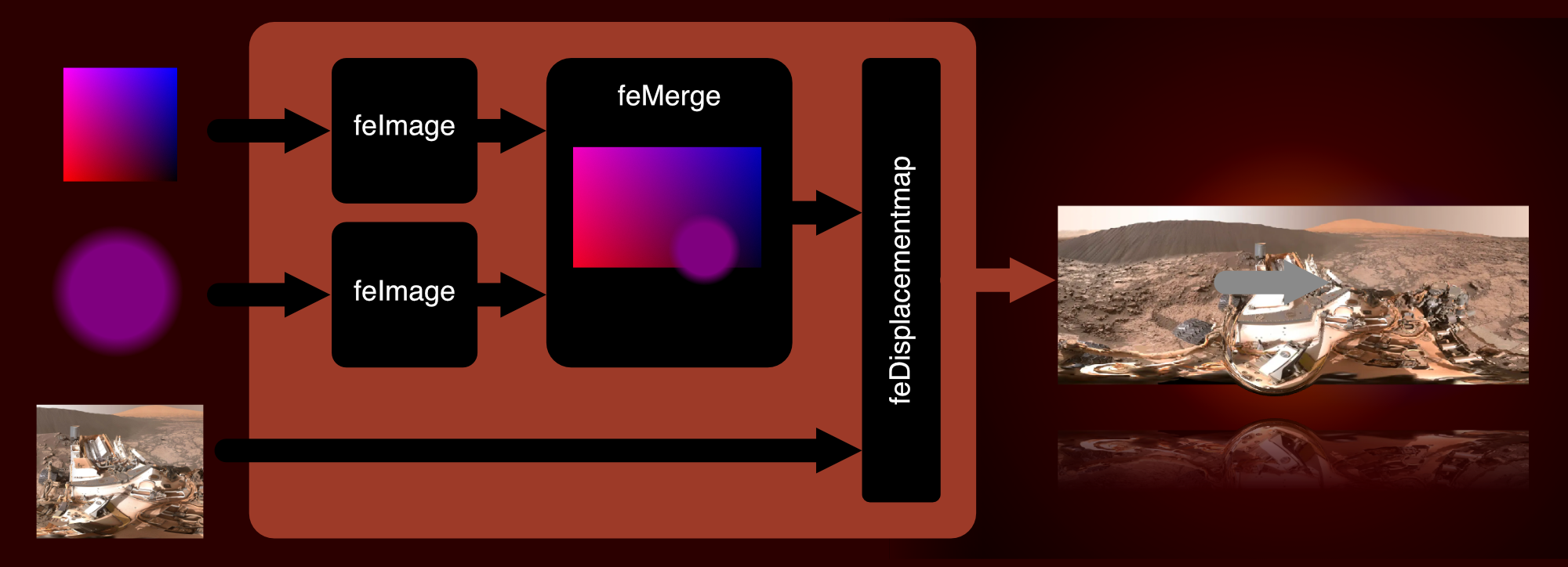
Let’s see what happens when we use an image of Barcelona’s famous La Sagrada Familia to "distort" the Mona Lisa:

- The first filter primitive is
feImagewhich holds a reference to the map (there are other filter primitives that can be used as an input. You will find several fascinating demos out there wherefeTurbulenceis used as displacement map, but in this article, we will mostly focus onfeImage). - This feImage is then fed into a
feDisplacementMapprimitive where the actual distortion happens:- A positive or negative
scaleattribute defines the strength of the distortion. - The purpose of
xChannelSelectorandyChannelSelectoris to determine which of the input image’s four-color channels (red, green, blue, alpha) should be applied to which axis for distortion. Both attributes default to the map’s alpha channel (which means if you’re using a map without alpha channels and omit these attributes, you’ll see nothing more than a diagonal shift of the source).
- A positive or negative
We then apply the filter with CSS:
.filtered {
  filter: url(#displacement-filter);
}
It may be fun to play around distorting images this way but it is unpredictable how the result will look and most of the time it’s not aesthetically pleasing at all. Is there a way to get pixel-perfect control over the output? Here’s what the spec says:
This filter primitive uses the pixels values from the image from in2 to spatially displace the image from in. This is the transformation to be performed:
P'(x,y) ← P( x + scale (XC(x,y) - .5), y + scale (YC(x,y) - .5))
The displacement map, in2, defines the inverse of the mapping performed.
OK, looks complicated at a first glance, but it is actually pretty easy to understand when broken down:
P'(x,y)stands for the coordinates of a pixel in the result;XandYare the coordinates of this pixel in the unfiltered source;XCandYCare the normalized(1/255)RGB color values of the given pixel in the map;- Finally, the result of the operation must be inverted (which basically means every
+in the formula must be replaced by a-).
We will run some simple experiments to verify our formula by feeding primitive bitmaps into a filter, consisting of only one single color. Let’s say the map is filled with rgb(51, 51, 51), how would we expect the coordinates of a source pixel at x=100 / y=100 to be transformed when fed into a displacement primitive with a scale value of 100?
X: 100 - 100 (51/255 - .5) = 130
Y: 100 - 100 (51/255 - .5) = 130

To scale an image equally in all directions, the color values must gradually decline from a maximum at one edge to a minimum at the opposite edge. We will use red for X and blue for Y from now on, but in the end, it doesn’t matter which color you chose for x- and yChannelSelector.
- In your favorite Image editor, open a new document;
- Set the background color of the document to black;
- Create a new layer and fill it with a left to right gradient from
rgb(255, 0, 0)torgba(255, 0, 0, 0); - Add a second layer and add a top to bottom gradient from
rgb (0, 0, 255)torgba(0, 0, 255, 0); - Set the blending mode for this layer to
screen.
Et voilà, you’ve built an absolute map! This map will serve as a solid foundation for all kinds of image distortions:
- By applying Photoshop-like distortion filters to this map, we are able to use these effects in CSS filters!
- We can control the scaling of the x- and y-axis independently by altering the transparency of the blue or red gradient.
- It is possible to "mask" parts of the map with a "neutral" color (
rgb(127, 0 ,127)or#7F007F) to prevent the corresponding parts in the image from displacing.

You may have noticed the pixelated edges that sometimes appear in the output image. Especially source material with high contrast, e.g. typography or vector artwork, is prone to this effect.

This is caused by several reasons:
- The filter will take the source image as a bitmap:
If there exist antialiased edges in the source, the filter will not "re-initialize" them after displacing the source. Any pixel will be transformed to its new location, that’s it. - Rounding errors:
Maybe a pixel from100,100must be shifted to83.276, 124.217. The filter must somehow map these coordinates to non-decimal pixel values. - Gaps after displacement:
Maybe two neighboring pixels, say at coordinatesx1:100,x2:101are shifted to different locations, maybex1:207.4,x2: 211.3. How will the filter fill the space in between? Hint: not at all. The spec clearly states:
“Sometimes filter primitives result in undefined pixels. For example, filter primitivefeOffsetcan shift an image down and to the right, leaving undefined pixels at the top and left. In these cases, the undefined pixels are set to transparent black.”
— Filter Effects Module Level 1, W3C
My weapon of choice to fix this issue is to add a slight blur, then increase the contrast with a feConvolveMatrix. Not perfect, but good enough for most situations. Here’s a demo on CodePen:
- Insert a
feImageprimitive with a reference to theabsolutemap; - Create the "magnifying glass", an SVG containing a circle filled with a radial gradient, starting at
rgba(127, 0, 127, 0)and ending atrgba(127, 0, 127, 1); - Insert a second
feImagewith a reference to the "magnifying glass"; - Merge both images into an feMerge primitive and make the result the
feDisplacementMap’sin2. As you may have noticed we’re using a negative scale factor here to make sure the image will be scaled down outside and is displayed at its normal size inside the "magnifying glass"; - Add some JavaScript so that the
xandyattributes of the feImage referencing the "magnifying glass" match the mouse position.
A totally different way to build an SVG displacement map is by making use of extremely thick blurred bezier paths instead of gradients. Here’s a little app that lets you change the bezier anchor points in a map created this way.

It’s possible to create some pretty rad maps this way, but you should keep in mind that blurring has an impact on rendering performance. Firefox even has a threshold of 100px on how much blurring is allowed.
AnimationBy now we learned everything about the main principles behind displacement filtering and how to create displacement maps in SVG. We are ready for the fun part: how to set everything into motion.
SVG filters can be animated and transitioned. A big problem is the fact that filter values referencing a URL will not be interpolated, but swapped out immediately without any transition in-between, a behavior that is in line with the spec. Can be ok in some situations, but boring most of the time. We want animated twirls, ripples, warps, and morphs!
When thinking of animated maps, the first thing that comes to mind is an animated gif or WebP. Well, animated images will work in every browser somehow. But performance varies greatly from quite bad to extremely bad. And then there are platform-related limitations: e. g. Blink is not able to apply this animated displacement filter to elements that contain other animated elements. And we didn’t talk about file size yet. Instead we will focus on the two most reliable animation techniques IMHO: SMIL (yes, SMIL still is a thing these days) and JavaScript.
A filter will usually be constructed from a variety of different primitives and every attribute that was added to a node, like x, y, width, height or scale can be animated with SMIL.
Here’s a very simple example: making use of an animated feFlood primitive to create a basic glitch effect:

This effect can be leveraged even more by throwing masks, blurs, and some colors into the mix. Here’s a pimped-up version of the effect using the same techniques, but in a more advanced way.

You may have noticed that depending on your browser and CPU, the performance of these demos can vary drastically. It’s a disappointing fact that SVG Filters are still not optimized for performance. Your GPU will accelerate some simple primitives (e. g. color operations), but when you build a compound filter chaining and merging many primitives you will quickly find framerates dropping and fans going up — especially in WebKit and Firefox. Browser vendors have a lot of topics on their to-do lists and SVG Filter Effects don’t have the highest priority there, especially as they still are not found that often out in the wild.
This doesn’t mean that you can’t use animated SVG Filters now, but you should apply them in a responsible way: preferably limit the dimensions of the animated paint area to the smallest possible rectangle, limit the number of iterations to the minimum, be careful with blurs and blending operations and test test test on many browsers and devices.
A good use case for animated filter effects are small, locally constrained animations applied to UI elements. Below is a demonstration of how the animated feImage effect from above can be used to spice up a rather boring progress bar:

- Create 2 different SVGs for each channel in our map. For each color create a grid of rectangles with randomly varying color intensity.
- Create 2 different
feImageprimitives. URL-encode each SVG, then put it into thehref-attribute of eachfeImage. - Add SMIL animations for
width,height, andyattributes. - Insert a
feBlendand blend bothfeImagesinto a single output. - Add some colored
feDropShadowsfor a cool split-color effect. - Blend everything, then feed it into a
feDisplacementmap. - Animate the
scaleattribute with SMIL. - Feel free to experiment by changing forms (e. g. use circles instead of rects), applying different timings, adding blur effects, and more.
So far we have learned that animating filter attributes with SMIL can help us to achieve really cool visual effects. On the other hand, we already saw how SVG fragments can be used as a displacement map. As SVGs are animatable with JavaScript, SMIL and CSS, it would seem obvious that we can apply animations directly to an SVG map right?
Unfortunately, SMIL and CSS animations in SVG images used
as input for feImage will not run when the SVG or fragment is URL
encoded. We will need to write some JavaScript for a reliable solution and take into account that two different approaches for Webkit and Blink/Quantum browsers are necessary. In a first step, let’s see how the "ideal" way of animating a map will look:
- Create the SVG fragment containing your map;
- Reference it from the
feImagethat controls yourfeDisplacementMap’sin2; - Feel free to animate everything in your fragment with JavaScript as you like. Roll your own script or use your favorite library.
"This sounds too easy. Where’s the catch?" Of course, you are right. The method described above is the ideal path, the way things should work but, here’s a strange matter of fact: It will not work anywhere but Webkit. In order for our animation to run in Blink and Firefox, we must implement a rather hacky solution and you won’t like it:
- Create the SVG fragment containing your map.
- In every frame of your animation, change all the values of every animated attribute.
- In every frame of your animation create a new URL encoded string containing a "snapshot" of the fragment and write it into the feImages
hrefattribute.
You’re probably thinking: "This is ugly! I don’t like it and you are a despicable person!". I feel your pain. The front end is a hostile habitat and sometimes we must do abhorrent things to survive (fun fact: the "ugly" method performs better in Blink than the "pure" method in Webkit will).
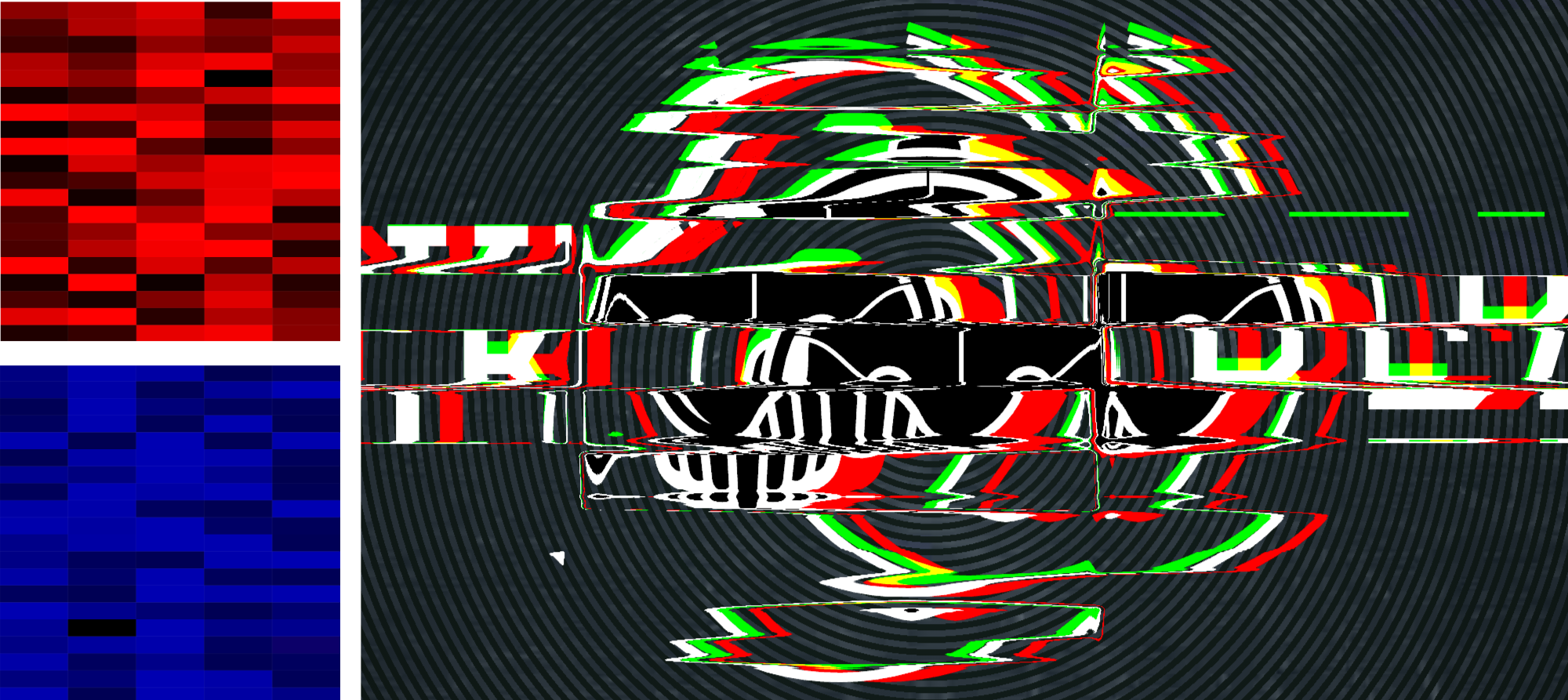
Let’s Rock!Let’s solve a real-world problem with this approach: here’s what happens to “The Rock” when we apply these two simple displacement maps:

2. Using Animejs’ Grid Animation
Animejs’ staggering and “grid” properties can help you create really cool typographic effects. This effect was created by animating a grid of circles:

3. A "Waving Flag" Menu
An unconventional way of swapping a second-level submenu. The fade-in effect is achieved by moving a striped map horizontally:

Please note that the demos shown above are highly experimental and mainly intended to demonstrate the concept of animated displacement maps. If you want to use any of these techniques in a live project, always take my earlier recommendations to heart. And forgive me for not going into detail on every example — it simply would exceed the scope of this article.