Voice Control Usability Considerations For Partially Visually Hidden Link Names
Digital accessibility tends to be taught through the lens of how your experience works (or fails to work) with a screen reader. It makes sense to think that, if it works for a screen reader, it will also work for a lot of other kinds of assistive technology.
However, this approach also indirectly reinforces the narrative that blindness is the majority experience. Within this narrative, there is also some subtlety in the fact that not everyone who uses a screen reader is blind.
The majority disability experience is actually depression, which is a complicated disability with highly variable symptoms. One of the most notable symptoms of depression is that it negatively impacts your cognition, which affects your ability to understand things.
The other salient bit is that the majority experience is not default. The point I’m getting at is that overcorrecting for one form of disability may unintentionally negatively impact the experience for other forms of disability — voice control software being one example.
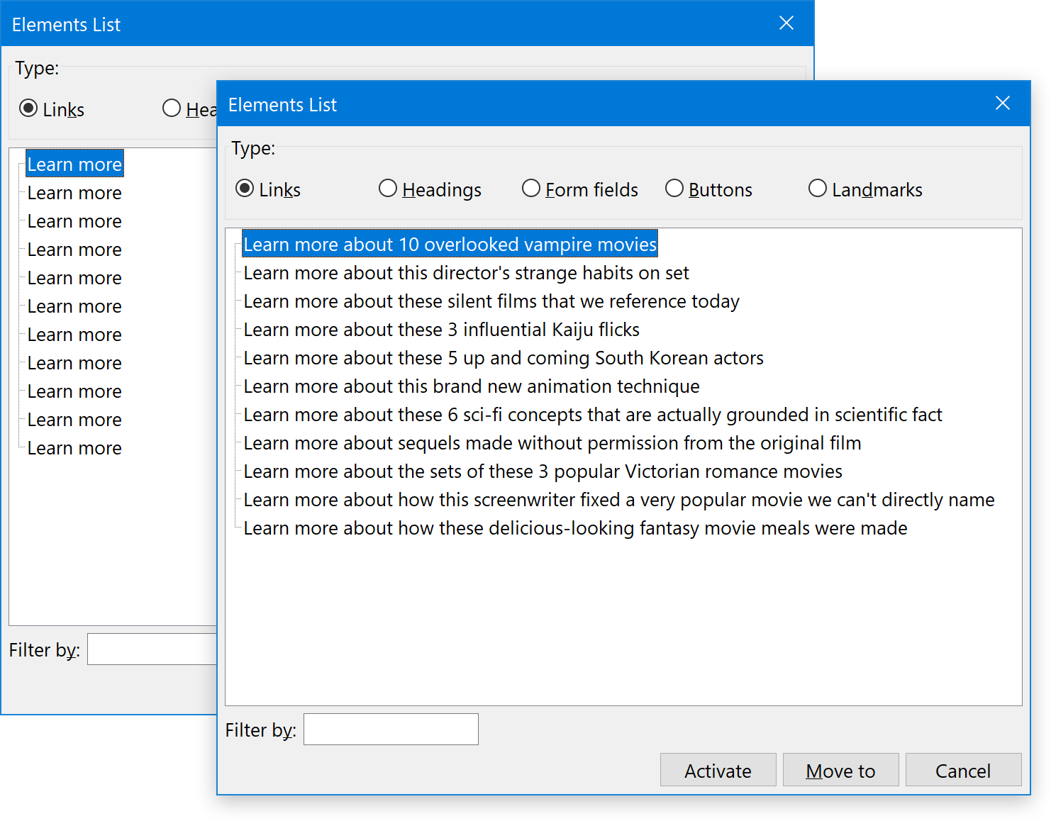
Unique Link NamesMaking each link’s accessible name unique is an important thing to do. It helps clarify where each link goes to someone who is navigating via a specialized screen reader browsing mode. For example, all major screen readers have the ability to list all the links on the current page or view, with the links being removed from their surrounding text content and context.
Eleven links called “learn more” don’t make a lot of sense when separated from their surrounding context. It’s far better to tell the reader what they’ll be learning about:
If you use CSS libraries such as Bootstrap or Tailwind, you may be familiar with a specialized class that a screen reader can read, but is not displayed visually. These classes help provide additional context, such as supplying additional heading elements to help with way-finding.
<h2 class="sr-only">
  Footer
</h2>
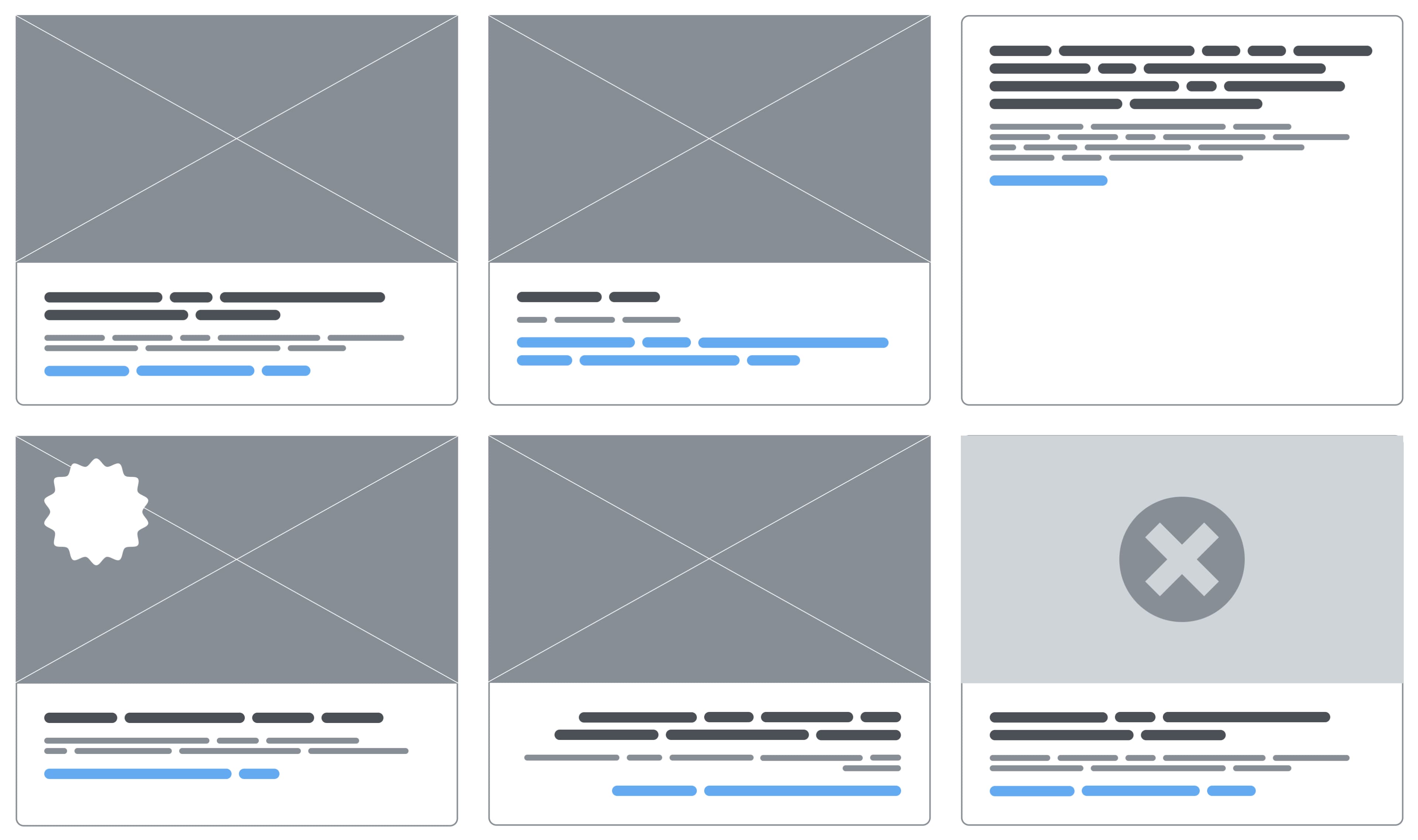
Another thing visually hidden classes are commonly used for is to hide the portion of an interactive control that makes its name unique. A common pattern for this is a call-to-action (CTA) link in a card component:

Who Uses It?
There are more people who use voice control than you’d think. If you’ve ever asked Siri to set a timer, congratulations! You’re a voice control user!
That being said, software like Voice Control, Dragon, and Talon are designed for more long-form, specialized use. People who use these applications may temporarily or permanently, and circumstantially or biologically be:
- Fully or partially paralyzed;
- Unable to use their hands;
- Unable to make fine motor movements;
- Unable to make repetitive movements over a long duration;
- Operating with lowered cognition.
Disability is also not a binary state, so it is entirely possible (and relatively common) that multiple disability conditions may be present at any given time.
WorkaroundsSome voice control software has the functionality to work around this issue, the same way screen readers do. Dragon, for example, uses heuristics to identify links that contain the term “learn more.” It then lists a number for each link with that term, which you can then say “choose number” to activate.
If you need to update your existing work to accommodate these kinds of real-world considerations, you’ll probably have to collaborate with content writers, developers, and project managers. Design thrives in this kind of collaborative environment, where you can identify and work with the limits of the systems you work inside of.
Sometimes you’ll be able to tweak what you already have. Sometimes you’ll have to create net-new content. Sometimes you’ll even have to throw it all out and go back to the drawing board. These efforts all speak to the value of a Shift Left methodology, where these kinds of considerations are named and dealt with early in the conception phase.
How Do We Make Sure Our Experiences Are Easy To Use By Voice Control Software?For interactive controls such as links and buttons, you’ll want to:
- Show the full text of the control’s name,
- Use a unique, accessible name for each control on the current page or view,
- Avoid overriding accessible names with
aria-label, and - Avoid using just a cryptic or abstract icon — especially if the control’s functionality is exotic.
These steps will go a long way towards making using voice control software easier and more pleasant.
It’s Not Really About Voice Control SoftwareThe three overarching themes that I hope you’re picking up on:
- Testing with a range of assistive technology is important to understanding actual support,
- Agency can be granted by letting go of control, and
- Design decisions carry a tremendous amount of power.
Your designs need to be flexible and adaptable, as well as be able to accommodate the many different ways people can interact with them. This includes voice control, as well as numerous other forms of assistive technology.
Further Reading On Smashing Magazine
- “Everything You Want To Know About Creating Voice User Interfaces,” Nick Babich & Gleb Kuznetsov
- “Equivalent Experiences: What Are They?,” Eric Bailey
- “Making A Strong Case For Accessibility,” Todd Libby
- “The Guide To Windows High Contrast Mode,” Cristian Díaz